PASK WINERY
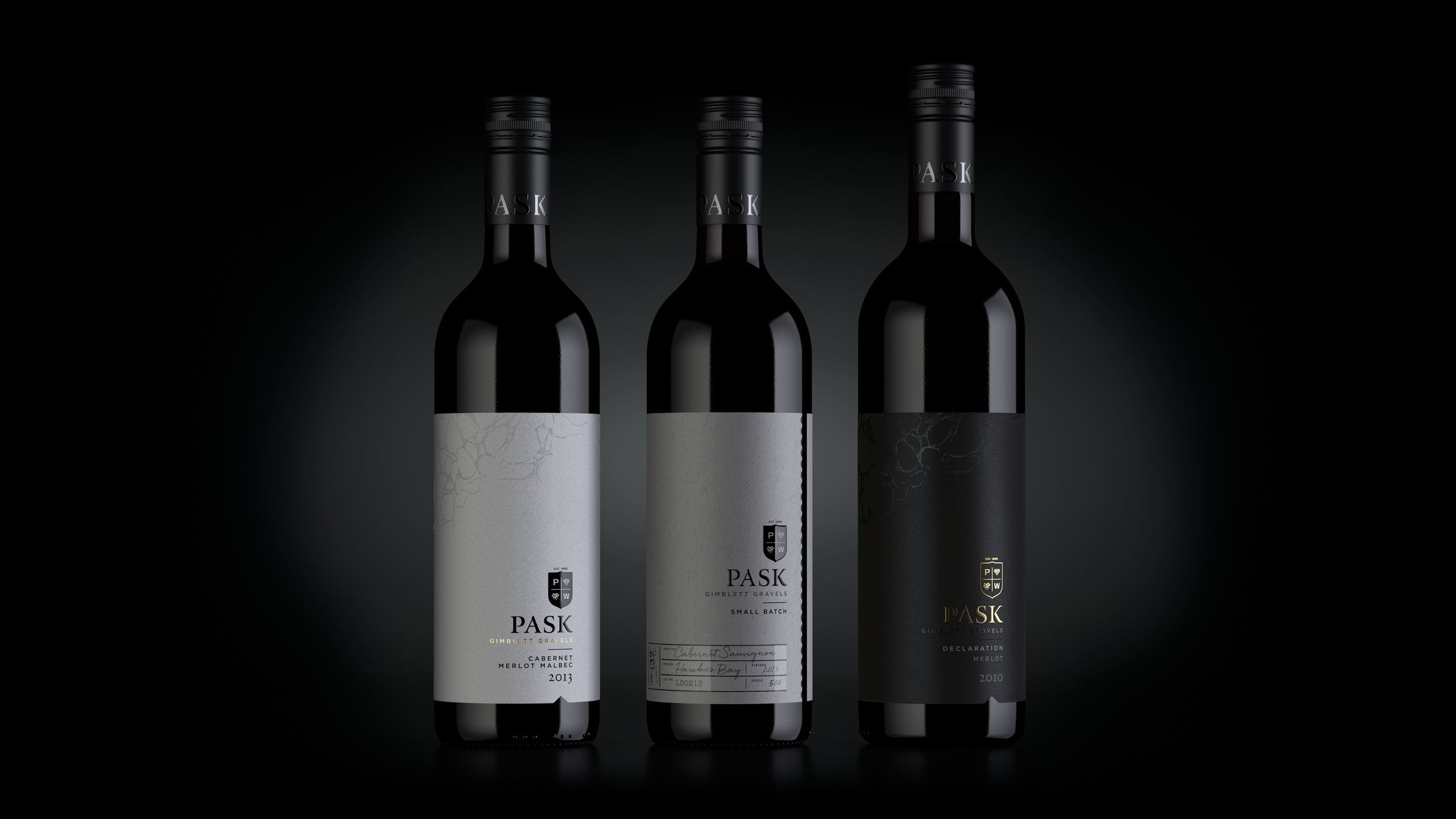
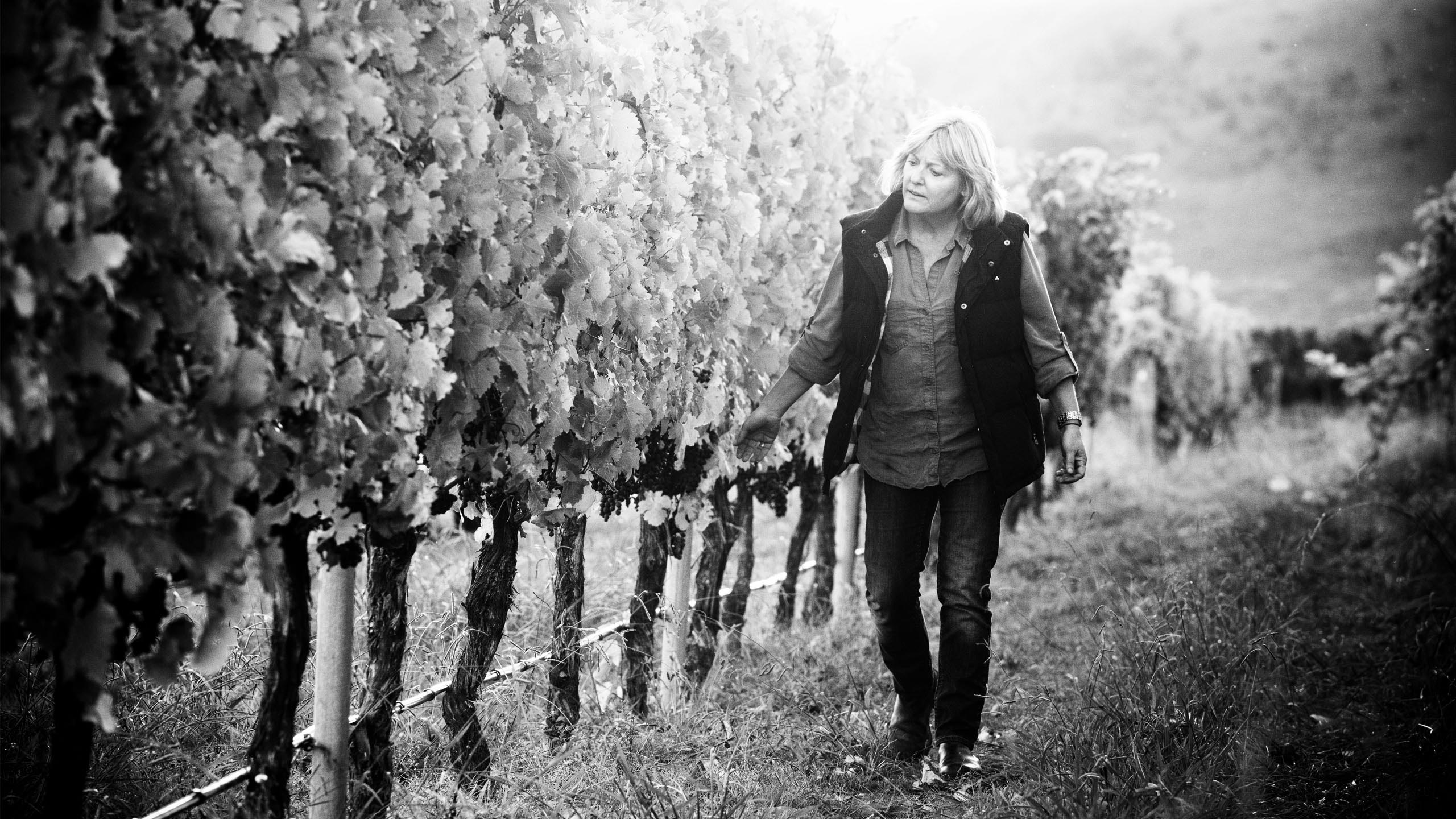
Pask Winery wanted their brand to be a truer reflection of who they were and the wines they made. The design had to be understated and elegant, a reflection of Kate Radburnd’s wine making style.
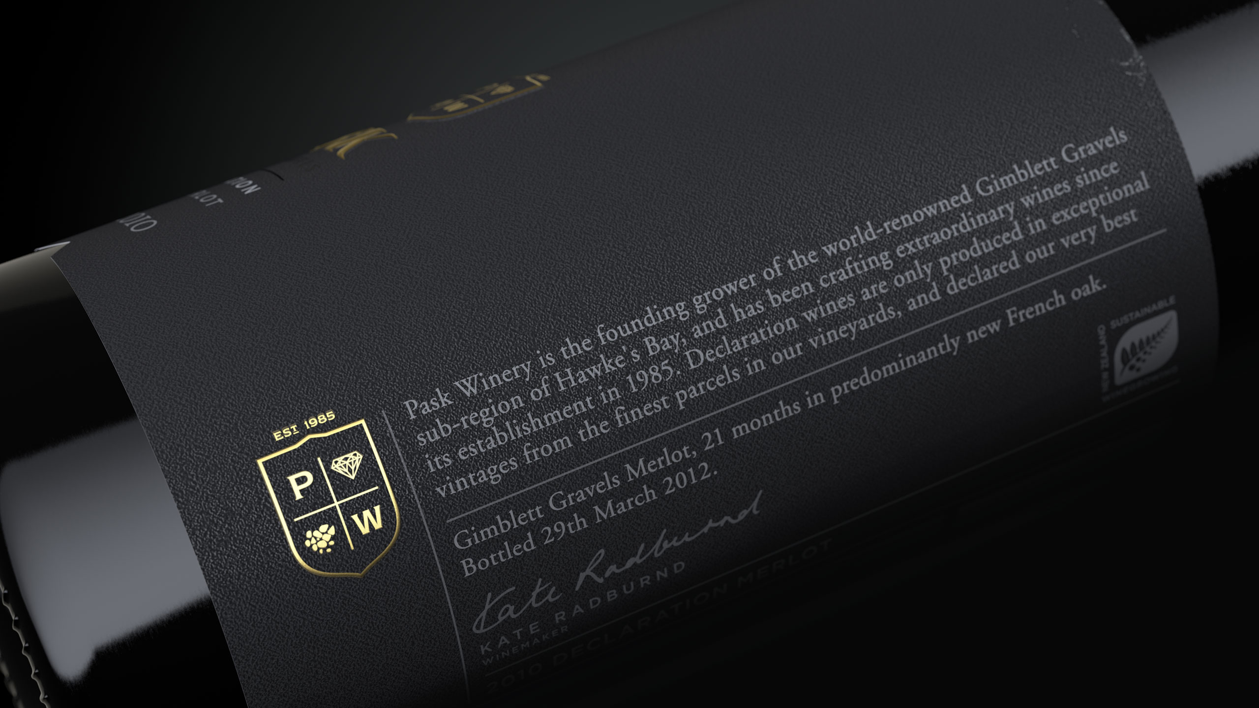
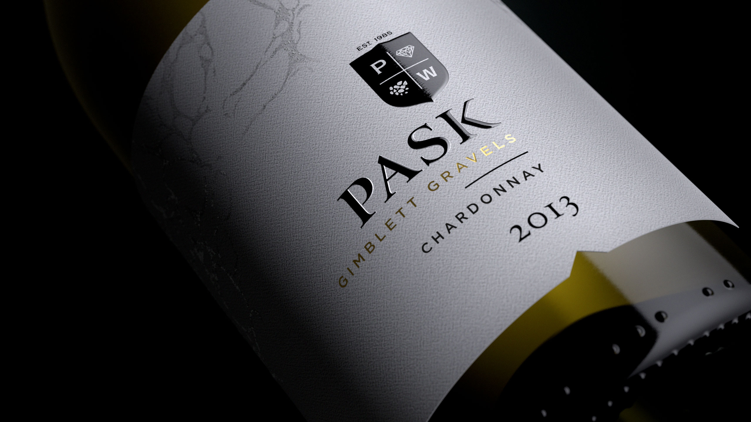
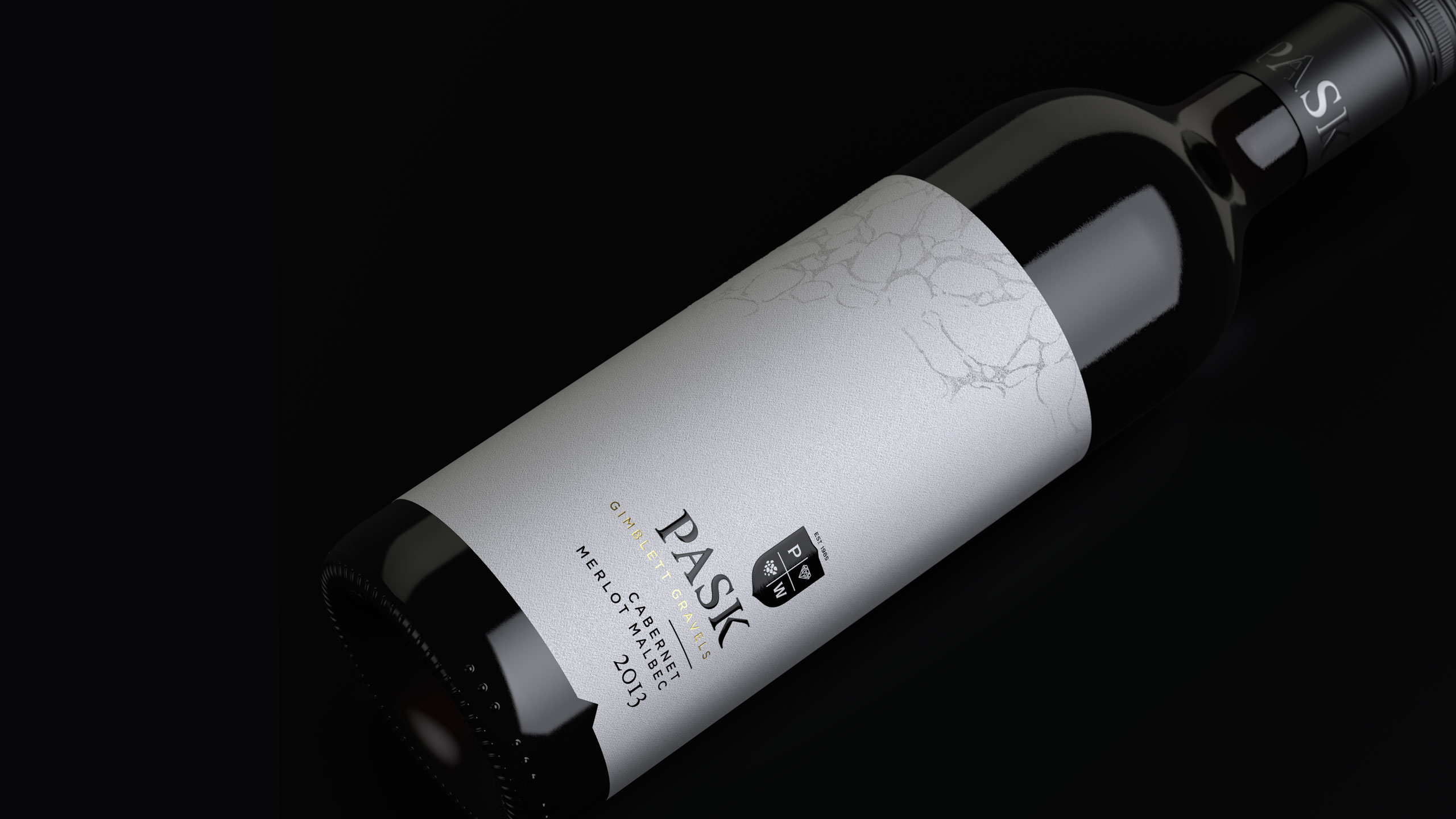
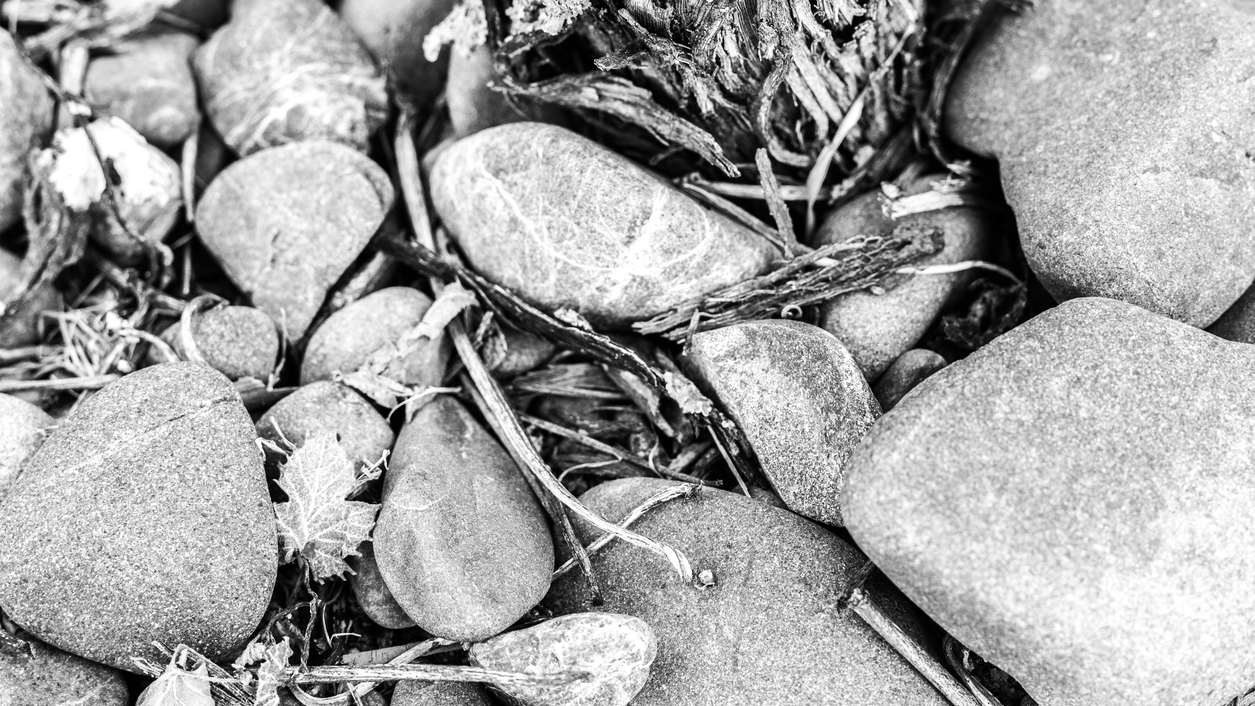
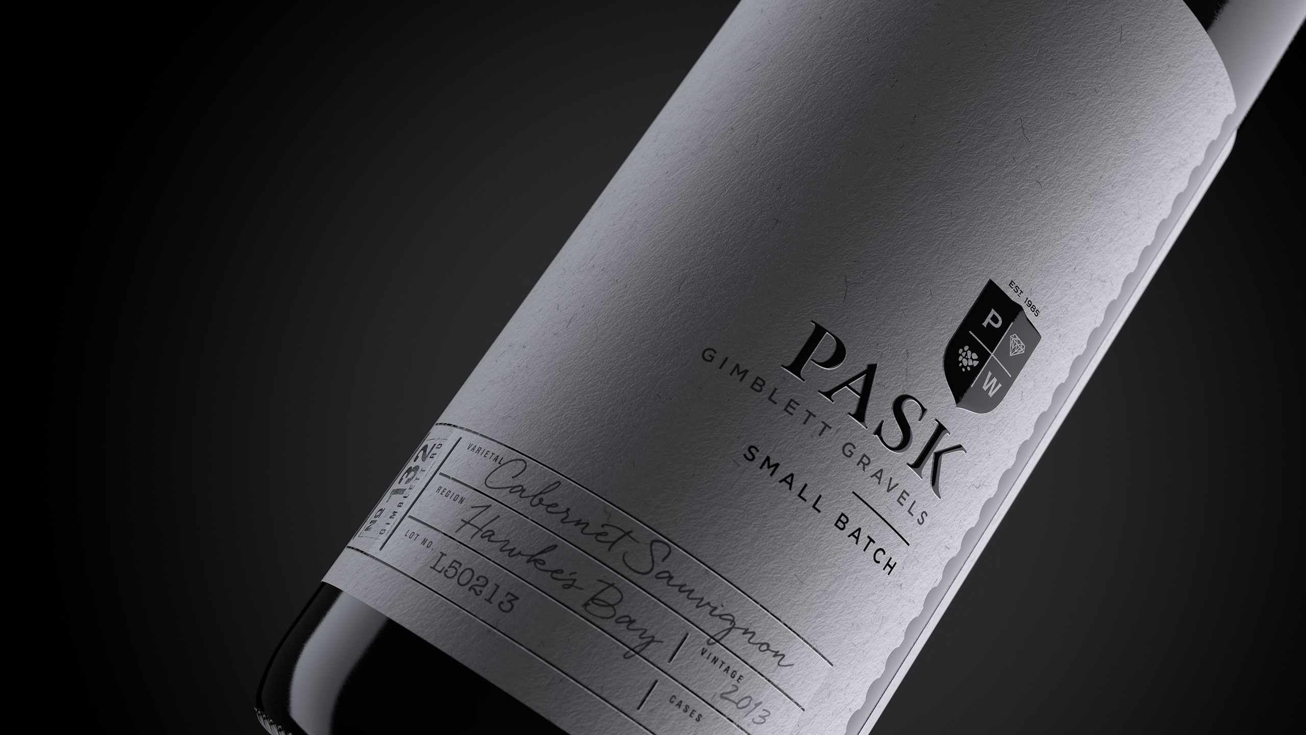
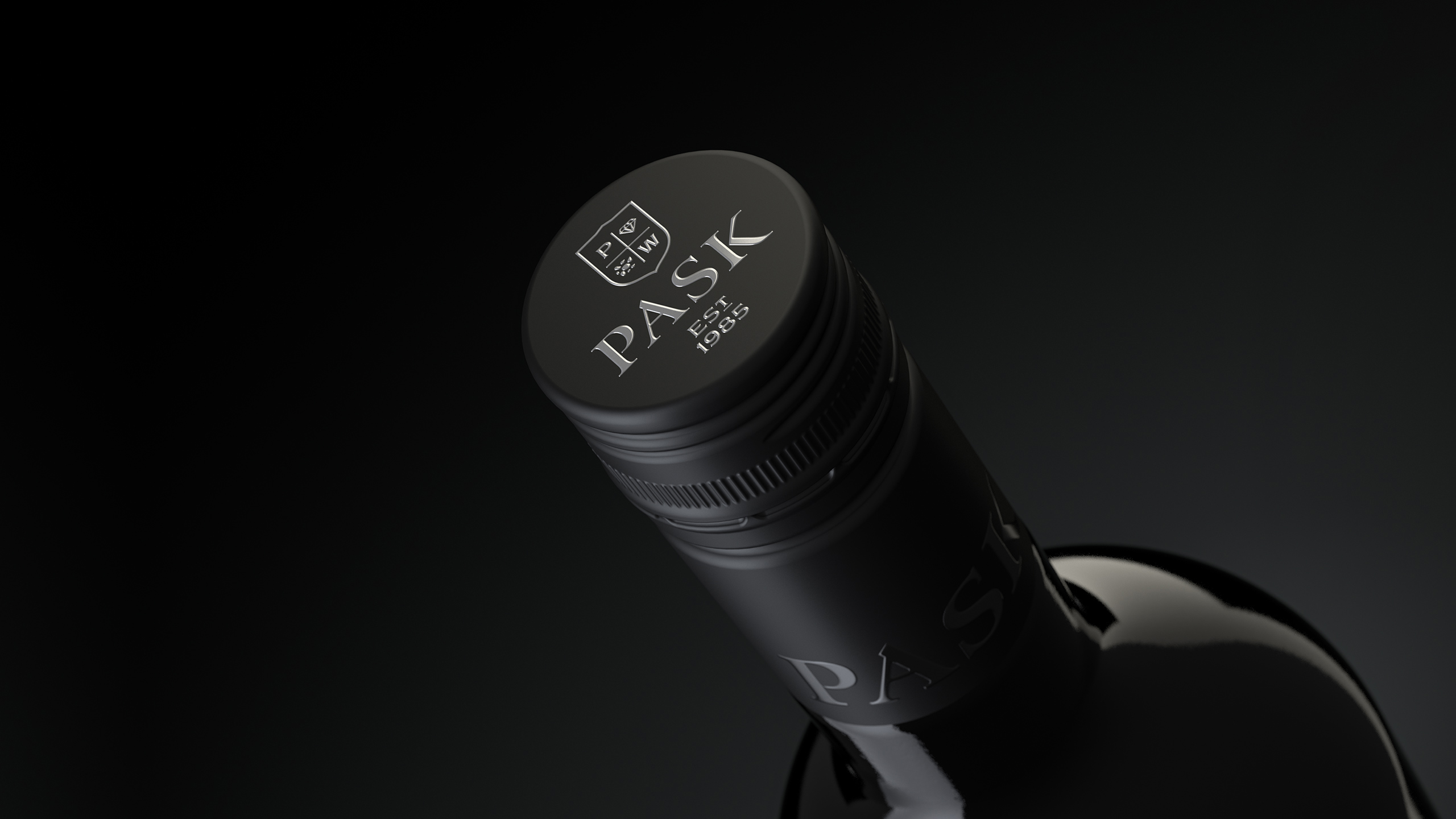
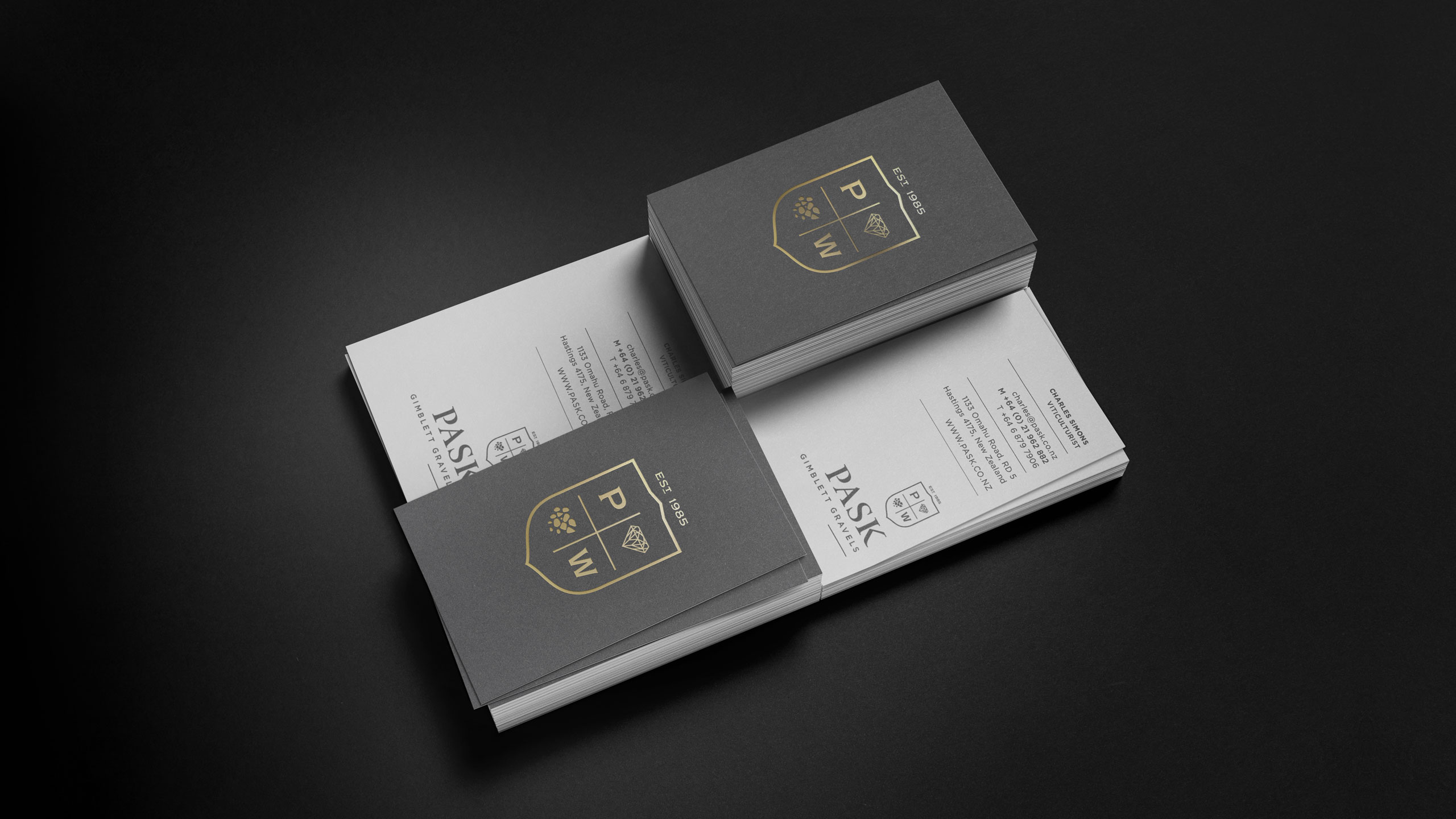
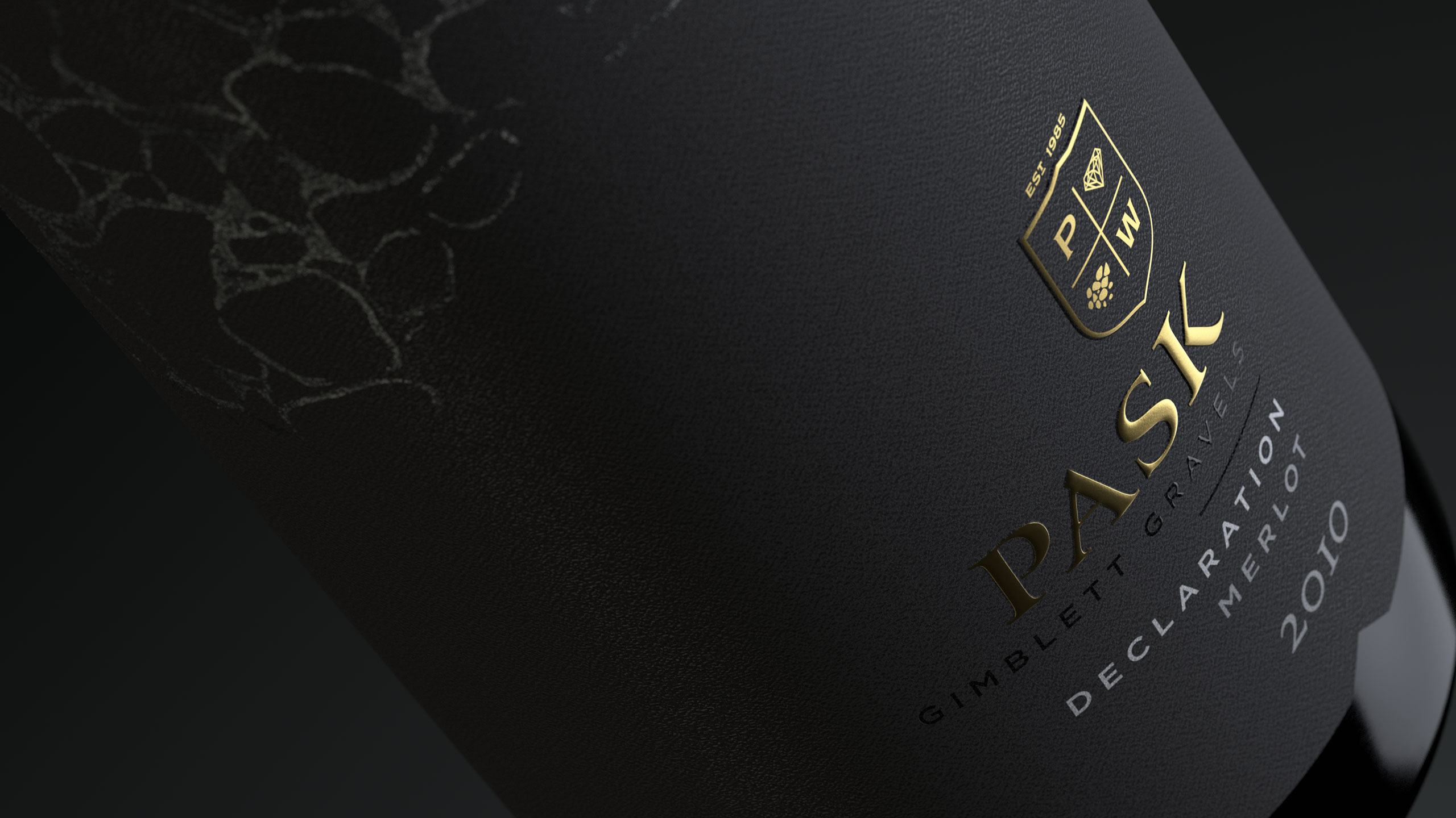
The Pask crest is divided into four segments and represents the most important elements of the winery – P W (their initials/legacy) and the stones of the Gimblett Gravels which they consider to be the jewel in their crown, since they are the only winery to solely produce all their wine from grapes grown there.
While the designs appear understated, detailing is brought through with subtle textural embellishments. A nod to the wines themselves.
PROJECT OUTPUT
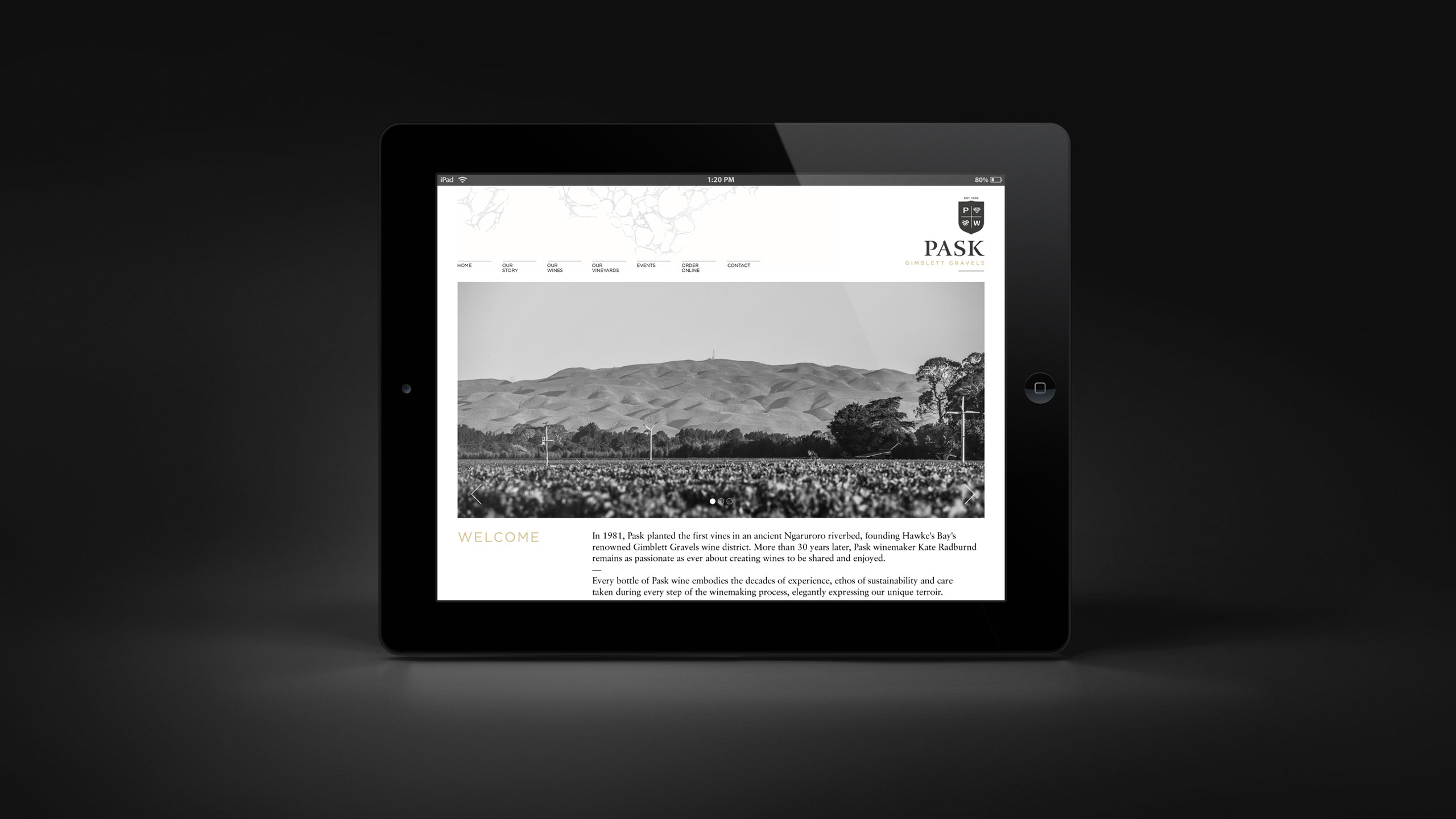
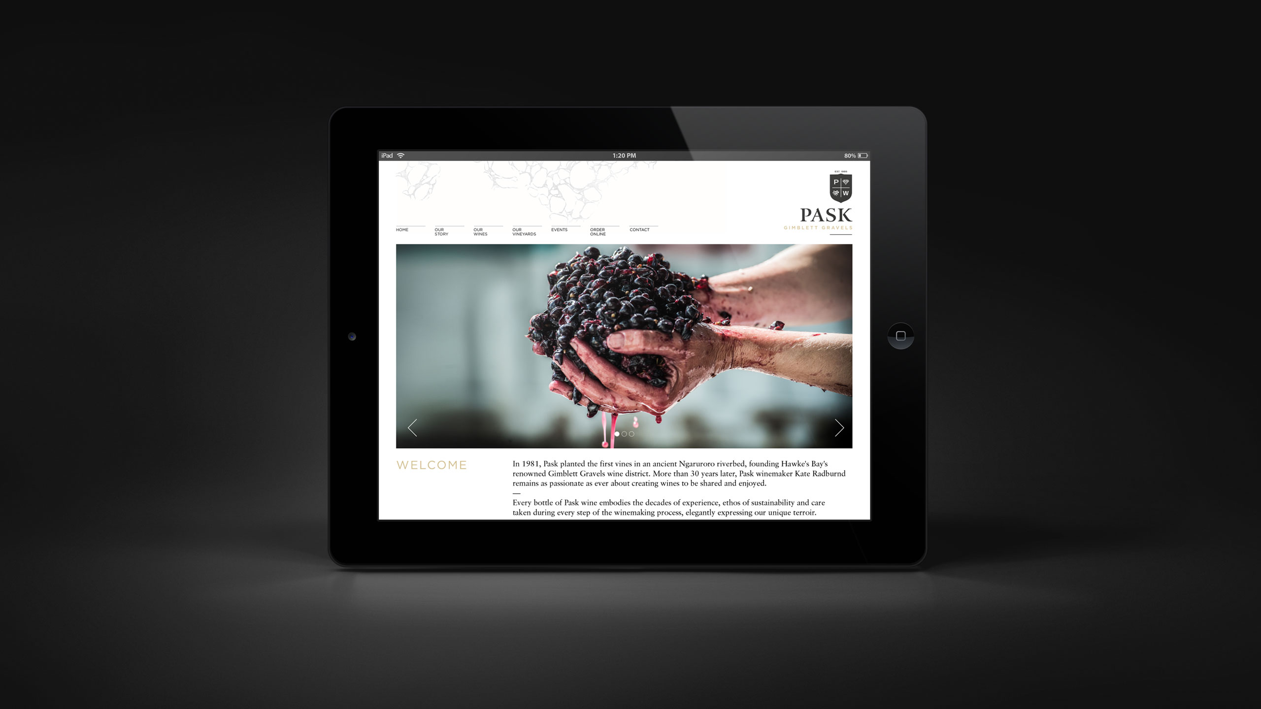
Brand mark, packaging, presentations, event material, digital, advertising.

Before