TIP TOP BAKERY
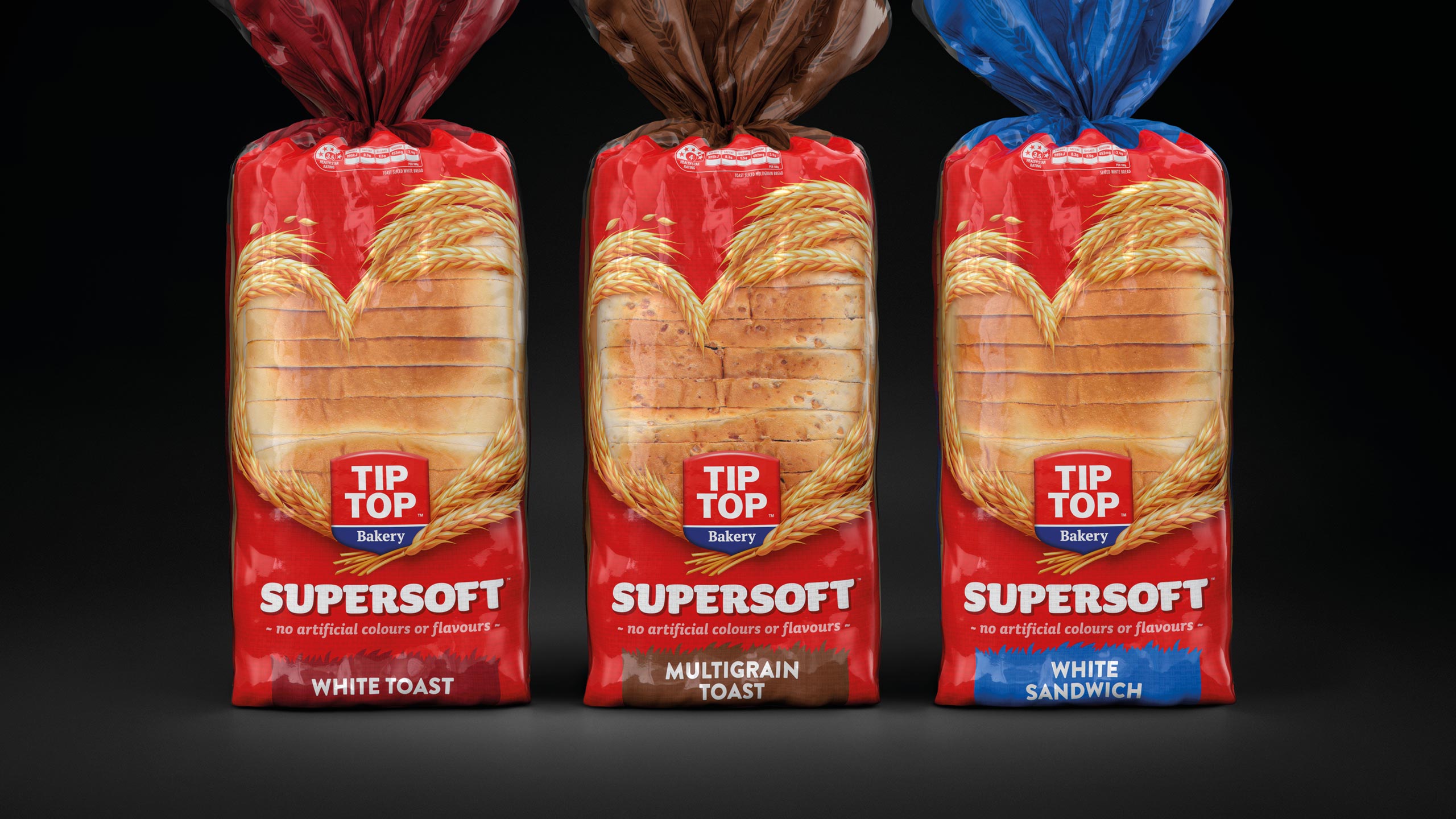
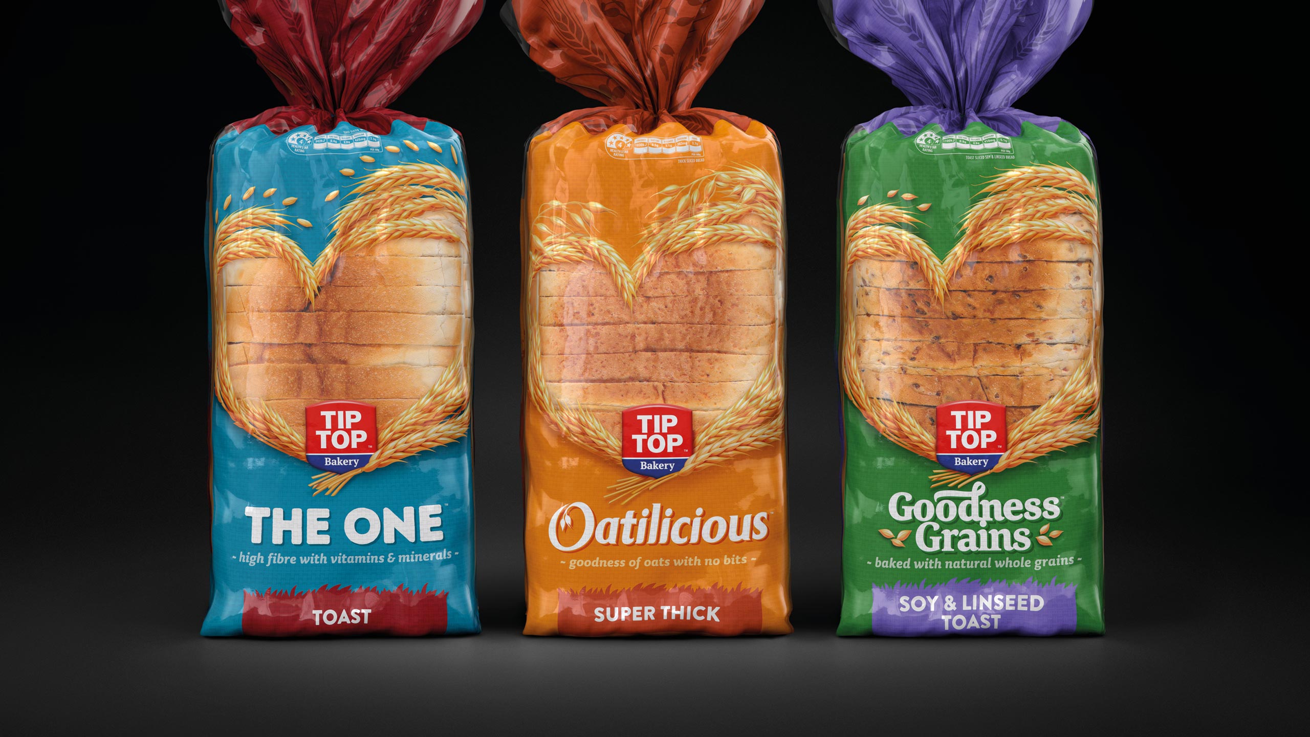
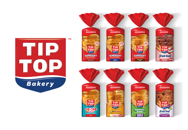
Tip Top is the largest brand within the bread aisle. The existing family was made up of 36 SKUs and was fragmented, with confusing message hierarchies and inconsistent naming conventions. Our task was to create more cut through at shelf and make the range easier to shop by having a portfolio architecture that makes sense to the target and felt like a family.
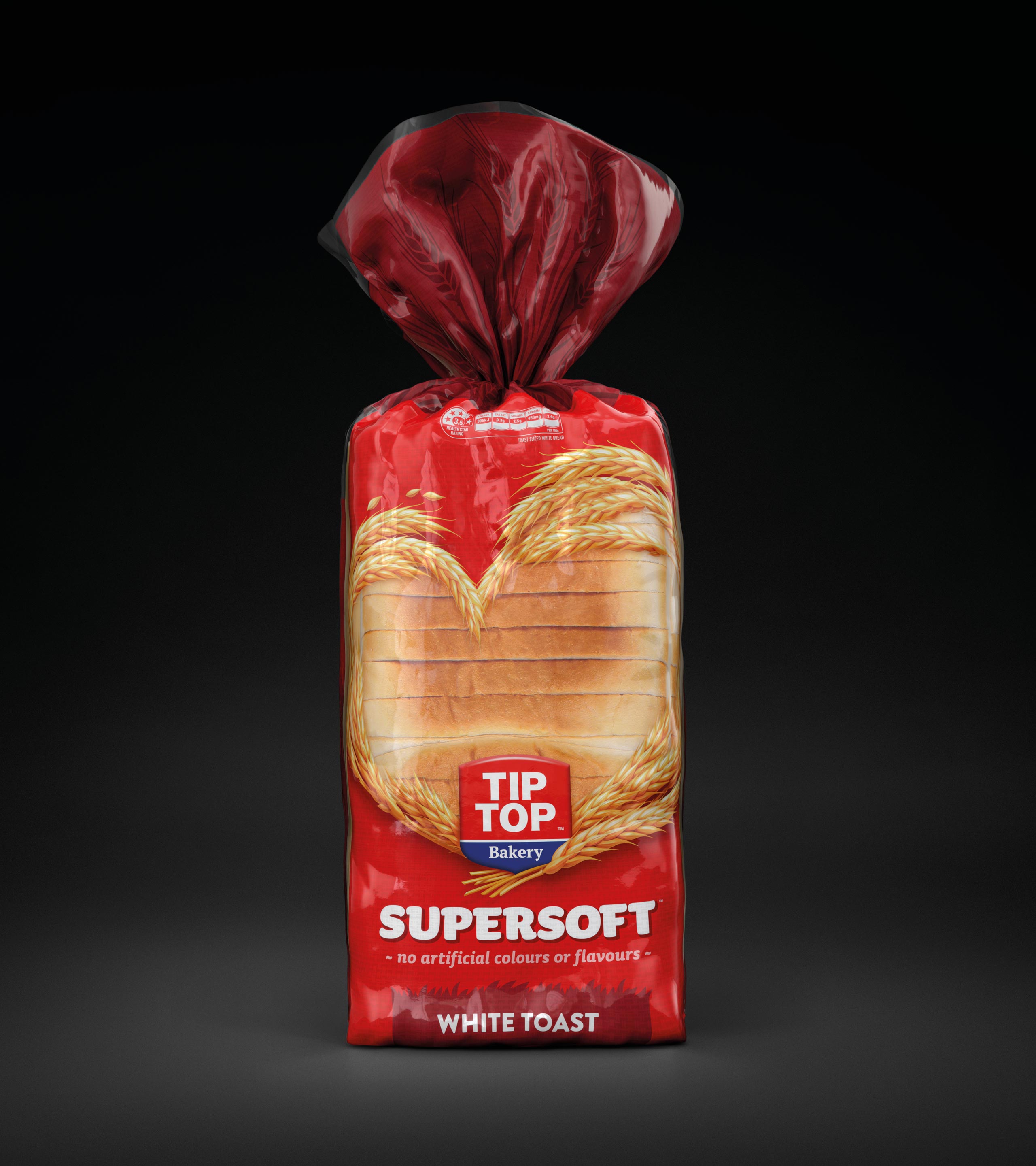
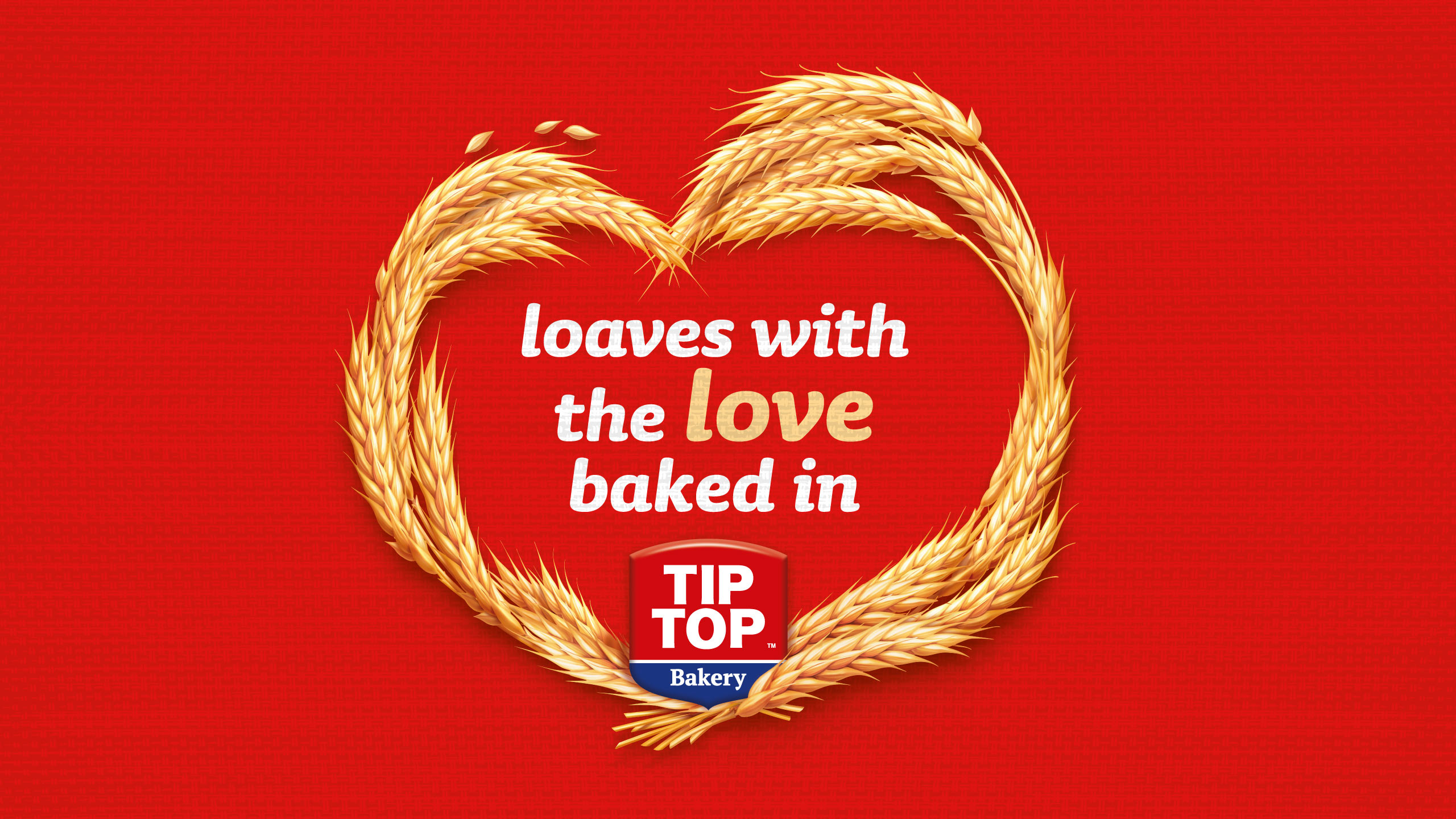
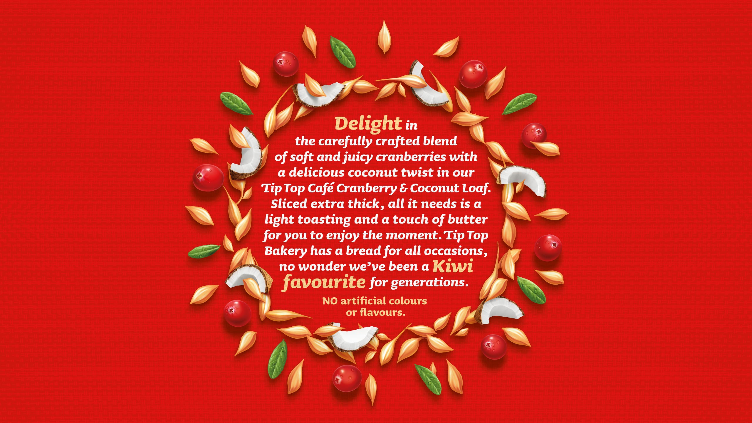
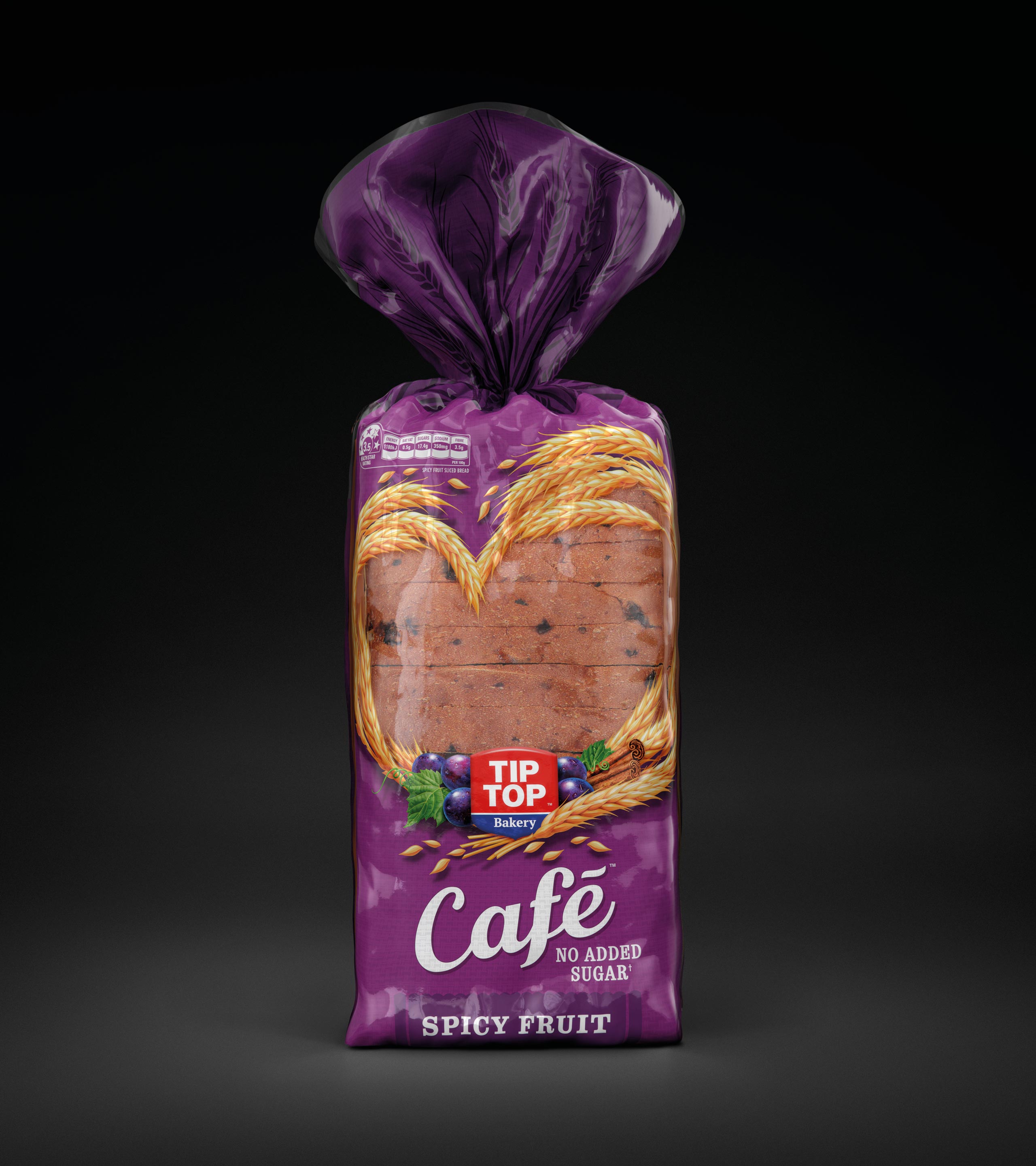
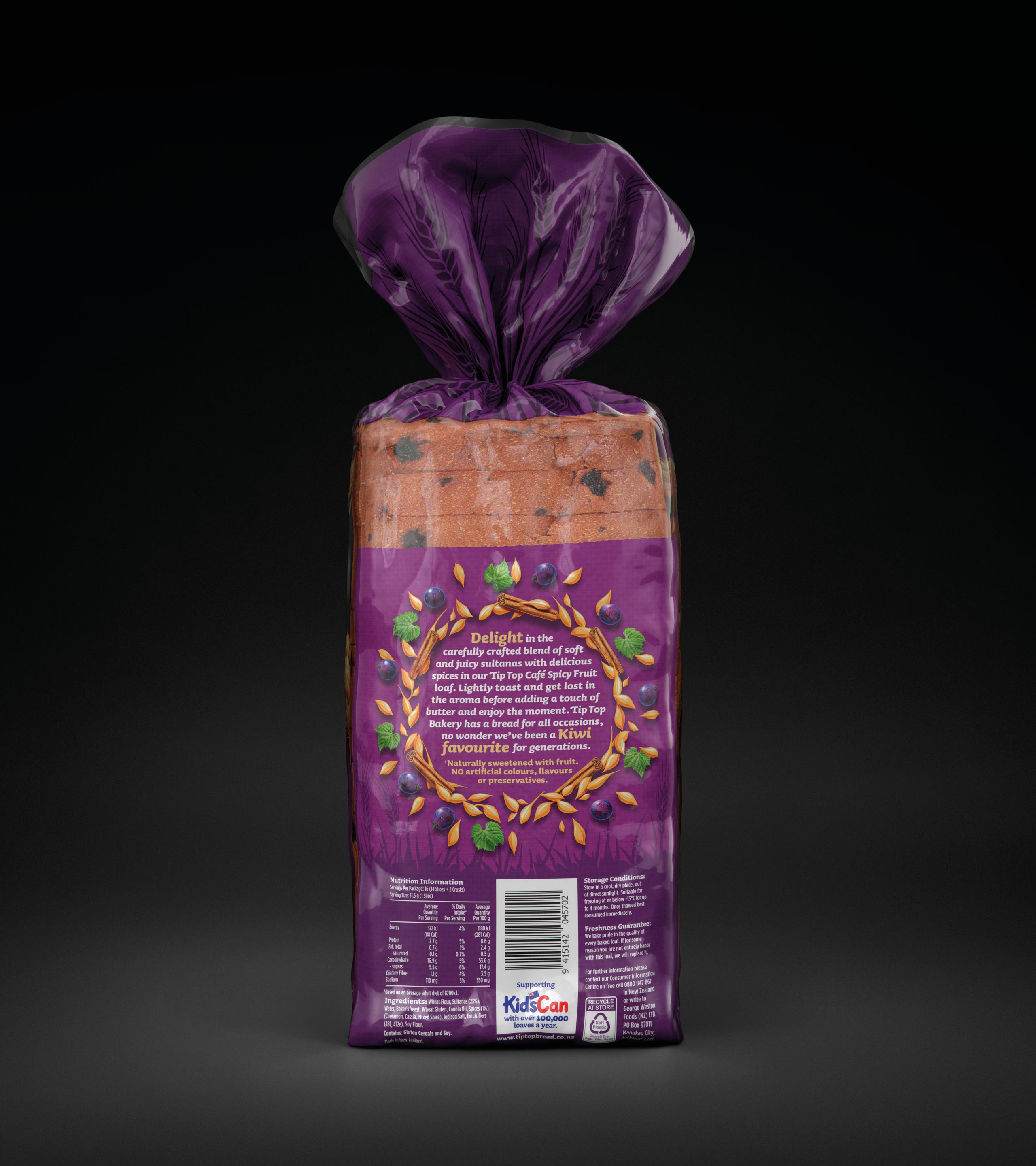
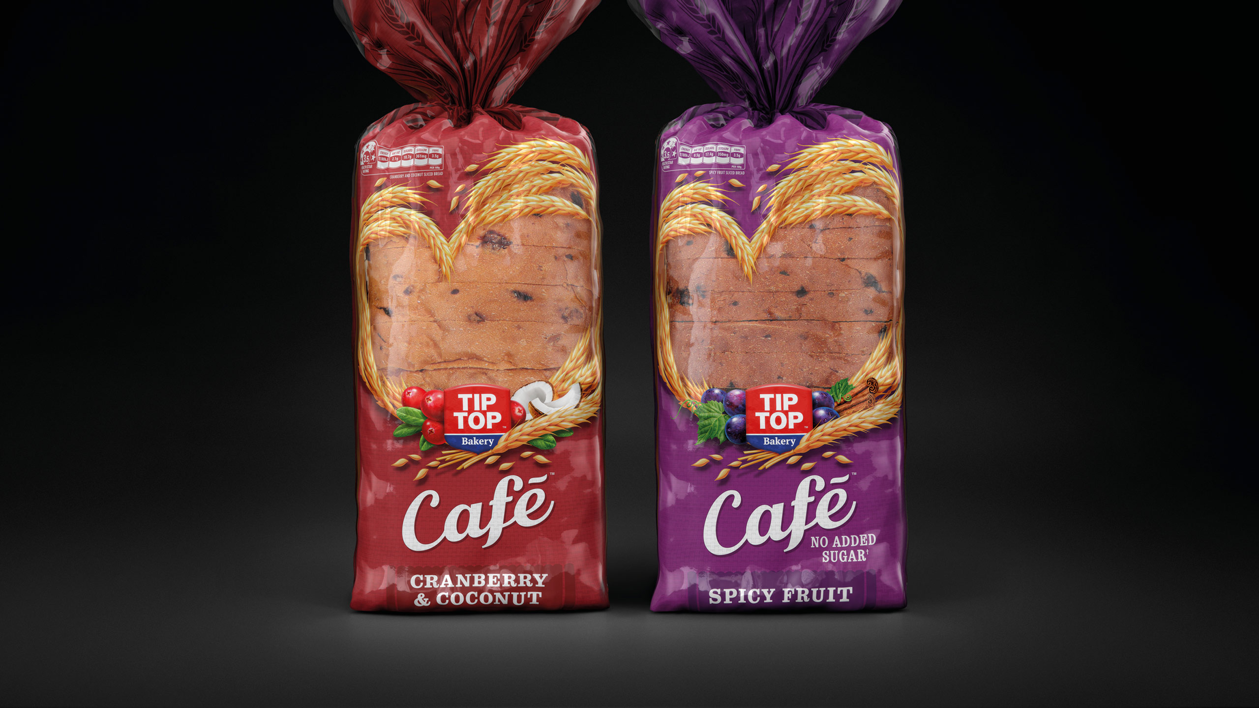
The vision was to encourage New Zealanders to rediscover their love of quality bread, redefining the role of bakery in their lives with renewed relevancy for modern Kiwi families. Extensive research found red was an ownable and recognisable brand asset, and had strong presence on shelf. The brand positioning ‘The bread with the love baked in’ was to be brought to life on pack.
Revised architecture moving from a sub brand model to an occasion model, reflecting how people shopped in the category. Consolidation of design and messaging across the overall category. Refinement of the ‘heart’ graphic, to bring the positioning to the forefront.
One SKU (Goodness Grains) was in danger of being deleted. It is now being 90% recommended by consumers. Sales have increased significantly across the category.
PROJECT OUTPUT
Brand mark, packaging, POS, brand style guide, exhibition, corporate communications.
Before