CHALLENGE
Montana, a name deeply familiar to New Zealanders for over 40 years, sought to introduce a new pinnacle tier that felt both premium and genuinely connected to its heritage. The ambition was to create a modern, confident expression of New Zealand terroir while ensuring the new range felt unmistakably part of the Montana family.
APPROACH
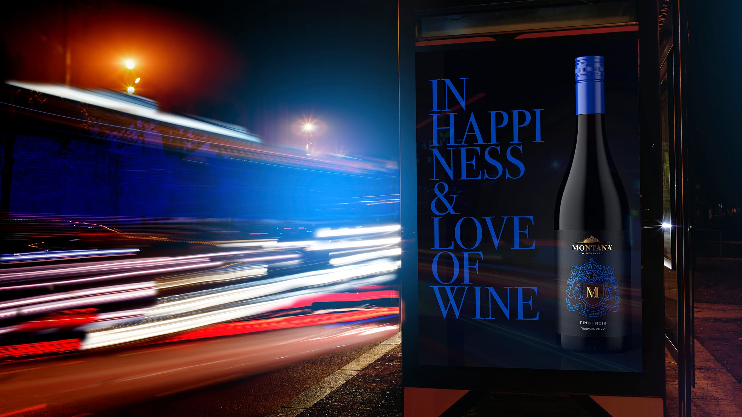
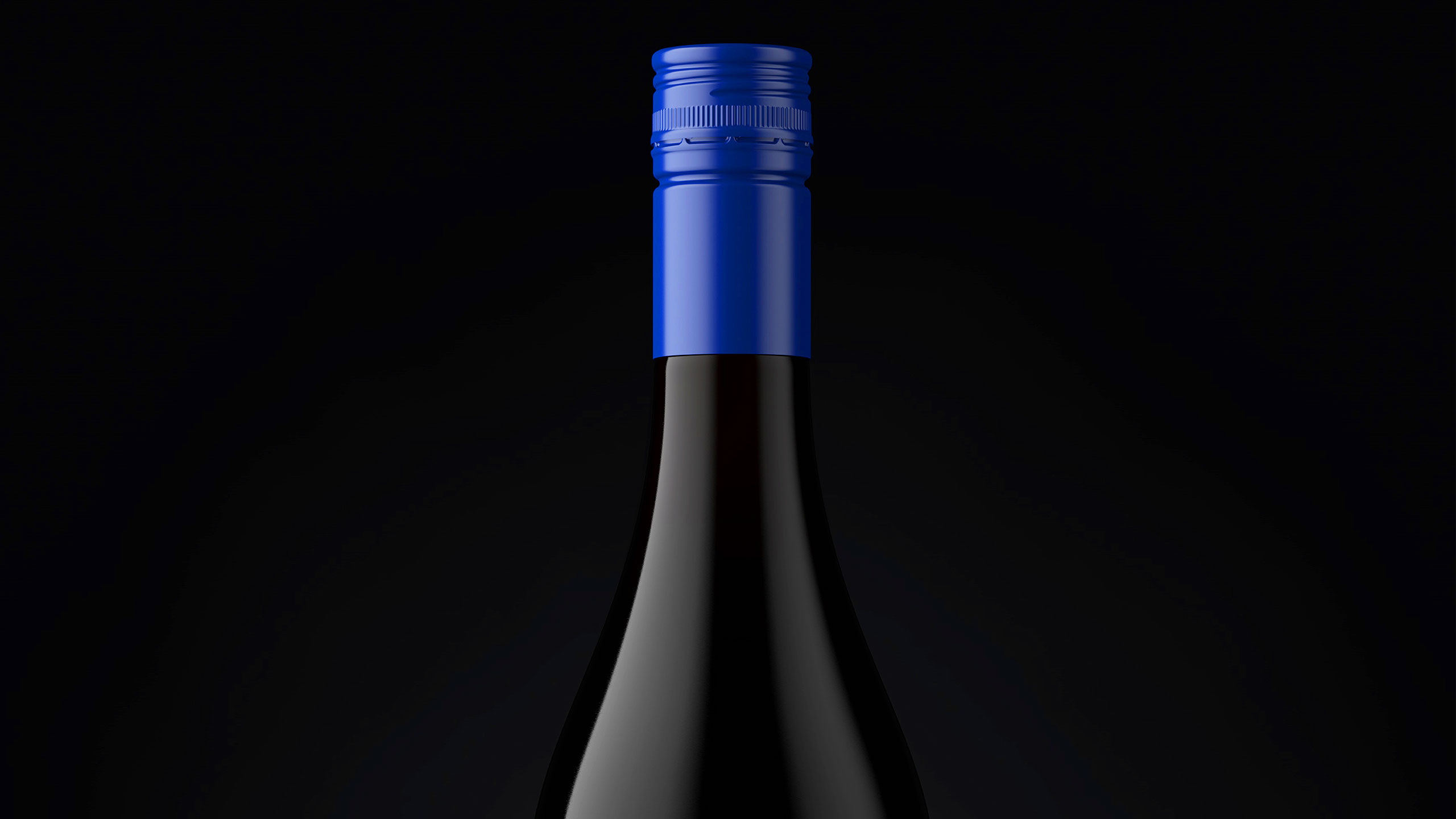
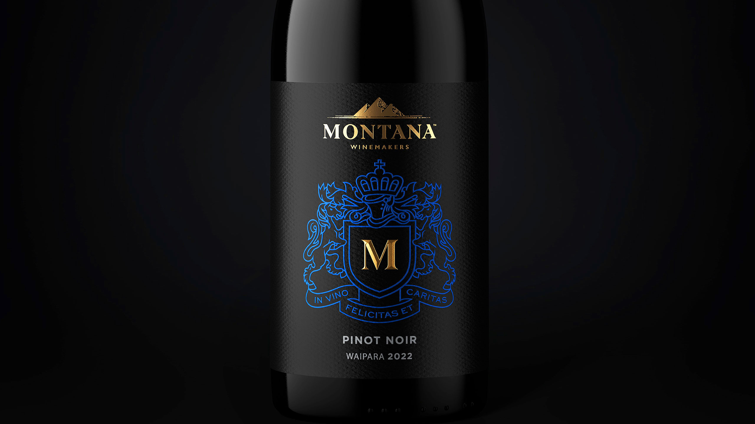
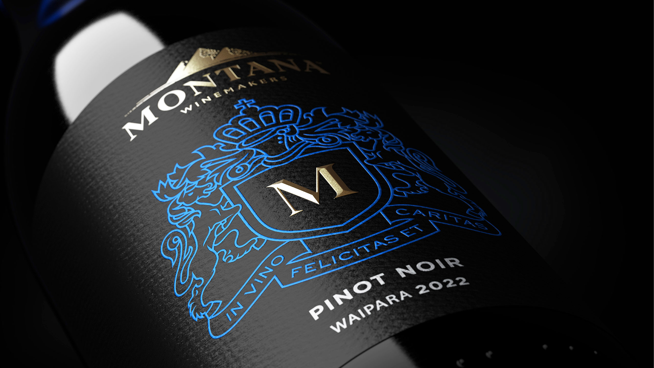
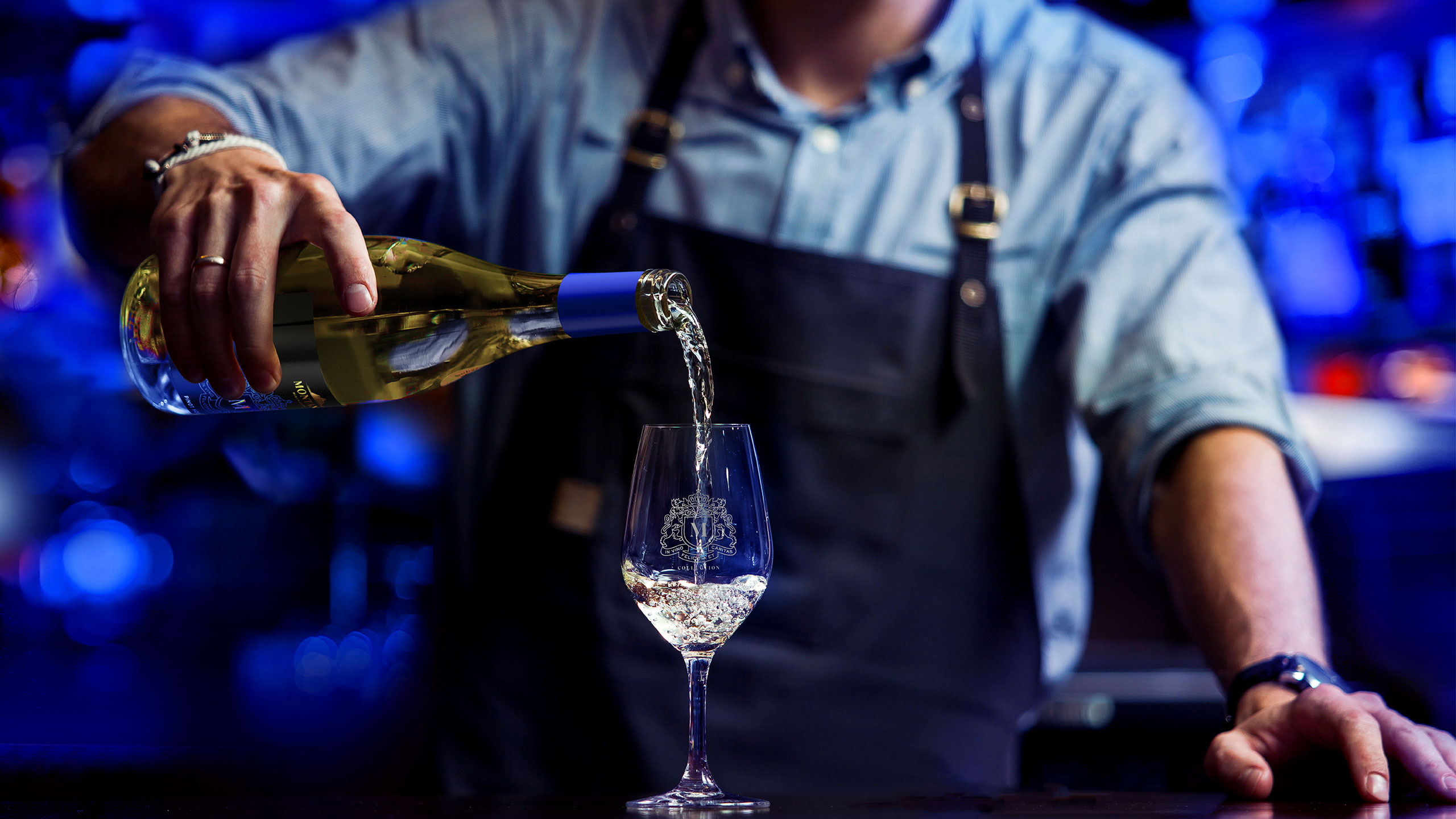
We began by revisiting the original Montana crest – In vino felicitas et caritas, and reinterpreting it for a contemporary audience. This became the anchor for a fresh visual identity that balanced heritage with modernity. The label was built around a bold, regal blue set against a classic black backdrop, delivering a sense of authority and quiet luxury. The design cues were carefully chosen to communicate a step up in craftsmanship without losing the warmth and familiarity that Montana is known for.
RESULT
M by Montana entered the market as a clearly defined premium range with a more distinctive and elevated presence. The interplay of heritage elements and modern design created a cohesive story that broadened appeal and reinforced Montana’s credentials at the upper tier of the category.
KEY TAKEAWAY
Premiumisation is most effective when it builds on what people already trust. M by Montana shows how reinterpreting heritage through a modern lens can create a confident, elevated offer that feels both new and authentically connected to the brand’s legacy.