CHALLENGE
Blueprint Global is an international logistics company that specialises in simplifying the world’s most complex supply chains. While their service offering was sophisticated and highly capable, their existing communications failed to reflect this. The brand’s visual language was overly technical, fragmented and lacked emotional connection – presenting the business as functional rather than thoughtful. What was missing was a sense of clarity, confidence and care; qualities that define how Blueprint Global actually operates. The challenge was to transform a purely operational identity into one that conveyed precision, reliability and humanity on a global scale.
APPROACH
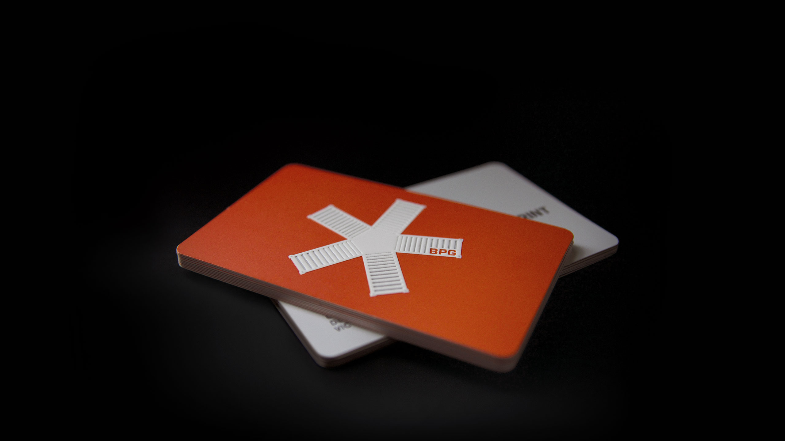
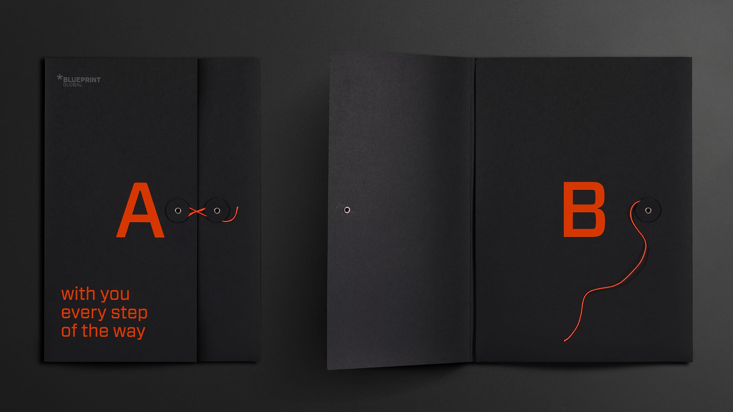
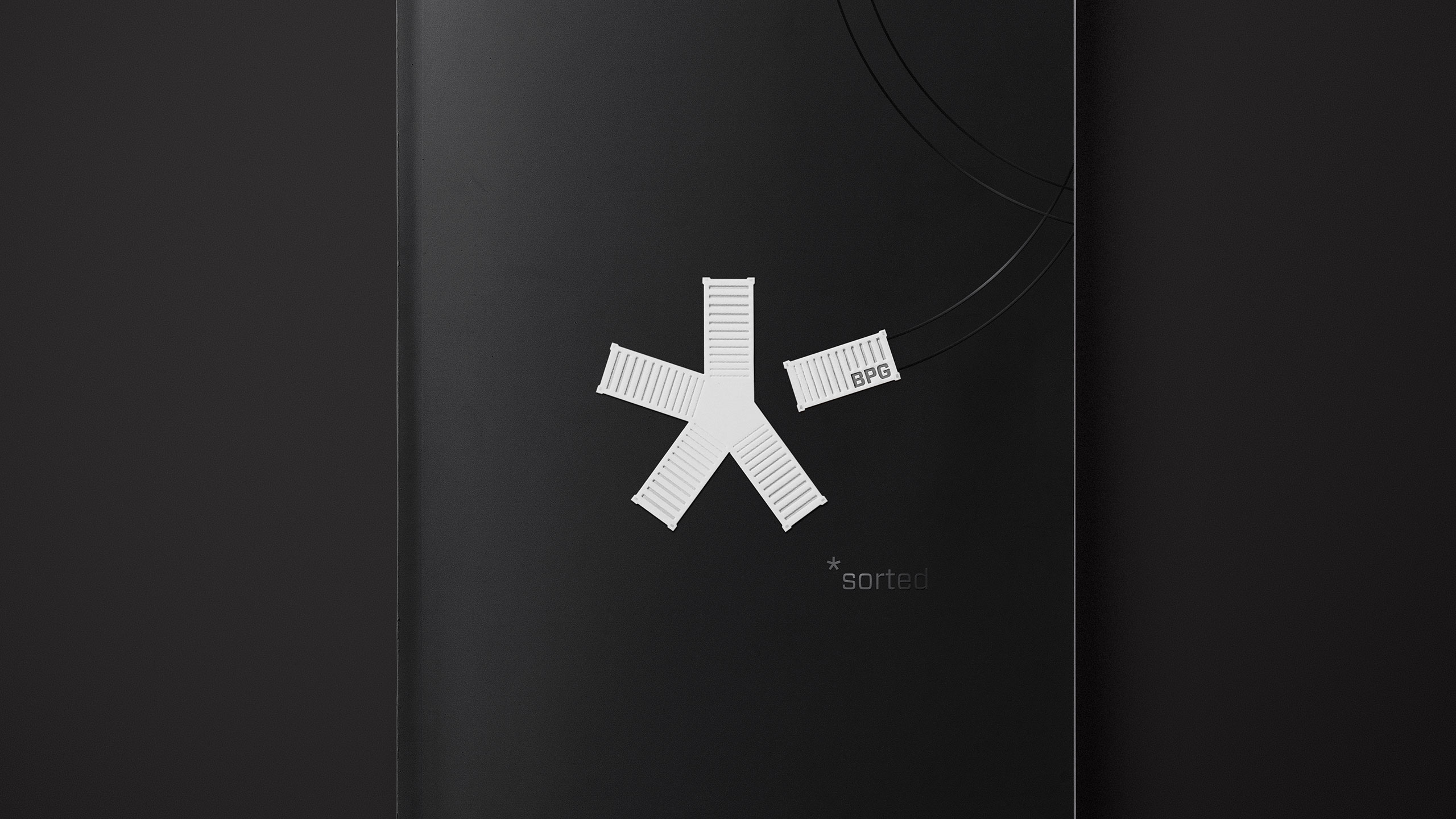
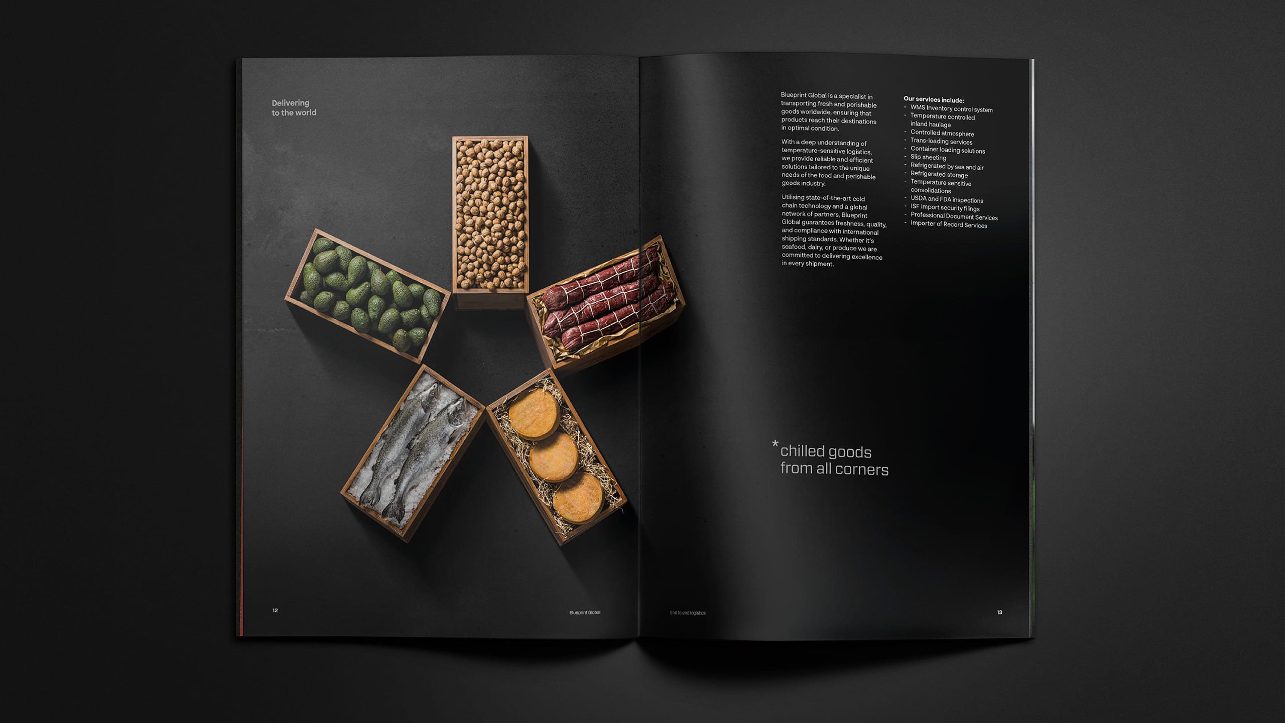
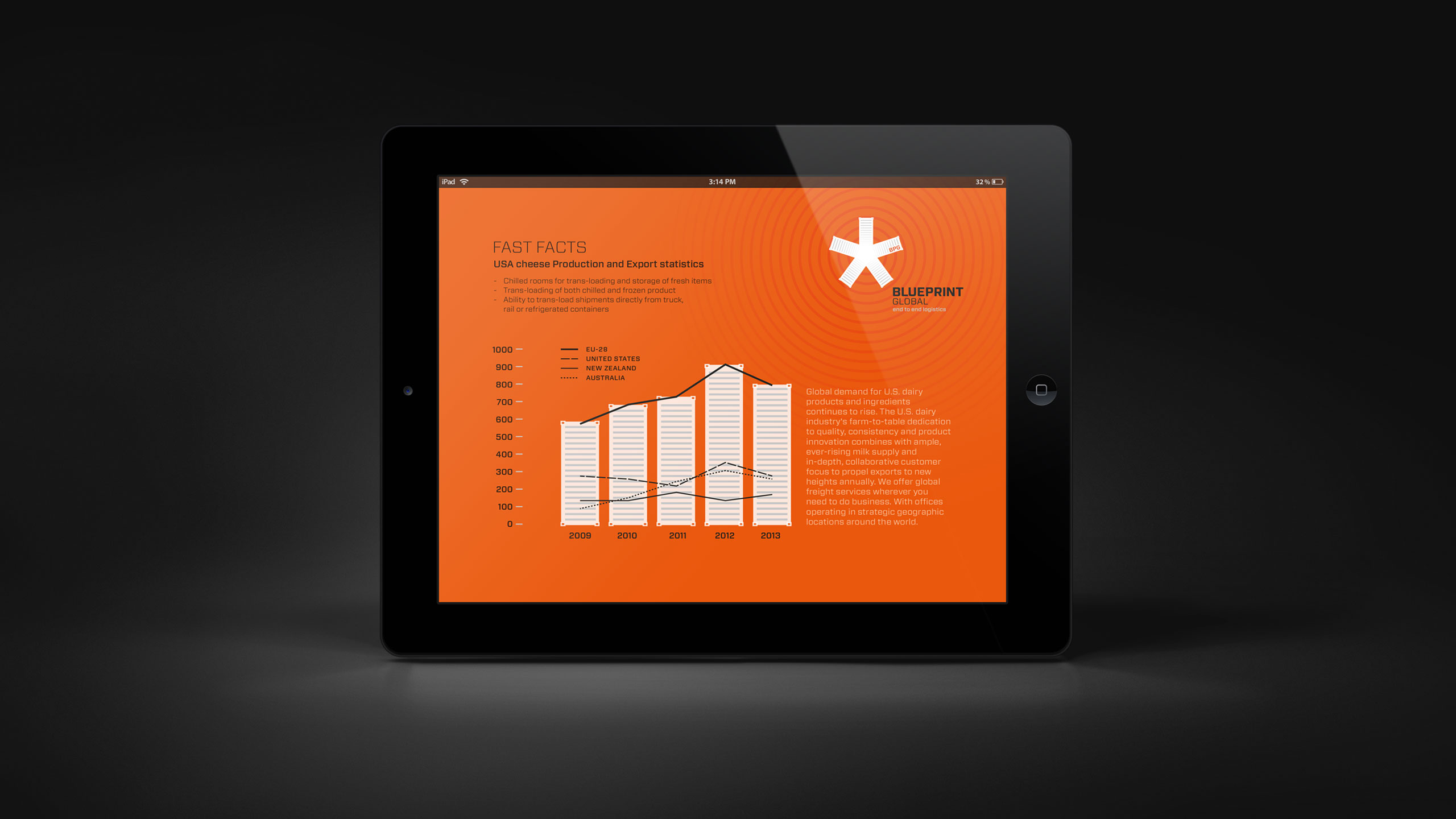
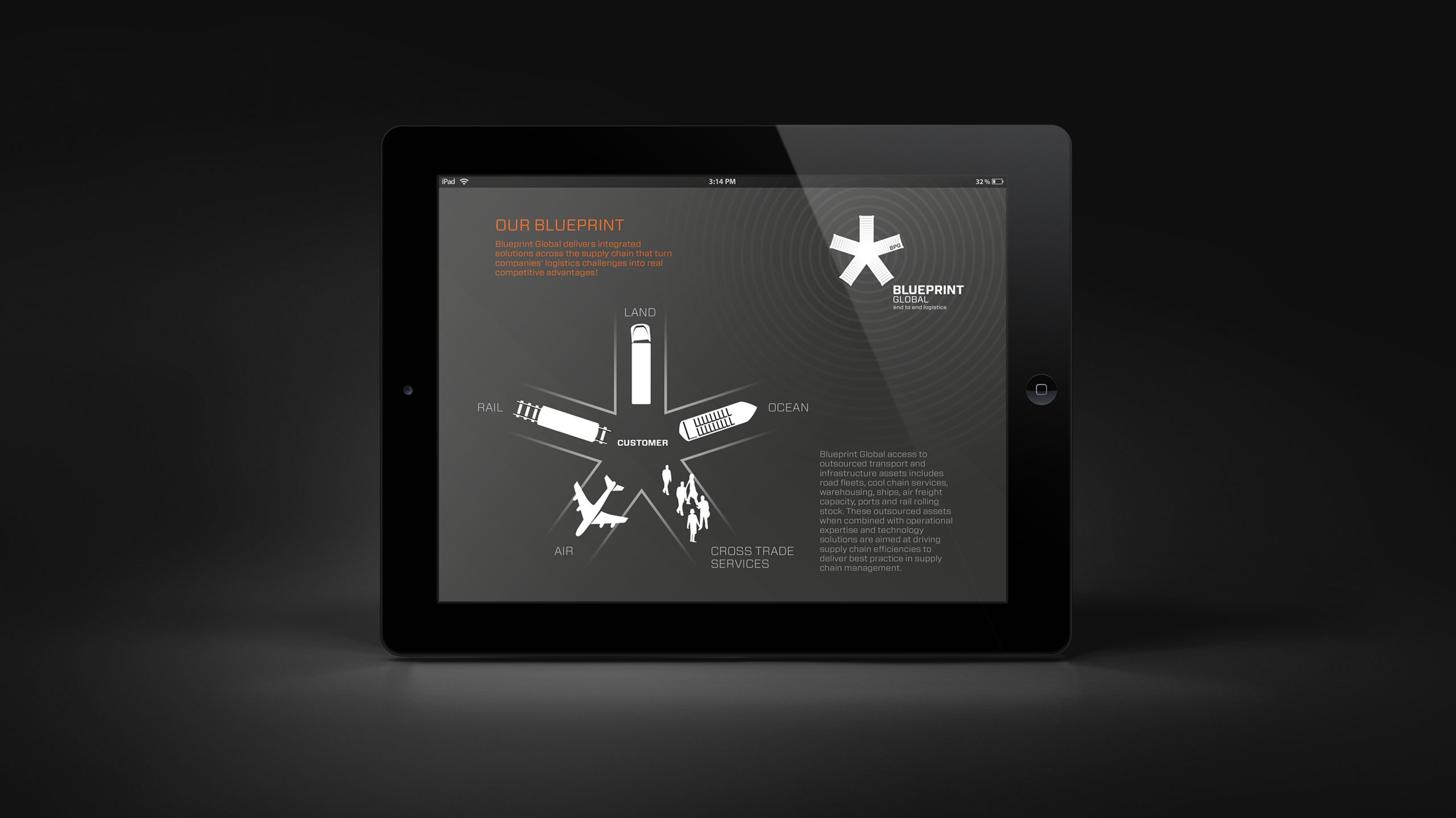
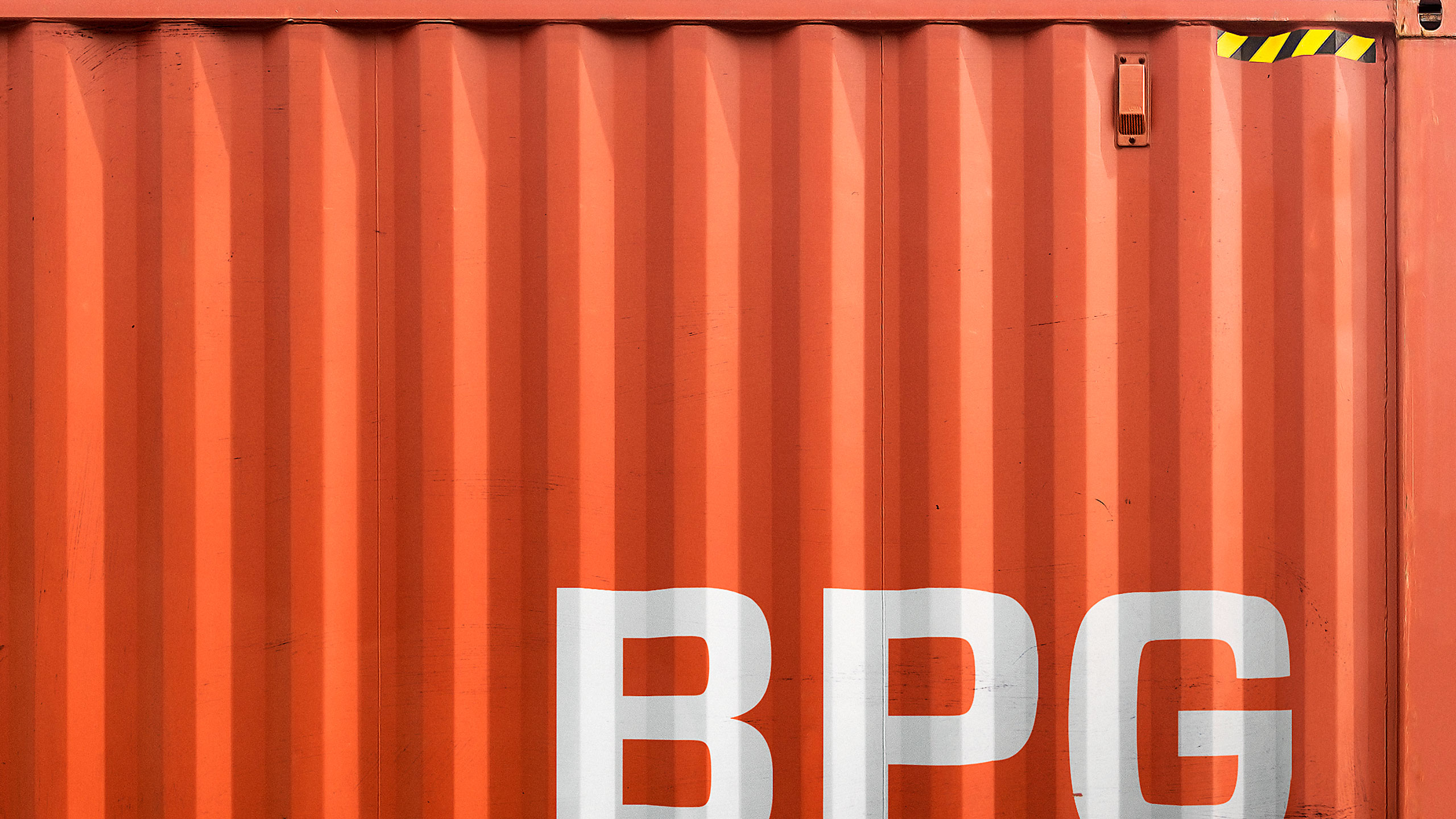
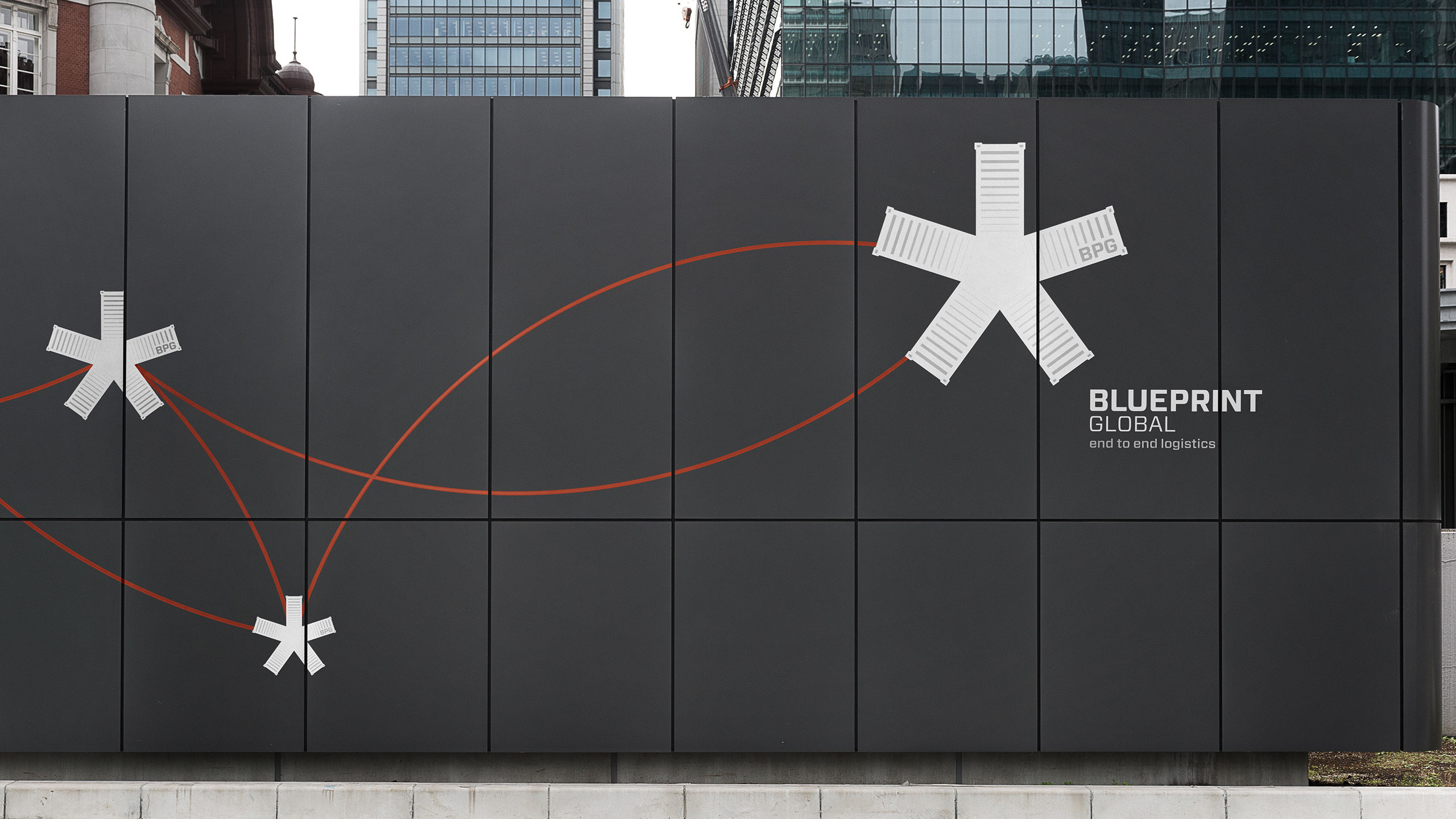
We reimagined the Blueprint Global identity around a single, unifying idea making complexity feel simple and personal. The new logo features five interlocking containers that form a distinctive, “chilled” symbol, representing the company’s five core business segments : air, sea, land, rail and cross-trade. The mark not only symbolises movement and connection but also becomes a playful, living device – adaptable across media and materials. It can be built from shipping containers, boxes, or even the products themselves, creating a dynamic link between the logo and the real world of logistics. To balance precision with emotion, we paired the mark with bold typography and photography that captures both the scale and humanity of global transport – sweeping infrastructure, movement, and the people behind it. The full identity was rolled out across every touchpoint : livery, digital platforms, presentations, stationery, signage and collateral. Each element was designed to be consistent yet flexible, allowing the system to evolve as the brand grows.
RESULT
The refreshed identity gave Blueprint Global a confident, modern presence that feels both structured and human. The logo has become a versatile storytelling tool – a mark that can flex across environments while retaining its integrity. Whether rendered digitally or built from physical materials, it reinforces the brand’s core idea: precision made simple. The new visual system unified previously disconnected communications and established Blueprint as a trusted, design-led leader in global logistics.
KEY TAKEAWAY
In logistics, clarity is the ultimate expression of confidence. By turning structure into a symbol and allowing that symbol to live and play in the real world. We gave Blueprint Global a brand that reflects its intelligence, agility and heart.

Before