CHALLENGE
Freshmax, one of the largest fresh produce companies in the Pan-Pacific region, wanted to create a brand that could unify its premium berry portfolio – from kiwiberries and blueberries to cherries and strawberries. The challenge was to build a distinctive fresh-produce brand that could live confidently across multiple fruit types while balancing strong brand presence with essential product visibility. In a tactile category where consumers inspect freshness before purchase, simplicity, trust and instant appeal were key.
APPROACH
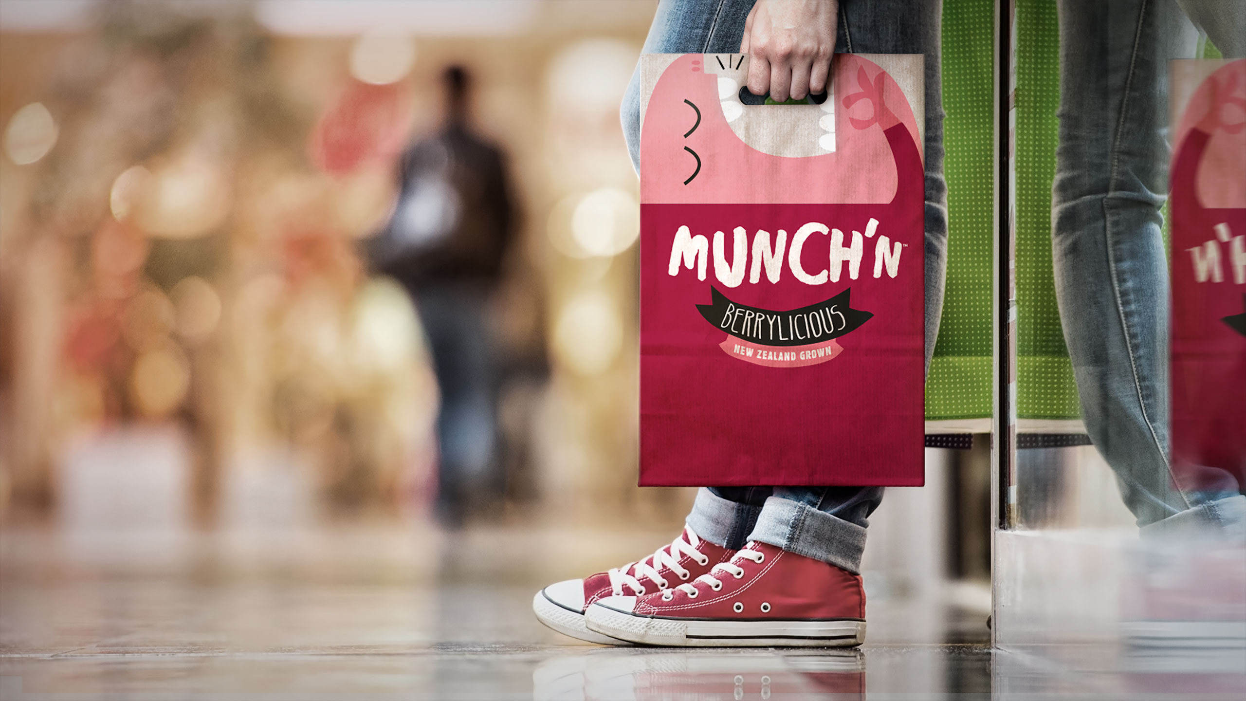
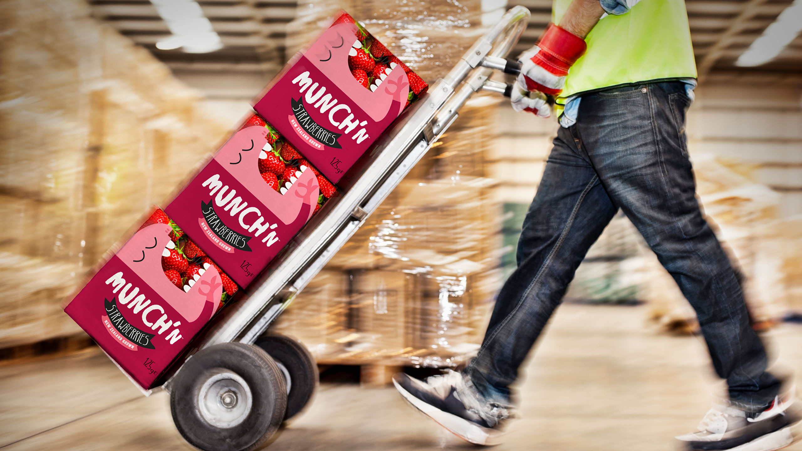
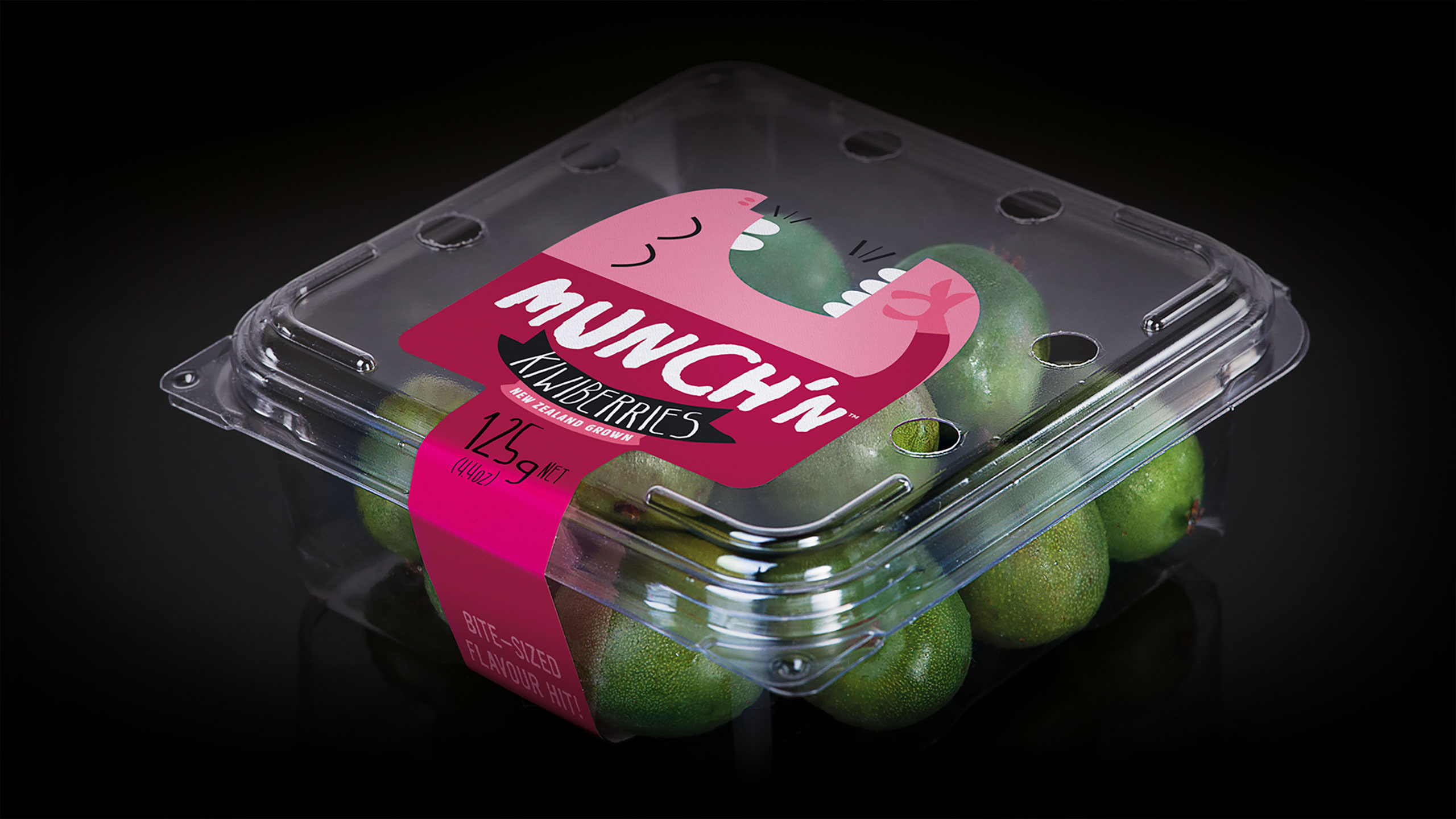
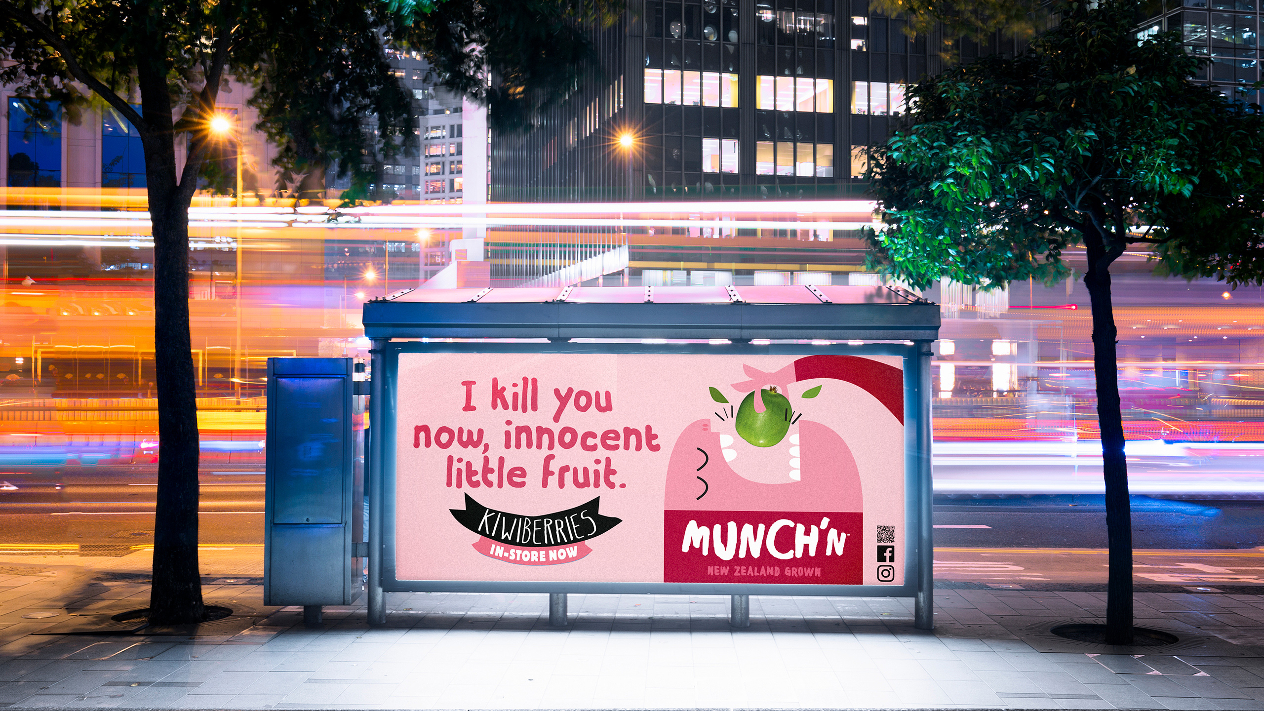
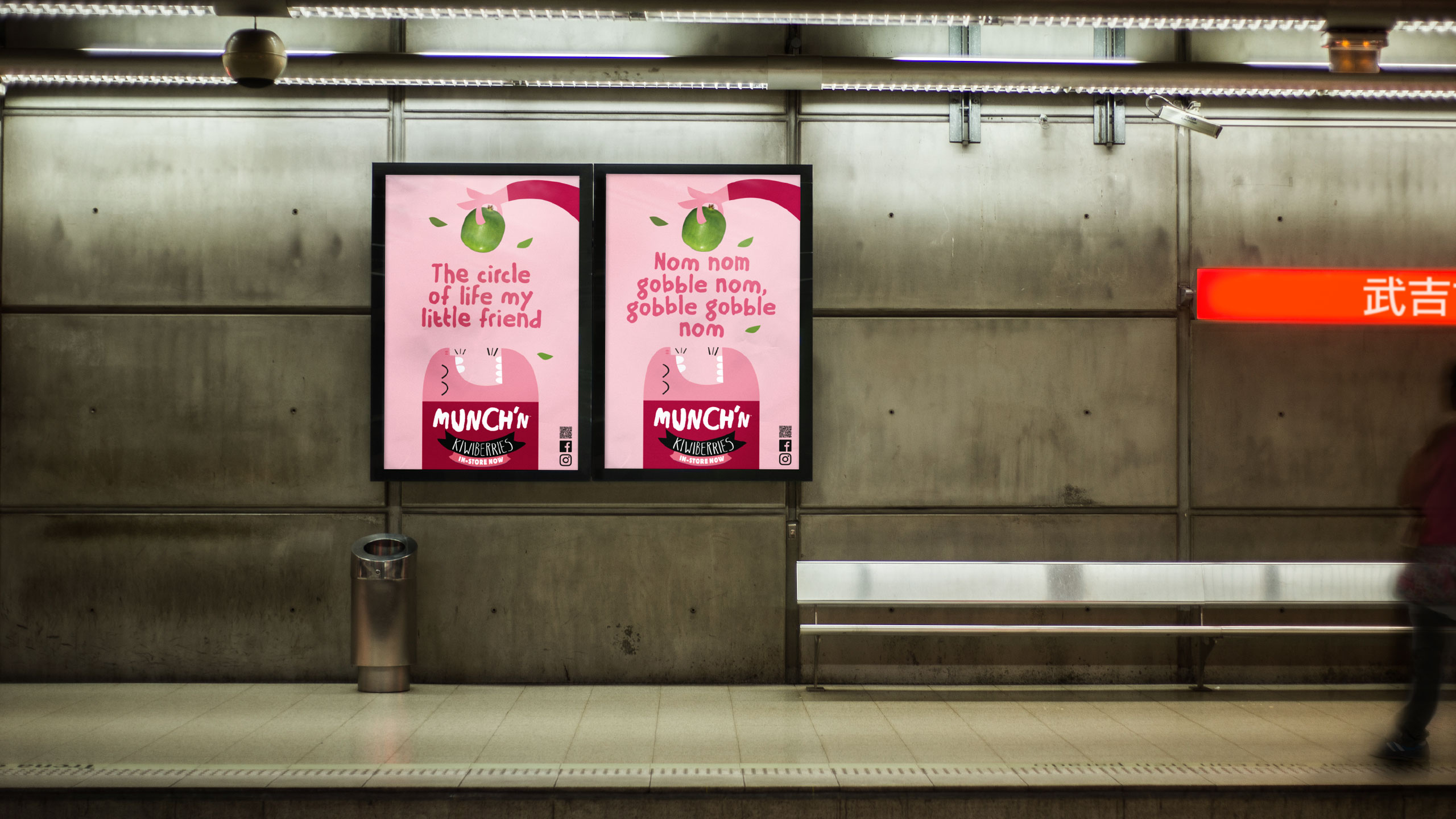
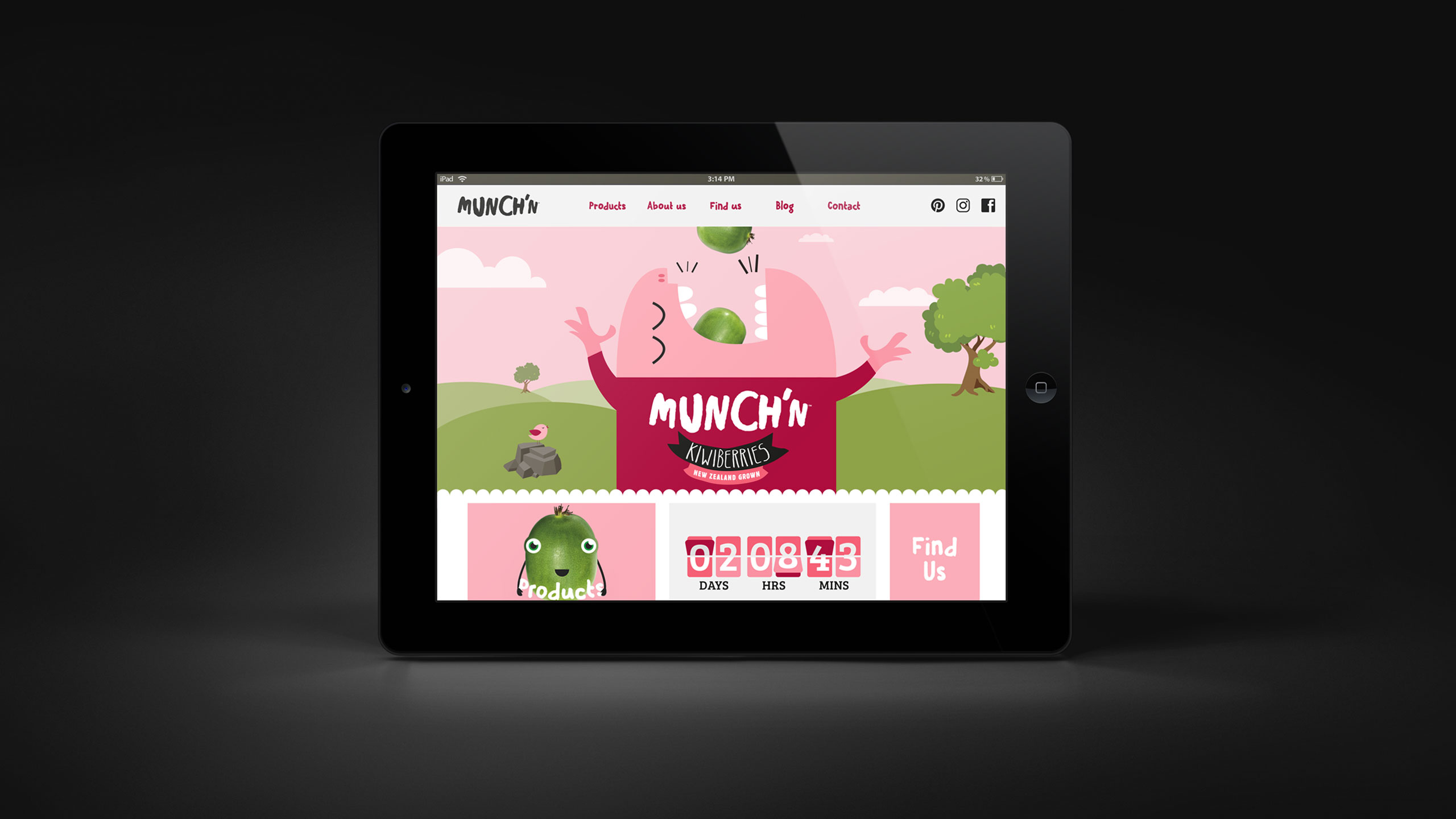
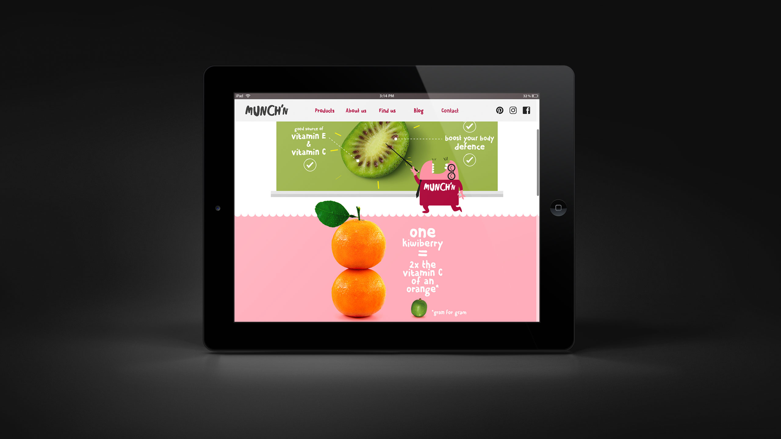
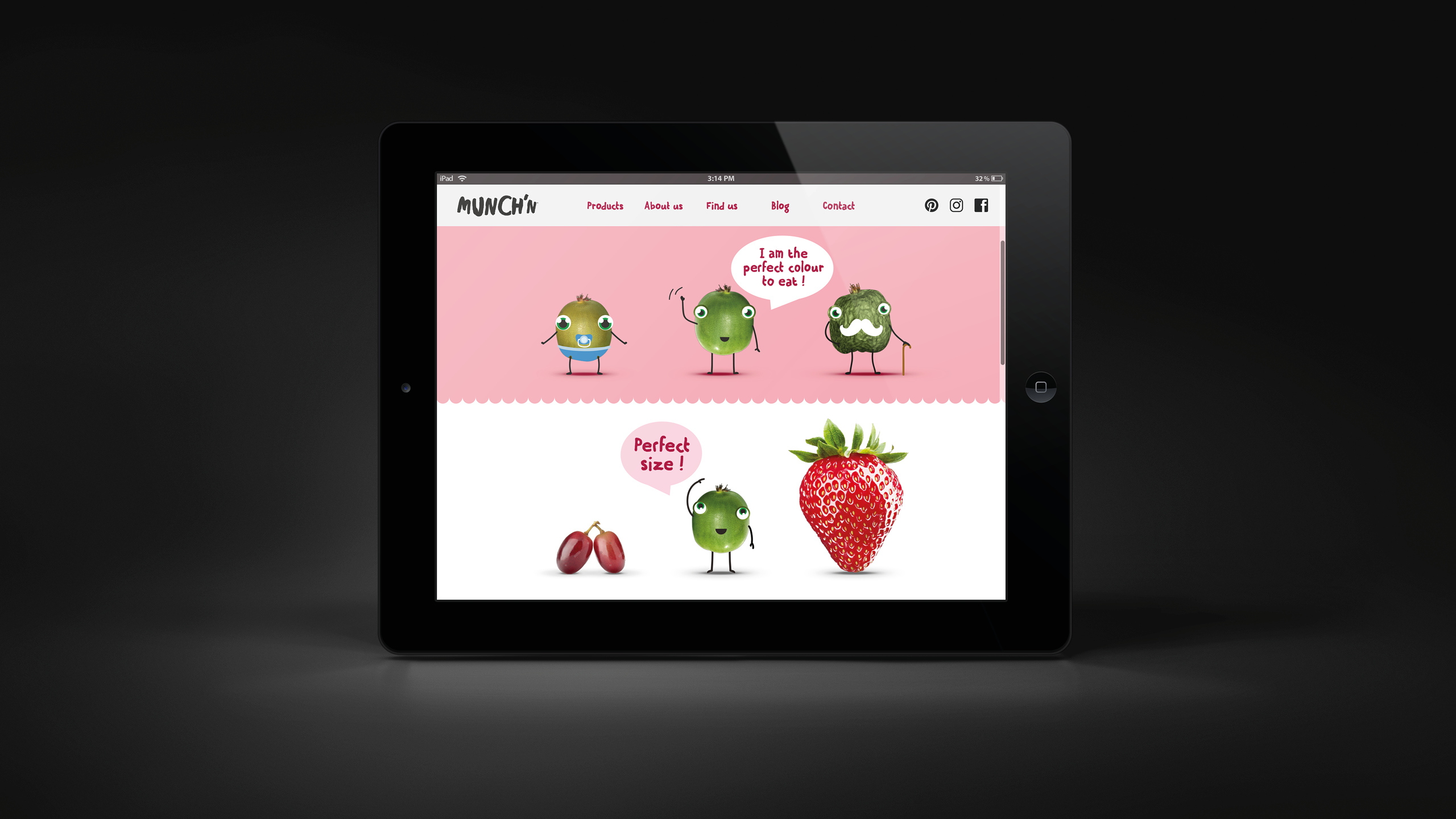
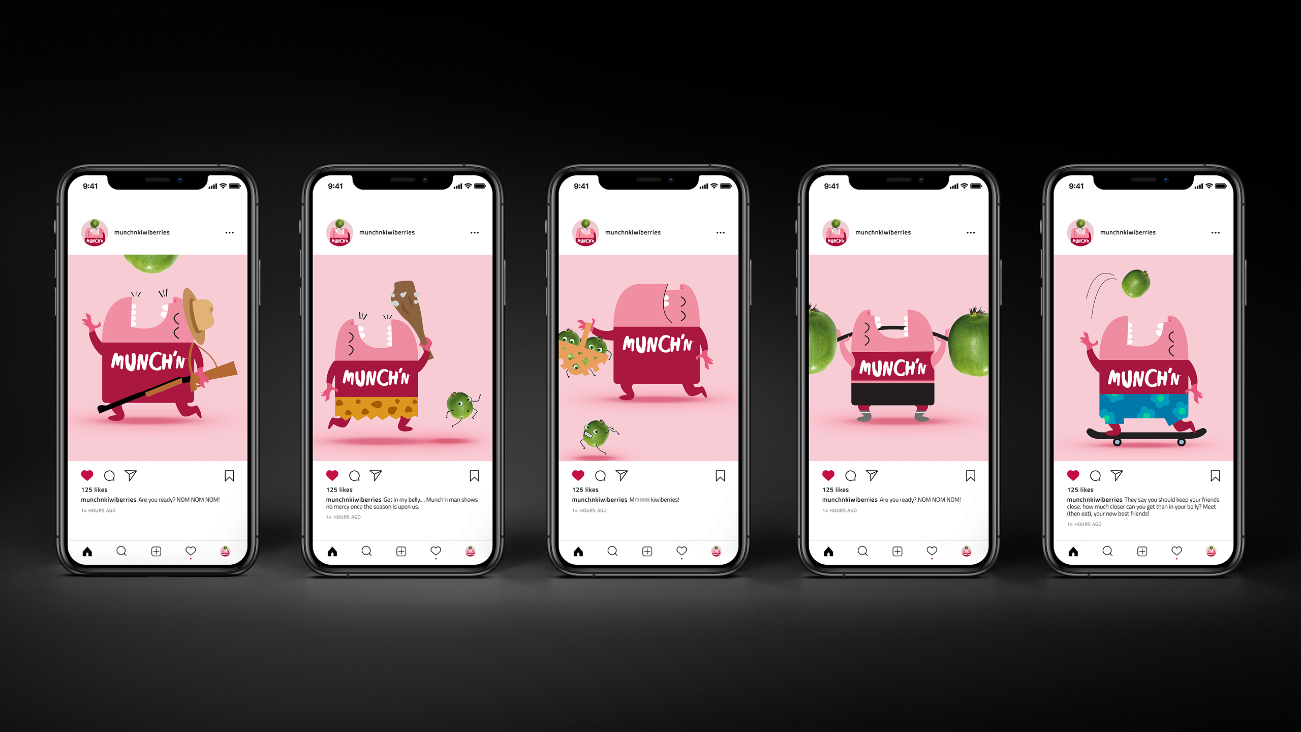
The idea for Munch’n was inspired by the irresistible, bite-sized nature of the fruit – perfect mouthfuls you can’t stop popping. The identity was designed to be bold, playful and immediately recognisable, using clean shapes and vibrant colours to ensure standout on small punnet labels. The design struck a careful balance between branding and transparency, letting the fruit remain the hero. Beyond packaging, the brand was brought to life through a digital-first campaign – building excitement before the season launched, engaging consumers across social media, and running a countdown as the harvest came to an end.
RESULT
Munch’n quickly established itself as a standout produce brand, recognised for its freshness, simplicity and personality. The identity’s flexibility allowed it to extend seamlessly across the wider berry range, creating a consistent family look at retail while supporting strong engagement online. The campaign helped drive anticipation and brand awareness in a category not typically associated with brand loyalty.
KEY TAKEAWAY
Even in categories where product drives purchase, a strong brand creates emotional connection. Munch’n proves that fresh produce can be both natural and branded – simple, joyful and full of flavour, just like the fruit itself.