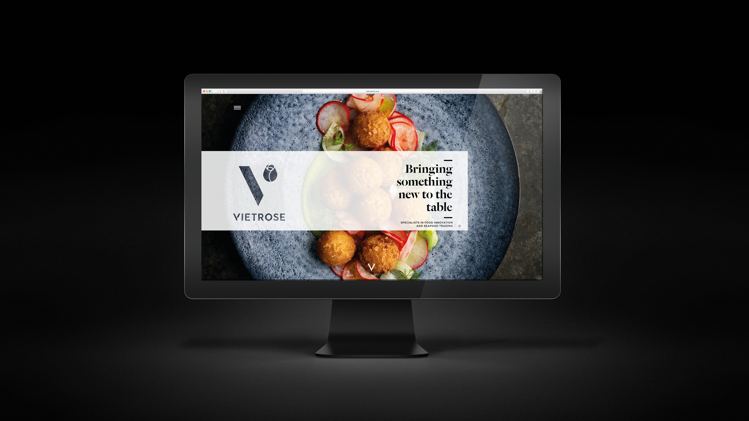
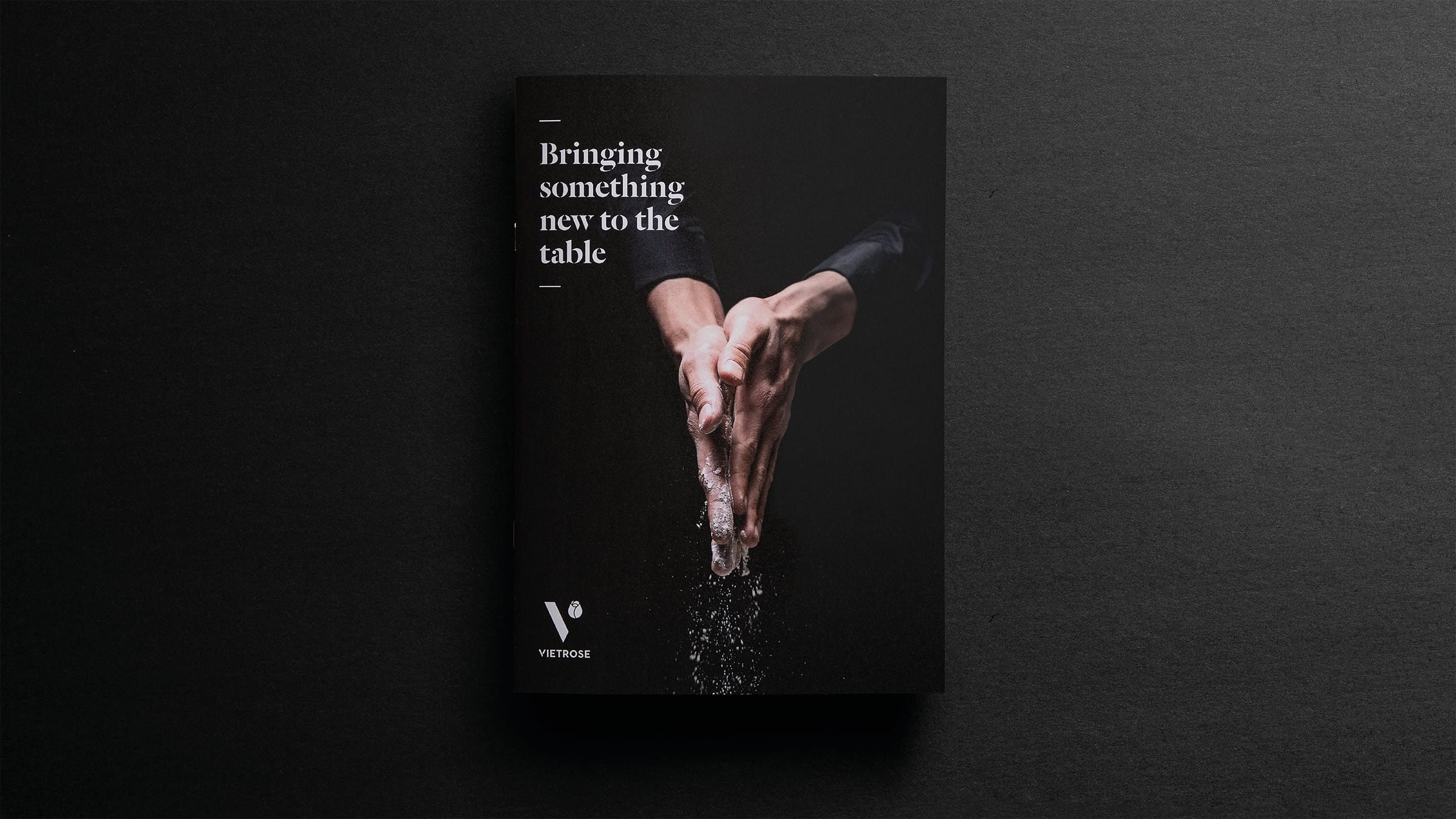
CHALLENGE
Vietrose had built a strong reputation as a young, ambitious food manufacturer exporting to markets around the world. Their products were high quality and innovative, but their corporate presence didn’t reflect the same energy or professionalism seen in their operations. The challenge was to create a cohesive brand identity and story that conveyed their passion for food, their precision in production and their growing international credibility.
APPROACH
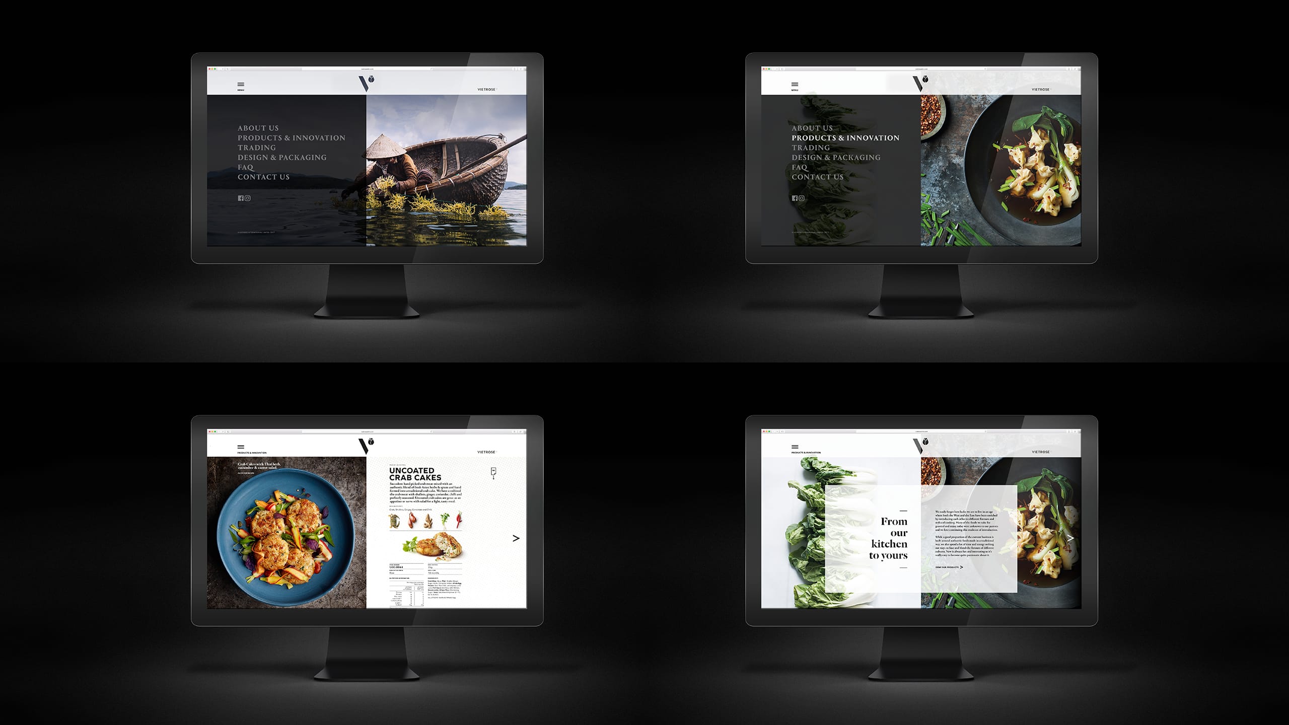
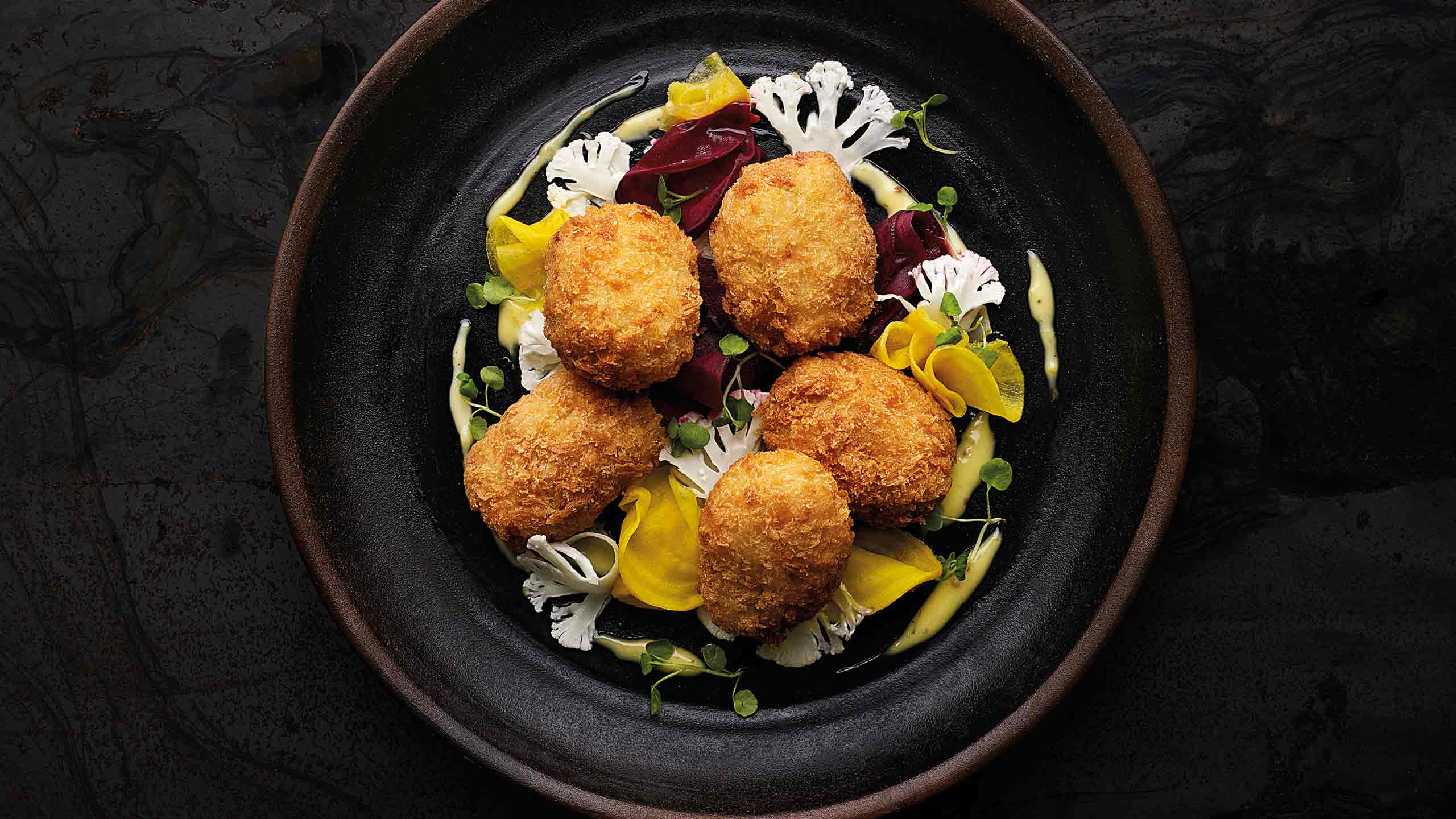
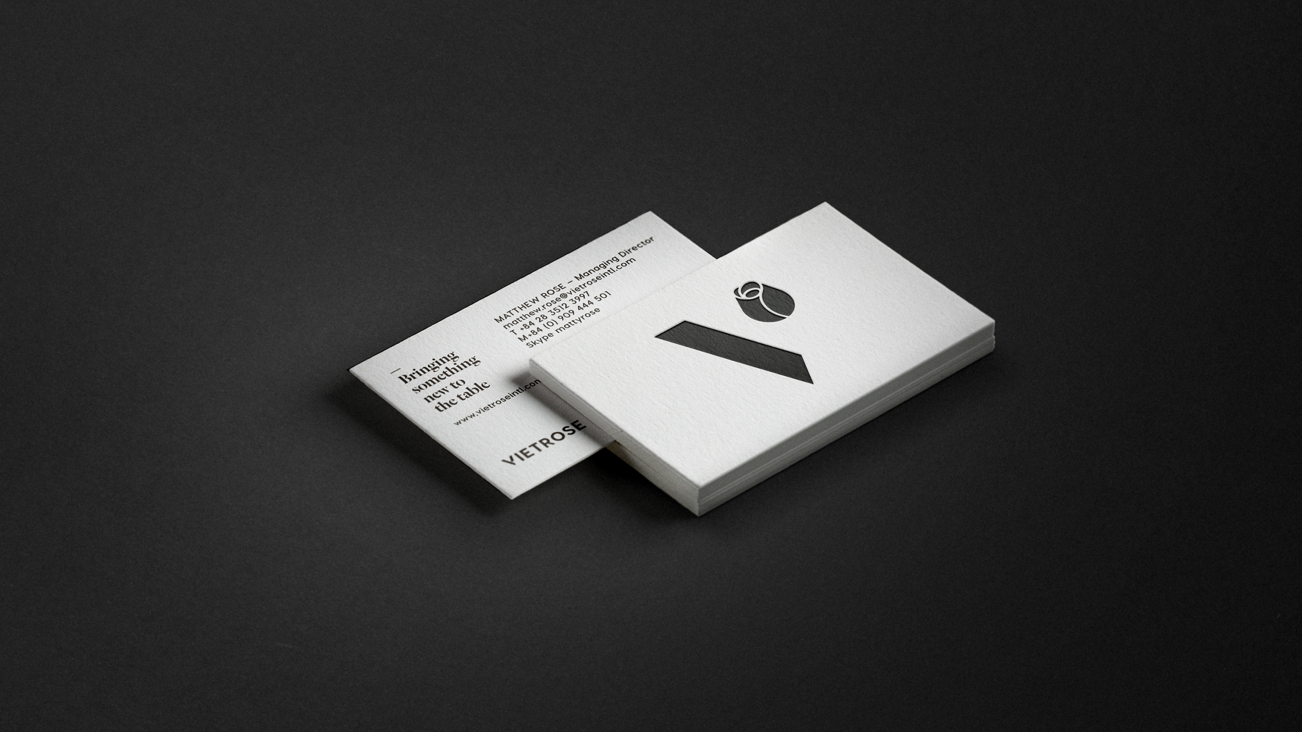
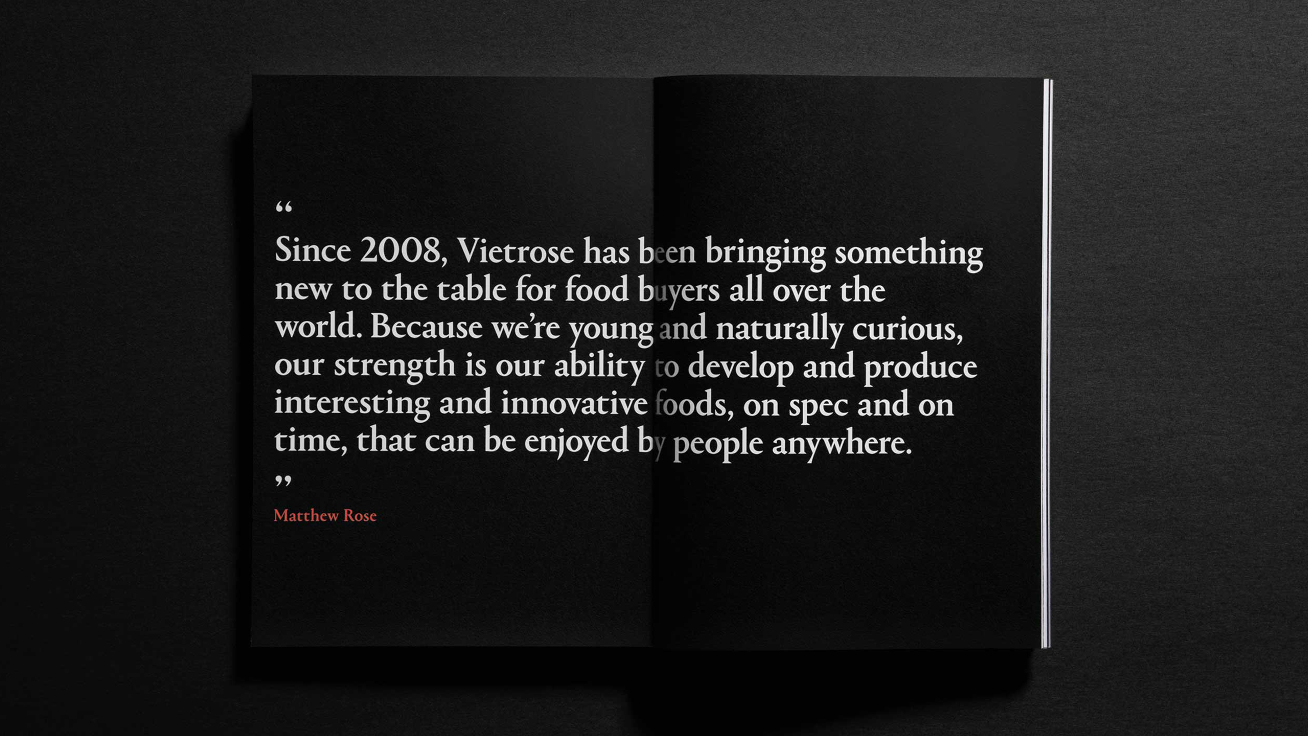
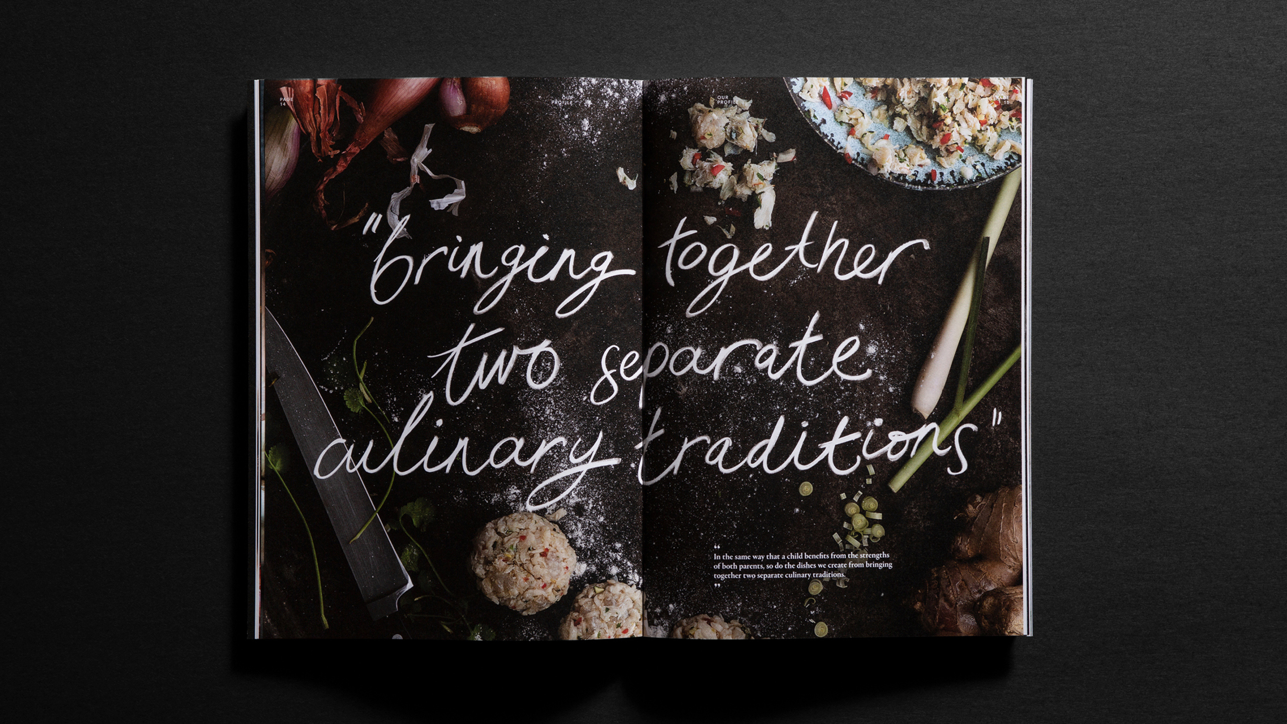
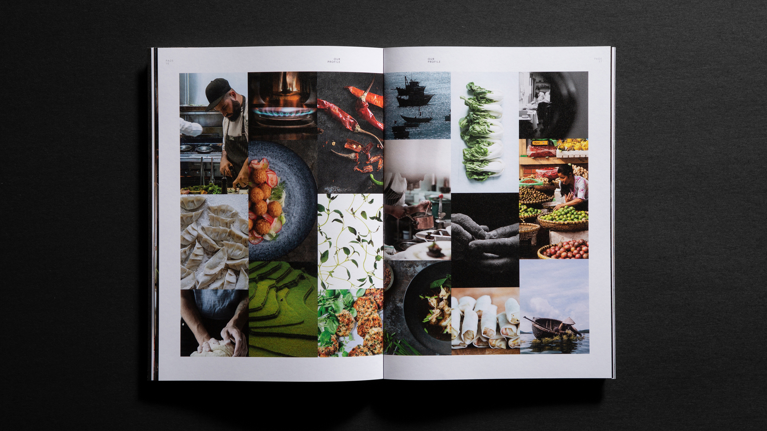
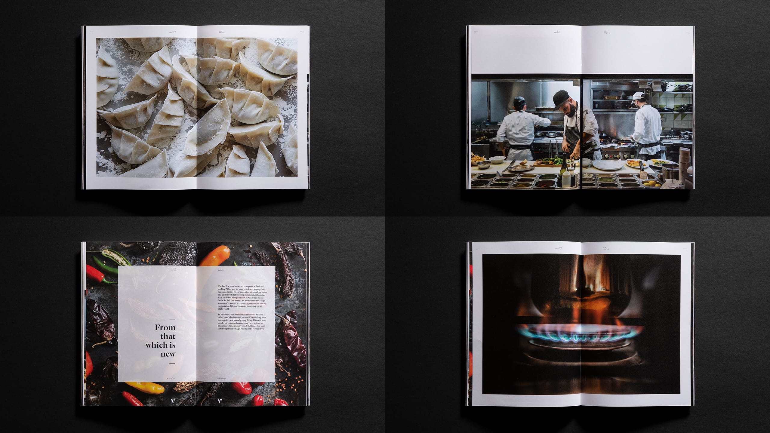
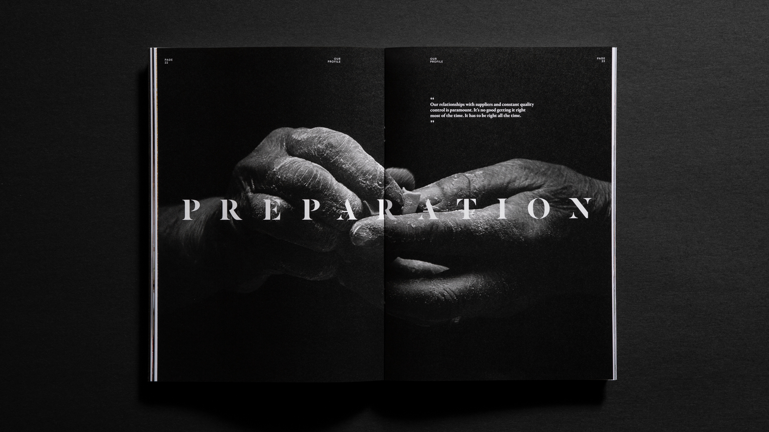
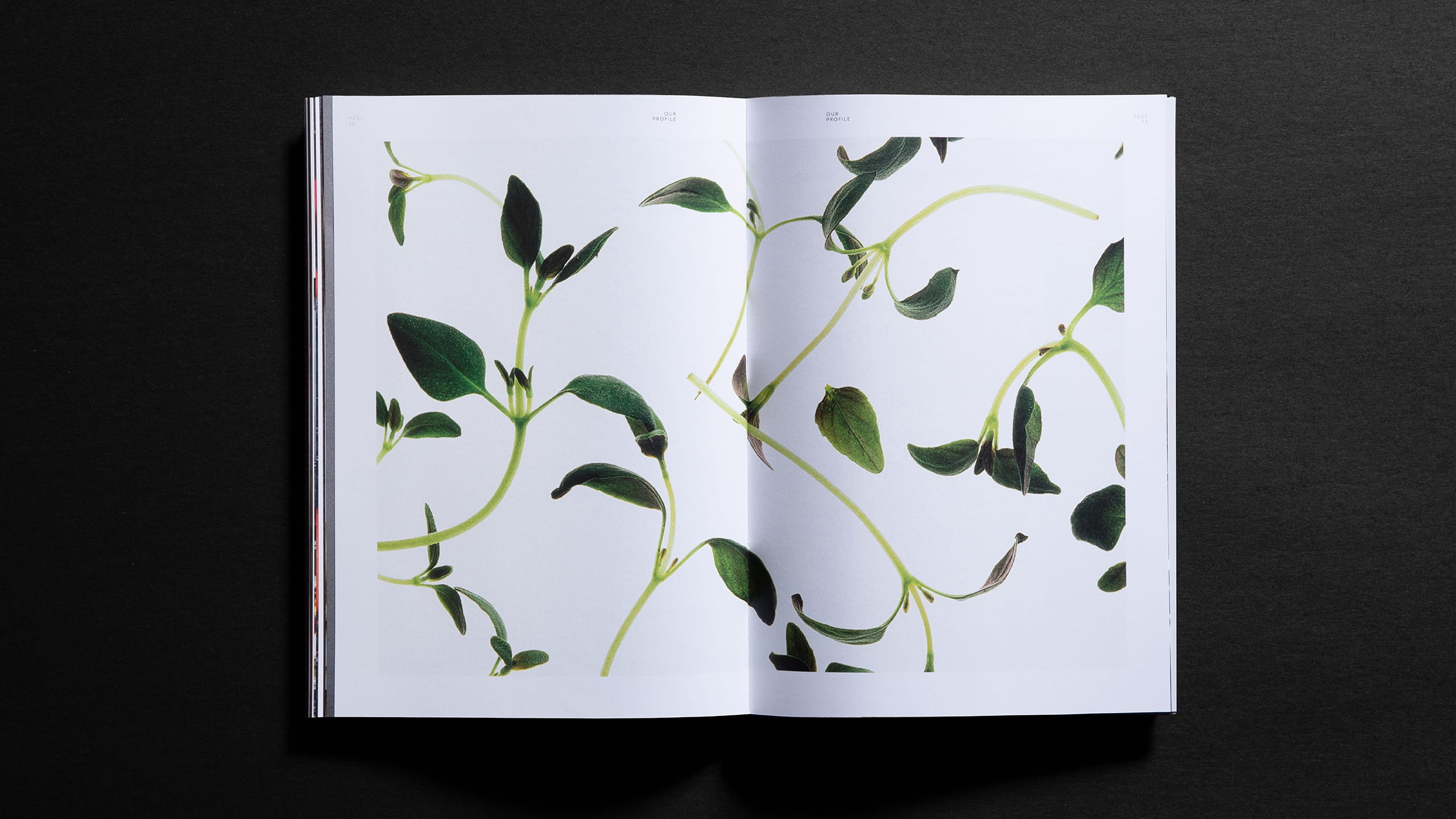
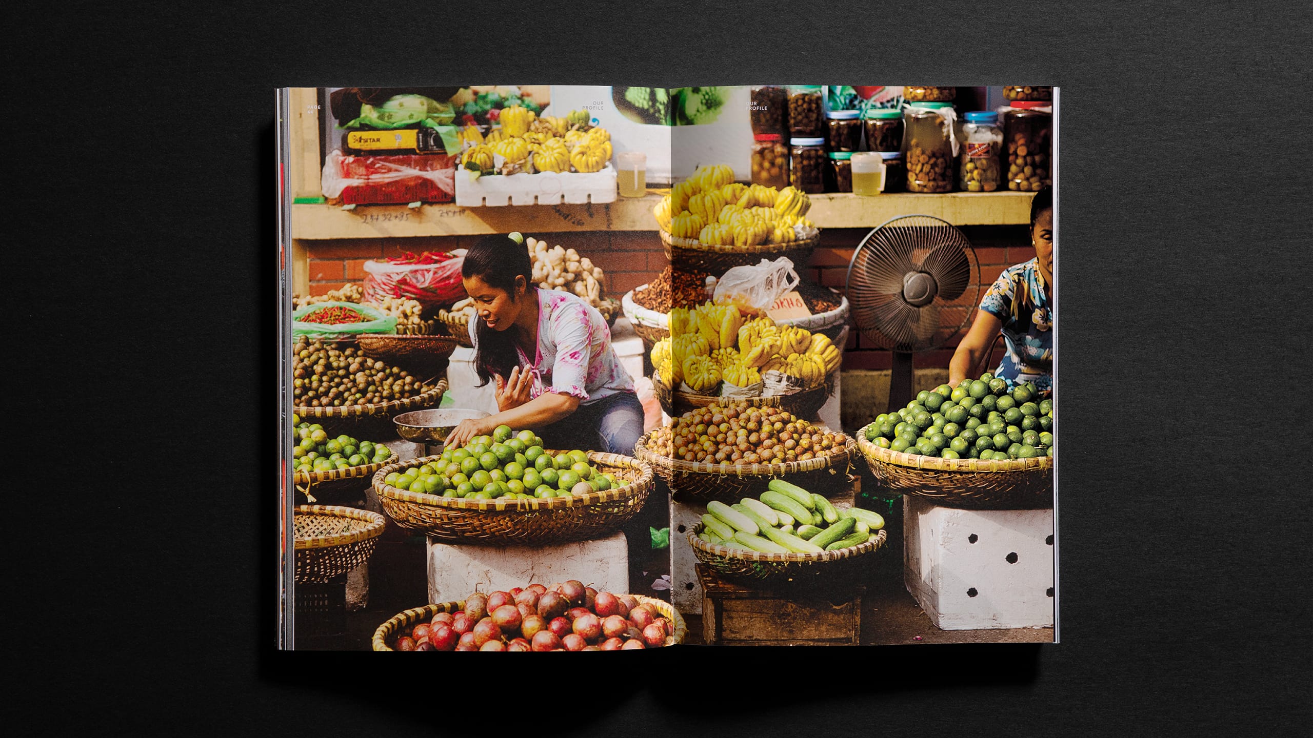
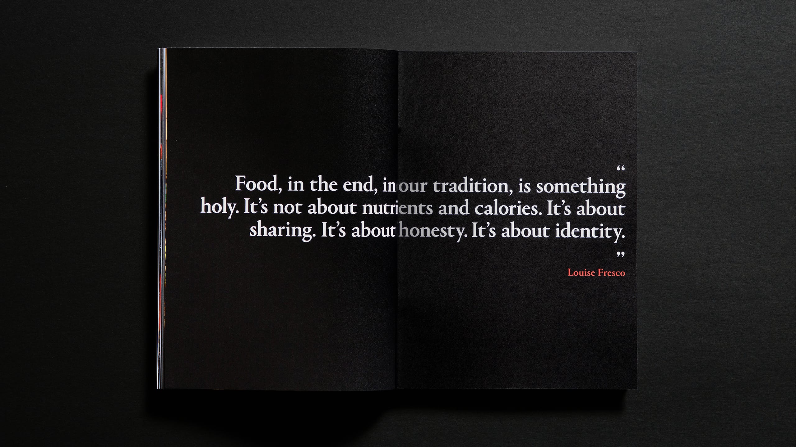
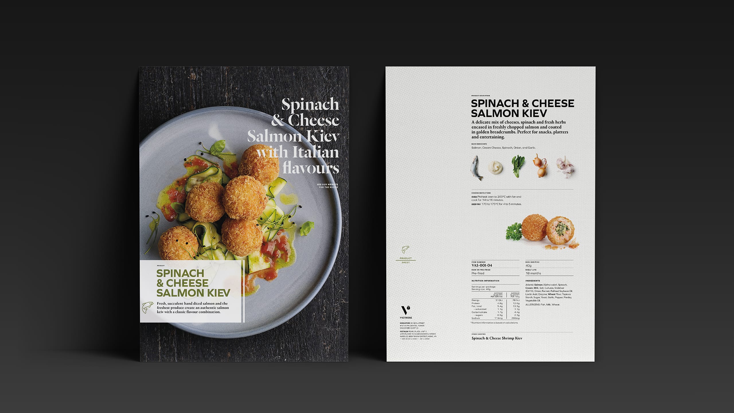
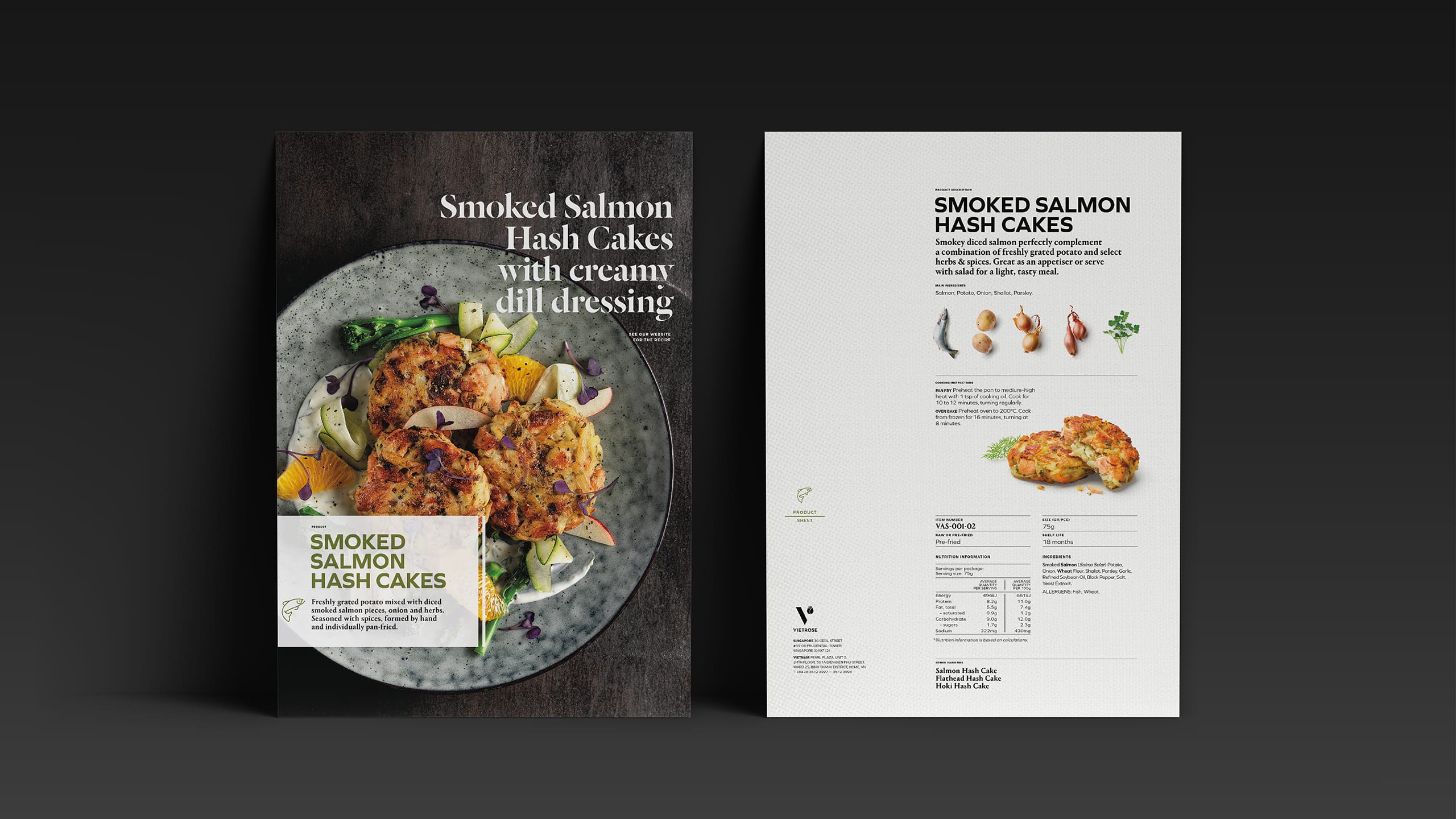
We began by uncovering what makes Vietrose different – a restless curiosity and a genuine enthusiasm for creating new, market-ready food solutions. From there, we built a corporate identity and visual language that told this story with conviction and clarity. The design system combined clean, modern typography with rich food imagery and purposeful storytelling to capture the company’s passion and innovation. The identity extended across every touchpoint, from uniforms and interiors to livery and digital.
RESULT
The refreshed brand positioned Vietrose as a confident, world-class food partner with a clear sense of purpose and personality. Their corporate profile and website now articulate not just what they make, but why they do it – a business driven by creativity, precision and reliability. The new identity has strengthened how Vietrose presents to both existing and new international buyers.
KEY TAKEAWAY
A clear, unified identity can elevate perception without changing what a company does. For Vietrose, design became a tool to express their professionalism and passion – helping a fast-growing exporter look, sound and feel every bit as impressive as the products they deliver.
Before