Challenge
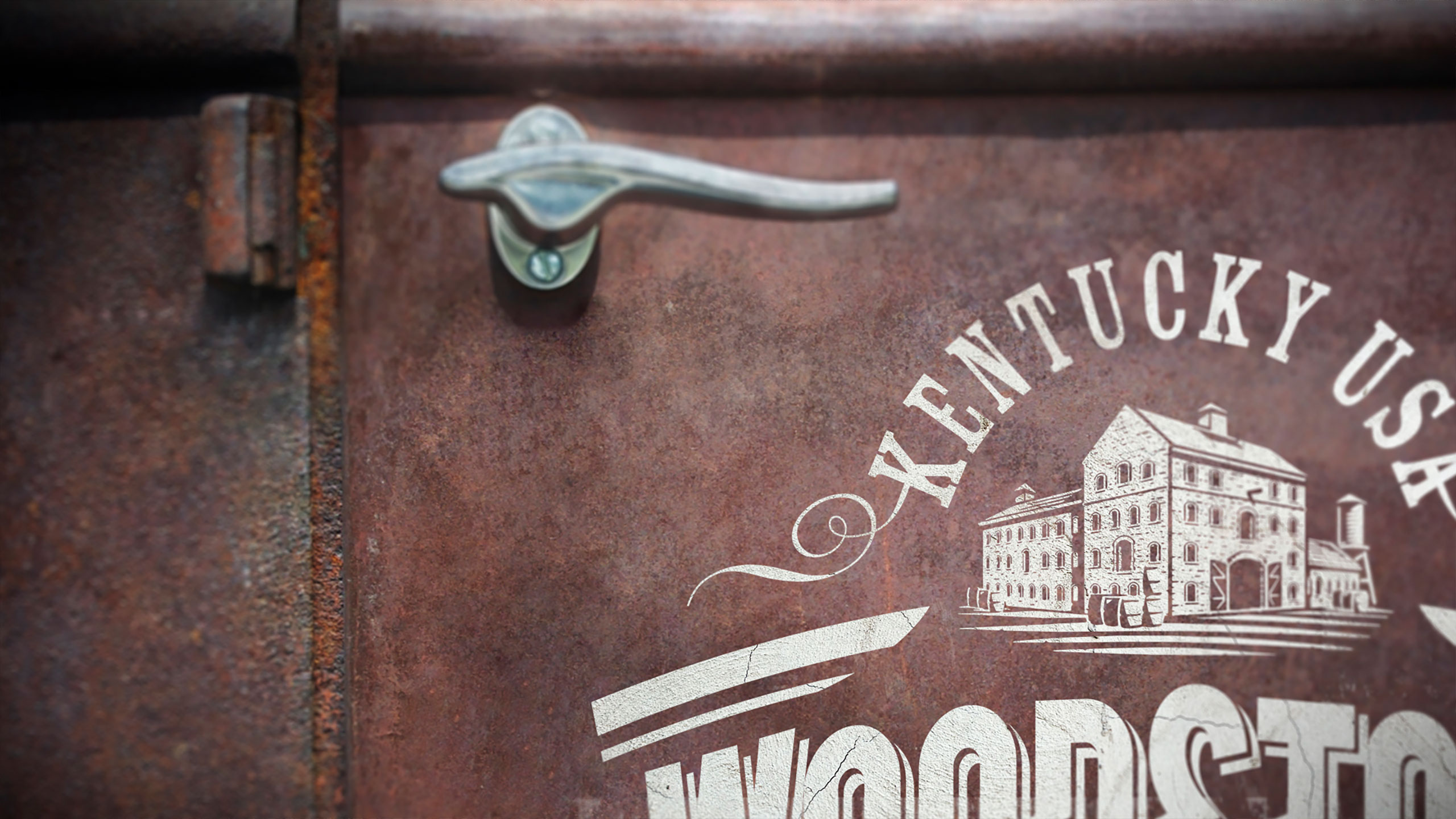
Woodstock Bourbon was facing a clear identity crisis. Although the product was made with true Kentucky Bourbon, its packaging failed to convey authenticity or credibility. The old design attempted to reinforce provenance by repeating the word “Kentucky” seven times on the front of the can, yet consumers still did not realise it was genuine Kentucky Bourbon. Instead of strengthening the message, the repetition diluted it. The brand needed a way to integrate this important truth into the hierarchy in a way that felt credible, ownable and unmistakably part of Woodstock’s story. Without a compelling identity to carry its heritage, Woodstock struggled to assert itself in a competitive bourbon RTD category. The opportunity was to bring its origins to life through a more confident, crafted and coherent expression.
Approach
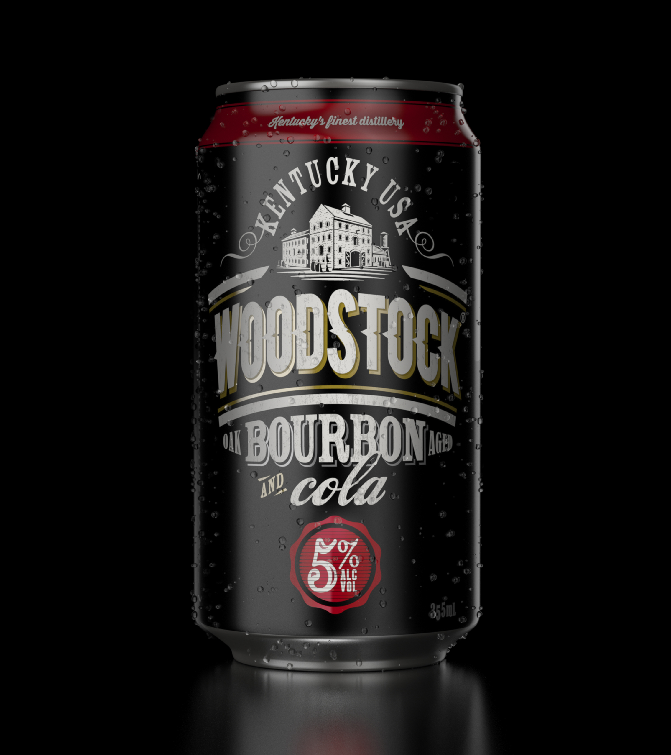
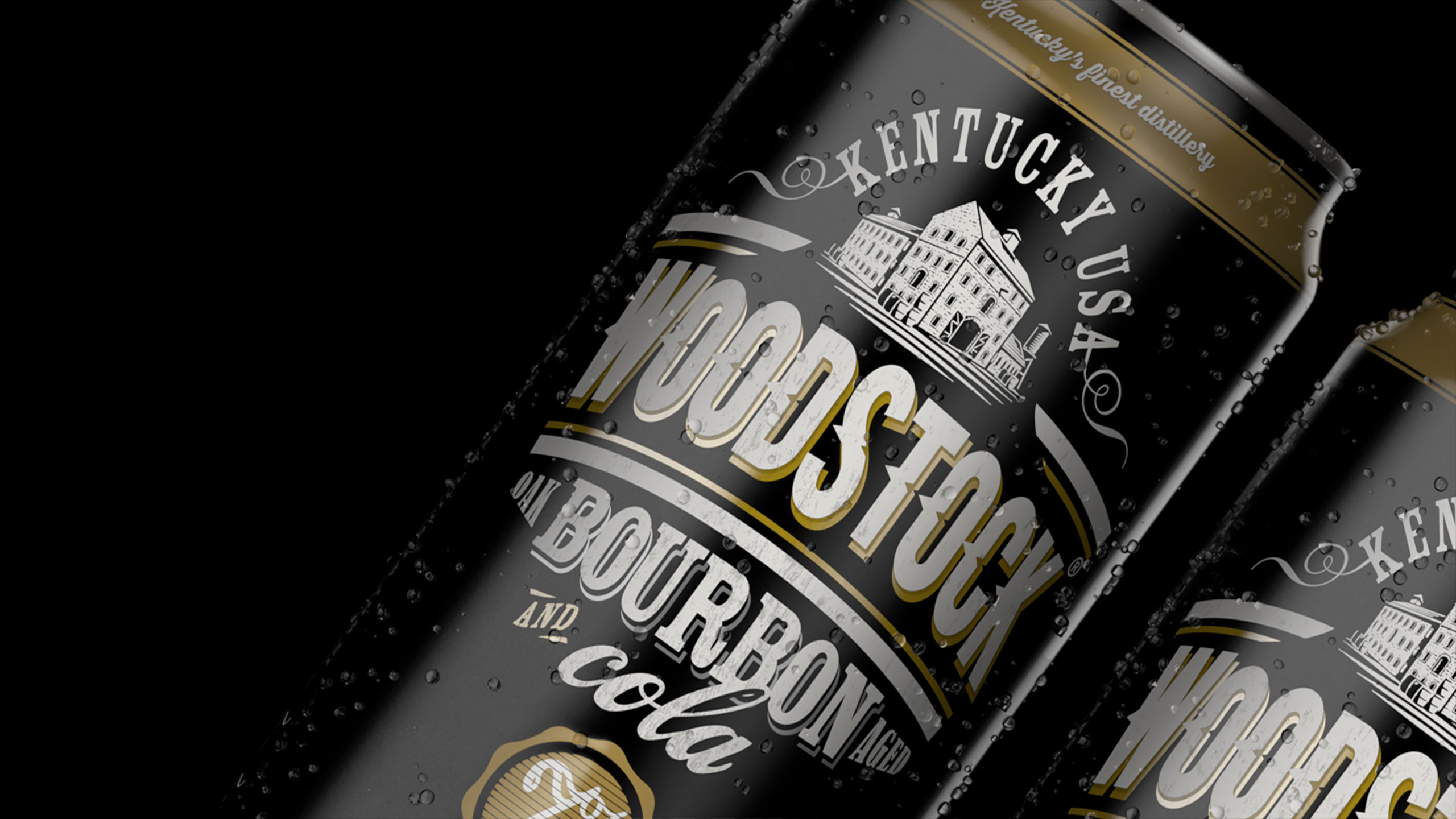
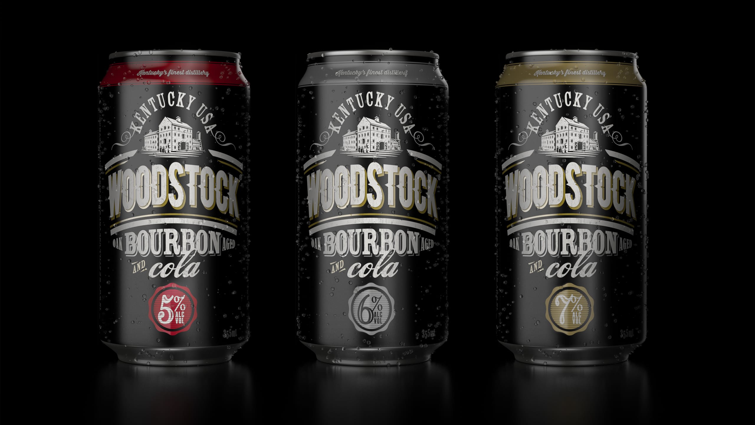
We began by elevating the brand’s core truth : that Woodstock is made with authentic Kentucky Bourbon. We developed a stronger, more iconic brand mark that locked up with key heritage cues, giving the pack an immediate sense of authority. Rather than repeating “Kentucky” excessively, we integrated provenance into the visual hierarchy so it became a meaningful, ownable part of the brand world. Layering and detail became central to the new system. Handcrafted aged typography, illustrative elements and textured messaging were introduced to tell Woodstock’s story with depth and craft. These cues evoked the world of real bourbon – barrels, age, timber, heritage – allowing authenticity to be felt rather than shouted. This approach replaced overstatement with genuine narrative power. The resulting identity was bold, grounded and flexible enough to strengthen the brand across all formats and flavours.
Result
The redesign transformed how consumers perceived Woodstock. What had previously felt confused and overstated became confident, credible and clearly rooted in Kentucky Bourbon heritage. By integrating provenance into the hierarchy and expressing it through crafted design rather than repetition, Woodstock reclaimed an authenticity that had been lost. The new identity restored pride and recognisability, giving Woodstock a distinctive presence that better reflects the character of the product itself.
Key takeaway
Authenticity resonates when it is woven into the brand, not forced upon the consumer. By integrating Kentucky provenance into a crafted hierarchy, Woodstock gained the credibility and distinctiveness needed to stand tall in the bourbon RTD category.

Before