WOODSTOCK
– via BC&F Dentsu
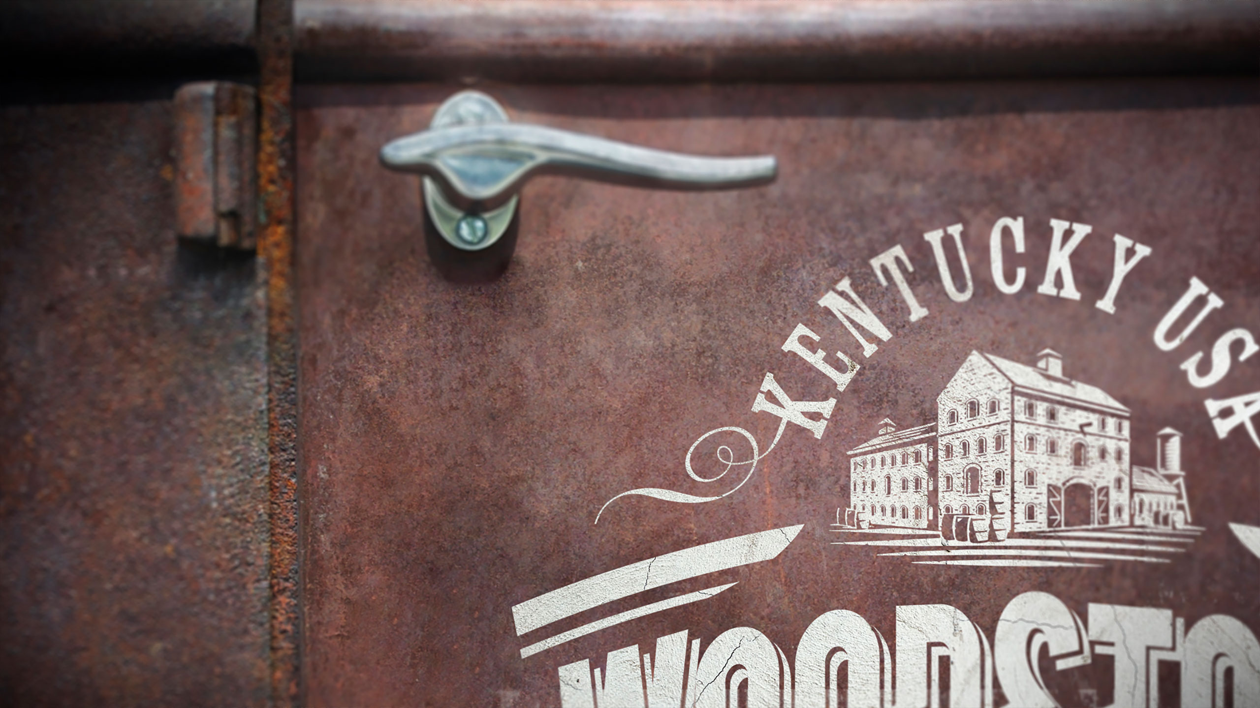
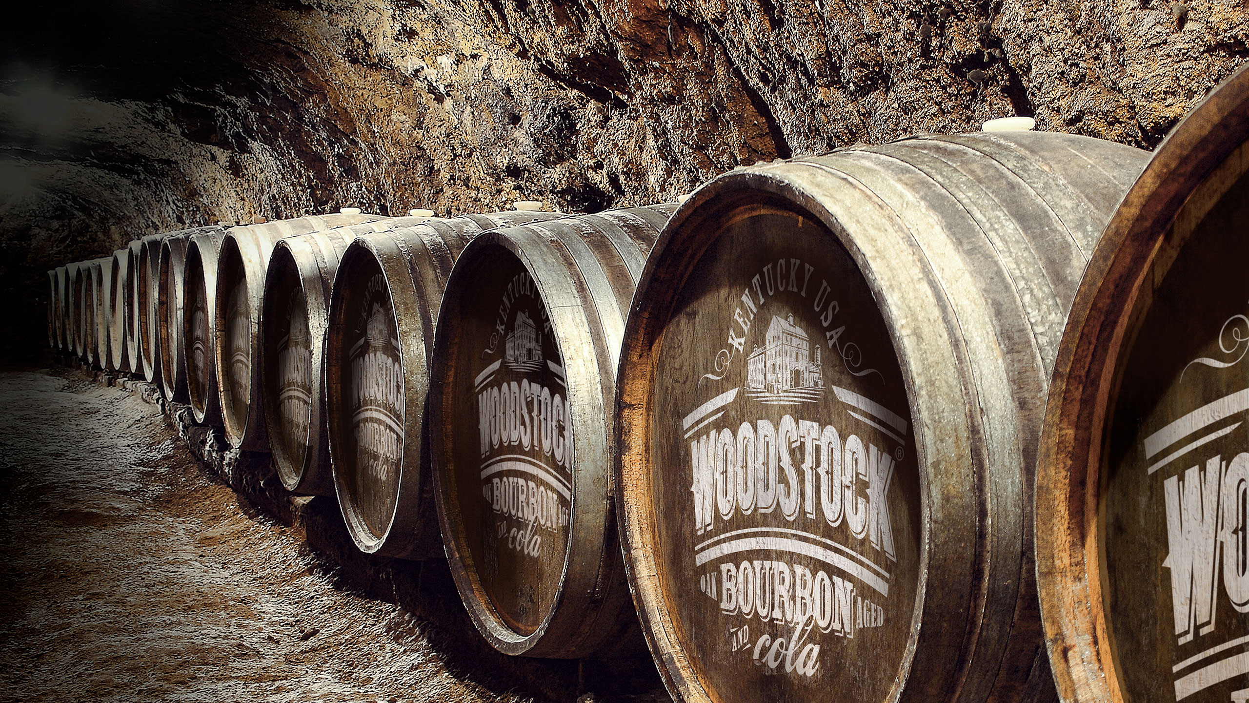
Woodstock Bourbon was struggling with an identity crisis. Even though it was made with true Kentucky Bourbon, it lacked authenticity & credibility. The current packaging had Kentucky Bourbon repeated seven times on the front of the can, yet consumers weren’t making the connection.
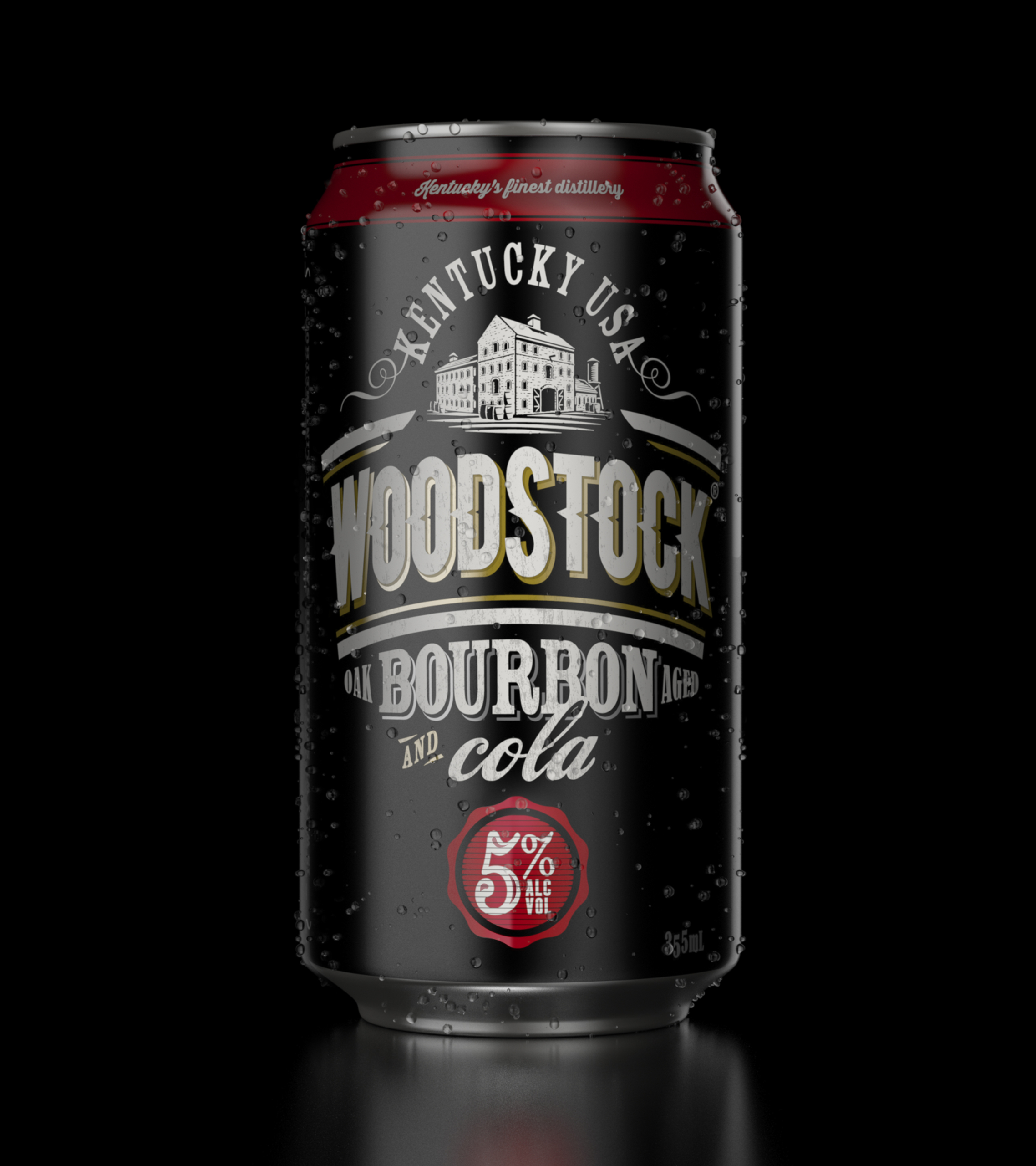
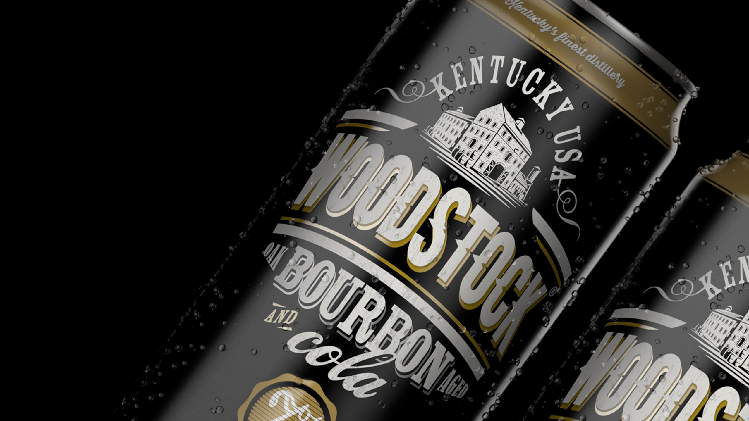
We developed a stronger, more iconic brand mark that locked-up with key elements illustrating Woodstock’s genuine heritage. Telling the brand’s story through layering and detail of handcrafted aged typography, messaging and imagery.
PROJECT OUTPUT
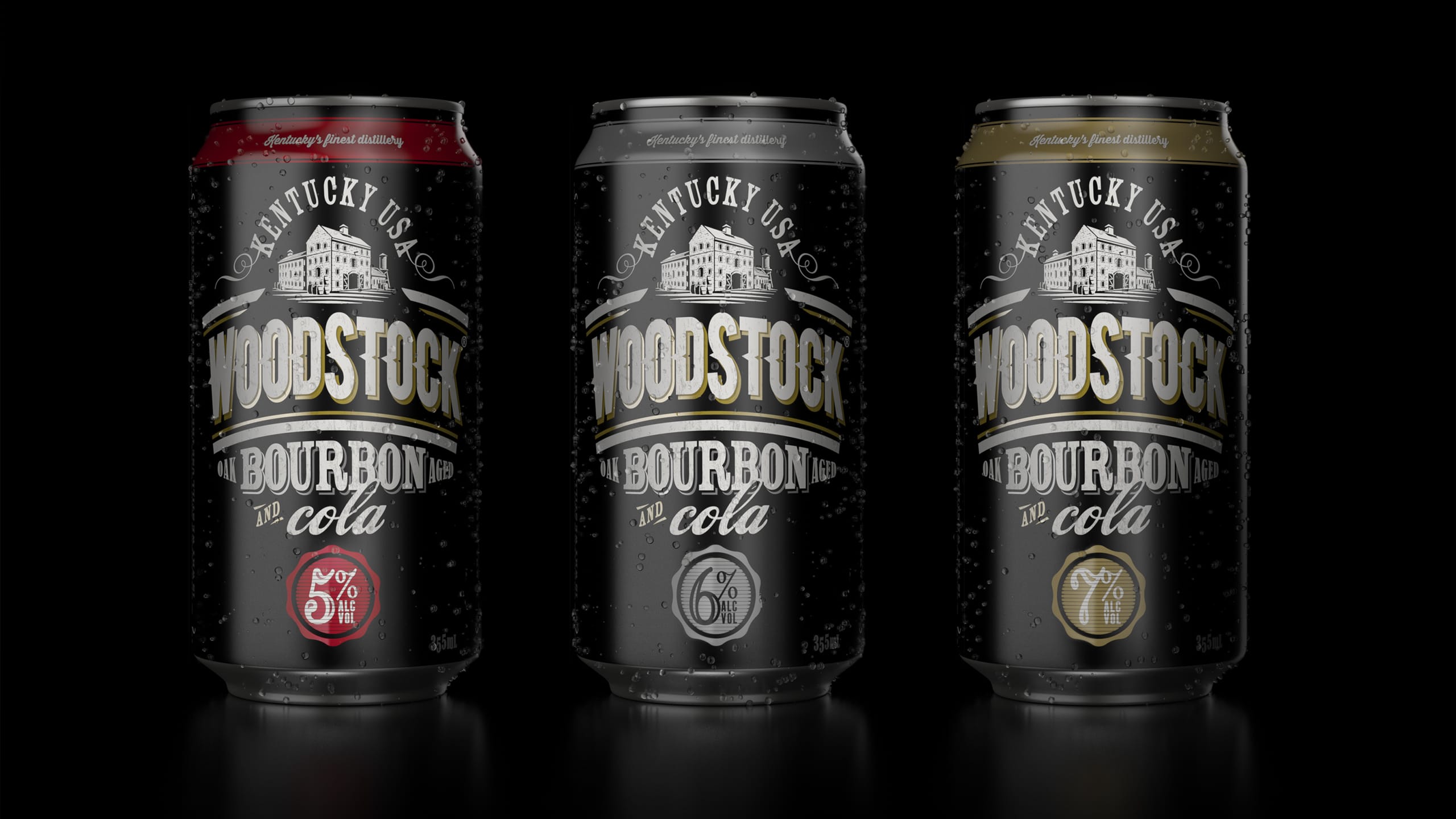
Brand mark, packaging, range architecture.

Before