CHALLENGE
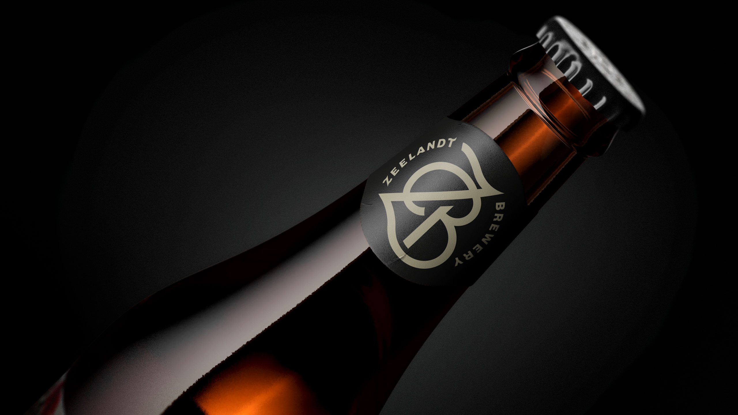
Zeelandt is a respected Hawke’s Bay craft brewery known for brewing beer with skill and integrity. The issue was that the packaging didn’t live up to the quality of the beer. The clothes didn’t match the man beneath. Chris at Zeelandt wanted a look that reflected the true to style ethos of each brew and encouraged people to pick it up with confidence.
APPROACH
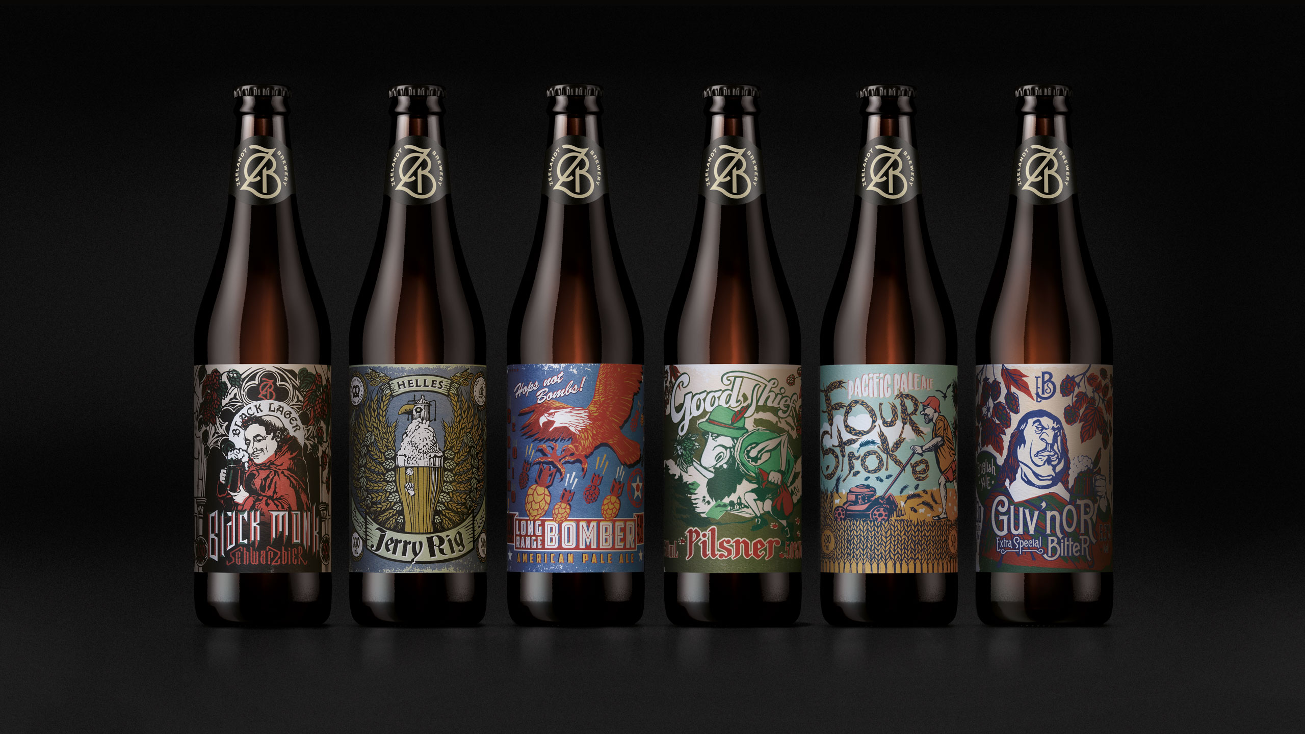
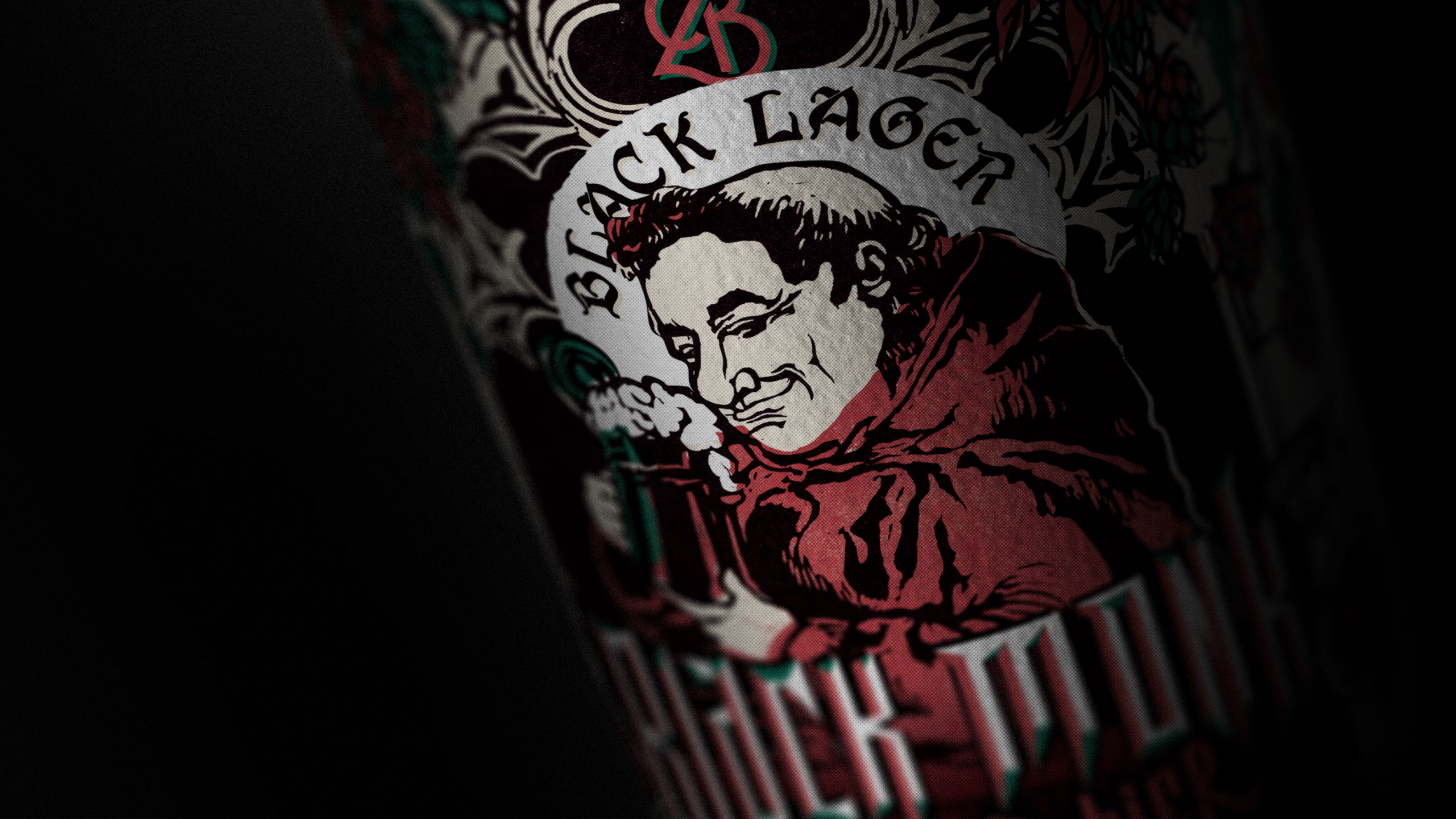
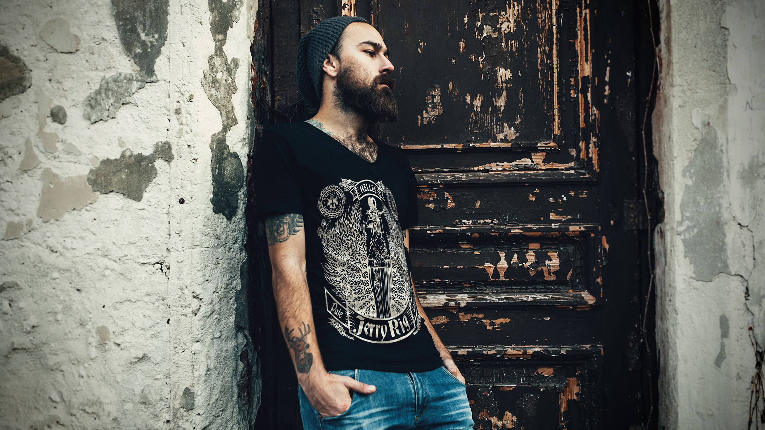
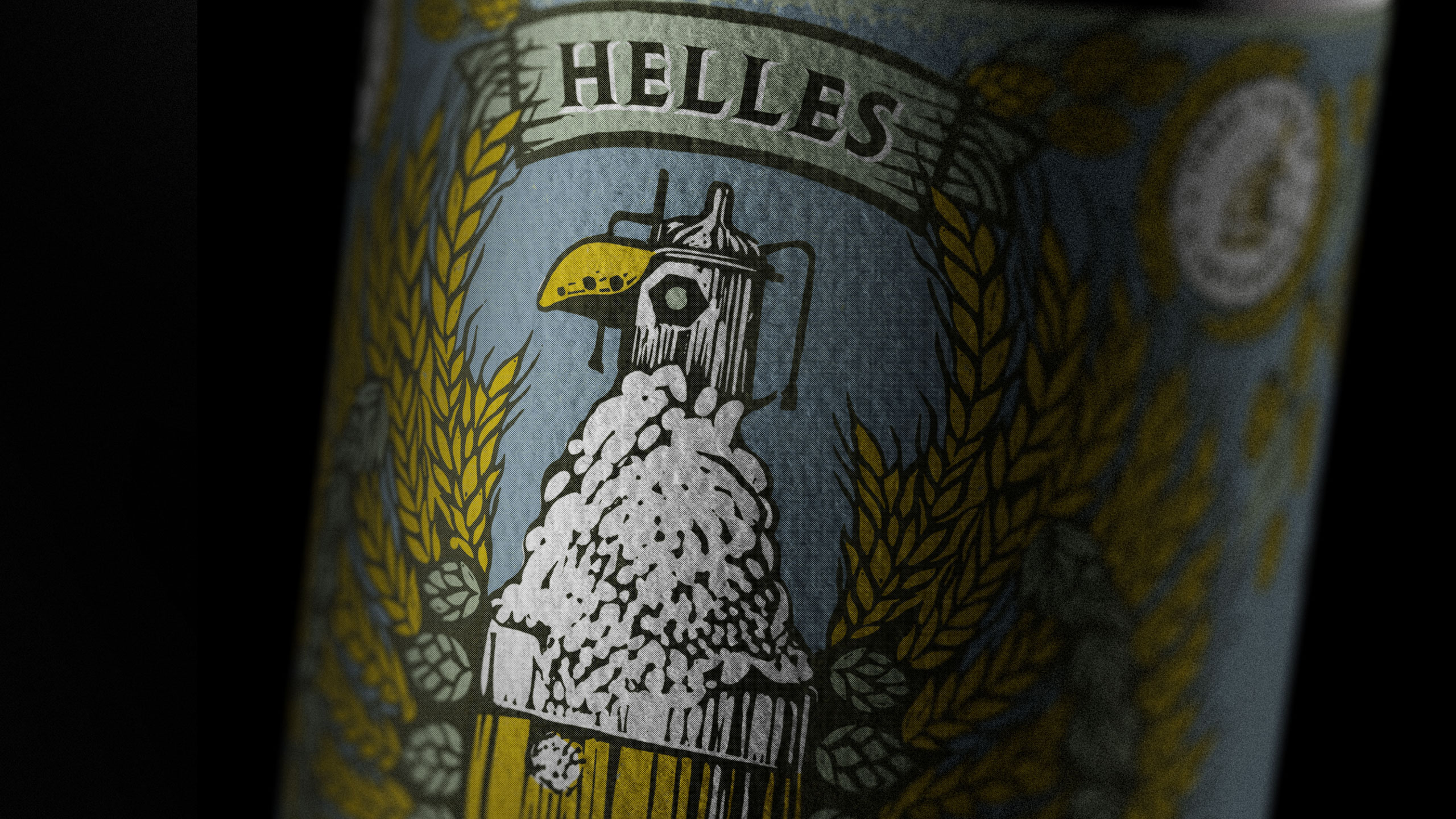
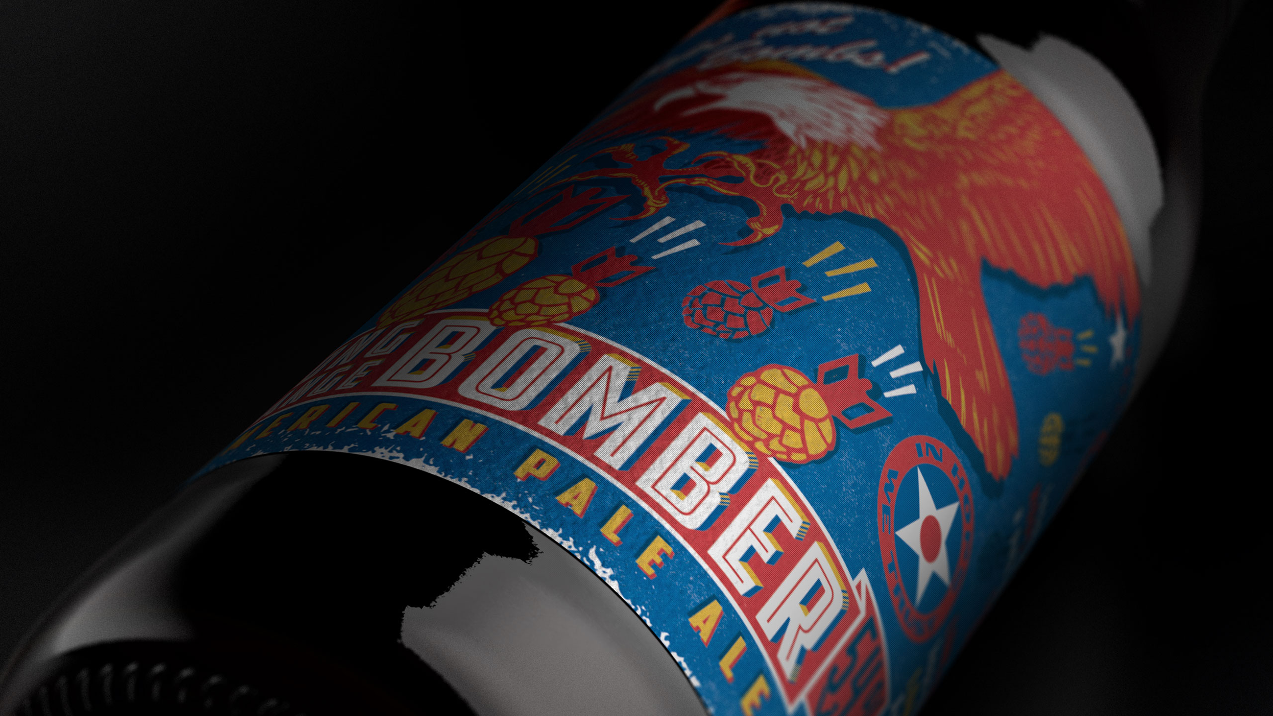
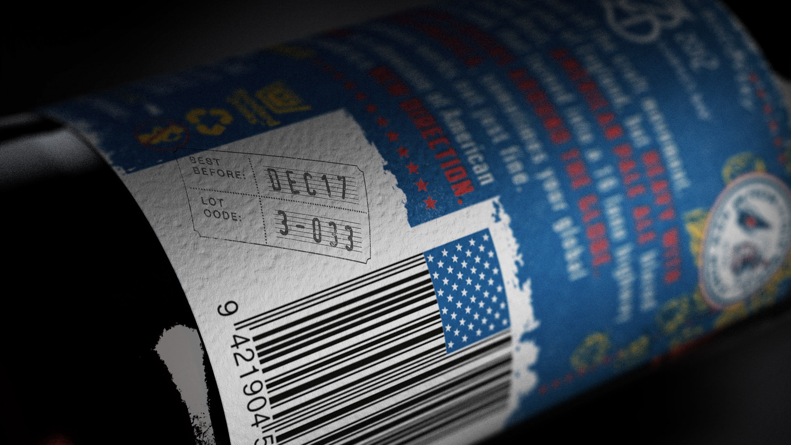
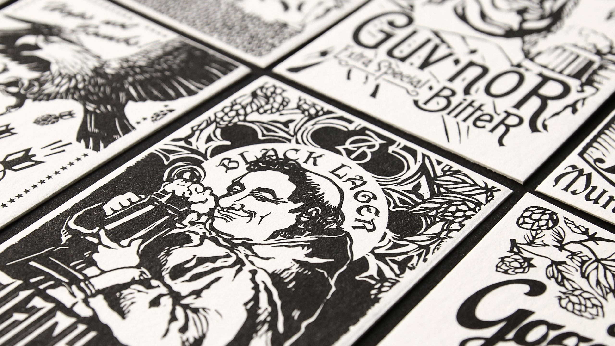
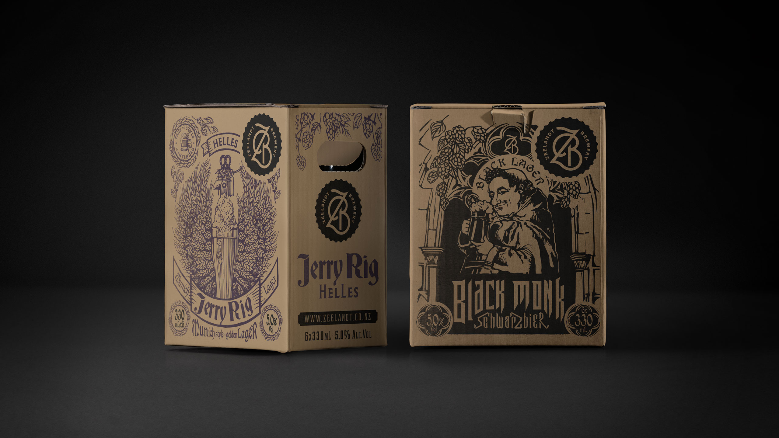
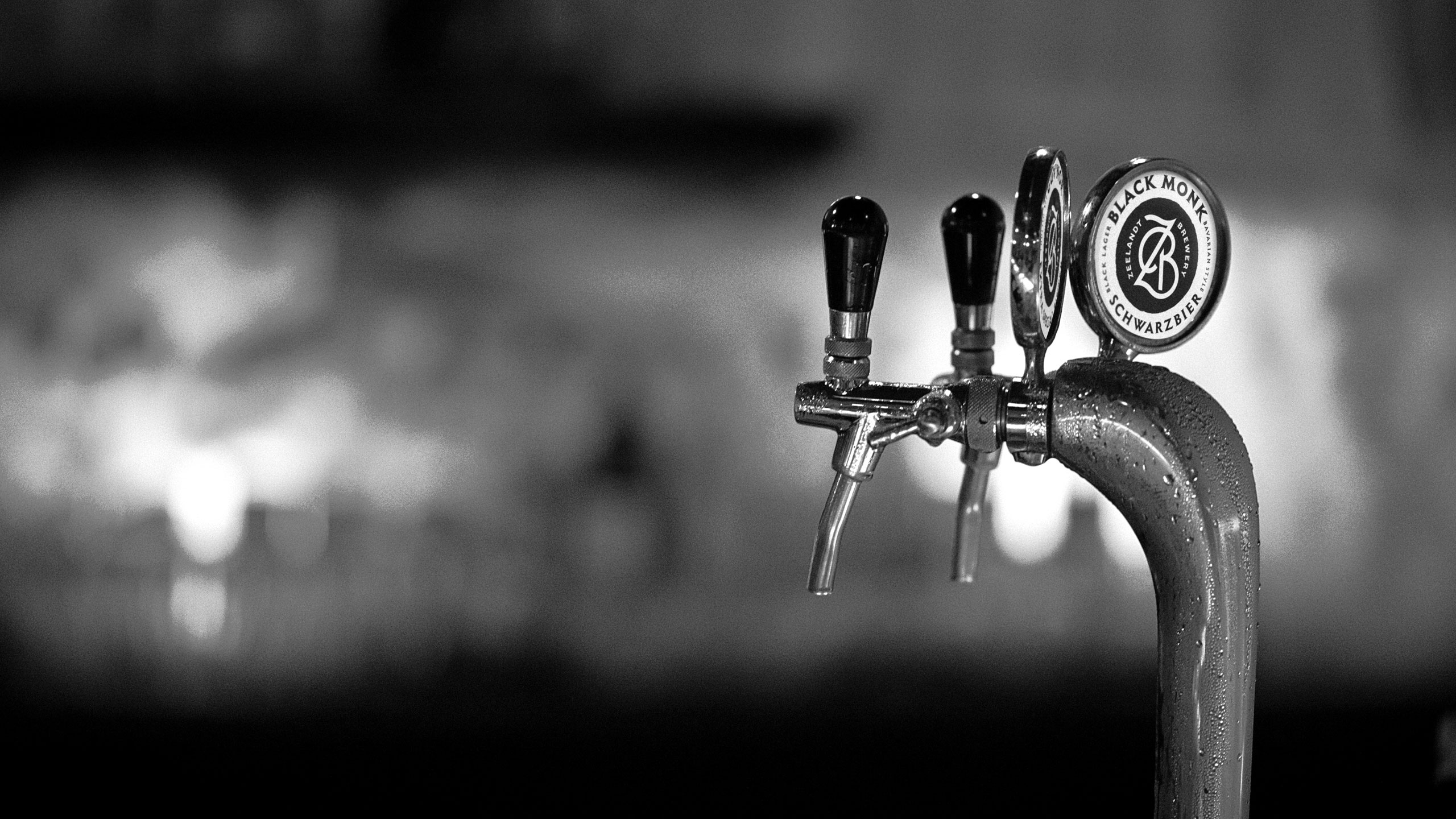
We created a story for every beer, using these narratives to guide the imagery and personality of the range. A consistent woodcut illustration style gave the beers a unified visual language, allowing a diverse set of images to feel connected as part of one family. The approach had both craft and memorability, helping each brew stand out while reinforcing the overall Zeelandt world. Because independent breweries often work with tight budgets, we built a system that allowed assets to be extended and reused across multiple touchpoints without losing impact. This ensured consistency, efficiency and a strong return on design investment.
RESULT
A cohesive and characterful brand system that reflects the depth and craft of Zeelandt’s brewing. The new identity and packaging increased shelf appeal, strengthened storytelling and created a sense of pride across all consumer and trade touchpoints.
KEY TAKEAWAY
When every brew has a story and the visual language amplifies that truth, the packaging becomes a powerful extension of the craft. Zeelandt’s refreshed identity proves that thoughtful design can elevate perception, create cohesion and work hard even within modest budgets.

Before