CHALLENGE
Blackbird Finance is a specialist lender supporting importers and dealers in the motor vehicle industry, helping clients secure finance for vehicles in transit or awaiting compliance. While their offer was progressive and well regarded, the brand itself felt dated and corporate. It lacked emotion, distinction and the confidence to match the company’s expertise and forward momentum in a competitive financial landscape.
APPROACH
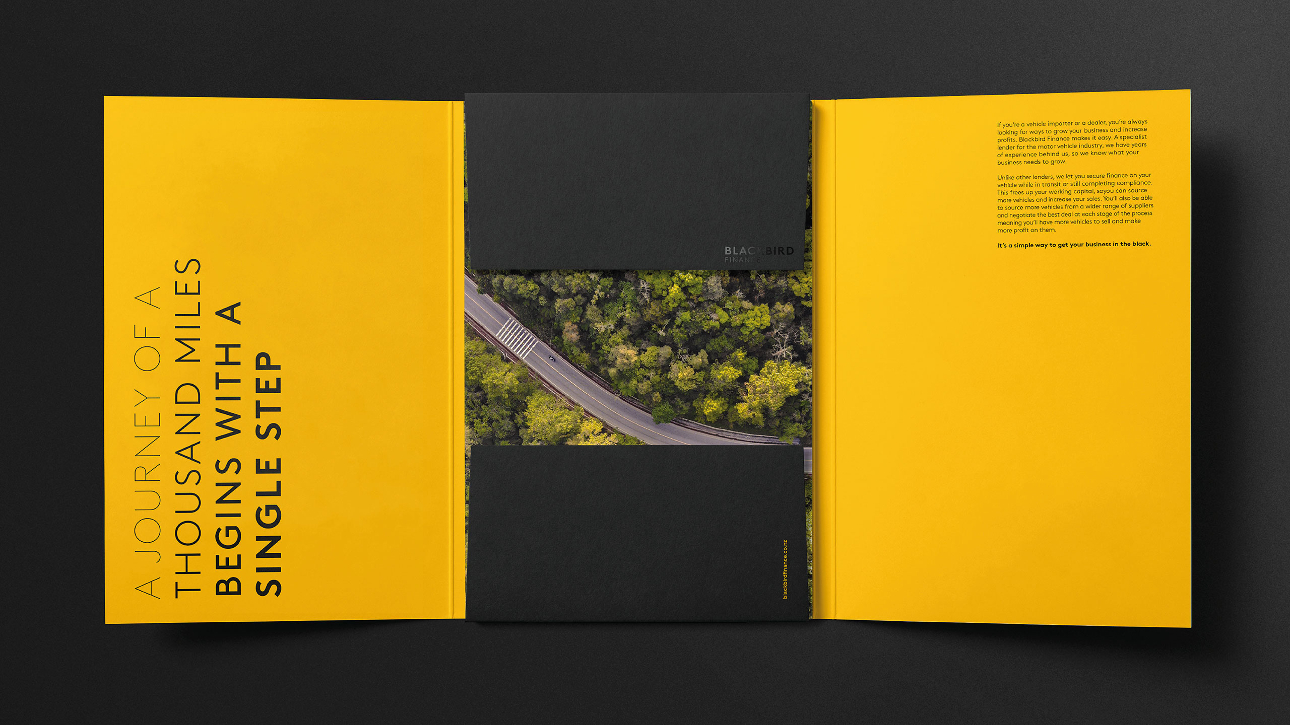
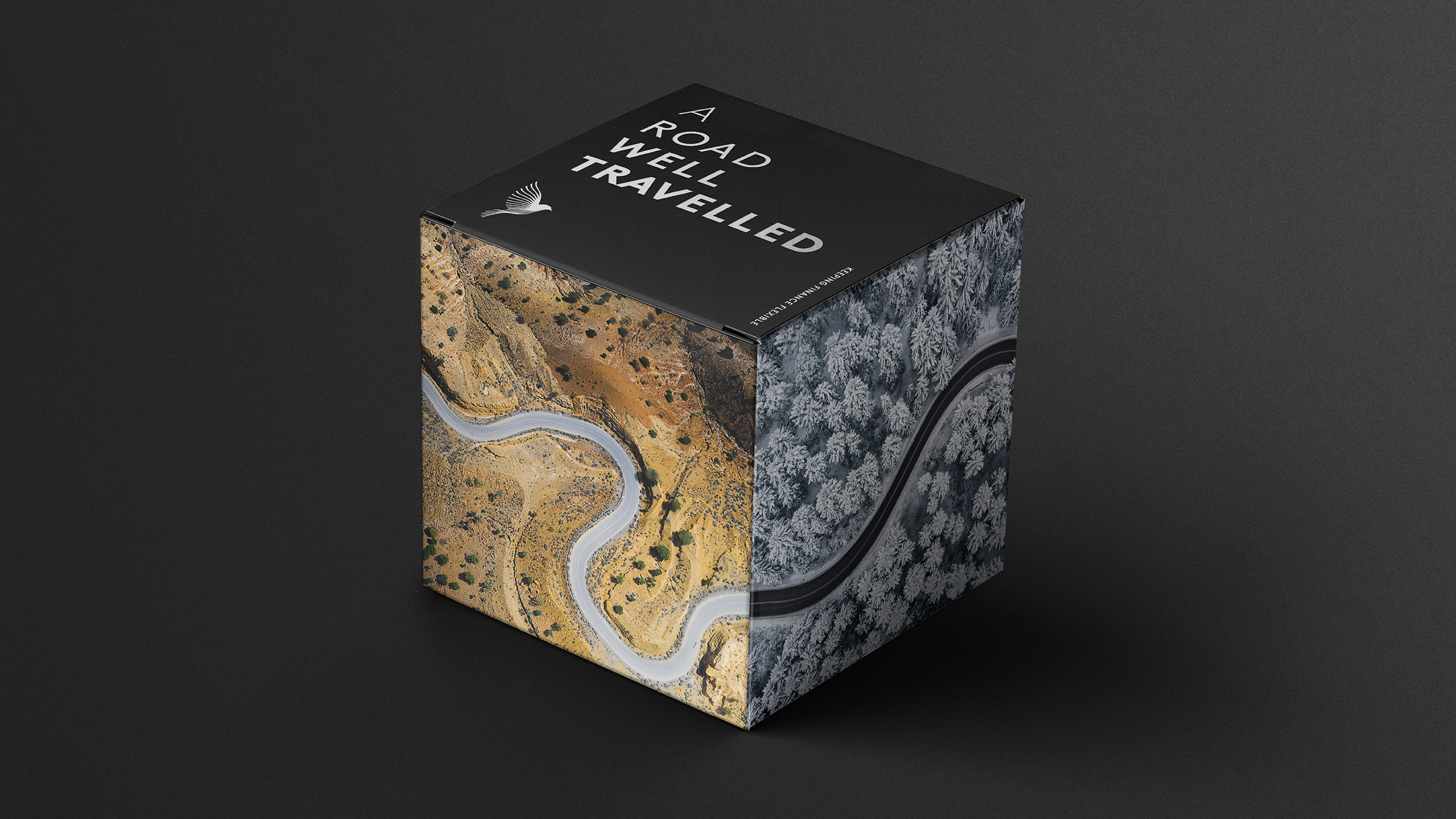
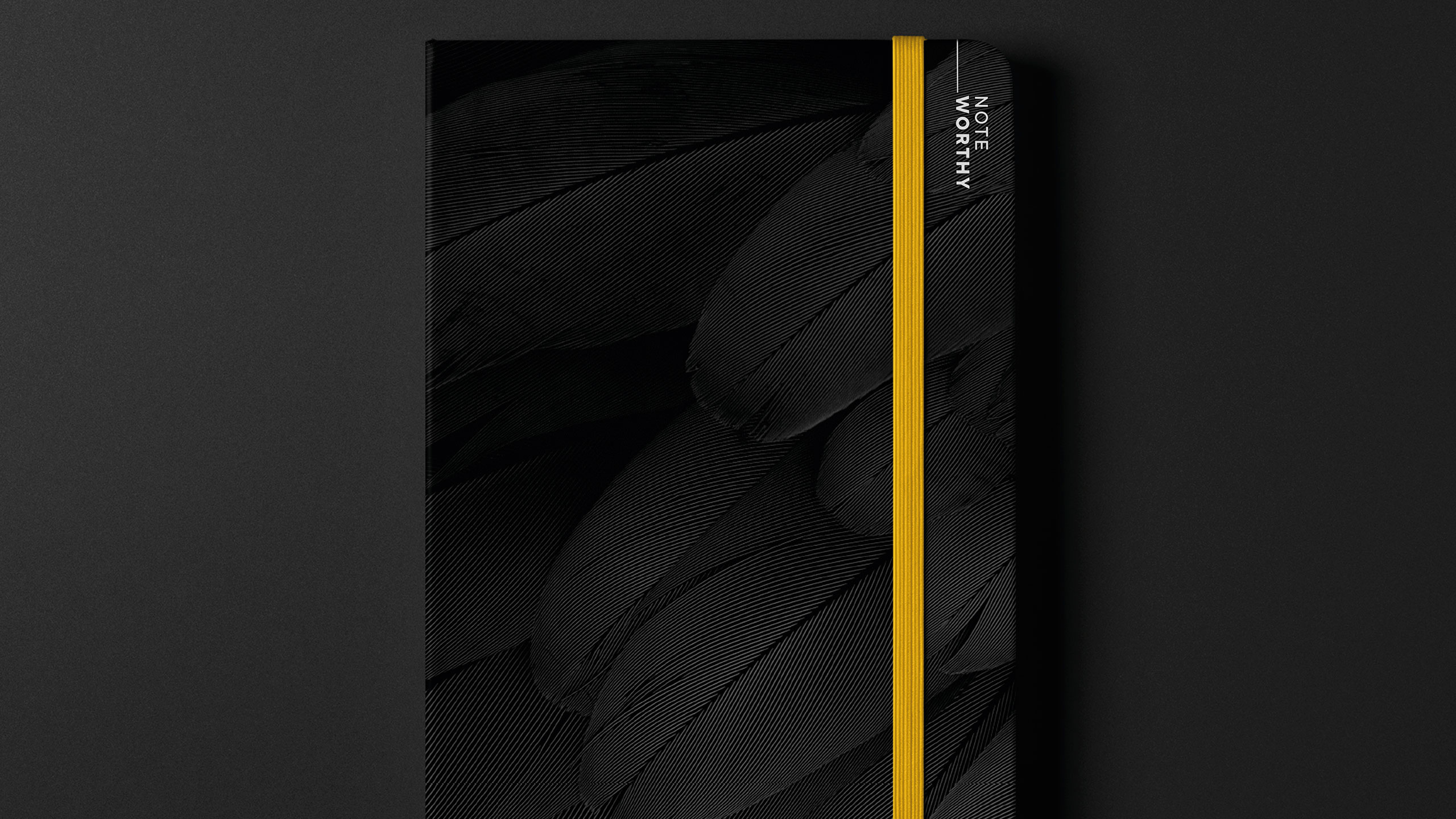
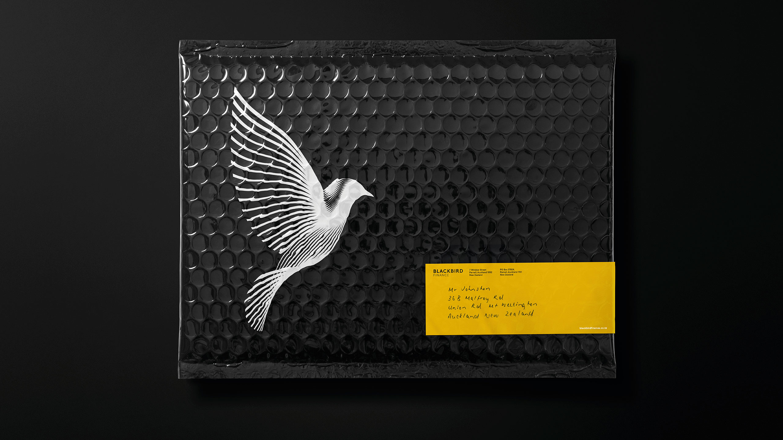
We reimagined the brand from the ground up, redefining every element from the symbol to the story. At the heart of the identity, we reinterpreted the blackbird itself, crafted into a beautifully refined form that carries a sense of strength, precision and gravitas. The new mark became a symbol of perspective and progress, embodying the company’s role in helping clients move forward with clarity and confidence.
The communications extended this idea through a powerful metaphor of journey, seen from the bird’s viewpoint. Roads, landscapes and movement became recurring visual themes, representing both physical and financial journeys. The tone of voice and design system were refined to feel dynamic, optimistic and personal, balancing professionalism with genuine human connection.
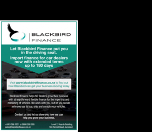
RESULT
The rebrand transformed Blackbird Finance into a distinctive, contemporary and trusted presence. The new visual identity, applied across website, vehicle livery, signage and collateral, unites sophistication with purpose. Every touchpoint now tells a story of progress and partnership, positioning Blackbird Finance as an agile, forward-thinking lender that helps clients see the bigger picture.
KEY TAKEAWAY
By reimagining the blackbird as a symbol of perspective and motion, and viewing communication through its lens, the brand now speaks to possibility and progress, capturing both the spirit of the journey and the confidence to soar above it.
Before