CHALLENGE
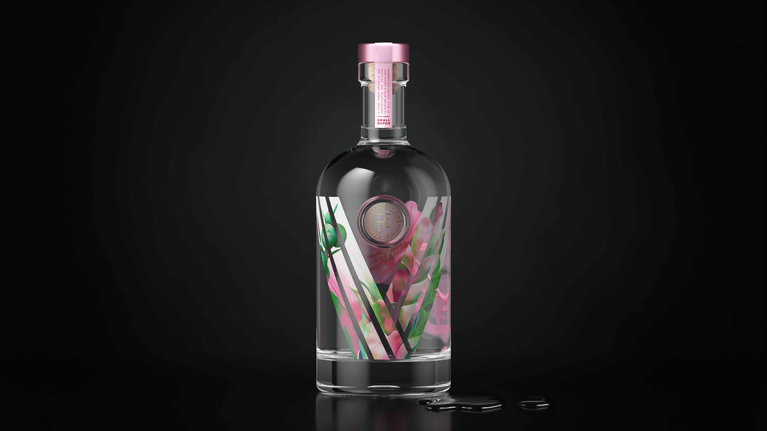
The brief was to create packaging for a colour changing gin that shifted from clear to pink when tonic was added. The challenge lay not only in naming and positioning the product, but in developing a design that visually expressed the transformation while remaining technically achievable on glass. The packaging needed to feel vibrant, modern and connected to the botanicals that drive the colour change.
APPROACH
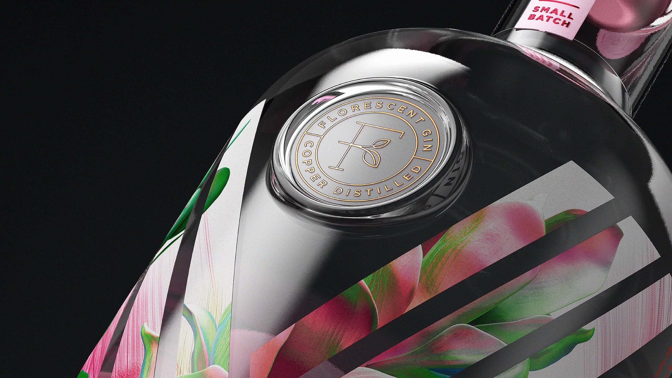
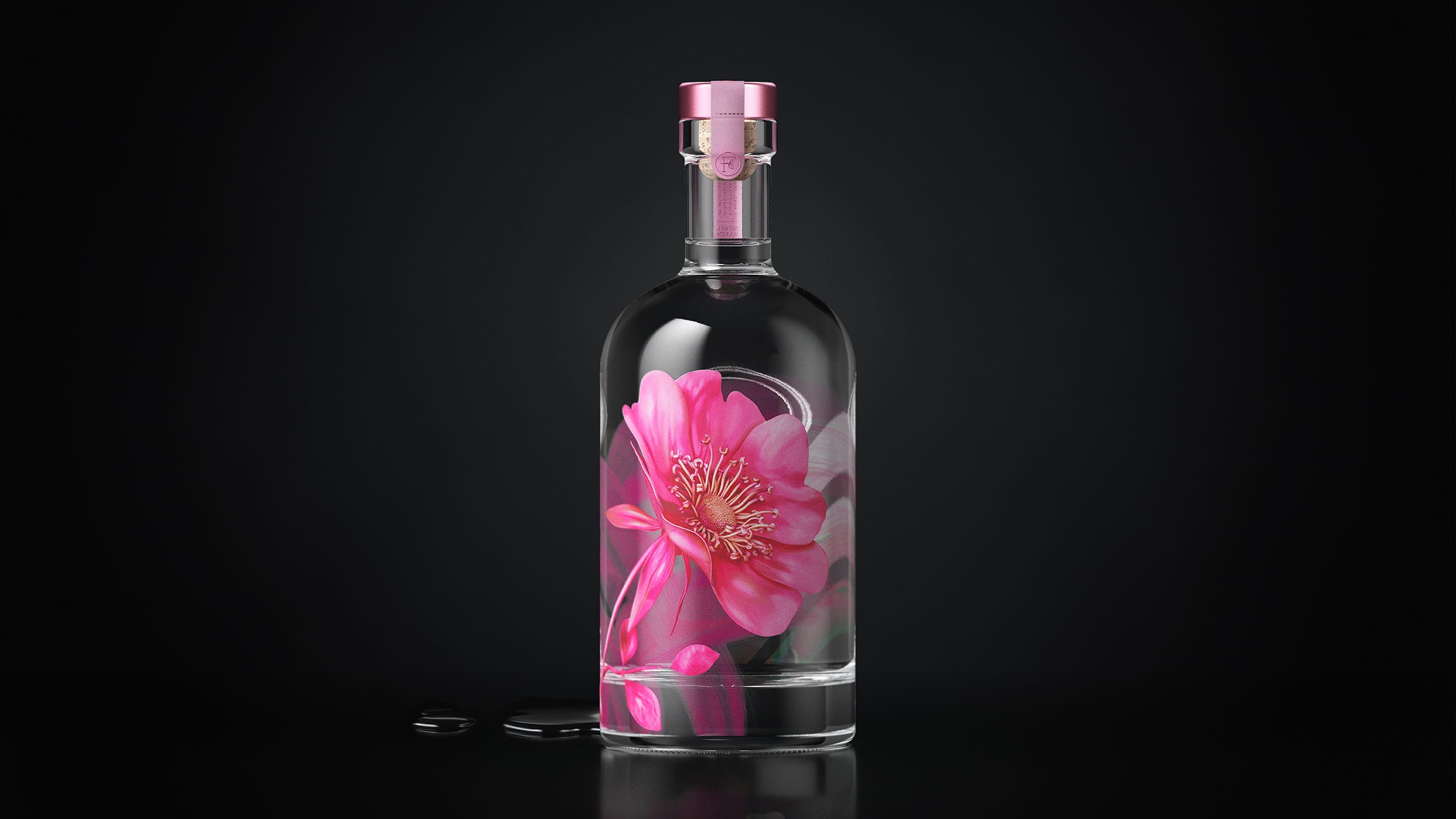
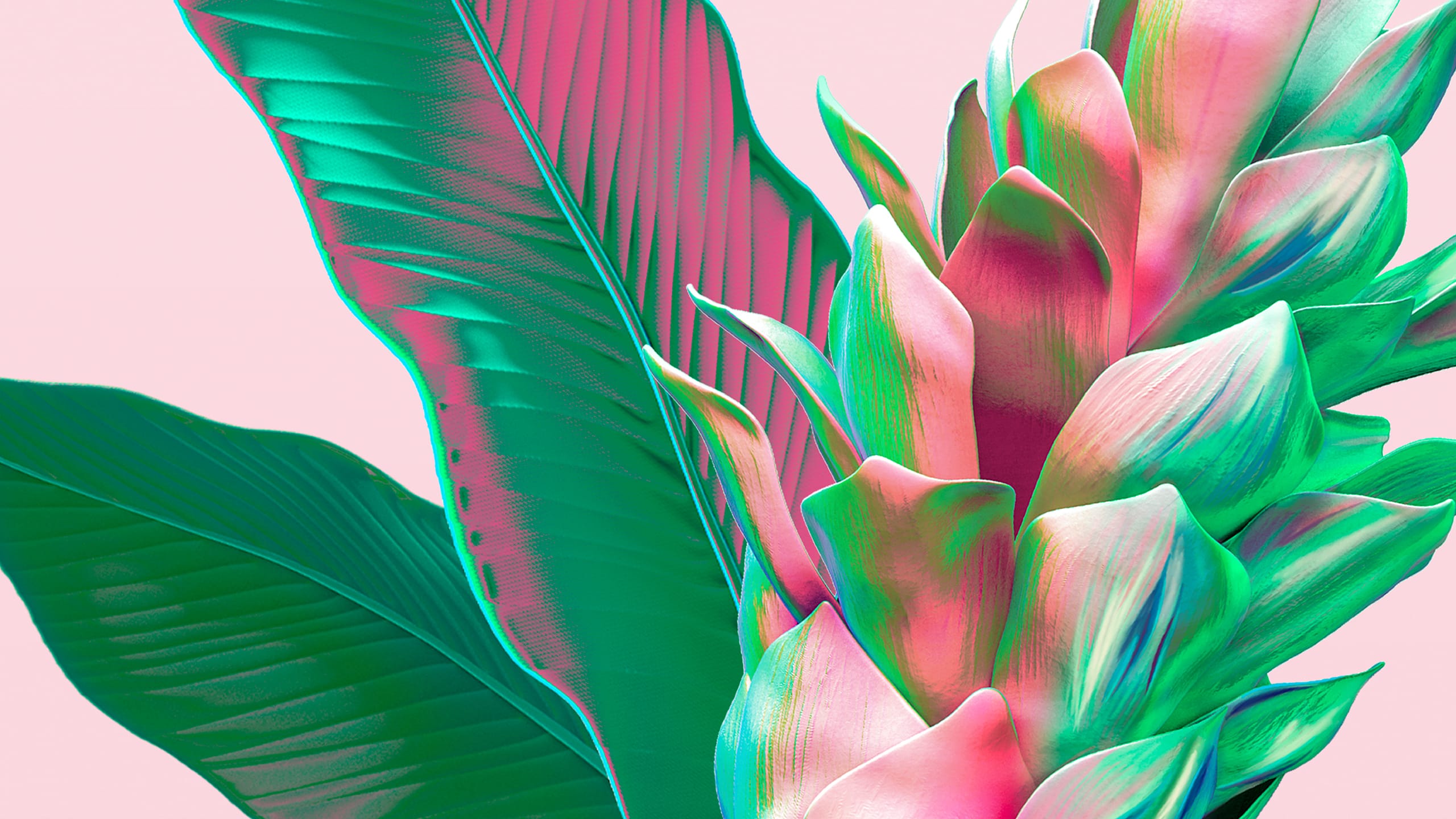
We created the name Florescent, a blend of colour and flora, capturing both the bright personality of the gin and the botanical cues behind it. The design centred on a screen printed front label that allowed consumers to peer through the artwork to reveal a vivid pink hibiscus flower on the back. This bloom represents the botanical catalyst responsible for the colour shift. The technical complexity was significant. The precision required for perfect alignment between the front screen print and the reverse artwork demanded high accuracy, multiple test runs and close collaboration with production partners Savour Glass. Colour density, opacity and bottle curvature all had to be carefully managed to ensure the flower appeared crisp and luminous through the liquid.
RESULT
The final design created a striking visual effect that amplified the theatre of the colour changing gin. The layered front and reverse printing produced a sense of depth and discovery, while the hibiscus became a distinctive focal point. Despite the technical challenges, the solution delivered clarity, vibrancy and a strong expression of the product’s personality..
KEY TAKEAWAY
Bold ideas often require technical bravery. Florescent Gin shows how thoughtful naming, layered storytelling and precise print craft can elevate a product, turning a functional colour change into a compelling and immersive brand experience.