CHALLENGE
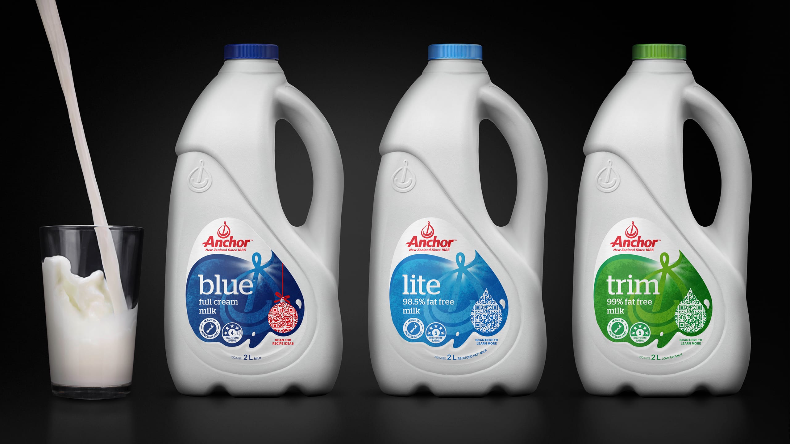
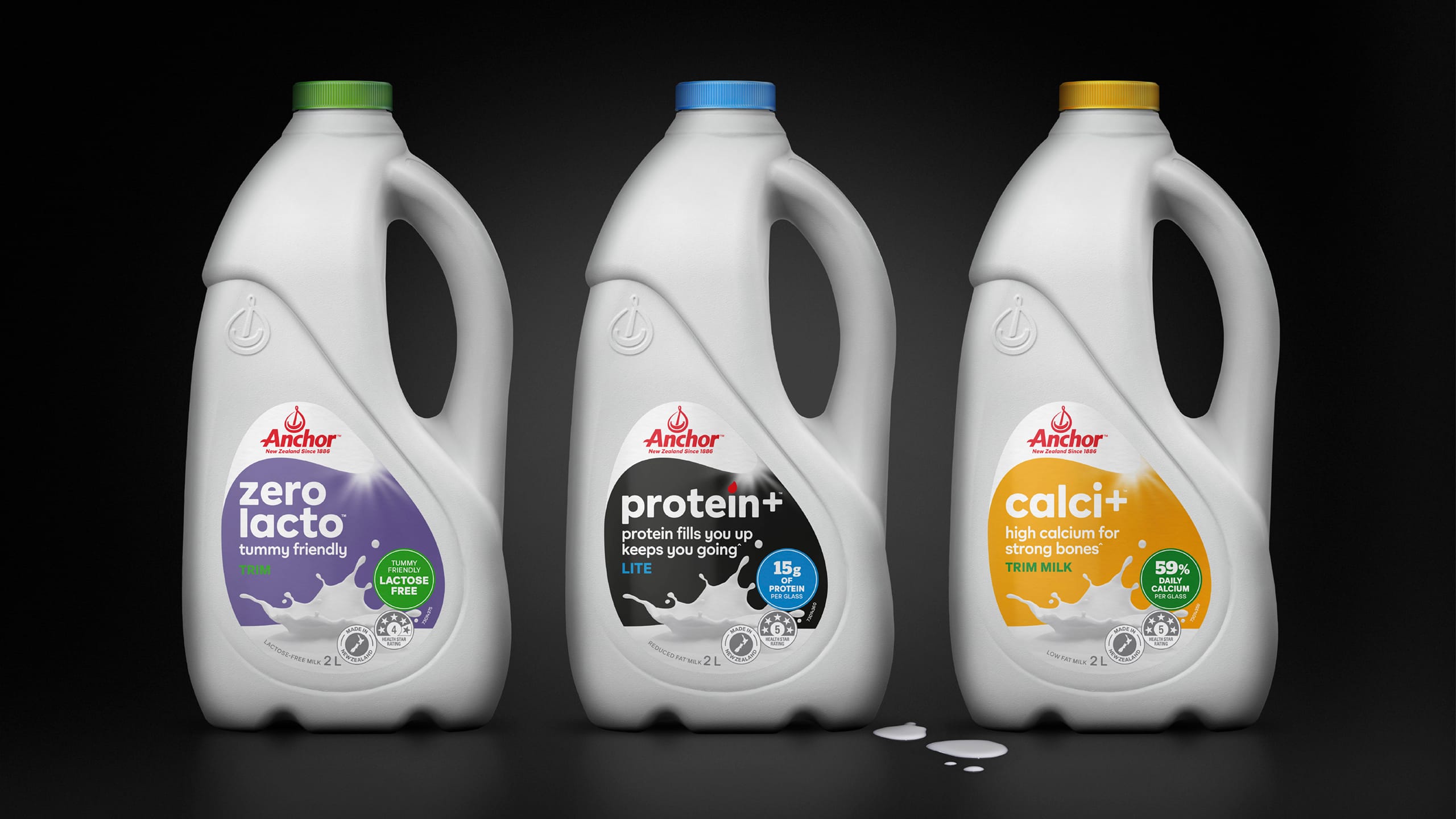
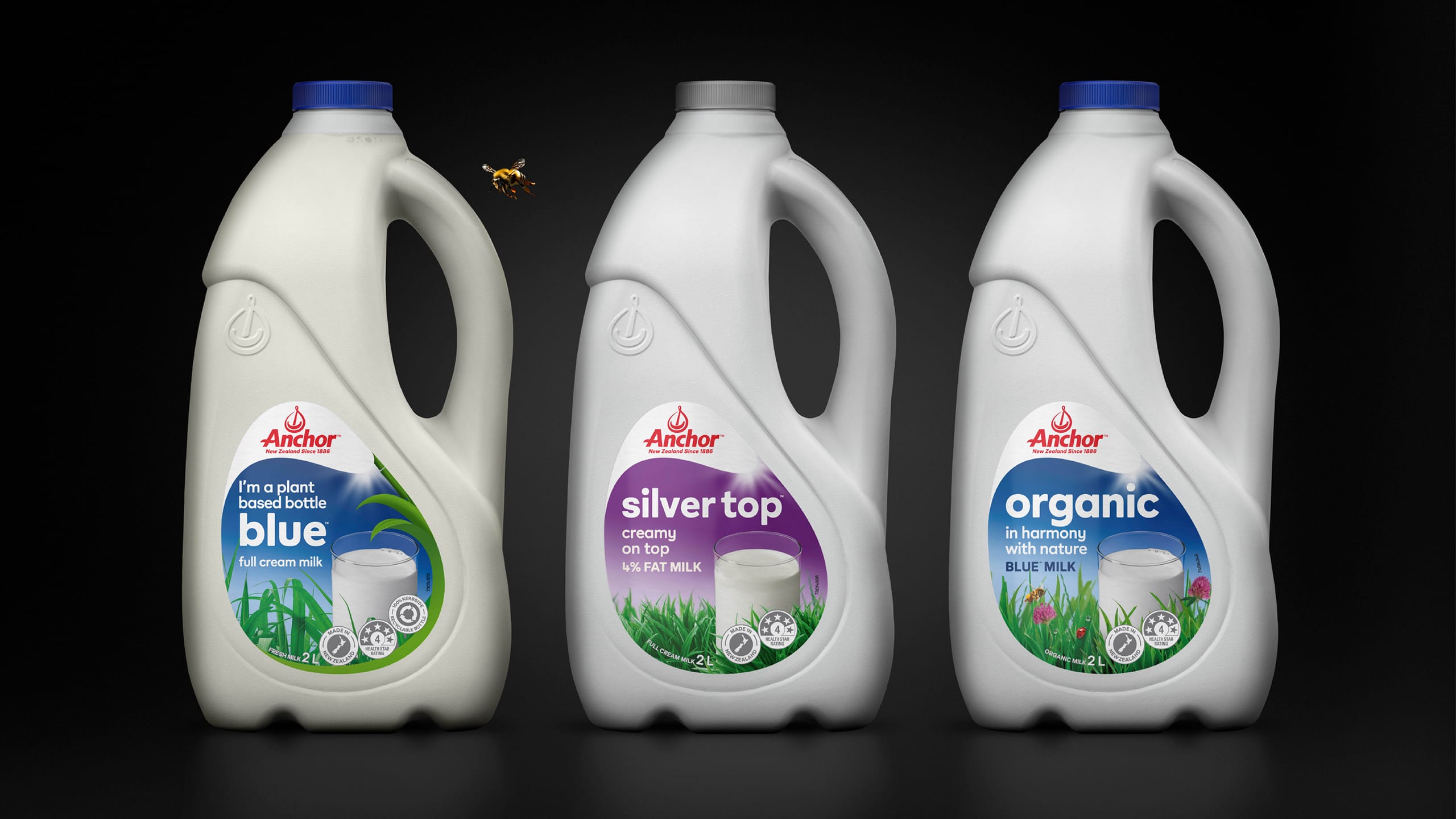
Anchor’s milk portfolio core and enriched range : Calci+, Protein+, Silver Top, Organic, Plant-Based and Zero Lacto, had strong individual products but low overall awareness. Each variant had its own design language, making the range confusing and disconnected on shelf. There was no unifying system or clear messaging hierarchy to help consumers understand the distinct nutritional benefits of each, from strengthening bones to supporting digestion or providing extra protein. The challenge was to bring clarity, cohesion and appetite appeal to a complex portfolio while reinforcing the premium nature of the products.
APPROACH
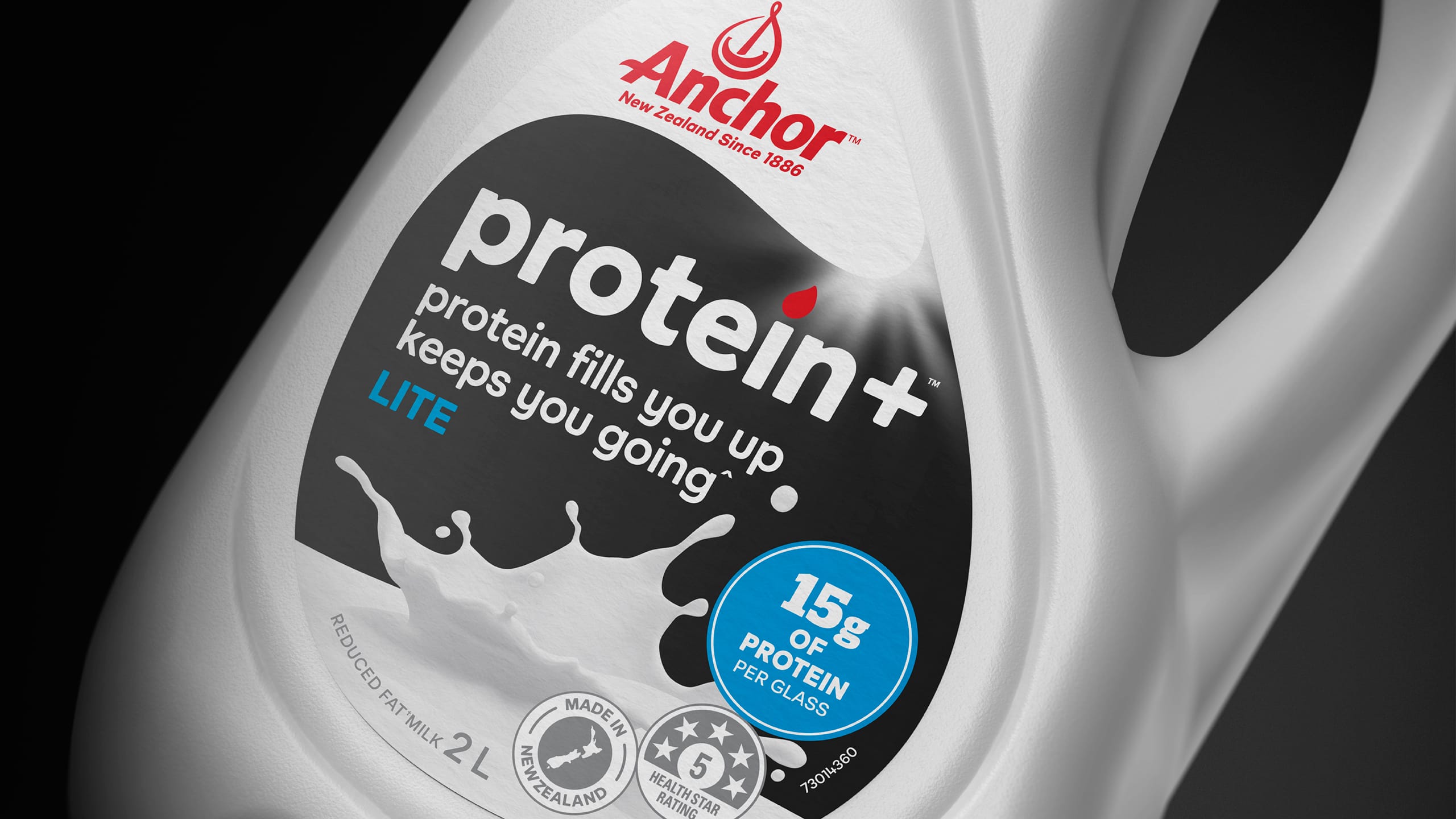
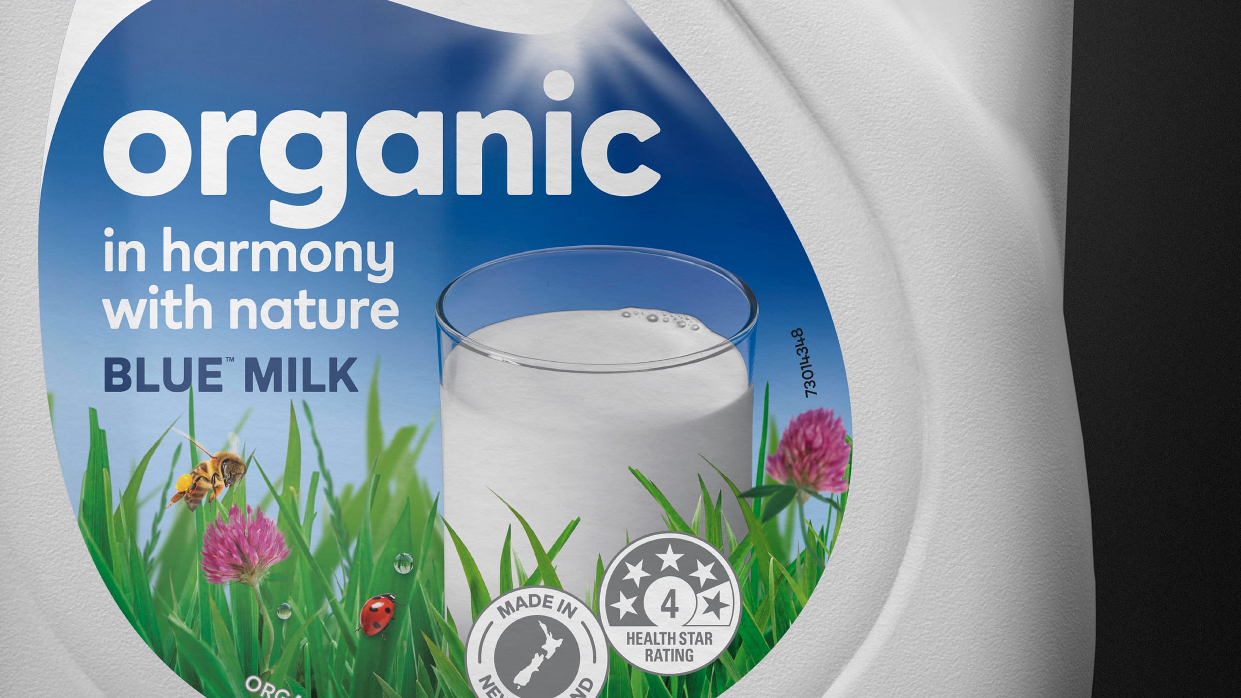
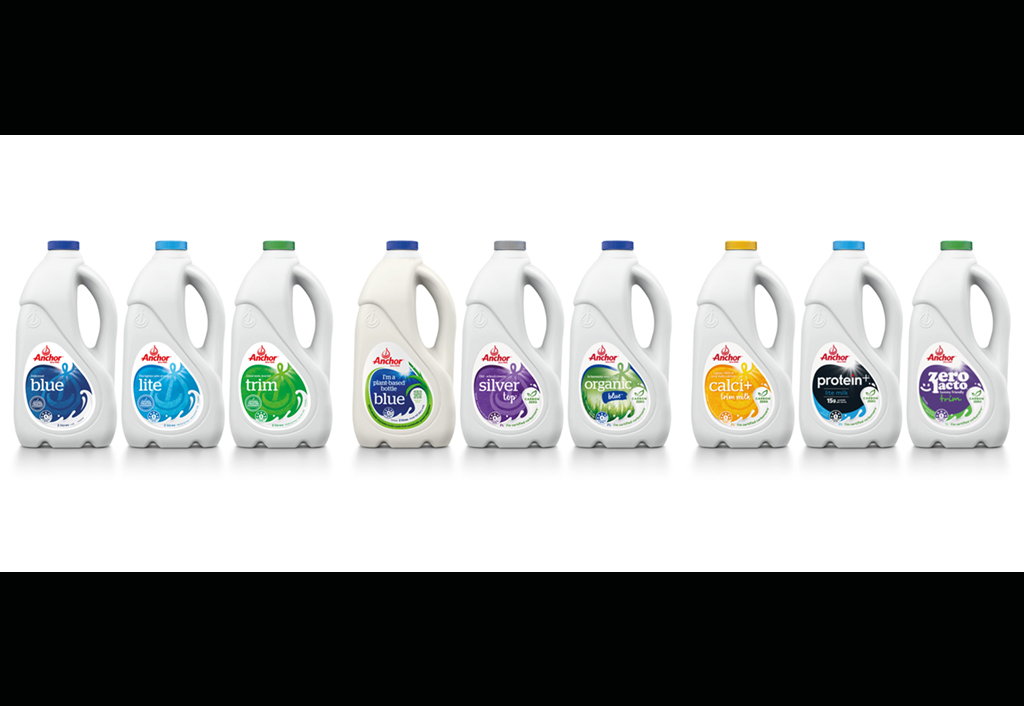
We began by defining a clear brand and range architecture, grouping the products into three intuitive tiers, Core, Premium and Wellness. This structure provided the foundation for a consistent visual and messaging system across the portfolio. We developed bespoke imagery and iconography to highlight each product’s unique benefits, supported by a simplified message hierarchy and stronger brand cues. The design language elevated the packaging, communicating both nutritional benefit and great taste while maintaining a cohesive Anchor family look.
RESULT
The refreshed Anchor milk portfolio achieved far greater shelf clarity and consumer understanding. The consistent visual system helped unify the range under one recognisable identity, while the hierarchy and benefit-led messaging improved navigation and purchase confidence. The new design successfully positioned the enriched range as a premium, purposeful offer within everyday dairy.
KEY TAKEAWAY
Clarity creates confidence. By introducing structure, consistency and stronger storytelling, the Anchor enriched portfolio now connects more clearly with consumers by delivering both the functional benefits they seek and the trusted quality they expect from Anchor.
Before
