CHALLENGE
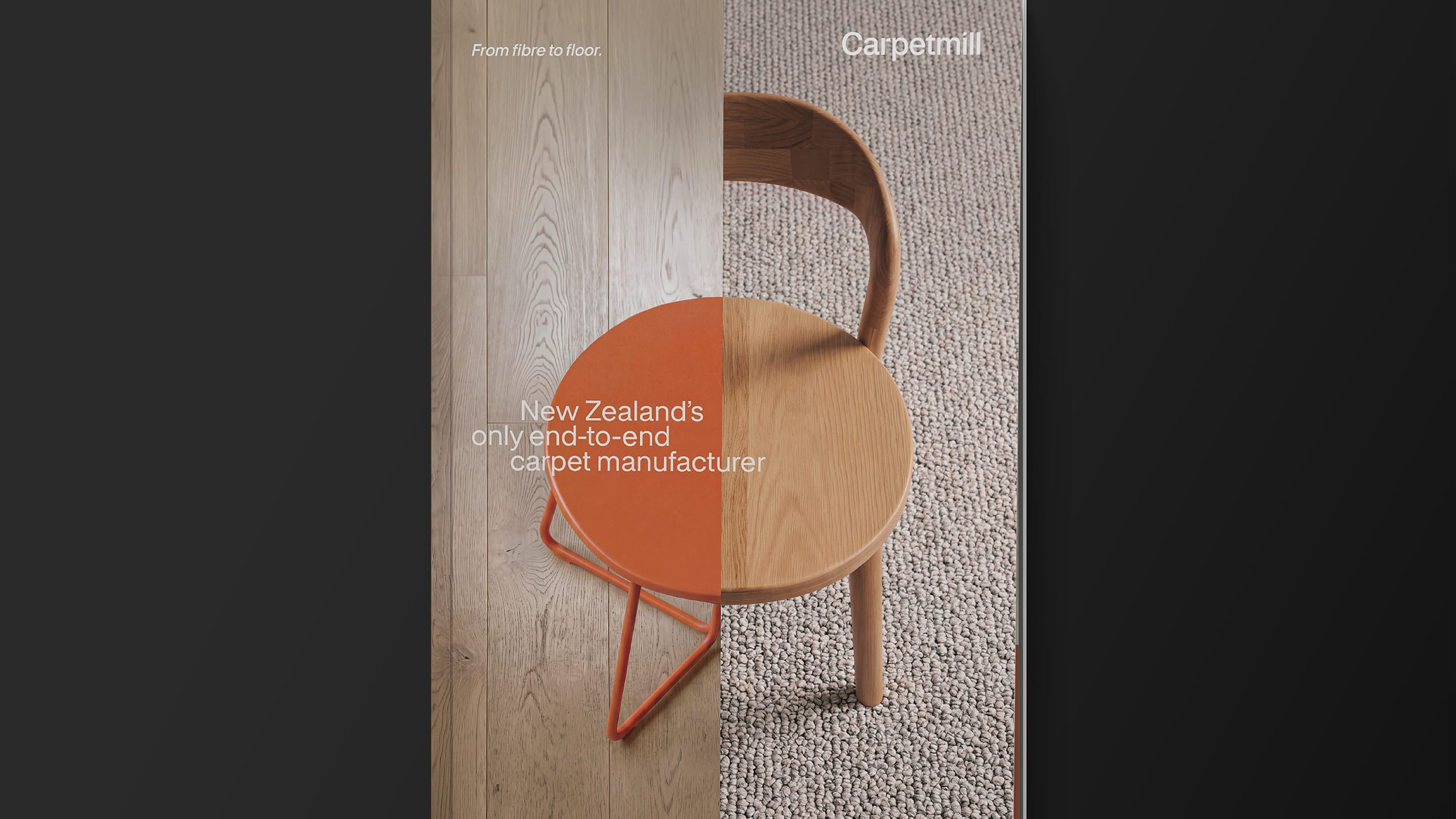
Carpet Mill has a position in the New Zealand flooring market that no competitors can match. It doesn’t simply resell product. It designs and manufactures carpet here in New Zealand, sells directly to customers and manages installation, giving the business knowledge and control across the entire journey from fibre to floor. Alongside its own soft flooring, Carpet Mill also offers a comprehensive range of hard flooring, creating a complete flooring solution for New Zealand homes and businesses.
Yet the brand wasn’t telling that story. Its identity and positioning had become dated, price-led and predominantly geared towards a mature audience. The bold red and black visual language felt hard and transactional in a category built around comfort, style and the experience of a space. It lacked the personality and contemporary appeal needed to reflect the quality of the business behind it, limiting broader appeal and the value Carpet Mill could command. The opportunity was to reposition Carpet Mill around what genuinely makes it different : a New Zealand business that understands flooring from the inside out.
APPROACH
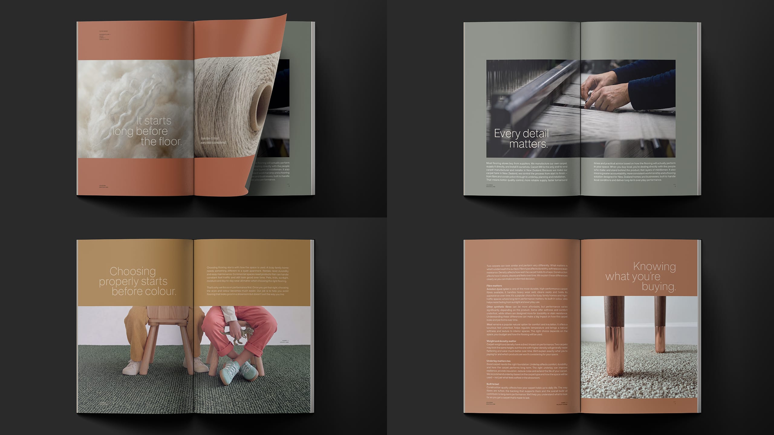
We began by shifting the conversation from selling carpet to owning flooring expertise. We built the strategic platform around Carpet Mill’s ability to design, manufacture, sell and install, creating a level of knowledge, accountability and control that imported and reseller brands cannot easily replicate.
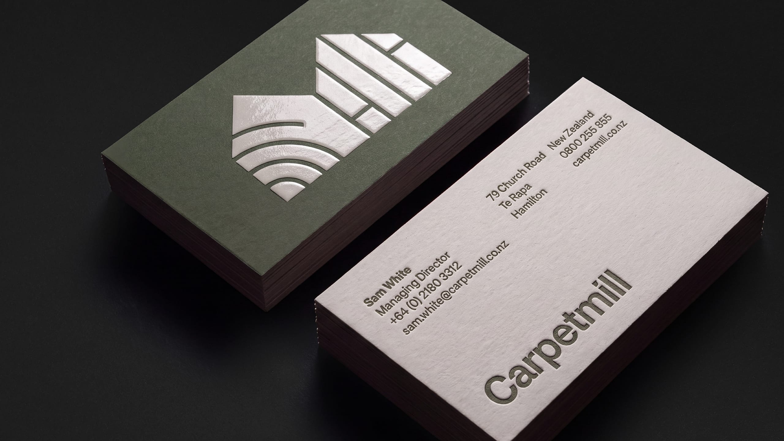
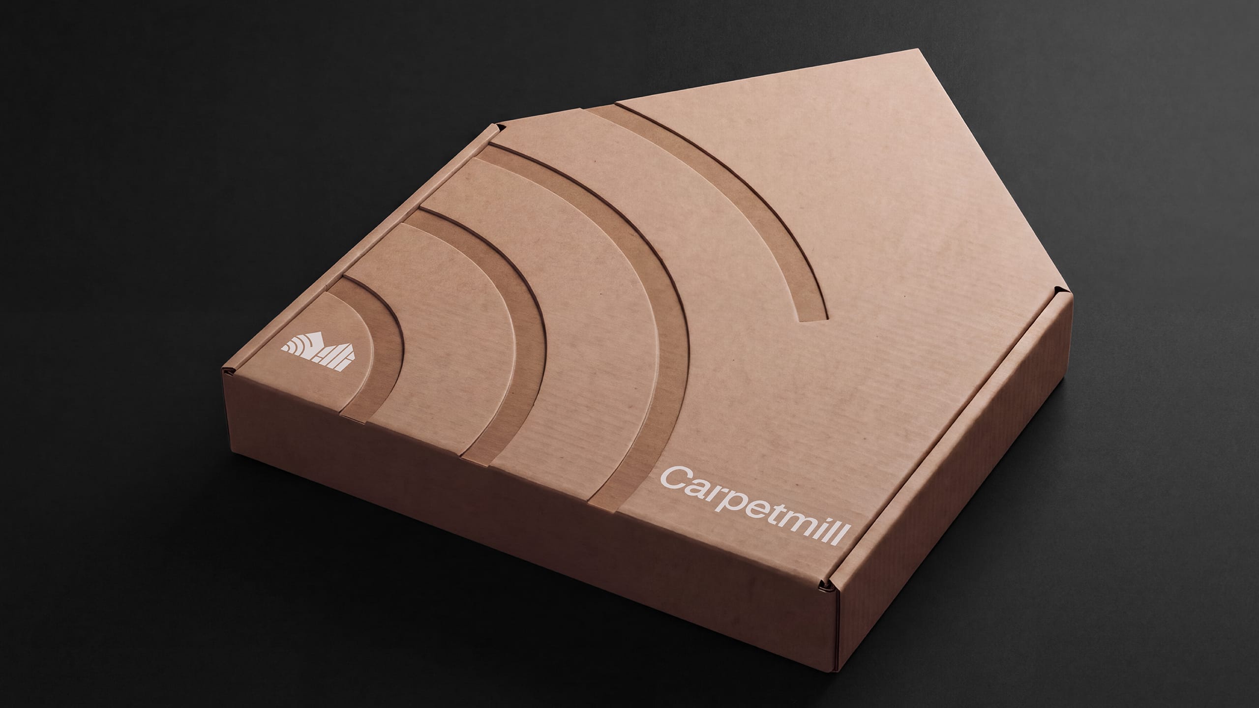
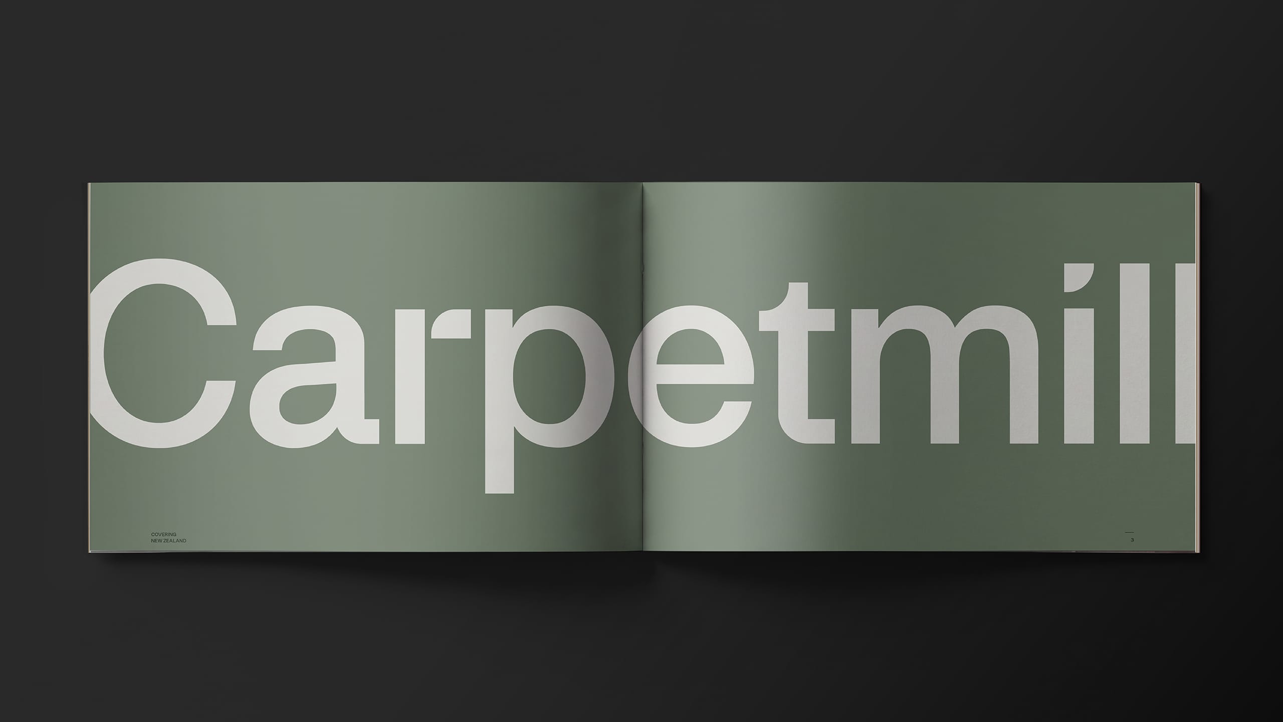
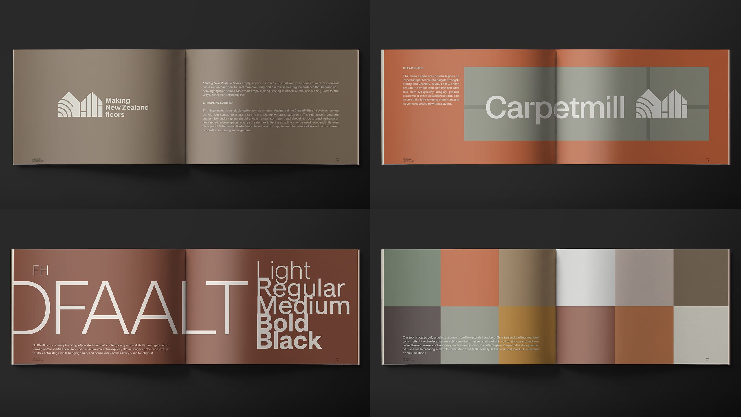
This thinking led to the brand essence, Made for real life. It connects the practical performance of flooring with the emotional role it plays in everyday spaces, positioning Carpet Mill as neither a discount warehouse nor a high-end design boutique, but a smart, contemporary flooring brand grounded in how New Zealanders actually live. The identity was rebuilt around a new, more cohesive Carpet Mill wordmark. Bringing the two words together creates greater strength and presence, while subtle curves reference the form of rolled carpet and soften the industrial character of the name.
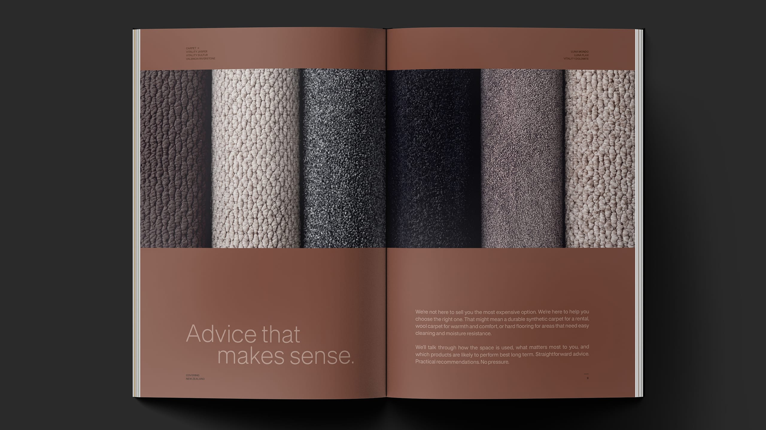
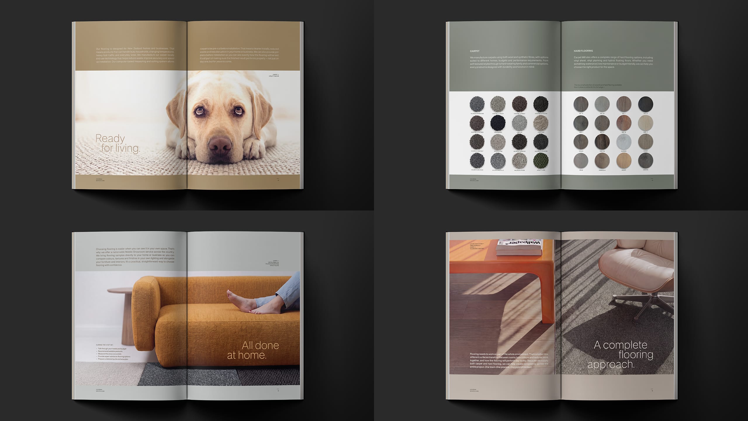
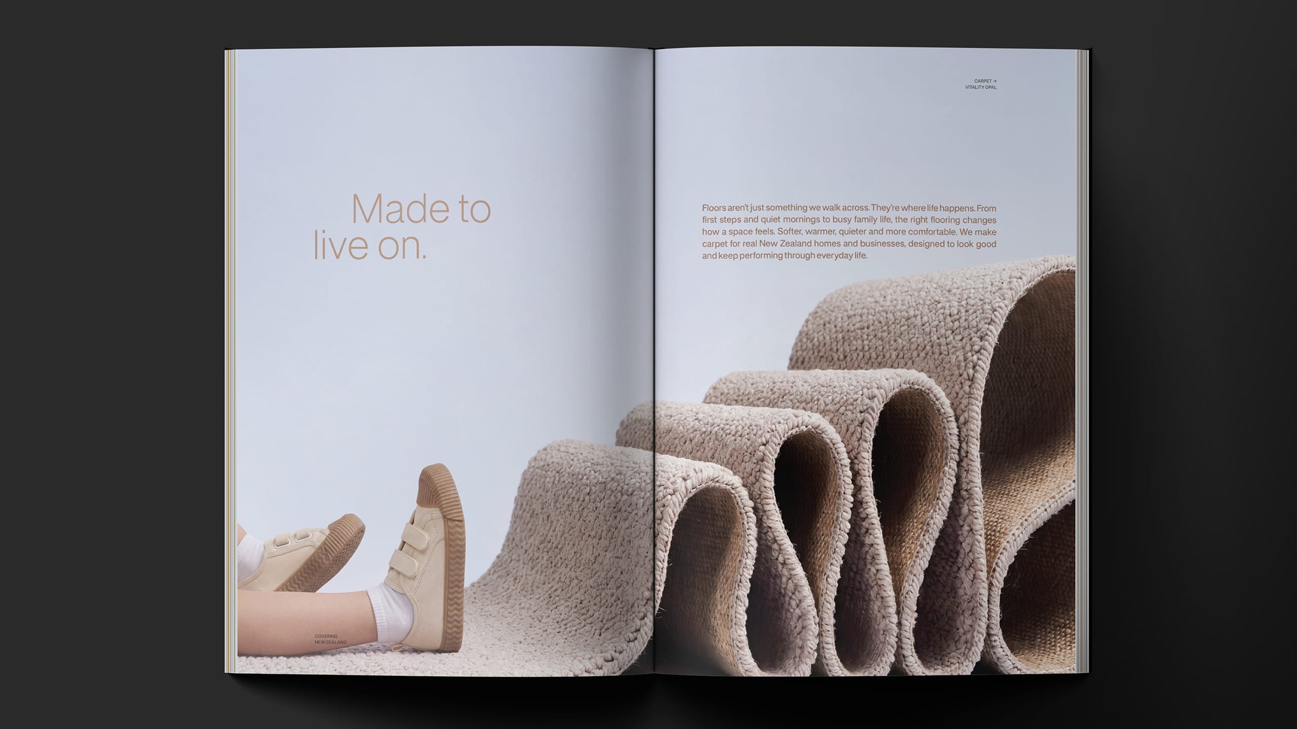
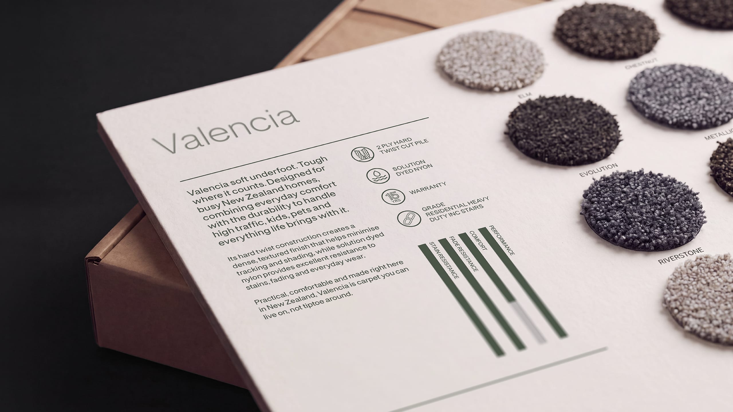
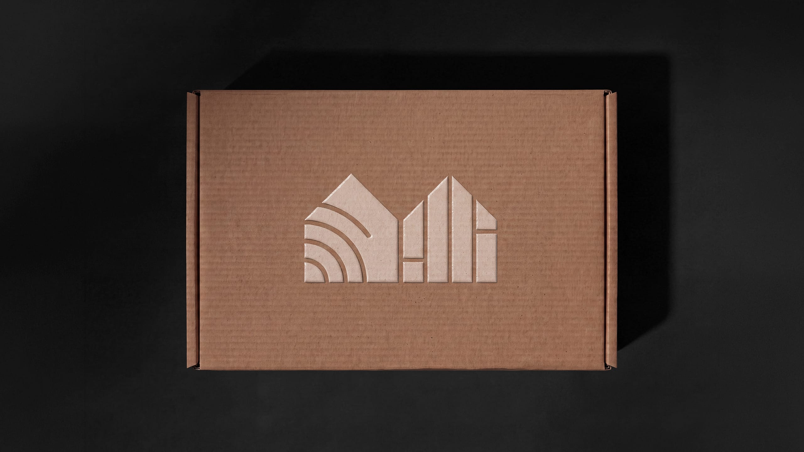
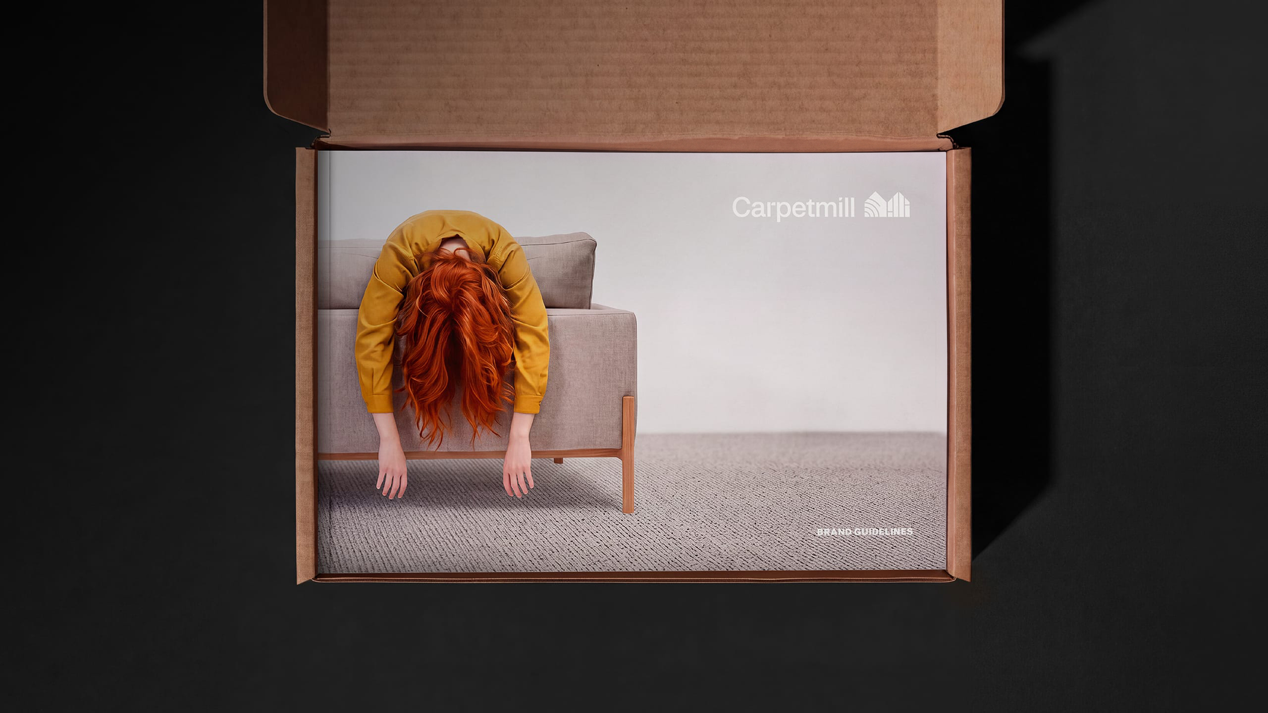
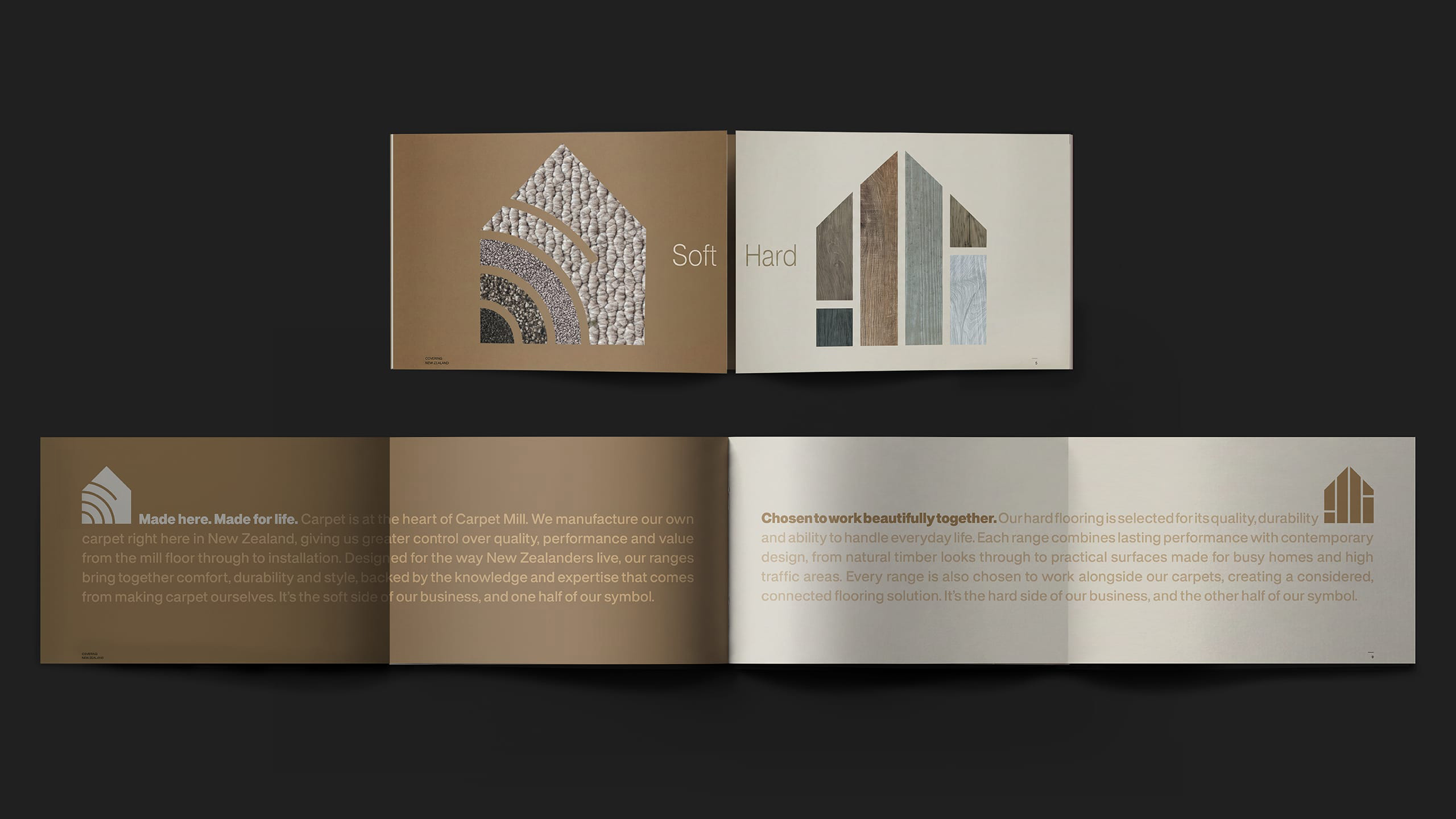
From there, we designed an abstract M to reflect the Mill itself. A distinctive new symbol was divided into two complementary parts representing the two sides of the Carpet Mill business : soft flooring and hard flooring. Together they form one mark, reflecting a business that brings two flooring worlds together under one brand. A sophisticated colour palette, contemporary typography, tactile material cues and a warmer, more human photographic style move Carpet Mill away from traditional flooring retail conventions. The resulting system gives the brand the flexibility to communicate manufacturing expertise and product performance while also celebrating the comfort, character and lived experience flooring brings to a space.
RESULT
The new Carpet Mill transforms the perception of the business from a traditional carpet retailer into a contemporary New Zealand flooring authority. It gives greater visibility to a powerful competitive advantage that had previously been hidden : Carpet Mill doesn’t just sell flooring, it understands how it is made, how it performs and how it should be installed. Manufacturing its own carpet gives the business control over quality and supply, while its expertise across both soft and hard flooring allows it to provide a complete solution.
The result is a more distinctive, sophisticated and cohesive brand designed to build preference beyond price, broaden its appeal and give Carpet Mill greater confidence to stand behind the value it creates.
KEY TAKEAWAY
Carpet Mill already had the difference. The challenge was making that difference visible.
By turning its manufacturing capability and flooring knowledge into the heart of the brand, Carpet Mill can move from simply selling what goes on the floor to owning the expertise behind it. Made for real life brings together the two sides of the business, soft and hard, with one clear idea : flooring designed around the way New Zealanders really live.

Before