CHALLENGE
Church Road sought to introduce a new tier to its portfolio that would celebrate the winemaking excellence of Hawke’s Bay and the craft of the Church Road team, led by winemaker Chris Scott. Positioned between the Grand Reserve range and Tom, this Single Vineyard release needed to communicate premium quality, provenance and craftsmanship, while maintaining coherence within the broader Church Road family. The challenge was to create a visual identity that felt both elevated and unmistakably Church Road.
APPROACH
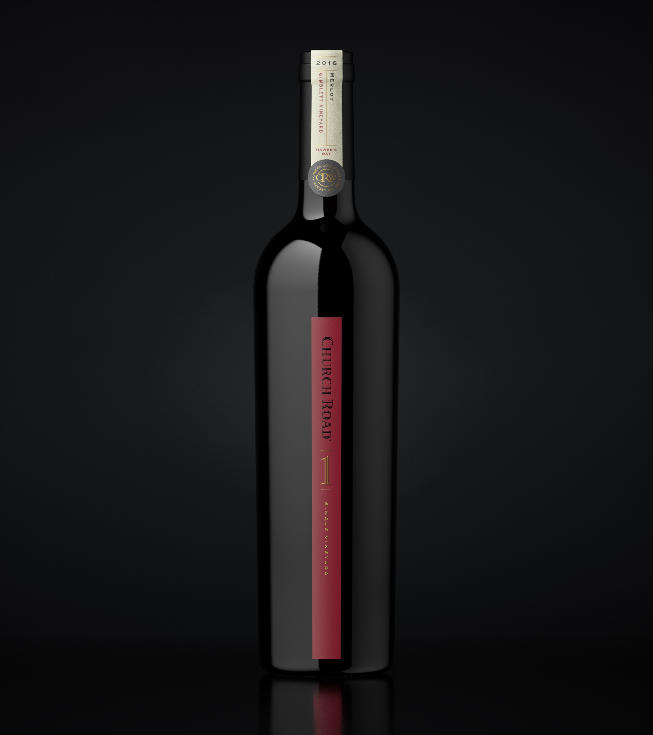
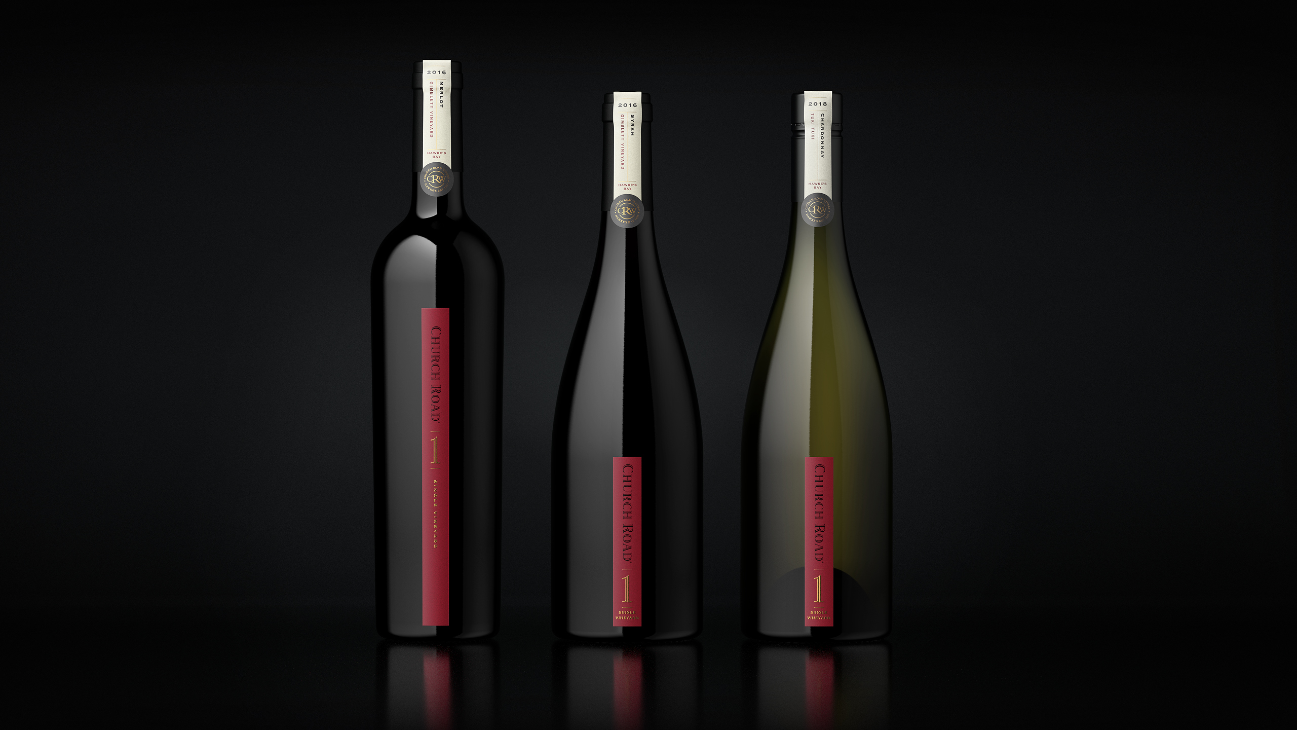
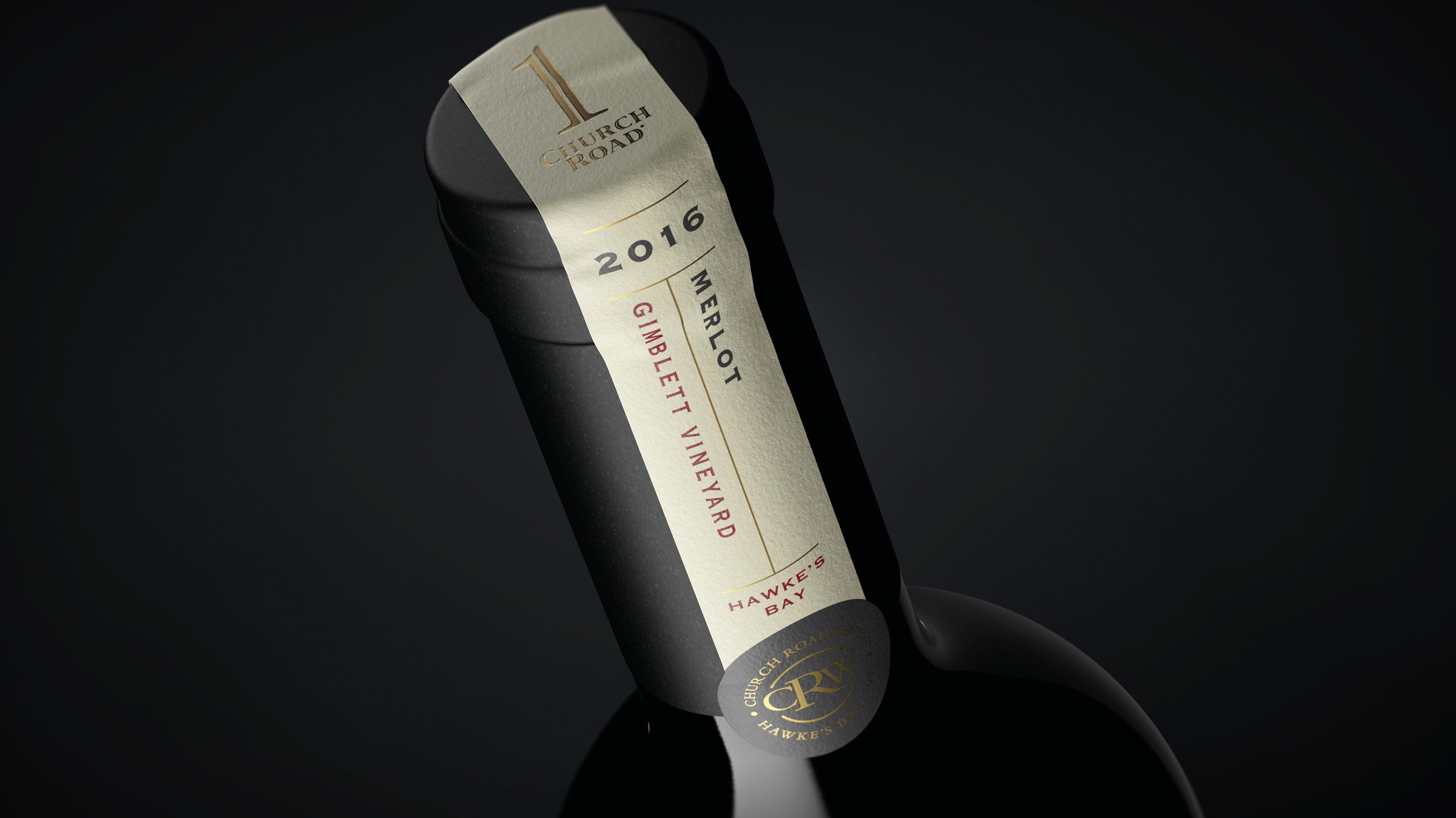
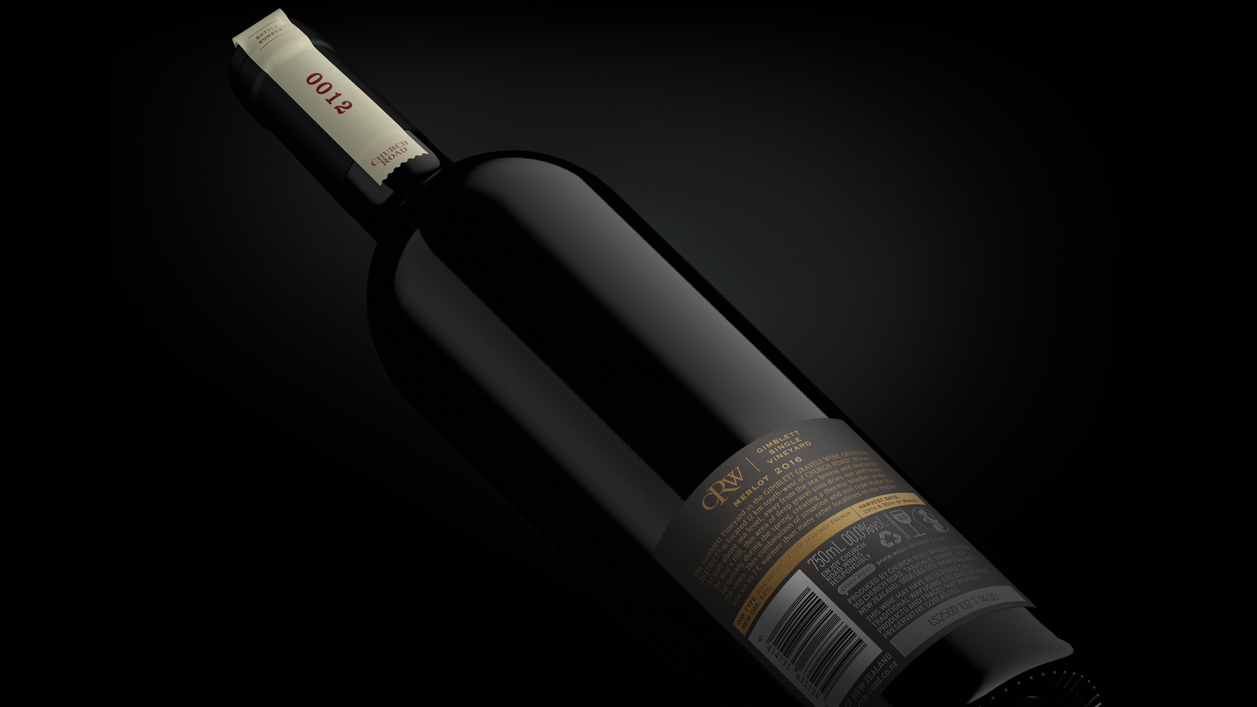
We centred the design on the idea that simplicity is the ultimate sophistication. Drawing from Church Road’s heritage and contemporary confidence, we created a label that reflected purity of place and the singular focus of a vineyard wine. The distinct label shape provided instant shelf and portfolio distinction, while refined detailing, texture and composition conveyed understated luxury. Every design choice was made to evoke credibility, confidence and restraint – qualities that define both Church Road and the wines themselves.
RESULT
The Single Vineyard range introduced a refined new expression of the Church Road brand. Recognisable at a glance, yet distinct within the portfolio. Its simplicity and craftsmanship gave it authority on shelf and in cellar, reflecting the care and precision behind each bottle. The design has strengthened Church Road’s presence in the premium wine segment and cemented its reputation for world-class winemaking.
KEY TAKEAWAY
True sophistication lies in restraint. The Single Vineyard design demonstrates how simplicity, clarity and craftsmanship can communicate authenticity and elevate brand perception without excess.
Featured on DesignRush
https://www.designrush.com/best-designs/awards/packaging