Challenge
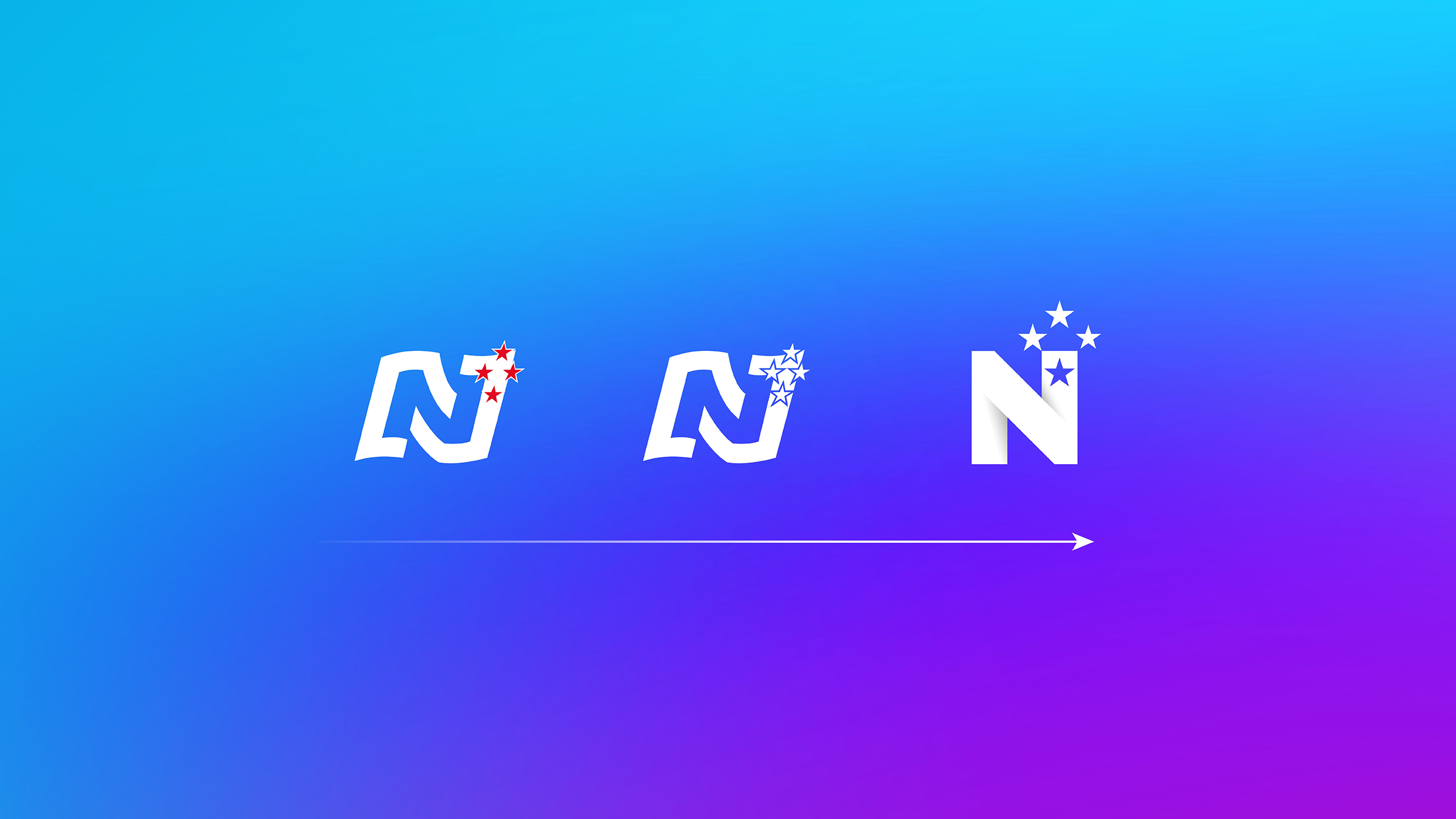
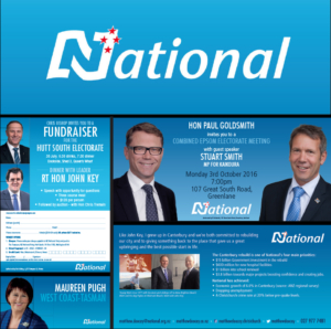
The brief was to modernise one of New Zealand’s most recognisable political identities without losing its heritage. The National Party’s N and Southern Cross were iconic and familiar, yet the overall identity had become static, overly corporate and disconnected from the warmth and optimism the party wanted to project. The challenge was to re-energise the brand to make it feel confident, contemporary and distinctly New Zealand, while retaining the trust and familiarity that decades of visibility had built.
Approach
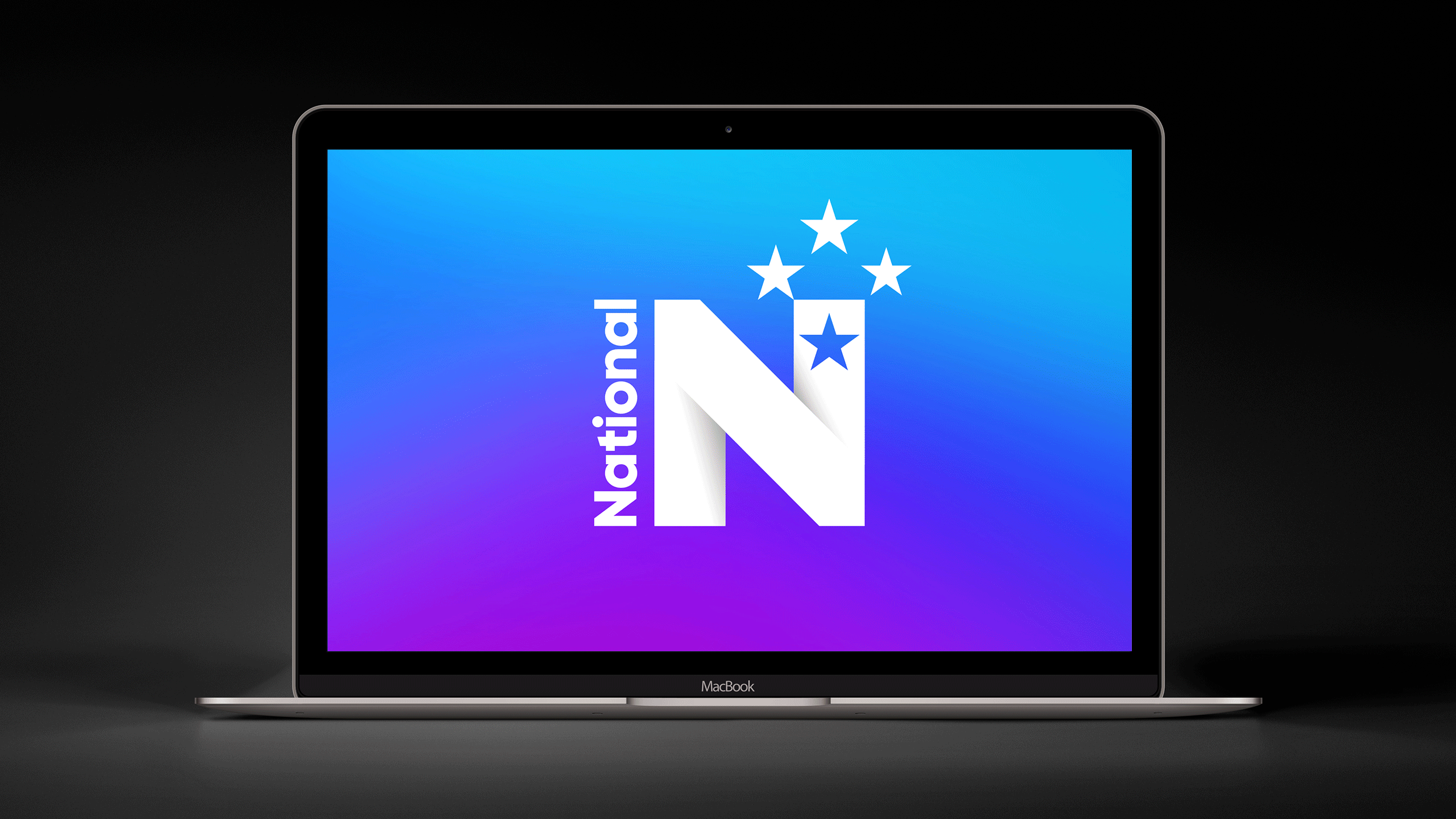
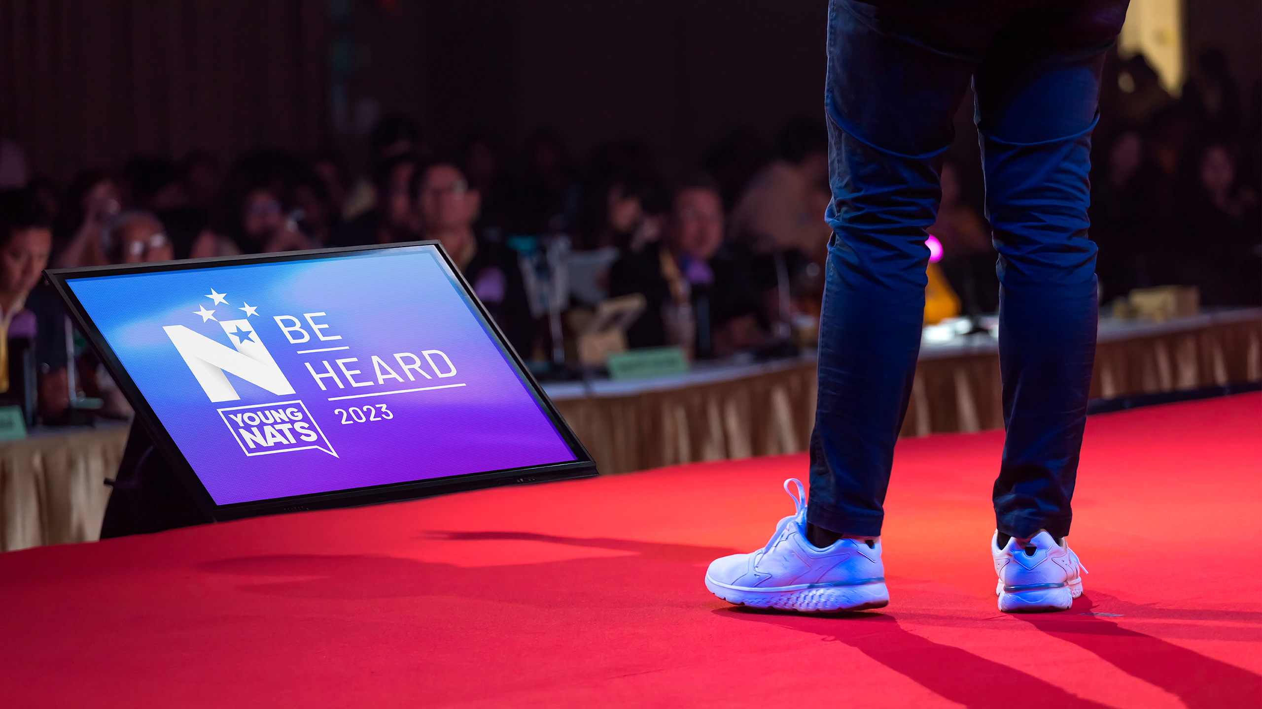
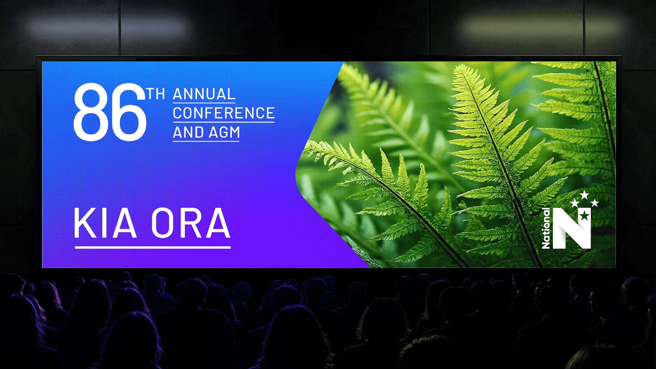
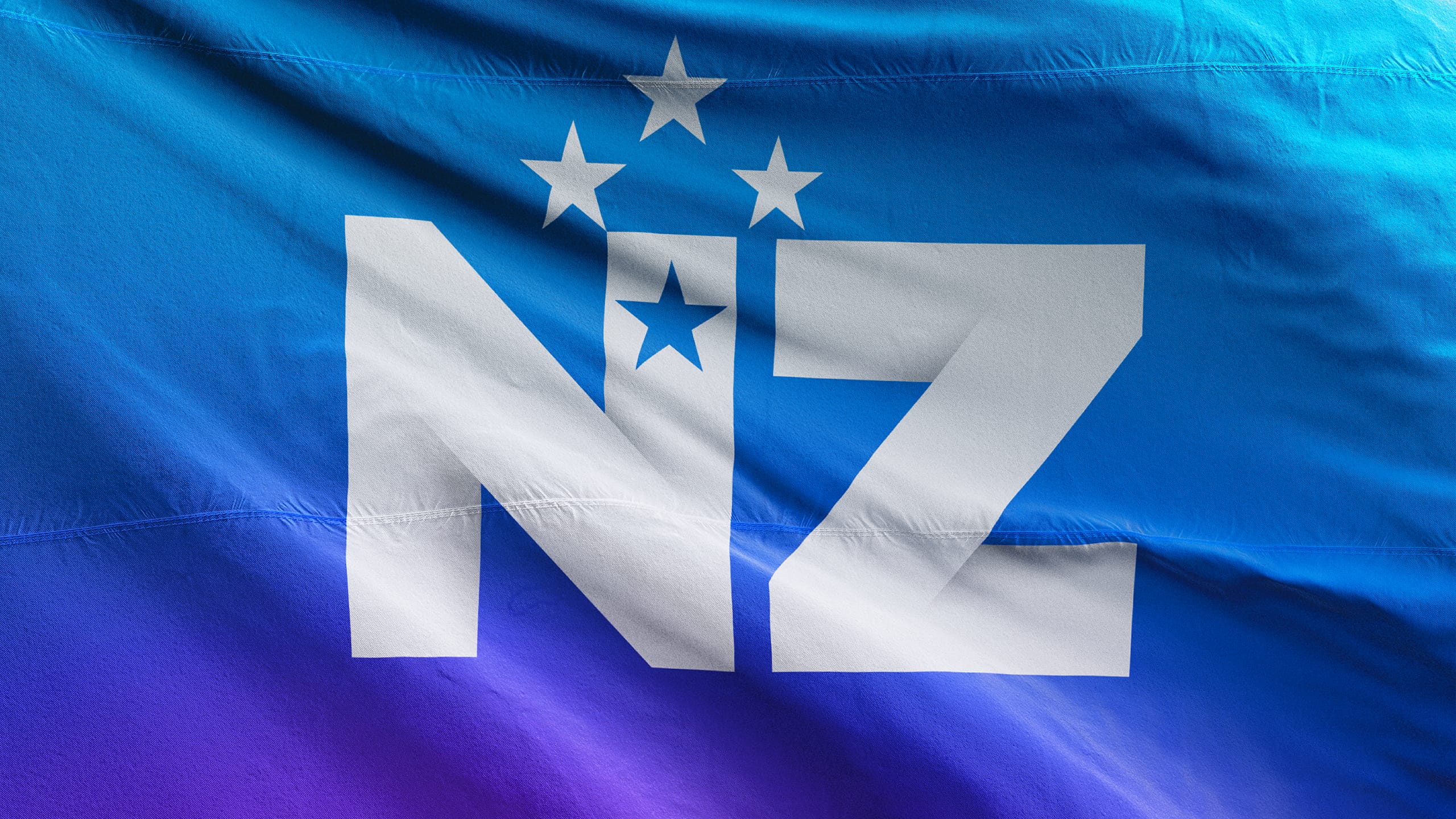
We started by strengthening the N to improve legibility and create a more confident silhouette that worked at every scale and medium – from billboards to digital avatars. The Southern Cross was reimagined as the central feature, symbolising forward energy, aspiration and unity. Colour played a crucial role : a warmer, more vibrant blue replaced the cooler corporate tone, complemented by a magenta accent that added freshness and energy.
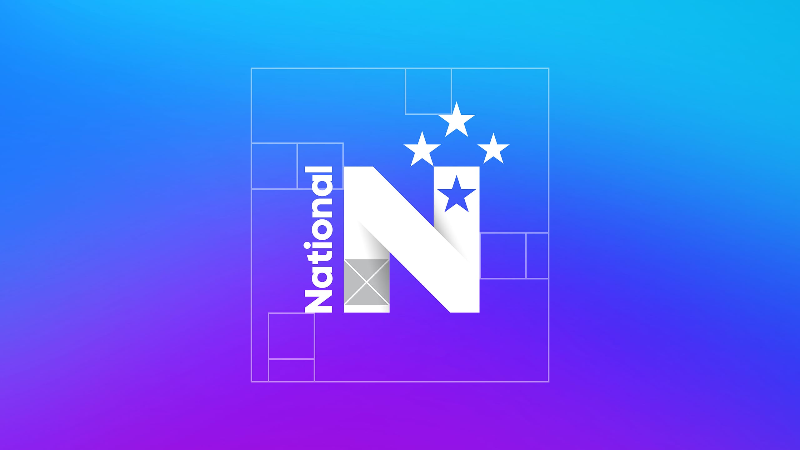
Behind the scenes, we developed a flexible design system and brand toolkit that ensured national consistency and local adaptability. This included logo variations, colour specifications, templates and rollout guidelines – empowering regional teams to apply the identity confidently and correctly, no matter the platform.
Result
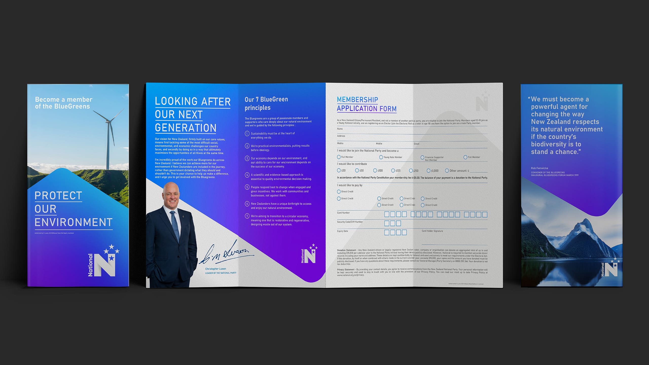
The new identity gave the National Party a revitalised sense of purpose and visibility. The refreshed mark feels open, modern and unmistakably New Zealand – equally effective on a podium, in social media, or in grassroots campaign material. The internal rollout toolkit has improved brand discipline and cohesion across all levels of communication, helping the party present as unified and forward-looking.
Key takeaway
Great brands evolve, they don’t erase their past. By building on familiar symbols and injecting them with renewed energy, the National Party’s identity was transformed into a mark that honours its legacy while looking confidently to the future.
Before