TEGEL — 2015 Repositioning
Note : this case-study was created in 2015/16, it has now changed to a different look under new management.
Challenge
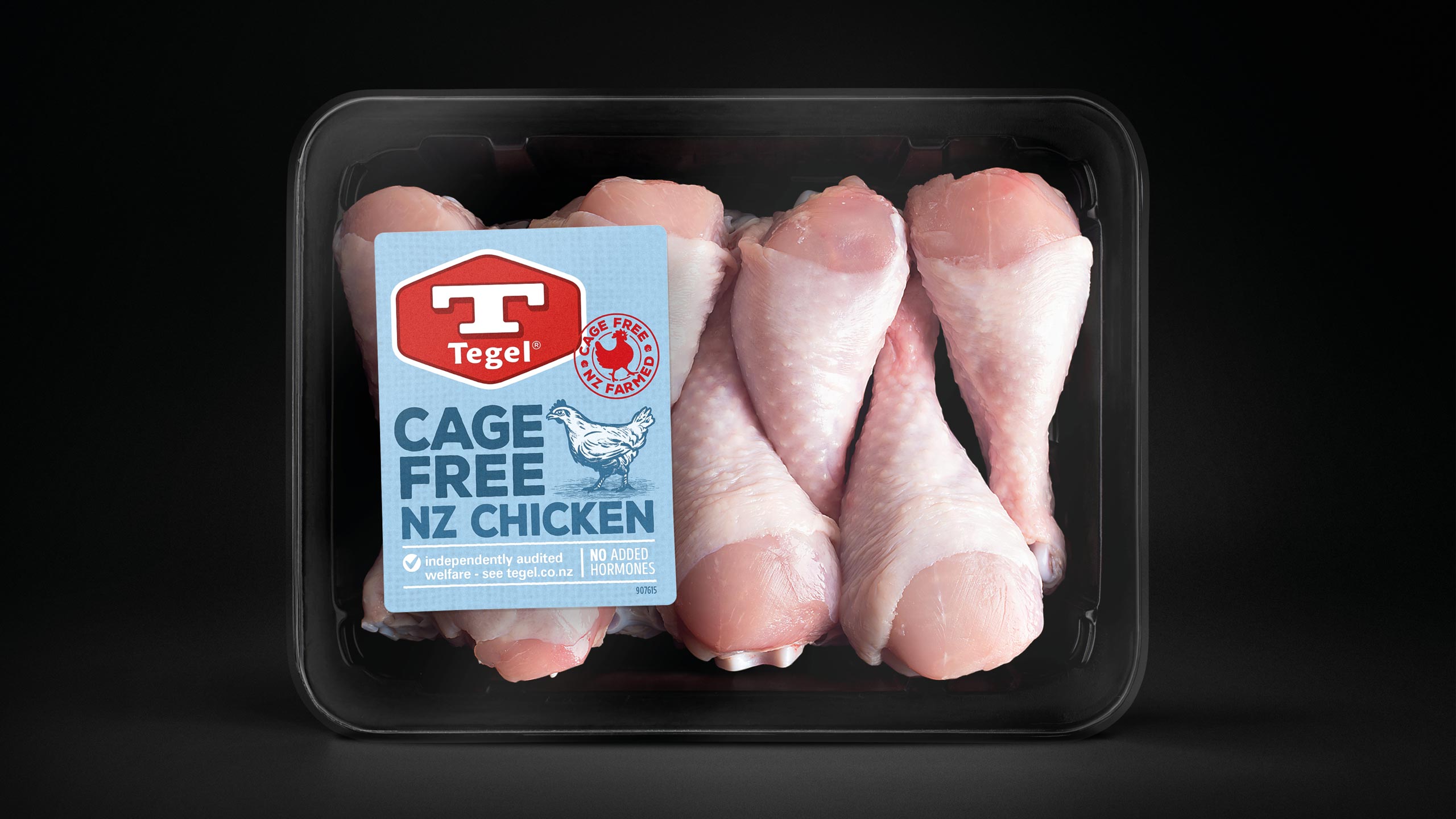
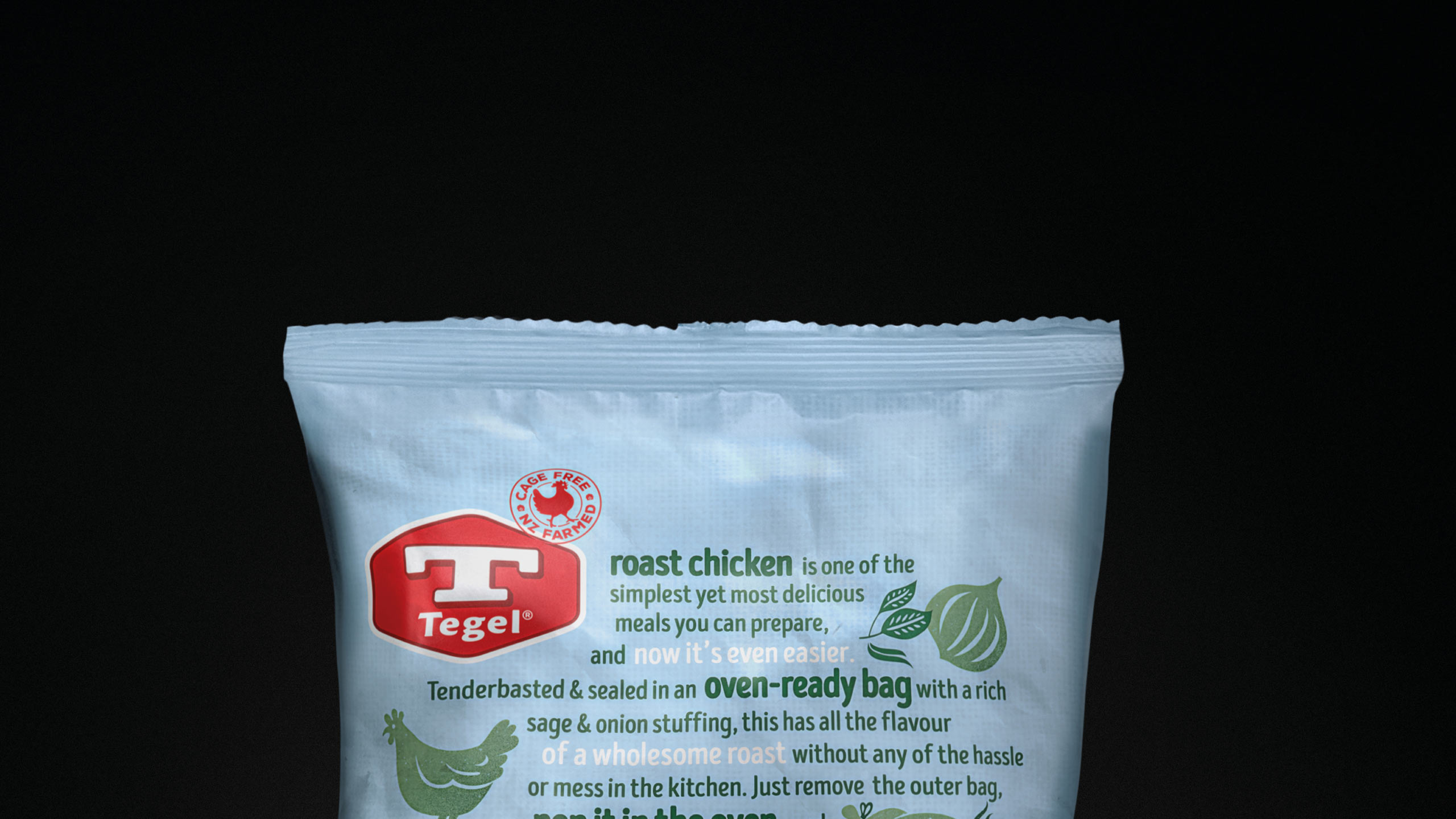
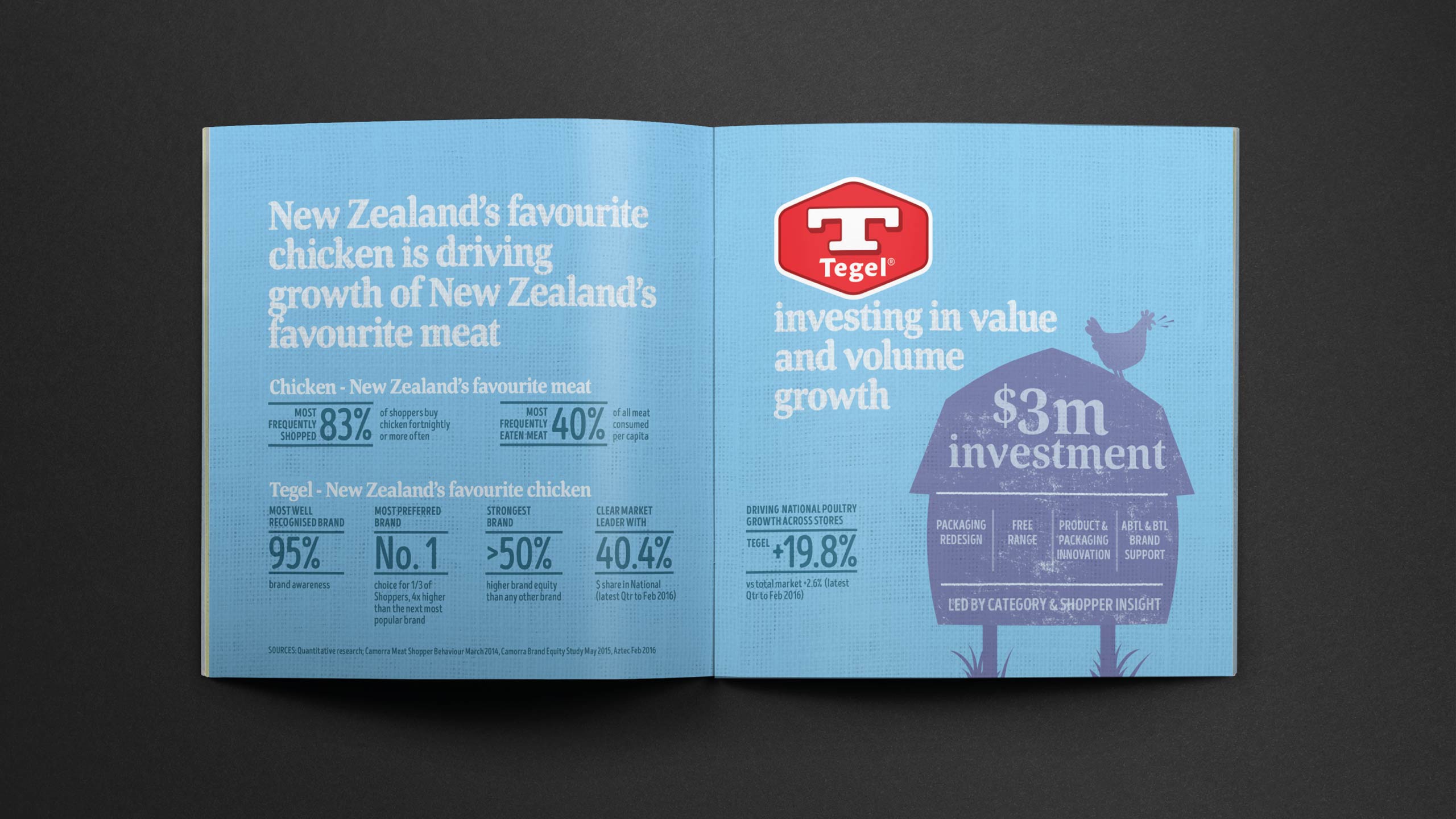
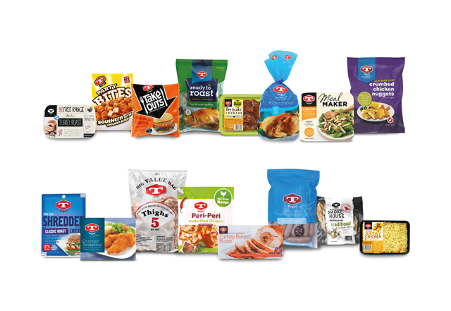
Tegel had long been an iconic New Zealand brand, yet its presence on shelf had become increasingly confused. Our audit uncovered more than eleven versions of the logo in active use. Colour application varied widely. Although the brand was historically associated with blue, this appeared only sporadically across the portfolio, creating a schizophrenic and incoherent impression. With more than thirty sub-branded product offers across Fresh, Frozen, Packaged Deli and Hot Cooked, the brand had lost the unity and confidence expected of a national market leader. This fragmentation weakened Tegel’s position. Years of unstructured product development had created SKU proliferation and inconsistent design execution. The result was a declining share of mind, shelf presence and value, with pressure coming from premium free-range competitors at one end and private label at the other. Tegel needed a comprehensive reset that would respect its heritage but rebuild clarity and leadership across every point of purchase.
Approach
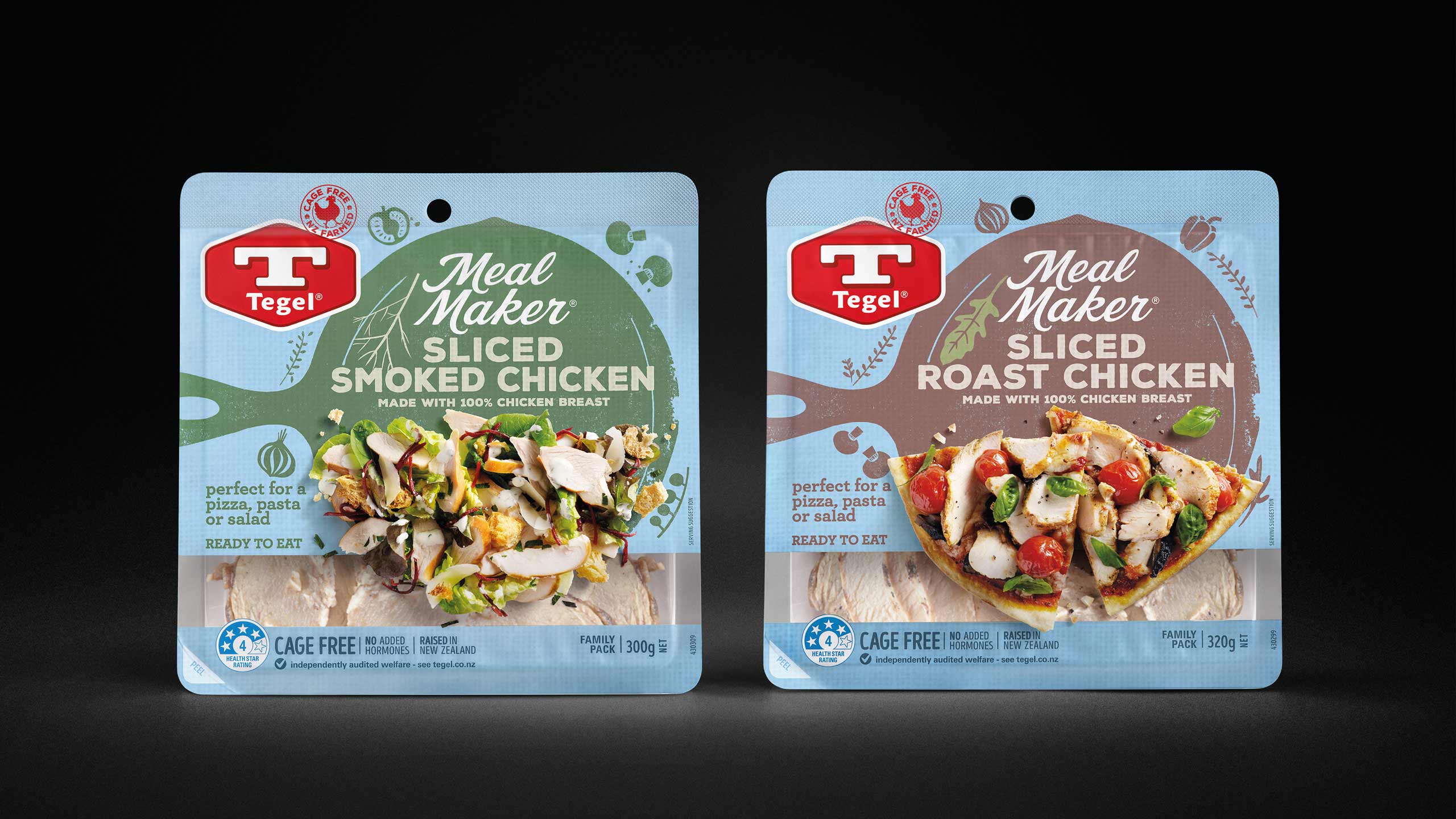
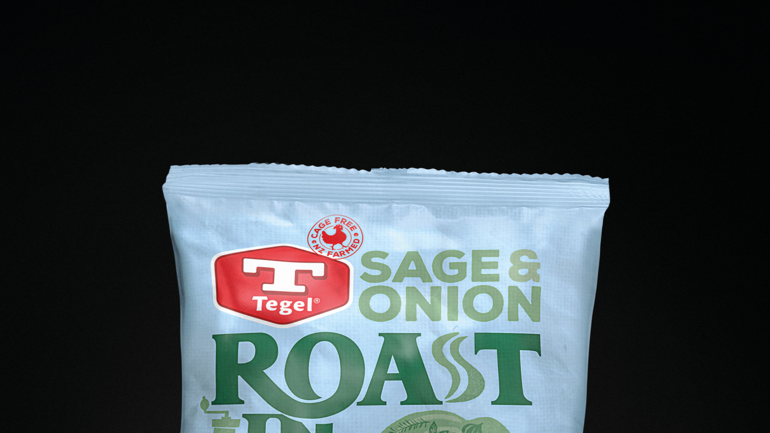
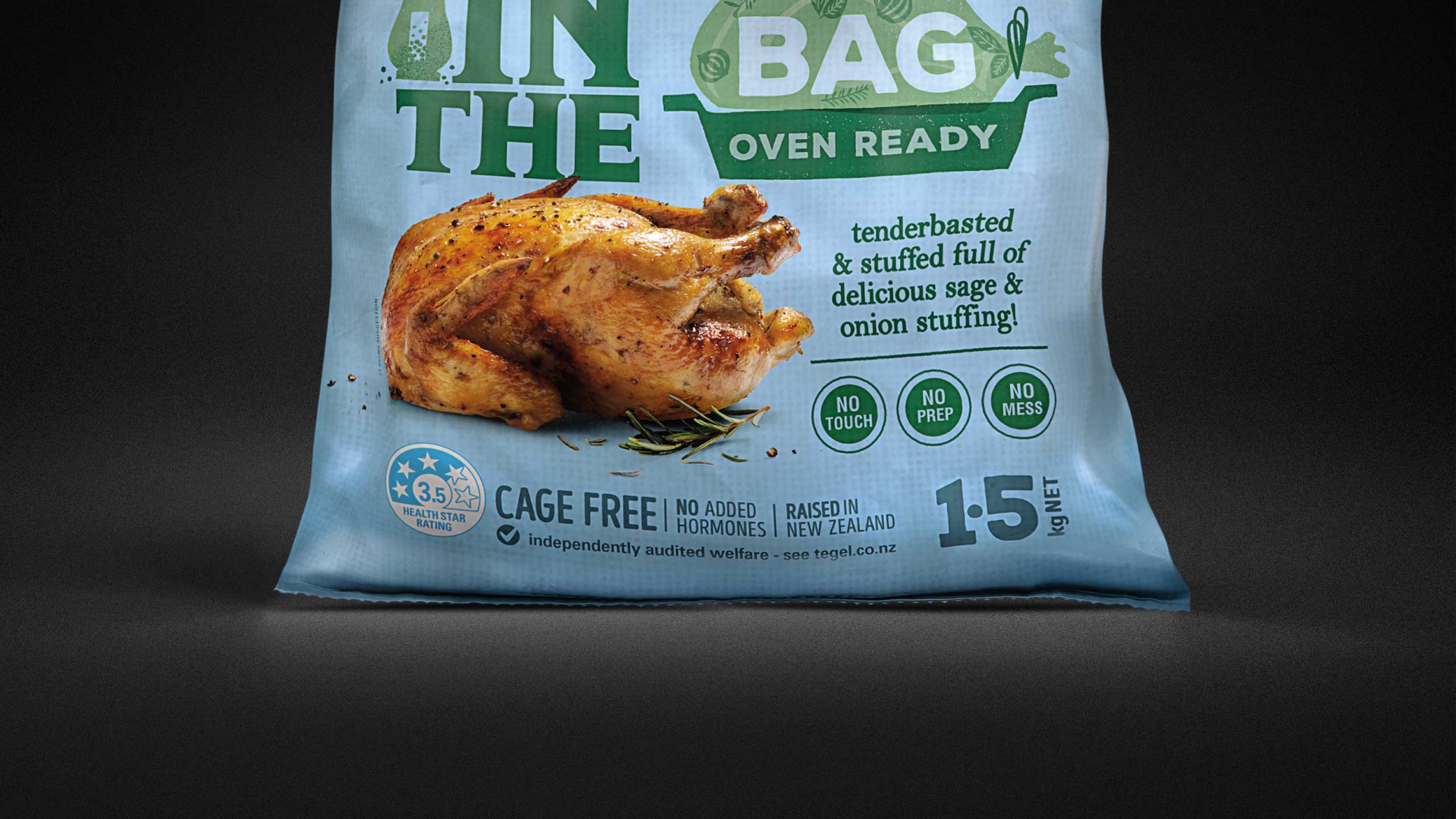
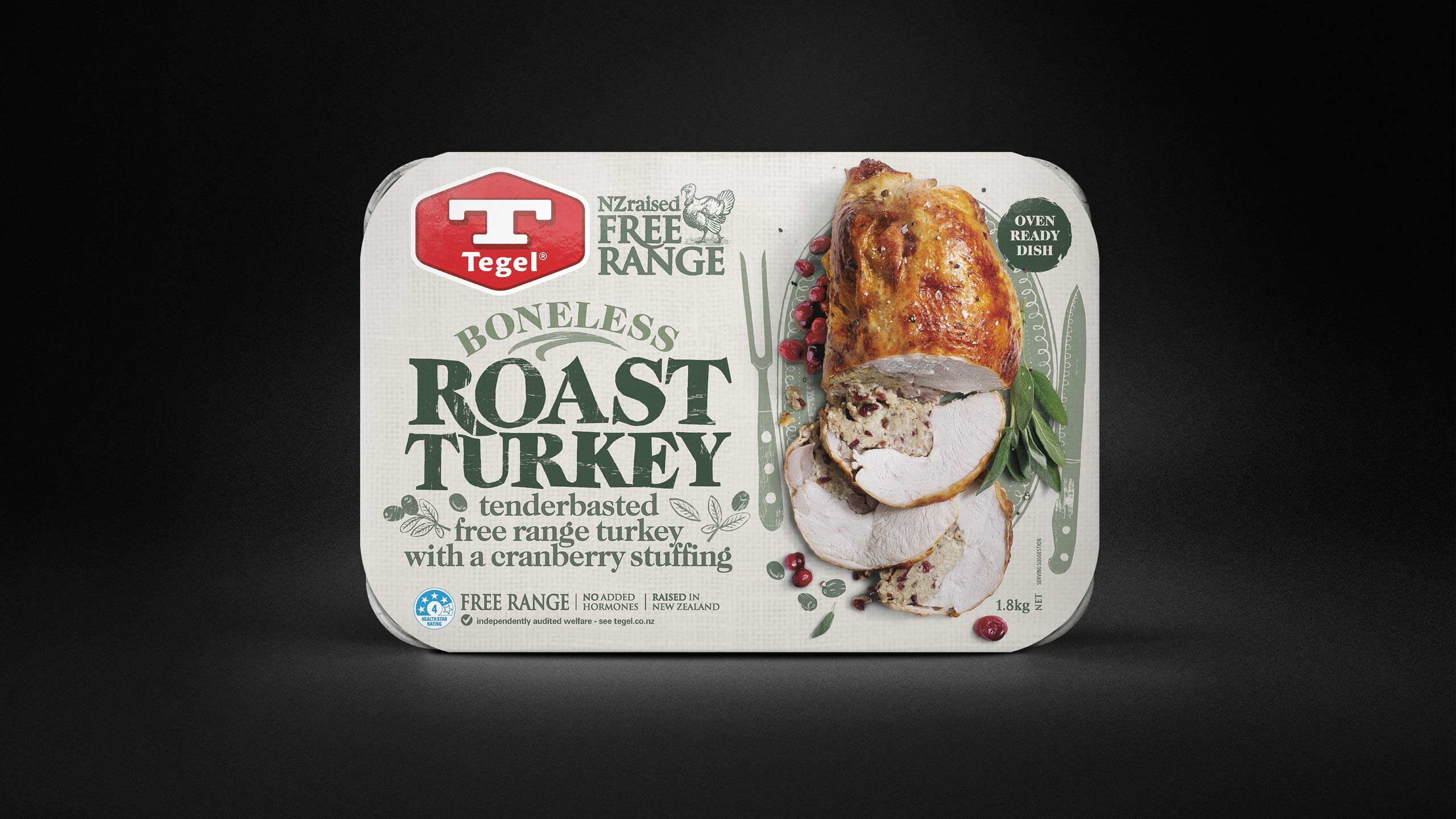
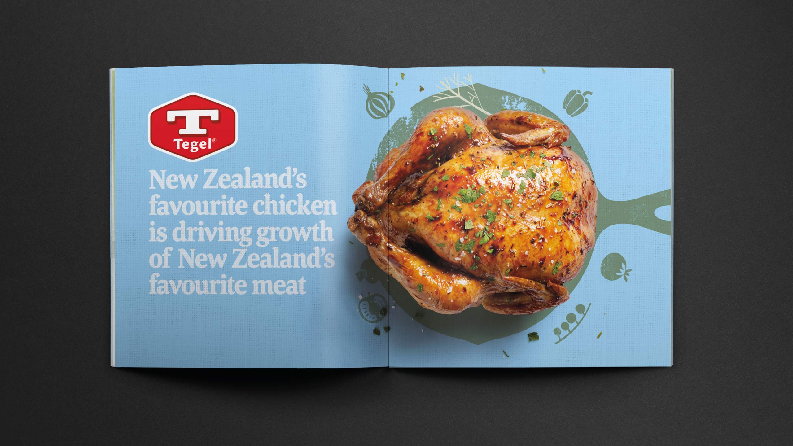
In late 2015, we embarked on a full repositioning of the brand. Blue was mandatory and could not be abandoned; it was too deeply rooted in Tegel’s history. The problem lay in how to make blue work as the anchor colour while still achieving variant differentiation, warmth, appetite appeal and clear category navigation. The answer came in shifting to a paler, more natural sky blue that felt fresher, lighter and more open. This created a calm, unifying canvas that allowed colour, flavour cues and delicious imagery to stand out without visual conflict.
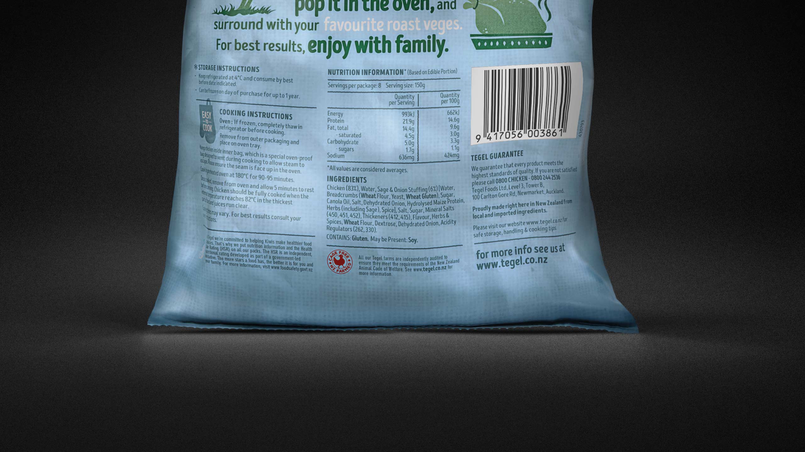
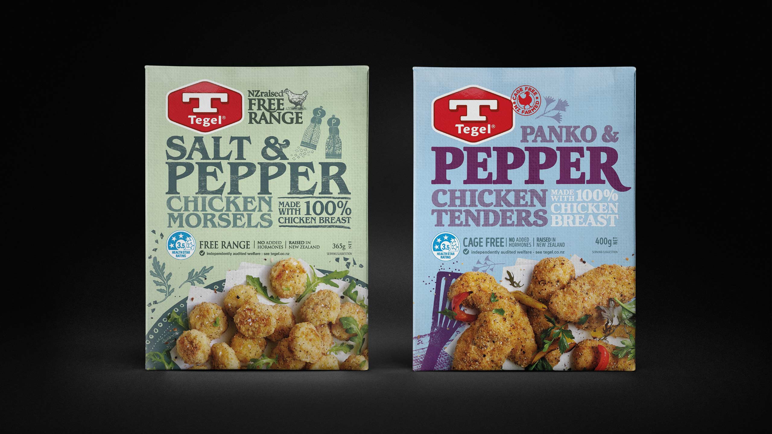
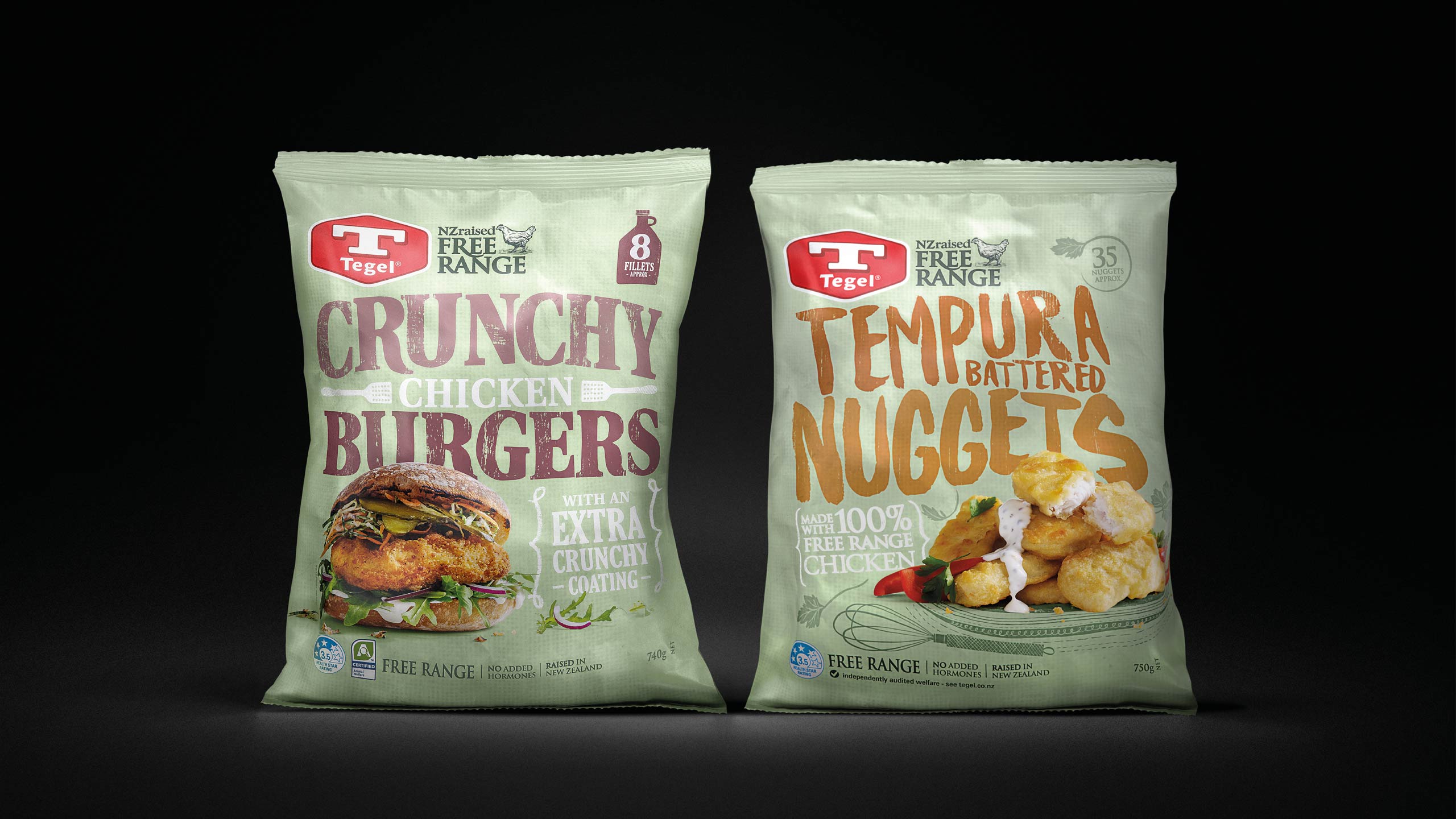
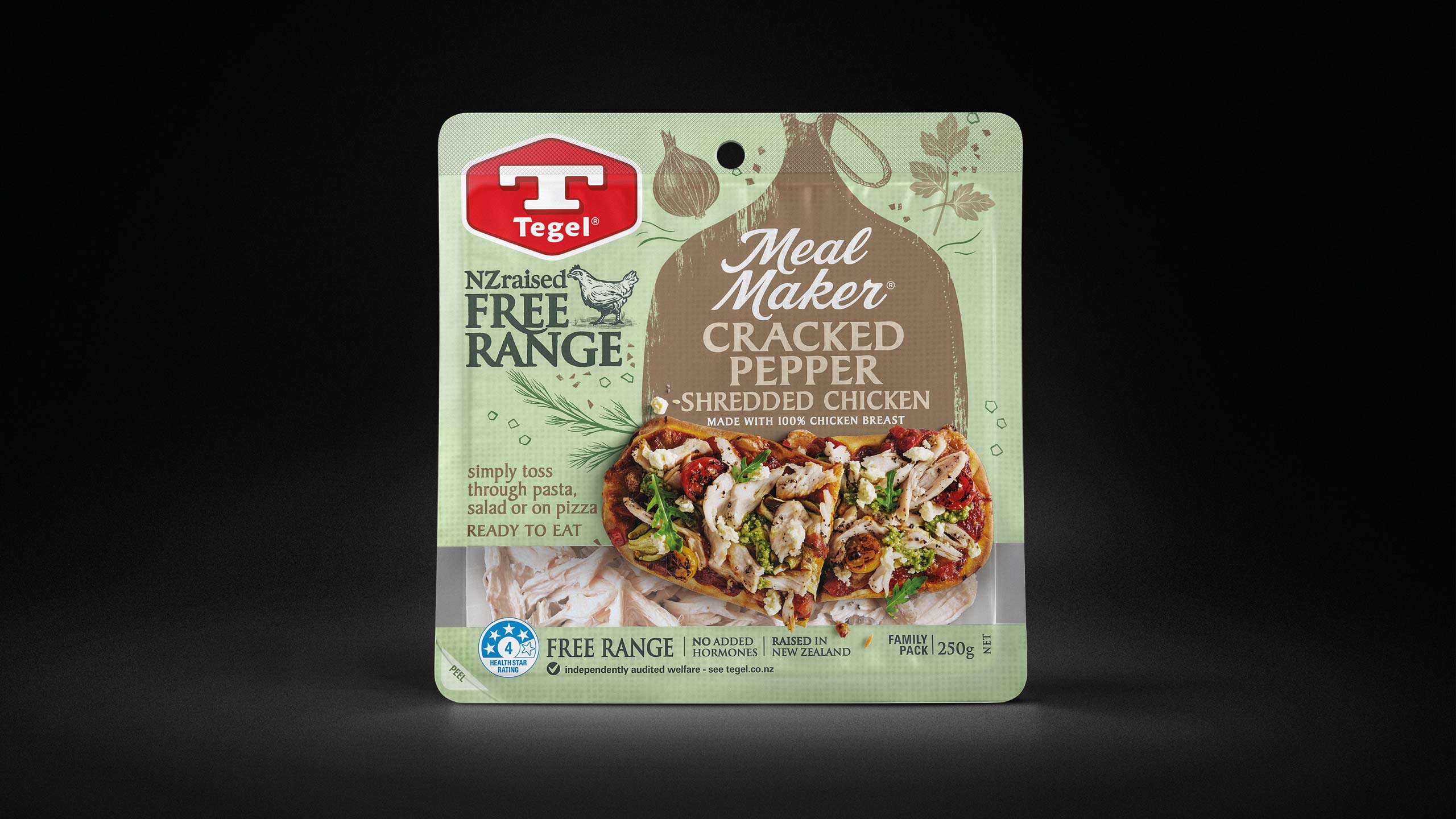
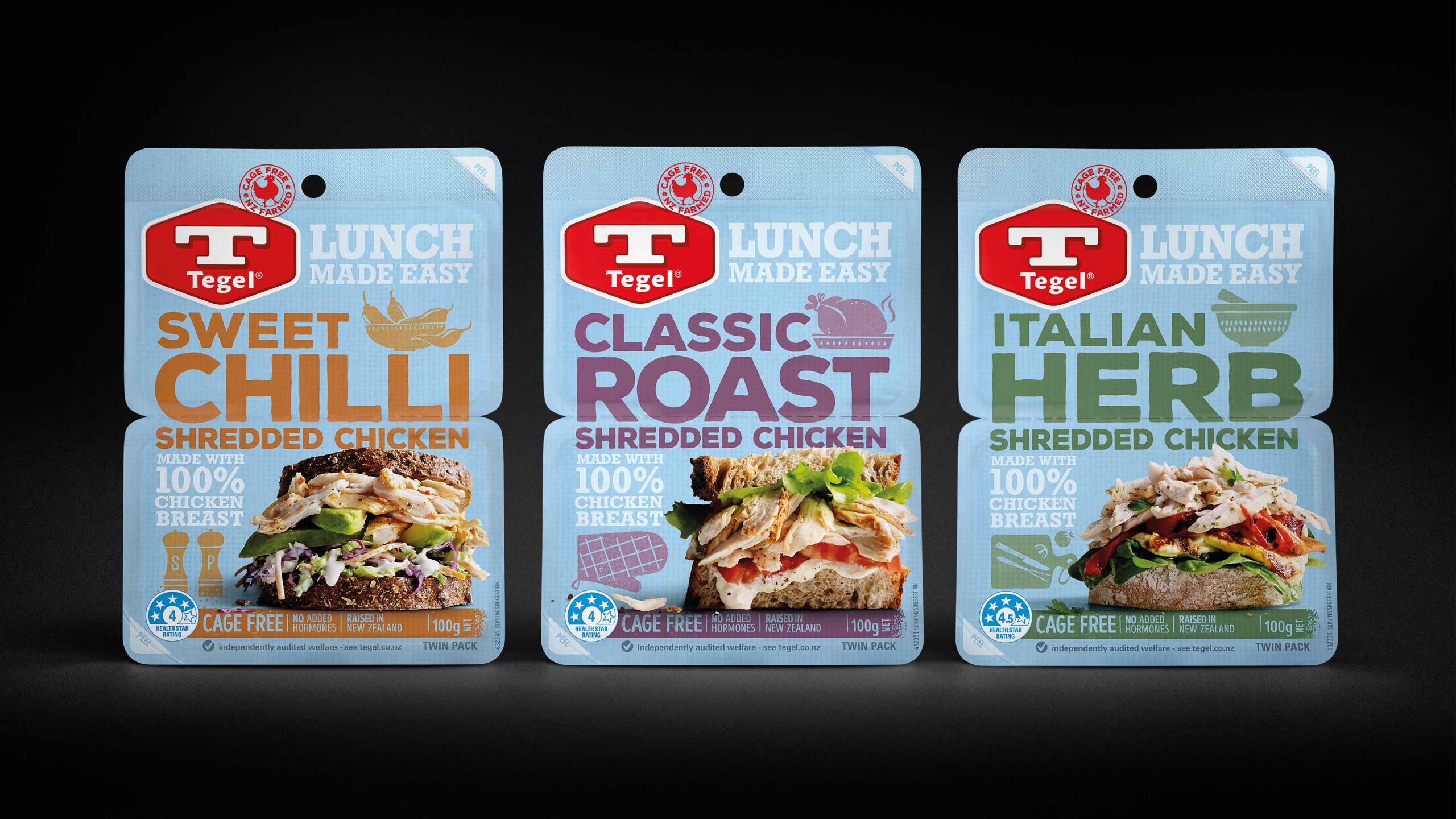
From this foundation, we built a coherent sub-brand hierarchy and introduced disciplined structure across the portfolio. Category-specific cues supported distinct shopper missions, while provenance and animal welfare assurances were brought forward with far greater clarity. A dynamic family look ensured consistency across more than 240 SKUs and an extensive export range. The design system had enough flexibility to express different need states across Fresh, Frozen, Deli and Hot Cooked, yet remained unmistakably Tegel in every environment.
Result
The revitalised identity re-established Tegel as a cohesive and confident brand across the store. What had been a scattered, inconsistent presence became a unified system with clear differentiation, strong appetite appeal and a modern expression of its heritage. The new sky blue provided the consistency the brand desperately needed while unlocking the space for sub-brand colour, photography and communication to work with greater impact. Shelf navigation improved, category recognition lifted and Tegel regained the visibility and authority it had been losing. The clarity and structure of the new system strengthened the brand’s ability to compete at both the premium and value ends of the market, supporting renewed growth in an intensely competitive grocery landscape.
Key takeaway
A mandatory colour can be a constraint or a strategic anchor. By reframing blue through a more natural sky tone and rebuilding the system around it, we transformed Tegel’s fragmented identity into a coherent, emotionally engaging brand with the strength to lead again.
Before