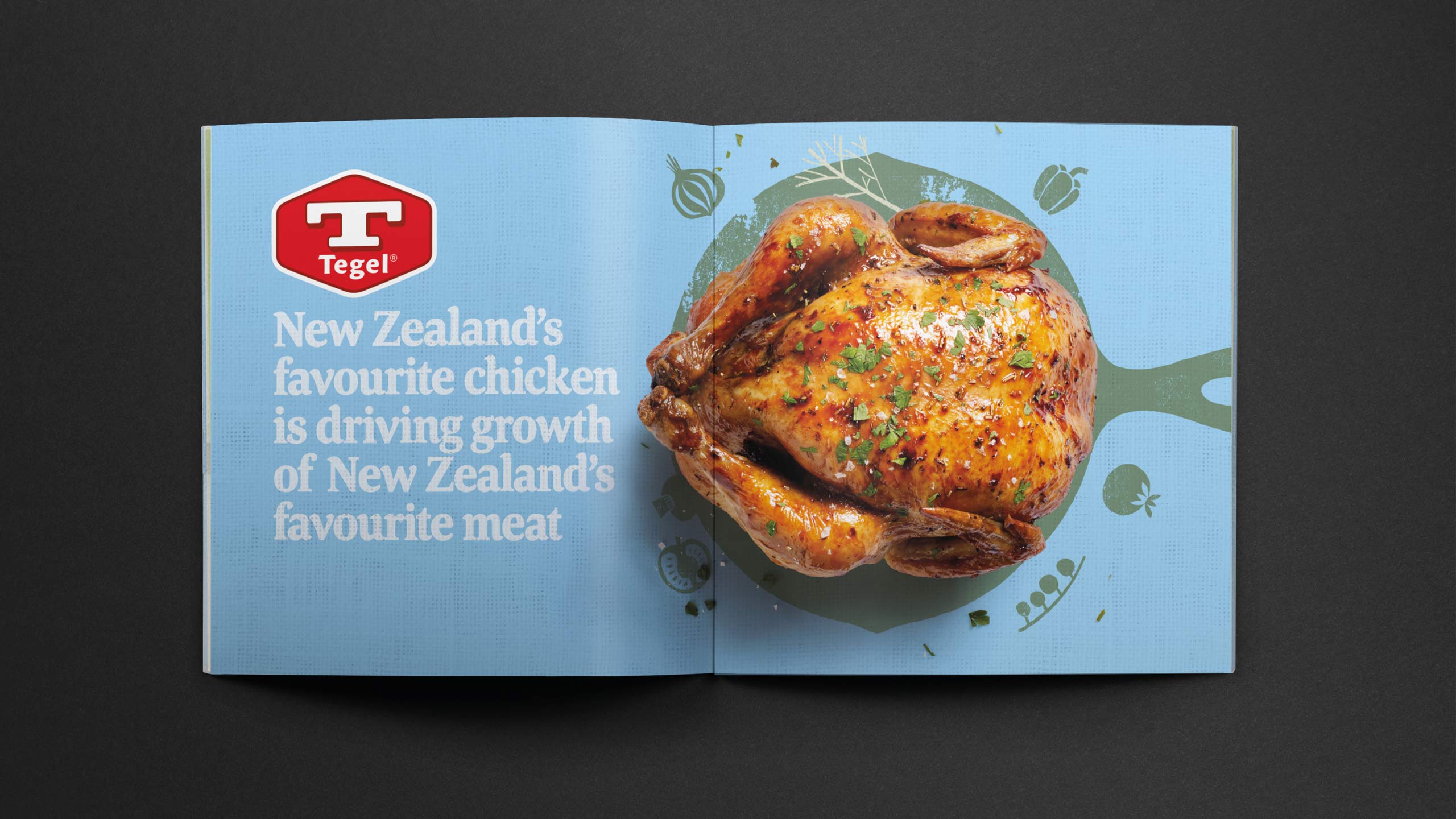
TEGEL — 2015 Repositioning
Note : this case-study was created in 2015/16, it has now changed to a different look under new management.
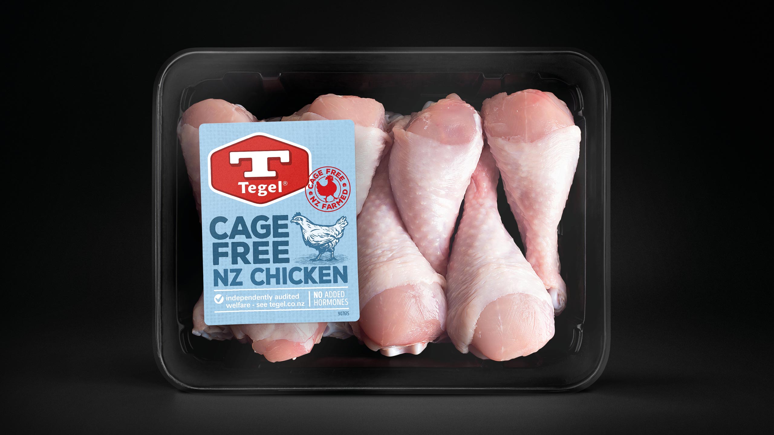
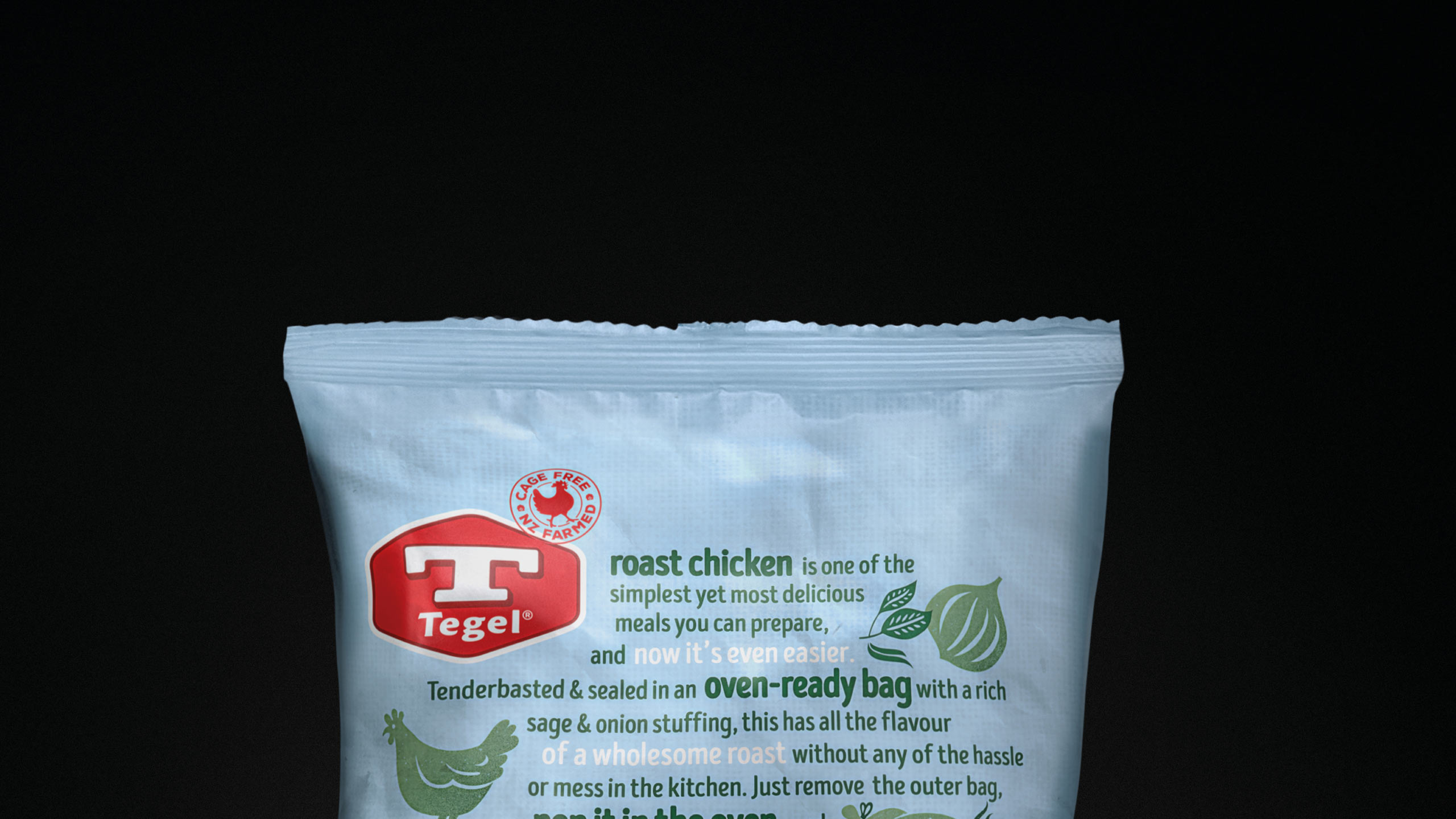
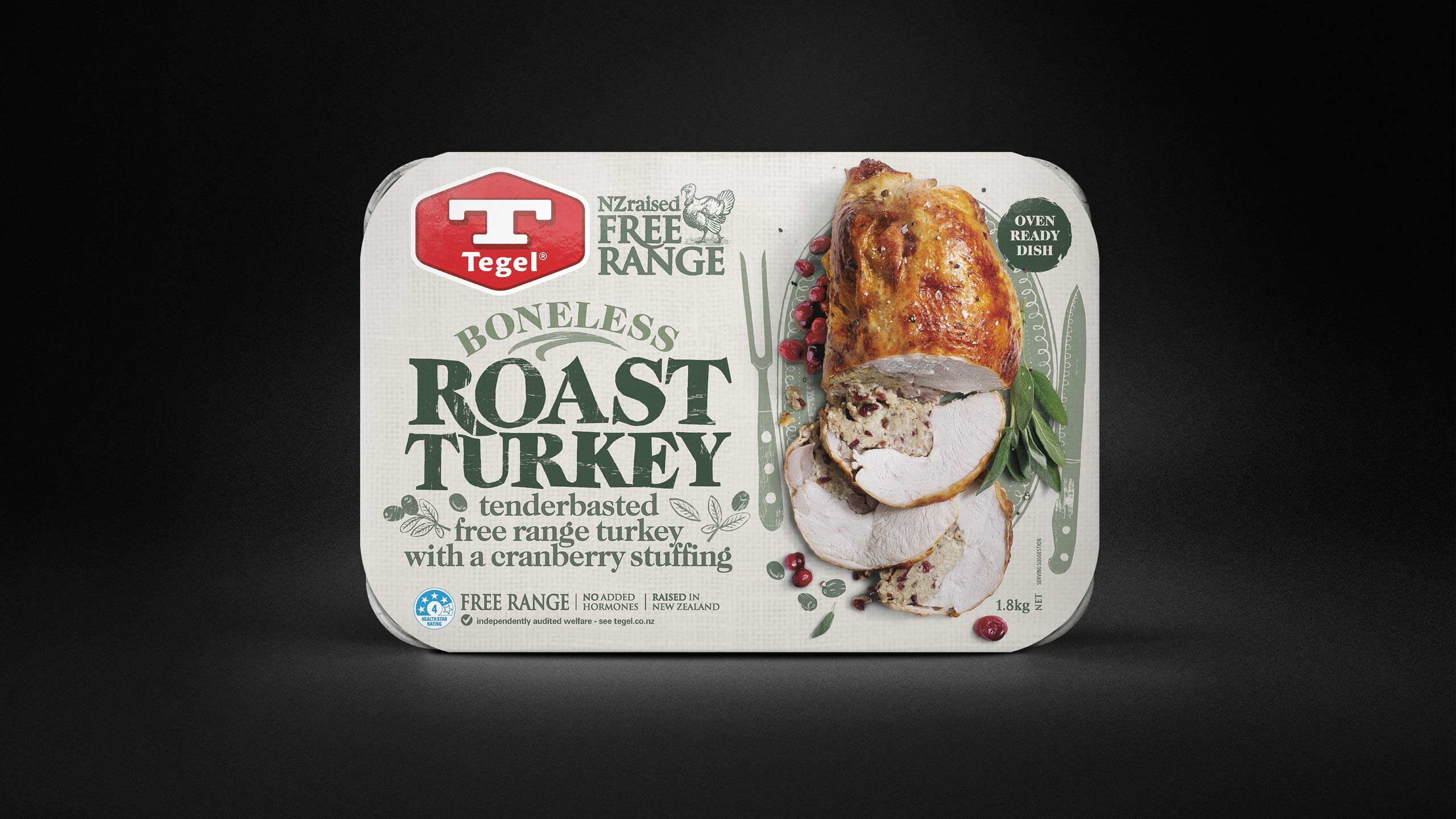
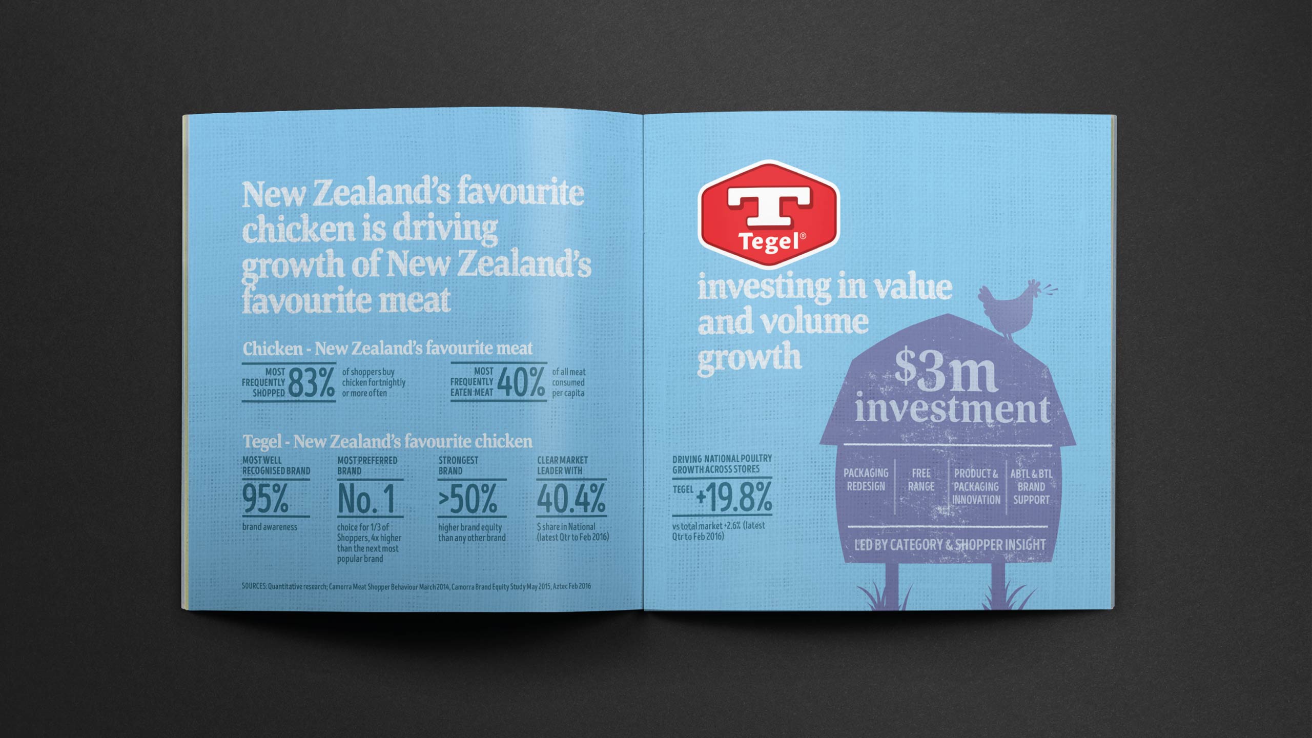
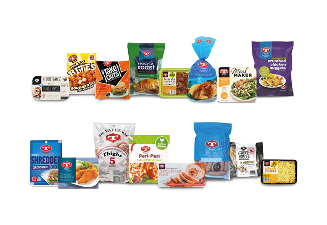
Tegel had been an iconic NZ brand with more than 30 sub-branded product offerings across four very different grocery categories; Fresh, Frozen, Packaged Deli and Hot Cooked.
Brand strength had been significantly eroded by unstructured product development resulting in sku proliferation and inconsistent design across each sub-brand. Tegel was losing share of mind, market share, shelf space and value to competitor offers at both the premium Free range and Private Label value ends of the market across the store.
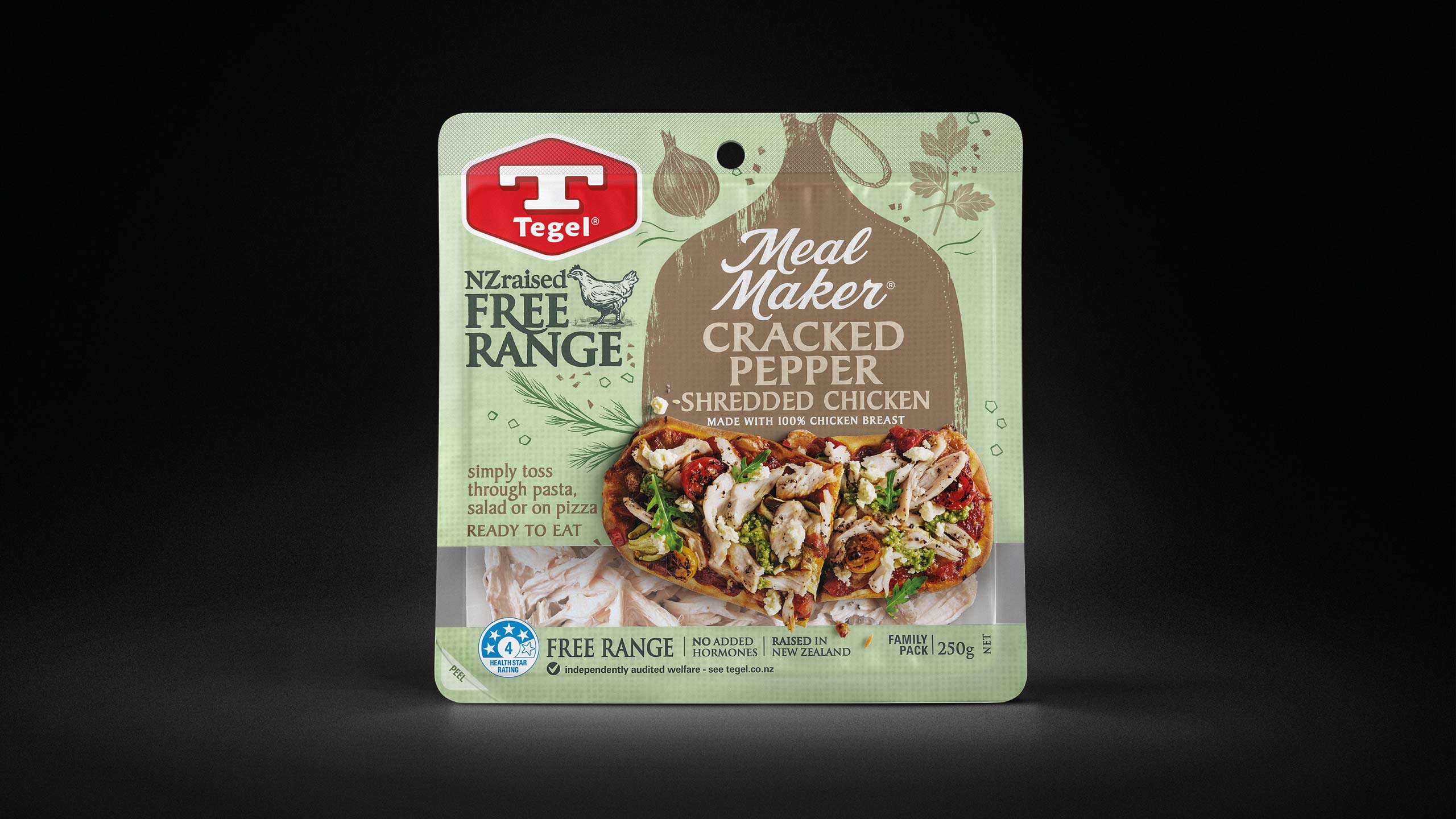
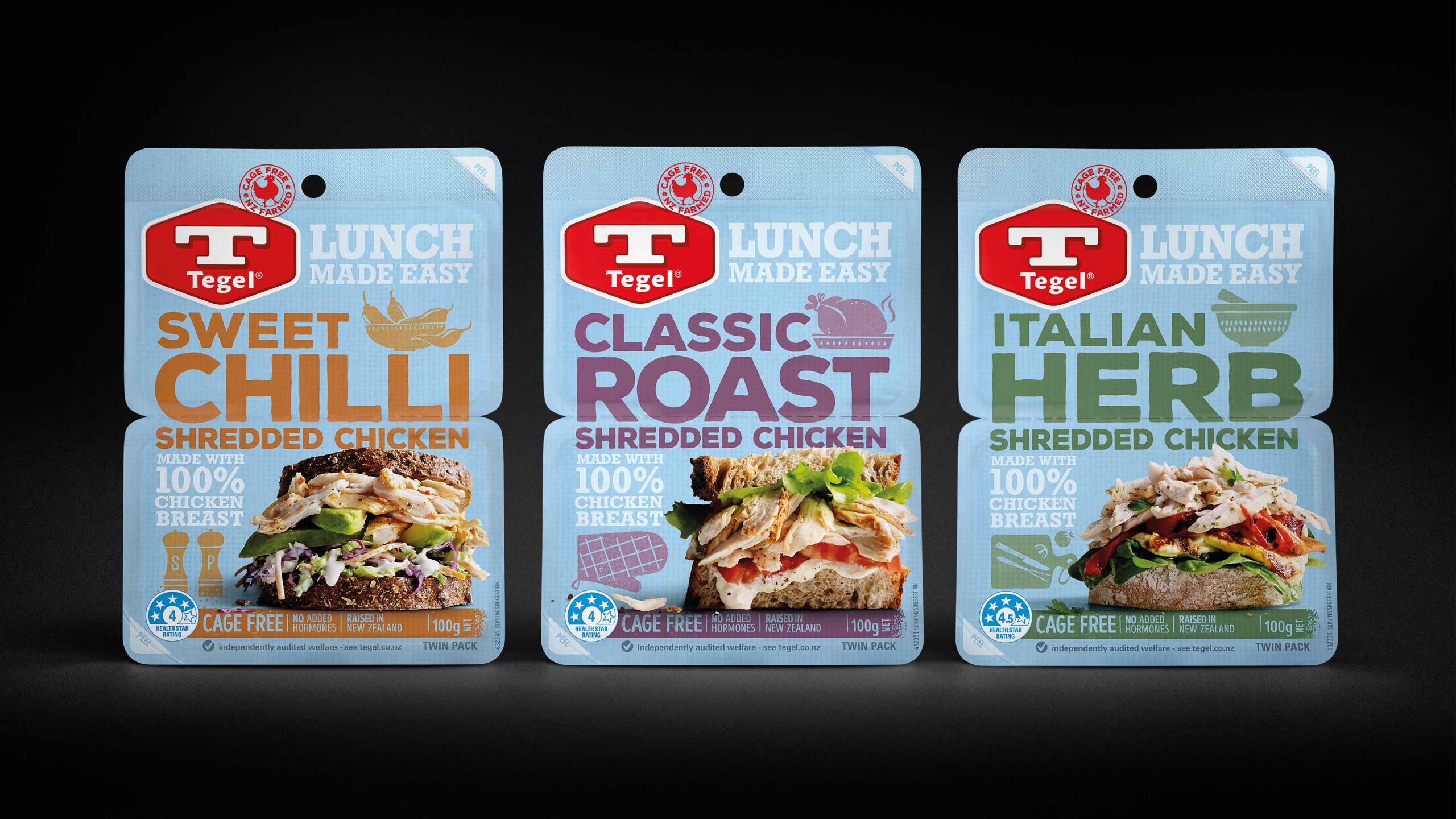
Late 2015 we embarked on a repositioning of the brand. The brief was to establish a strong consistent impression across the store that recognised but contemporised Tegel’s brand heritage. Create a clear sub-brand structure and hierarchy and deliver key shopper cues specific to each Category. Ensure stand out and ease of shopping across each Category’s very different point of purchase formats. Establish a clear premium to value hierarchy of each range within the category. Communicate critical provenance and animal welfare assurances. Inform usage and create stand-out appetite appeal.
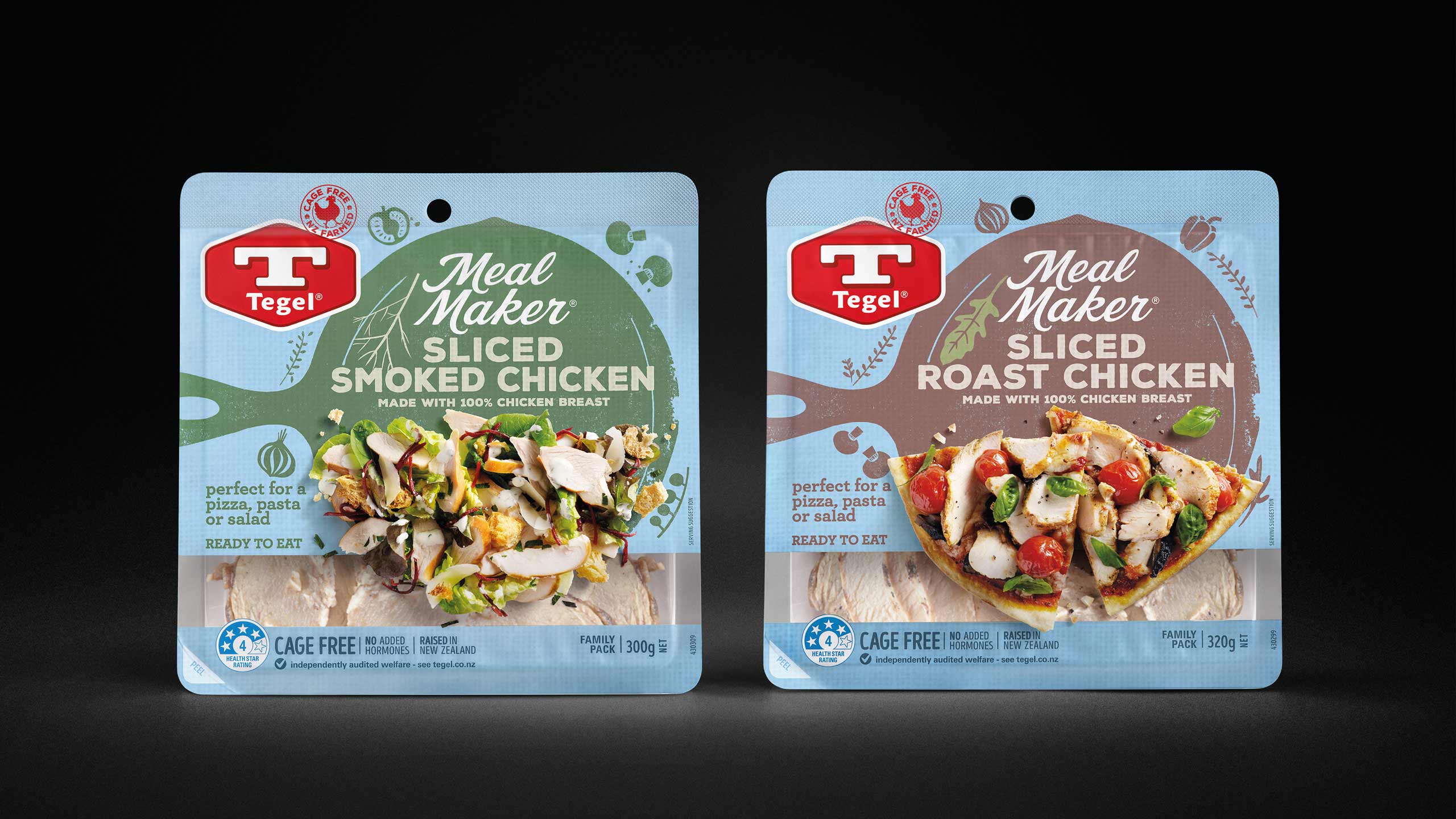
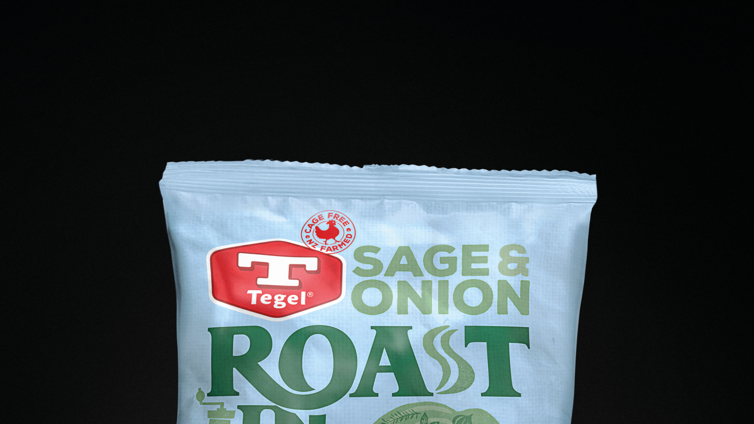
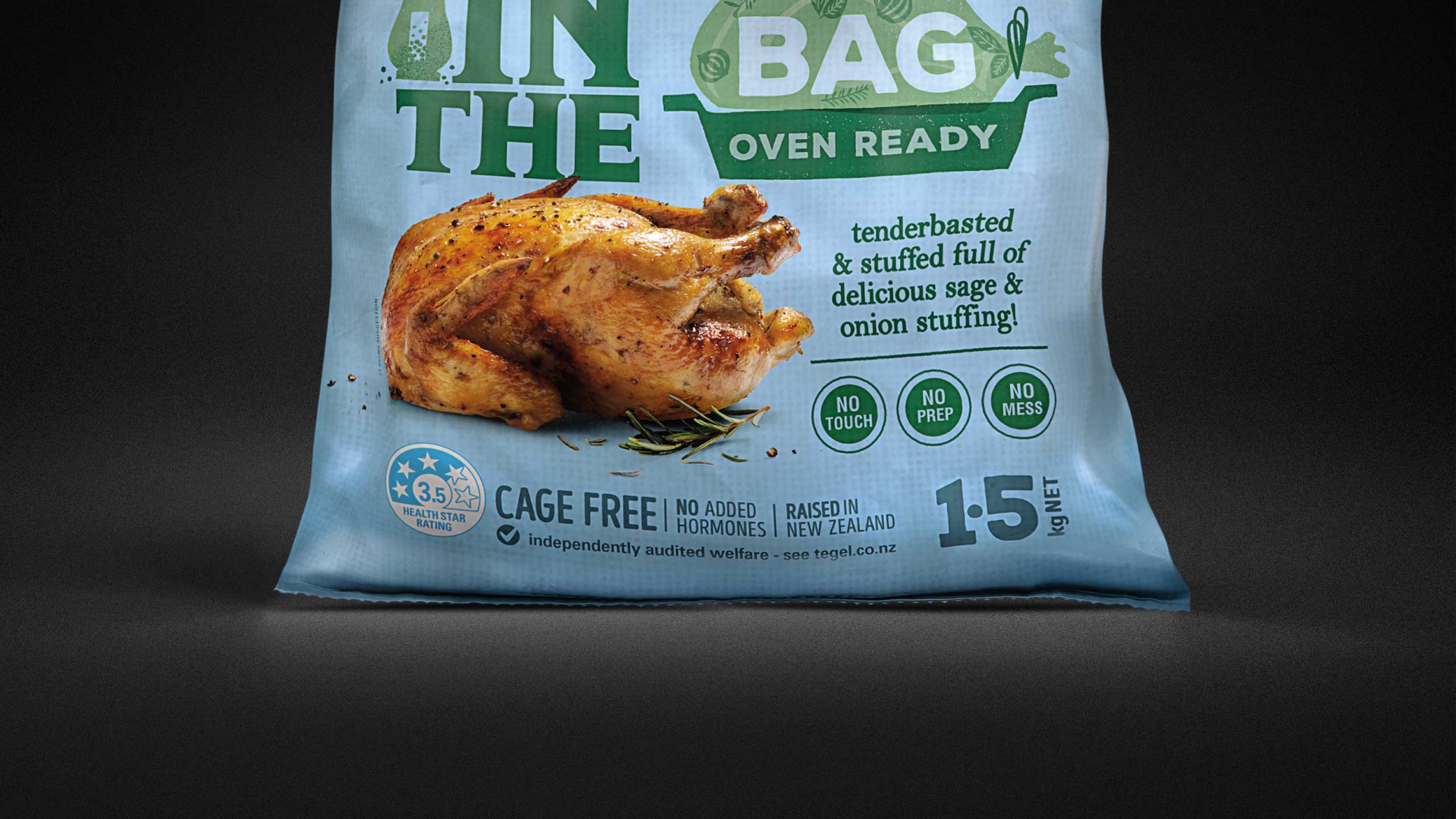
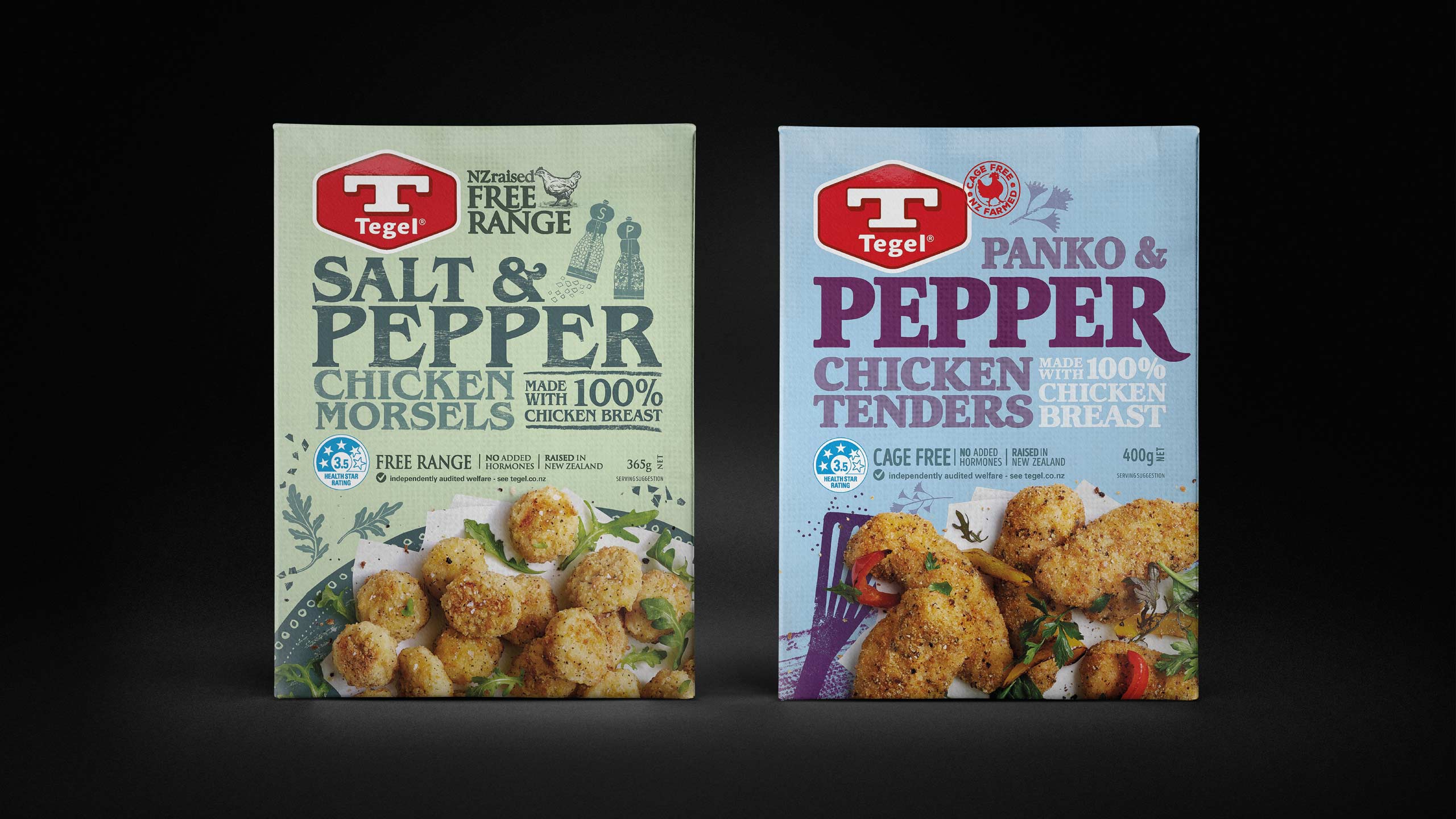
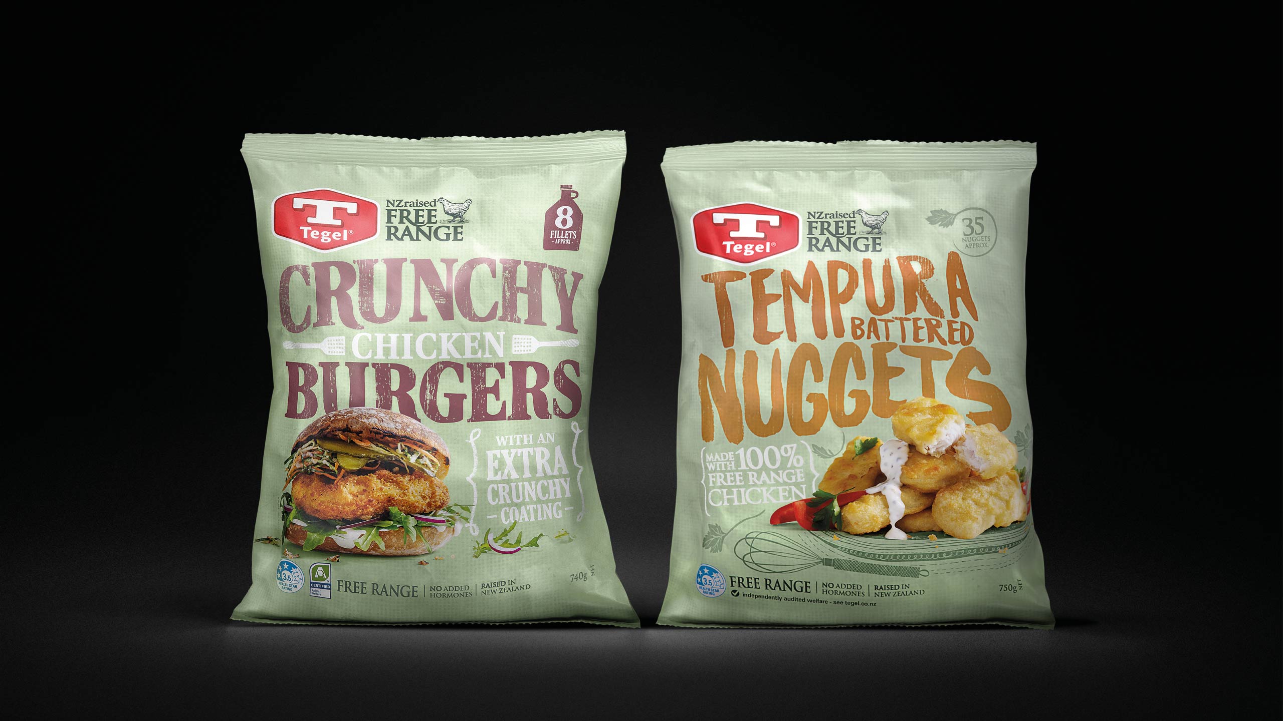
We re-ignited Tegel’s brand by giving it a heart and soul, through a dynamic family look that could stretch across 240+ SKUs nationally as well as an extensive export portfolio. The design needed enough flexibility that it could target different need states across every category.
PROJECT OUTPUT
Brand identity, packaging, trade material, events, brand guidelines, corporate stationery.
Before