CHALLENGE
Anchor is a Kiwi classic, part of New Zealand homes, fridges, pantries and tables since its beginnings in the Waikato in 1886. Yet in recent years the brand had lost clarity. Disparate communication, combined with a functional push toward nutrition and performance, created a tone that lacked warmth, humanity and accessibility. Consumers continued to associate Anchor with trust and familiarity, but the brand no longer stood for anything exceptional. Its story had become fragmented, and its emotional power was fading.
APPROACH
Our task was to develop a masterbrand system that could reconnect Anchor with New Zealanders in a deeper and more meaningful way. The goal was to give the brand a clear, ownable narrative device that could unify every message and make Anchor instantly identifiable, no matter the context.
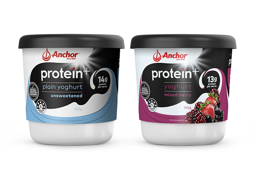
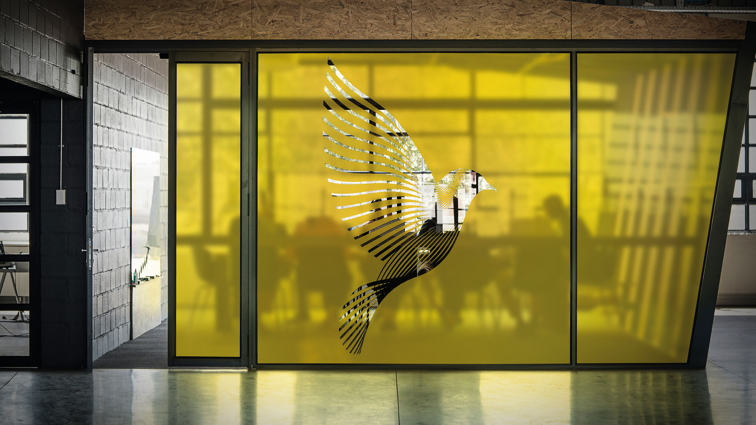
Drawing on the brand platform The natural home of dairy, we created a signature milkflow device to house the logo and tagline. This flowing, organic form expresses the natural simplicity of milk while bringing softness, warmth and inclusivity back to the brand. It acts as a visual anchor across all communications, ensuring that every story, whether about people, products or moments of home life, feels unmistakably part of the Anchor world. The system reinforced a sense of ease, care, vitality and belonging, qualities that sit at the heart of the brand.
We rolled the design system out across the entire vehicle fleet, outdoor and press advertising and social media. It has also been adopted by Anchor teams throughout the Pacific markets, creating consistency and recognisability across regions.
RESULT
The new masterbrand identity restored emotional clarity and cohesion to Anchor, transforming scattered communication into a unified brand experience. The milkflow device provides an instantly recognisable frame that supports everything from storytelling to functional messaging, helping Anchor reconnect with consumers through warmth, trust and everyday relevance.
KEY TAKEAWAY
When a brand with deep heritage re-centres around a simple, emotionally resonant story, recognition and meaning return quickly. The Anchor masterbrand system shows how a single, ownable visual device can unify communication, rebuild connection and bring a classic New Zealand brand back to the heart of home life.