Good Feeding

CHALLENGE

Good Feeding set out to tackle a defining health issue of our time : rising childhood obesity and the long-term influence of early taste formation. Parents often face a confusing feeding landscape, especially when babies may give up to ten “yucks” before a single “yum”. With mothers milk’s natural sweetness shaping early expectations, many baby foods rely heavily on apple, reinforcing sugary preferences that can persist for life. Good Feeding wanted to break this cycle by helping parents introduce real flavours, diverse ingredients and healthier habits from the very beginning.

The Go Well programme delivered weekly meals supported by an ecosystem of nutritionists, scientists, paediatricians, analysts, growers and farmers, backed by 24/7 help. The science behind the meals was genuinely innovative. Advanced processing allowed food to retain far more natural goodness than you could achieve at home, resulting in bright, nutrient-rich meals. Importantly, the programme adapted to each child. If a baby struggled with a particular week of flavours, Good Feeding could repeat it to help the child gain confidence at their own pace. The challenge was to build a brand capable of expressing this depth of science and care with clarity, warmth and modernity in a category full of predictable tropes.

APPROACH

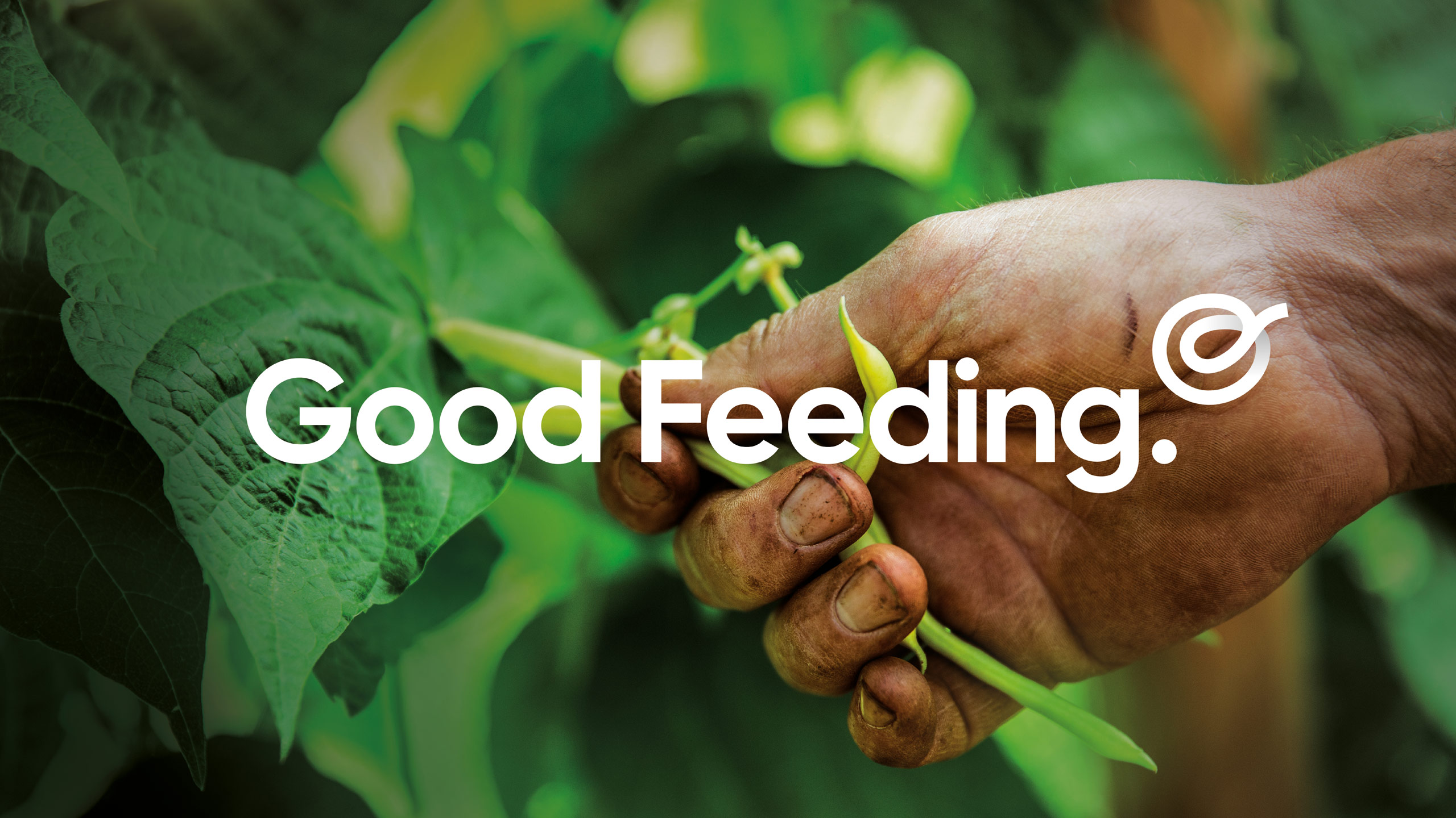
We shaped a strategic platform around the belief that good feeding builds good living. This informed the name Good Feeding, positioning the brand as a guide grounded in both science and empathy. Parents were framed as central participants in a wider support ecosystem, strengthened by the weekly delivery rhythm. The visual identity brought these ideas to life through a continuous sprout–spoon symbol, representing growth, nourishment and the loop between expert insight, natural ingredients and daily routines.

The design system championed honesty. Colours referenced real foods rather than pastels, and photography highlighted the vibrancy made possible by the advanced cooking technology. The tone of voice explained the feeding journey clearly, from why babies resist new flavours to how repeated exposure reshapes taste buds. We reinforced the programme’s flexibility, showing how repeating a week supported natural progression rather than forcing pace. The result was a brand expression that felt modern, informed and deeply attuned to parents’ realities.

RESULT

The refreshed brand distinguished Good Feeding from sweetness-driven and sentimental competitors, offering a grounded, intelligent and supportive approach. Parents responded strongly to the clarity of the programme, the practicality of weekly delivery and the reassurance of being able to repeat flavour stages when needed. Healthcare professionals valued the scientific foundation, the nutritional integrity of the meals and the alignment with child development.

The United States pilot saw strong engagement, with families and professionals noting both the quality of the meals and the confidence created by the ecosystem behind them. This momentum has positioned Good Feeding for international expansion, supported by a proven model integrating science, behaviour and parental support.

KEY TAKEAWAY

Good Feeding shows how purpose, evidence and empathy can reshape early feeding. By addressing sweetness dependency, normalising repeated exposure and using technology to preserve natural nutrition, the programme offers a healthier, more realistic way to build lifelong habits. The weekly delivery model, adaptive repeat-week support and round-the-clock guidance place parents at the centre of a connected ecosystem, driving meaningful impact from the very first spoonful.

Vietrose

CHALLENGE

Vietrose had built a strong reputation as a young, ambitious food manufacturer exporting to markets around the world. Their products were high quality and innovative, but their corporate presence didn’t reflect the same energy or professionalism seen in their operations. The challenge was to create a cohesive brand identity and story that conveyed their passion for food, their precision in production and their growing international credibility.

APPROACH

We began by uncovering what makes Vietrose different – a restless curiosity and a genuine enthusiasm for creating new, market-ready food solutions. From there, we built a corporate identity and visual language that told this story with conviction and clarity. The design system combined clean, modern typography with rich food imagery and purposeful storytelling to capture the company’s passion and innovation. The identity extended across every touchpoint, from uniforms and interiors to livery and digital.

RESULT

The refreshed brand positioned Vietrose as a confident, world-class food partner with a clear sense of purpose and personality. Their corporate profile and website now articulate not just what they make, but why they do it – a business driven by creativity, precision and reliability. The new identity has strengthened how Vietrose presents to both existing and new international buyers.

KEY TAKEAWAY

A clear, unified identity can elevate perception without changing what a company does. For Vietrose, design became a tool to express their professionalism and passion – helping a fast-growing exporter look, sound and feel every bit as impressive as the products they deliver.

Before

GoalsGetter

CHALLENGE

Formerly known as Nikko Asset Management, Amova Asset Management is one of the world’s largest investment companies. As part of their evolution, they wanted to strengthen their presence in the New Zealand market through GoalsGetter – a smart online investment platform that makes it easy for anyone to start investing with as little as $250. The platform needed to feel approachable and motivating, helping everyday investors set personal goals, from a dream holiday to a first home or retirement. They can then track their progress online.

APPROACH

We developed the strategic brand platform and visual identity to bring GoalsGetter to life in the digital world. Centred on optimism, action and empowerment, the identity uses an action focused “GO” logo to symbolise forward momentum. A suite of vibrant illustrations adds warmth and personality, helping to make investment feel engaging and achievable.

RESULT

The new identity positions GoalsGetter as an empowering, user friendly way to invest with Amova. It combines clarity and optimism, balancing digital simplicity with the reassurance of expert fund management.

KEY TAKEAWAY

By transforming investing into an accessible, goal driven experience, GoalsGetter helps everyday investors take confident steps towards achieving their ambitions – supported by the global strength of Amova Asset Management.


Before

Blackbird Finance

CHALLENGE

Blackbird Finance is a specialist lender supporting importers and dealers in the motor vehicle industry, helping clients secure finance for vehicles in transit or awaiting compliance. While their offer was progressive and well regarded, the brand itself felt dated and corporate. It lacked emotion, distinction and the confidence to match the company’s expertise and forward momentum in a competitive financial landscape.

APPROACH

We reimagined the brand from the ground up, redefining every element from the symbol to the story. At the heart of the identity, we reinterpreted the blackbird itself, crafted into a beautifully refined form that carries a sense of strength, precision and gravitas. The new mark became a symbol of perspective and progress, embodying the company’s role in helping clients move forward with clarity and confidence.

The communications extended this idea through a powerful metaphor of journey, seen from the bird’s viewpoint. Roads, landscapes and movement became recurring visual themes, representing both physical and financial journeys. The tone of voice and design system were refined to feel dynamic, optimistic and personal, balancing professionalism with genuine human connection.

RESULT

The rebrand transformed Blackbird Finance into a distinctive, contemporary and trusted presence. The new visual identity, applied across website, vehicle livery, signage and collateral, unites sophistication with purpose. Every touchpoint now tells a story of progress and partnership, positioning Blackbird Finance as an agile, forward-thinking lender that helps clients see the bigger picture.

KEY TAKEAWAY

By reimagining the blackbird as a symbol of perspective and motion, and viewing communication through its lens, the brand now speaks to possibility and progress, capturing both the spirit of the journey and the confidence to soar above it.


Before

Arcadia

Challenge

Arcadia Park is a collection of ten architecturally designed townhouses in the heart of Epsom, created by Leuschke Group, one of New Zealand’s most respected practices. Despite the quality of the design and its premium location, the development needed a brand identity that could translate architectural intent into market appeal. The task was to build a brand that felt confident and refined, captured the values of the project and supported sales by giving future homeowners a clear sense of place. The early materials did not yet reflect the harmony, proportion and care inherent in the homes. The ambition was to create a presence that signalled quality, elevated perception and told a coherent story across all touchpoints, from digital listings to printed collateral and on-site experience.

Approach

Working closely with Arcadia Developments, we explored the essence of the project : crafted homes grounded in strong architectural thinking. From this came a brand platform centred on balance and precision. The identity is anchored by a distinctive A mark whose geometry echoes the architectural forms. This becomes more than a logo. It is a signal of stability and a visual expression of the development’s principle of creating beautiful, high quality family homes. A refined palette, contemporary typography and structured layouts bring clarity to the brand. Photography direction highlights materiality, light and architectural lines. Marketing materials, including brochures, floorplan packs and digital assets, were shaped to support the buyer journey. Site signage and wayfinding mirror the restraint of the identity, reinforcing a sense of a development considered in every detail.

Result

The identity brought Arcadia Park to life with clarity and assurance. Prospective buyers were able to understand the potential of the homes before construction was complete, supported by strong visual storytelling and consistent communication. The distinctive A mark quickly became a recognisable symbol for the development, building familiarity and trust. The brand elevated perception and helped position Arcadia Park as a premium, architecturally led offering. Sales materials supported confidence and engagement, giving buyers a clear understanding of the design intent and value.

Key takeaway

When architectural thinking is translated through a disciplined identity, it becomes a commercial advantage. Arcadia Park now has a unified brand presence that turns a well-designed development into a compelling place to belong.

Bird & Barrow

2022 Transform Awards
Best Brand Evolution (Consumer)
Gold Winner

“The brand changes hit the mark with consumers at the point of sale and the depth of the brand creates a relationship between producers and buyers for future purchases.”
— 2022 Transform Awards judging comments

CHALLENGE

Previously known as George and Jo’s, the brand faced a growing trust issue. Consumer research revealed that people were sceptical of its fictional founders, questioning whether the brand’s promises of being 100% antibiotic free and free range were genuine. To restore confidence, the business needed a new name, story and identity that conveyed authenticity, care and transparency while celebrating the farmers behind the product.

APPROACH

We developed a strategic brand platform and name – Bird & Barrow Free Range, 100% Antibiotic Free Chicken, to communicate what truly makes their chicken special. The new brand story put real farmers and their values at the centre, highlighting their respect for the environment, commitment to animal welfare and dedication to producing food families can trust. Visually, we broke away from the category’s predictable greens and natural tones, introducing distinctive blue packaging paired with hand-drawn illustrations that bring to life the care, protection and freedom of Bird & Barrow’s farming practices, even down to the radios played in the barns to keep the chickens happy.

RESULT

The rebrand transformed Bird & Barrow into a trusted, characterful and premium brand that consumers could connect with emotionally. It carved out a clear point of difference on shelf while reinforcing the brand’s values of honesty, care and provenance.

KEY TAKEAWAY

By replacing fiction with authenticity and crafting a story rooted in genuine care, Bird & Barrow restored consumer trust and created a distinctive, meaningful brand that stands proudly for integrity from farm to fork.


Before

Culley’s Hot Sauce

CHALLENGE

Culley’s began in 2010 selling home-grown, home-made sauces at local farmers markets and has since grown into an international success, with products sold in supermarkets, restaurants and specialty food stores across New Zealand and overseas. While the business had expanded rapidly, the brand had not evolved with it. There was a need to pause, define a clear strategic direction and create a brand system that reflected the scale, personality and passion behind Culley’s.

APPROACH

We developed a strategic brand platform built around the essence of flavour, fire, flair. This captured Culley’s bold, maverick spirit and passion for big flavour. The new identity brought this energy to life through bespoke illustrations for each product, designed to express the heat, character and craft behind every sauce. The visual language balanced fiery intensity with refined detail, creating a distinct, ownable personality that stood out powerfully on shelf.

RESULT

The refreshed identity unified the range and elevated Culley’s into a leading force in the hot sauce category. Each pack became a statement piece – vibrant, expressive and instantly recognisable, building a strong emotional connection with consumers and giving the brand clear shelf dominance both locally and internationally.

KEY TAKEAWAY

By capturing the bold personality of its founder and the artistry of its sauces, Culley’s now stands as a benchmark for how authenticity, flavour and design flair can transform a home-grown brand into a global success story.

Before

Tip Top Bakery

CHALLENGE

Tip Top is the largest brand in New Zealand’s bread aisle, but its 36-SKU portfolio had become fragmented and inconsistent. Confusing naming conventions, unclear message hierarchies and a lack of visual cohesion made it difficult for shoppers to navigate. The challenge was to unify the range under one clear system that reflected how consumers actually shop, while reigniting love for the brand and reaffirming Tip Top’s place at the heart of Kiwi homes.

APPROACH

Through extensive research and strategic review, we simplified the brand’s architecture by moving from a complex sub-brand model to an occasion-based structure that aligned with modern shopping behaviour. The redesign consolidated messaging, refined the heart device and leveraged Tip Top’s signature red as an ownable brand asset for strong shelf standout. The positioning “The bread with the love baked in” became the foundation for a warmer, more human identity that celebrates quality and everyday goodness.

RESULT

The refreshed portfolio created clarity, cohesion and stronger recognition across all ranges. The new system made the bread aisle easier to navigate and re-established Tip Top as the trusted, loveable choice for New Zealand families. Sales lifted significantly across the category, and the previously underperforming Goodness Grains SKU saw a remarkable turnaround, now recommended by 90% of consumers.

KEY TAKEAWAY

Even the biggest brands need structure and heart to stay relevant. By unifying the Tip Top range and strengthening its emotional connection, we helped New Zealand’s best-known bakery brand rediscover its warmth, confidence and shelf dominance.


Before

Tegel

TEGEL — 2015 Repositioning

Note : this case-study was created in 2015/16, it has now changed to a different look under new management. 

Challenge

Tegel had long been an iconic New Zealand brand, yet its presence on shelf had become increasingly confused. Our audit uncovered more than eleven versions of the logo in active use. Colour application varied widely. Although the brand was historically associated with blue, this appeared only sporadically across the portfolio, creating a schizophrenic and incoherent impression. With more than thirty sub-branded product offers across Fresh, Frozen, Packaged Deli and Hot Cooked, the brand had lost the unity and confidence expected of a national market leader. This fragmentation weakened Tegel’s position. Years of unstructured product development had created SKU proliferation and inconsistent design execution. The result was a declining share of mind, shelf presence and value, with pressure coming from premium free-range competitors at one end and private label at the other. Tegel needed a comprehensive reset that would respect its heritage but rebuild clarity and leadership across every point of purchase.

Approach

In late 2015, we embarked on a full repositioning of the brand. Blue was mandatory and could not be abandoned; it was too deeply rooted in Tegel’s history. The problem lay in how to make blue work as the anchor colour while still achieving variant differentiation, warmth, appetite appeal and clear category navigation. The answer came in shifting to a paler, more natural sky blue that felt fresher, lighter and more open. This created a calm, unifying canvas that allowed colour, flavour cues and delicious imagery to stand out without visual conflict.

From this foundation, we built a coherent sub-brand hierarchy and introduced disciplined structure across the portfolio. Category-specific cues supported distinct shopper missions, while provenance and animal welfare assurances were brought forward with far greater clarity. A dynamic family look ensured consistency across more than 240 SKUs and an extensive export range. The design system had enough flexibility to express different need states across Fresh, Frozen, Deli and Hot Cooked, yet remained unmistakably Tegel in every environment.

Result

The revitalised identity re-established Tegel as a cohesive and confident brand across the store. What had been a scattered, inconsistent presence became a unified system with clear differentiation, strong appetite appeal and a modern expression of its heritage. The new sky blue provided the consistency the brand desperately needed while unlocking the space for sub-brand colour, photography and communication to work with greater impact. Shelf navigation improved, category recognition lifted and Tegel regained the visibility and authority it had been losing. The clarity and structure of the new system strengthened the brand’s ability to compete at both the premium and value ends of the market, supporting renewed growth in an intensely competitive grocery landscape.

Key takeaway

A mandatory colour can be a constraint or a strategic anchor. By reframing blue through a more natural sky tone and rebuilding the system around it, we transformed Tegel’s fragmented identity into a coherent, emotionally engaging brand with the strength to lead again.


Before

Waste-Not Kitchen

CHALLENGE

Every year, Kiwis send over 123,000 tonnes of edible food to landfill. Waste-Not Kitchen was founded to help change that by transforming surplus meat from Farro Fresh into nutritious soups for those in need. The initiative operates on a simple “buy one, give one” model : every soup purchased donates another to families in the local community. The challenge was to create a brand and packaging system that captured this powerful purpose while feeling positive, approachable and full of heart.

APPROACH

We developed a brand identity that expressed both care and optimism – a celebration of doing good, not a lecture about waste. The name Waste-Not Kitchen inspired a design language that feels warm and human, brought to life through hand-drawn character illustrations representing each flavour. The tone of voice balanced nourishment and purpose : Good for you. Good for the community. Good for the planet. The result was packaging that feels uplifting and real, something people are proud to buy, knowing it helps someone else.

RESULT

Within the first few weeks of launch, Waste-Not Kitchen had already donated thousands of soups and prevented significant amounts of quality food from going to landfill. The brand quickly built awareness through its authentic story and relatable design, engaging both Farro shoppers and local communities.

KEY TAKEAWAY

Purpose-led brands don’t just feed demand – they feed change. Waste-Not Kitchen proves that design with heart can transform surplus into sustenance, turning a sustainability challenge into a story of community nourishment.