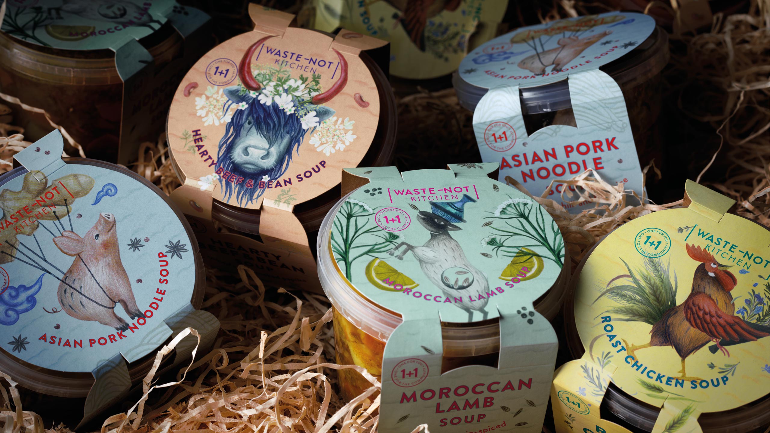
CHALLENGE
Every year, Kiwis send over 123,000 tonnes of edible food to landfill. Waste-Not Kitchen was founded to help change that by transforming surplus meat from Farro Fresh into nutritious soups for those in need. The initiative operates on a simple “buy one, give one” model : every soup purchased donates another to families in the local community. The challenge was to create a brand and packaging system that captured this powerful purpose while feeling positive, approachable and full of heart.
APPROACH
We developed a brand identity that expressed both care and optimism – a celebration of doing good, not a lecture about waste. The name Waste-Not Kitchen inspired a design language that feels warm and human, brought to life through hand-drawn character illustrations representing each flavour. The tone of voice balanced nourishment and purpose : Good for you. Good for the community. Good for the planet. The result was packaging that feels uplifting and real, something people are proud to buy, knowing it helps someone else.
RESULT
Within the first few weeks of launch, Waste-Not Kitchen had already donated thousands of soups and prevented significant amounts of quality food from going to landfill. The brand quickly built awareness through its authentic story and relatable design, engaging both Farro shoppers and local communities.
KEY TAKEAWAY
Purpose-led brands don’t just feed demand – they feed change. Waste-Not Kitchen proves that design with heart can transform surplus into sustenance, turning a sustainability challenge into a story of community nourishment.
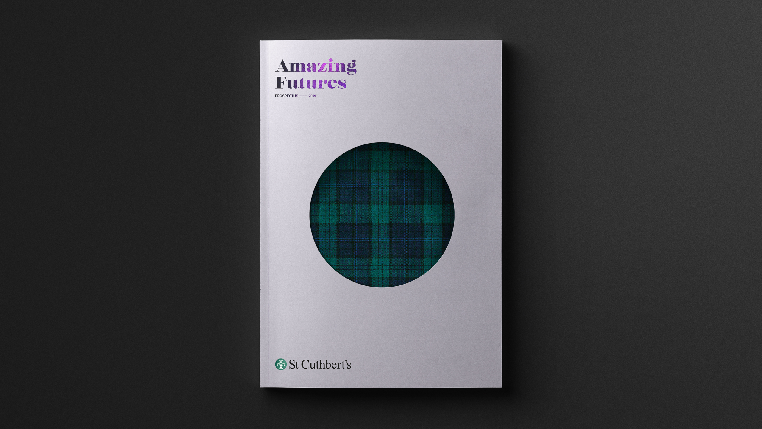
CHALLENGE
In 2018, St Cuthbert’s College refined its brand strategy around a new essence : Making Girls Amazing. The challenge was to translate this powerful idea into a contemporary visual identity that reflected the school’s academic excellence, spirit of empowerment and strong sense of community, while engaging both current families and future students.
APPROACH
We worked with the school to evolve their visual identity and apply it consistently across key communications. The new direction brought warmth, confidence and clarity to every touchpoint, balancing tradition with modernity. From the refreshed website and Open Day materials to the flagship 2019 Prospectus, the design expressed the energy, curiosity and potential of St Cuthbert’s students.
RESULT
The refreshed visual identity brought the brand essence to life, creating a cohesive and inspiring expression of what the school stands for. Each piece of communication now reflects a balance of heritage and forward thinking, helping St Cuthbert’s connect more meaningfully with parents, students and the wider community.
KEY TAKEAWAY
By aligning design with purpose, the brand now embodies the school’s belief in empowering young women to achieve their best – a confident, uplifting expression of Making Girls Amazing.
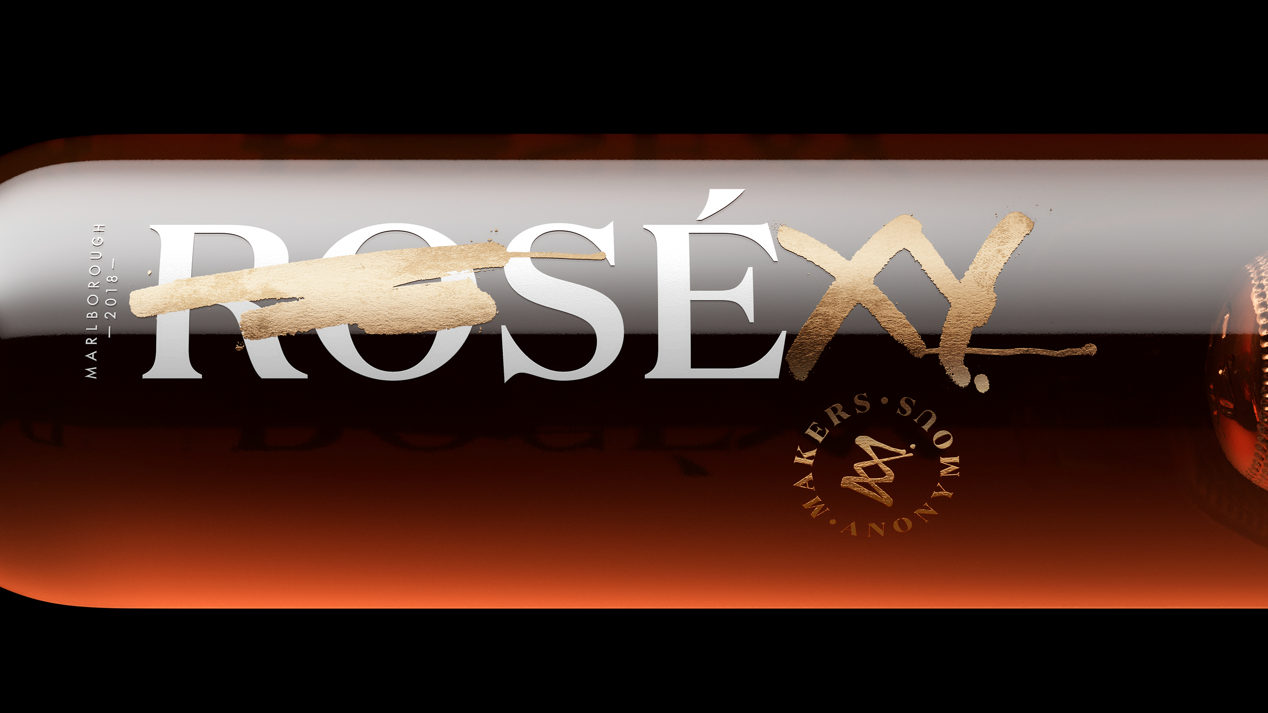
CHALLENGE
Pernod Ricard set out to create a wine brand that would push beyond traditional category cues and attract consumers to the premium wine segment in a fresh, unconventional way. Makers Anonymous needed to stand apart from the existing Pernod Ricard portfolio, challenge expectations and express a spirit of confident disruption, while remaining commercially accessible.
APPROACH
We centred the brand on the idea of a beautiful collision – where the expected meets the unexpected. This became the foundation for a visual world defined by glamorous rebellion. The bottles were printed directly, allowing the wine itself to provide colour and immediacy. Bold variant cues were then overlaid with gold metallic graffiti-inspired type, deliberately subverting the classic silhouette of a wine bottle while still feeling refined and intentional. For packaging and collateral, we created a bespoke typeface, Rebellious, to extend the attitude consistently across all touchpoints.
RESULT
Makers Anonymous entered the market with a striking and highly differentiated presence. Its fusion of elegance and irreverence signalled a new kind of premium wine experience and carved out space beyond conventional category norms. The brand’s bold visual personality broadened appeal, particularly among consumers seeking something modern, spirited and design-led.
KEY TAKEAWAY
Breaking category rules can elevate perception when done with clarity and purpose. Makers Anonymous shows how blending rebellion with refinement can create a distinctive premium brand that feels fresh, confident and culturally relevant.
Challenge
Launching a new start-up is a significant step, and Number Worx was entering the market with an ambition to provide practical financial acumen and guidance to businesses of all sizes. As a completely new offering, they needed a brand identity that would give them confidence and reassure prospective clients that they were in capable, trustworthy hands. The challenge was to create a name, visual identity and communication style that could simplify what can often feel complex and inaccessible, while still conveying professionalism and expertise. The founders understood the value they could deliver, but without a clear and distinctive brand, their story risked being lost in a crowded advisory landscape. The brand needed to stand apart, articulate its purpose with clarity and express its personality in a way that felt fresh, pragmatic and confident.
Approach
Our inspiration came from the idea of piecing together the financial puzzle of business. We developed the name Number Worx to express both competence and approachability, signalling a service that understands how numbers underpin every decision yet is grounded in practical, real-world support.
The logo and design system build on this puzzle concept, using interconnected forms and structured geometry to represent clarity emerging from complexity. The identity frames financial insight in a way that feels simple, relatable and unintimidating. Collateral, from business cards to presentation templates and digital assets, was designed to present information cleanly and confidently, reinforcing the idea that Number Worx turns financial detail into meaningful direction. Tone of voice was kept clear and direct, helping demystify financial conversations and positioning the business as a partner who brings order, understanding and forward momentum to their clients’ operations.
Result
The new brand gave Number Worx a strong, credible point of entry into the market. The identity expressed both the practicality and the reassurance clients look for in financial guidance, while the name set the foundation for a memorable and distinctive presence. By simplifying the story and visual language, the brand allowed the founders to communicate their value with far greater impact. With a cohesive identity and consistent suite of tools, Number Worx entered the market with clarity, confidence and a clear proposition — transforming a start-up into a brand ready to grow.
Key takeaway
When the value a business provides is complex, the brand should make it feel simple. Number Worx shows how a well-considered identity can translate financial expertise into a clear, accessible and confidence-building story for clients.
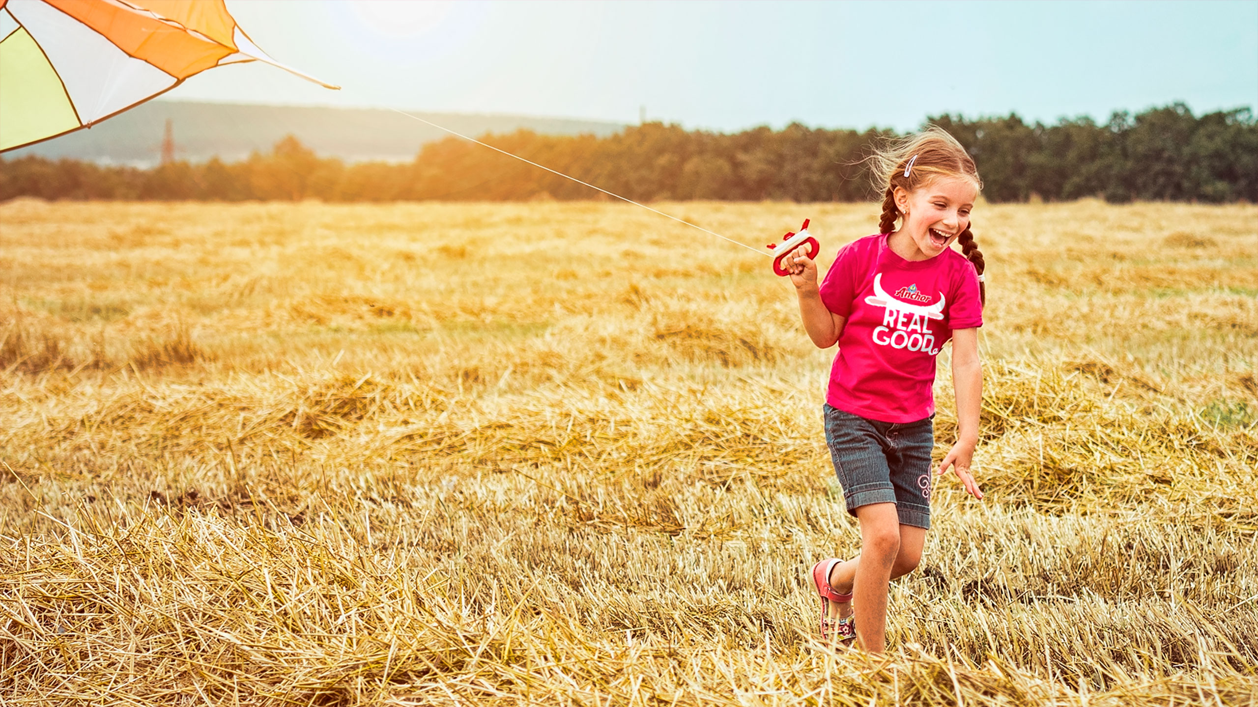
CHALLENGE
Fonterra needed to refresh the Anchor Flavoured Milk range for up to fourteen diverse global markets, each with different languages, cultural nuances and varying levels of brand familiarity. The previous sports focused packaging did not translate universally and lacked the simplicity and personality needed to attract younger consumers. The task was to create a design system that could transcend language barriers, hero flavour and deliver strong shelf impact across varied retail environments.
APPROACH
Insights showed that bold flavour cues, simplicity and emotional connection would be essential to lift appeal with younger audiences. We moved the brand away from its sports led heritage and built the campaign around Real Milk Real, a platform that celebrated what makes Anchor trusted. This allowed us to drive messaging such as Real Milk Real Taste and Real Milk Real Energy, reinforcing both credibility and enjoyment.
To add personality and strengthen universal understanding, we brought the packs to life as loveable characters. Each one was created to express Taste, Energy and Strength in a way that felt fun and culturally neutral. This character idea became the heart of the communication system. We showed the characters removing their old clothes, the previous packaging, to reveal their new look underneath. This made the packaging change instantly clear and joyful, even in markets where consumers may not read the language.
RESULT
The refreshed Anchor Flavoured Milk identity delivered stronger shelf standout, clearer flavour navigation and a more youthful and globally cohesive presence. The Real Milk Real platform provided a simple and confident message, while the characters became an engaging device for expressing Taste, Energy and Strength across every touchpoint including point of sale, outdoor, vehicles, trade presenters and promotional items. The system proved flexible, memorable and effective across multiple countries.
KEY TAKEAWAY
When a brand needs to communicate across many languages, character and product truth create universal connection. By combining the Real Milk Real platform with a bold character driven identity, Anchor Flavoured Milk achieved clarity, expressiveness and global relevance, turning a packaging update into a playful and meaningful brand moment.

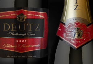
Before
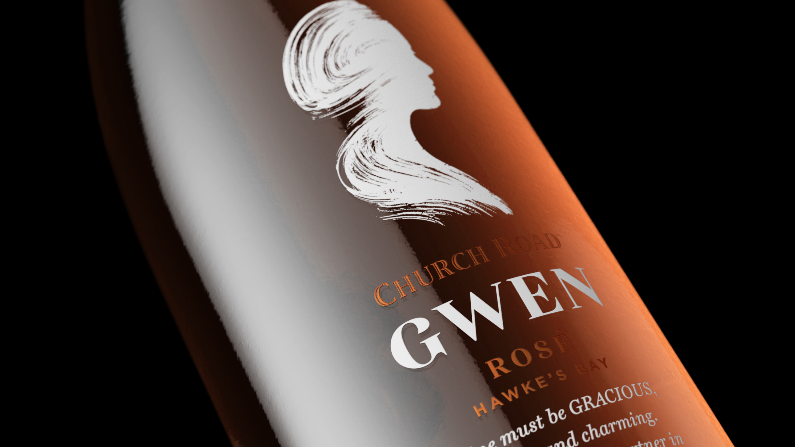
CHALLENGE
Church Road were introducing a Provence-style Rosé unlike anything in their current portfolio. More delicate and feminine, it needed its own identity while still feeling aligned with the brand’s heritage. The challenge was to create a refined, emotionally resonant design that appealed to a predominantly female audience and brought new consumers into the Church Road world.
APPROACH
We centred the design on a poem written by founder Tom McDonald to his wife, Gwen. Its themes of grace and charm became the basis for the Rosé’s visual story. A poised illustrated silhouette of Gwen created instant distinction and emotional depth printed direct to bottle. Around it, we kept the design restrained – soft tones, elegant typography and a clean layout with subtle elements of copper foil to express the wine’s finesse and Provence-inspired style.
RESULT
The Rosé added a fresh, graceful dimension to the Church Road portfolio. Its feminine cues and storytelling broadened the brand’s appeal, while the refined execution maintained Church Road’s quality and craft. On shelf, it signalled a premium yet approachable expression of the brand, helping attract new consumers to the range.
KEY TAKEAWAY
Authentic storytelling, expressed with restraint, can elevate a brand. The Rosé shows how a simple, emotive idea can introduce a new chapter while remaining true to a respected heritage.
Before

Challenge
Kirk Group is a leader in pre-press and print technology, operating across Australia, New Zealand, Asia and India. As the business continued to grow, its identity no longer reflected the scale and sophistication of its offer. The organisation needed to bring its regional operations together under one cohesive brand that clearly articulated its vision, capability and technical leadership. The objective was to position Kirk Group as one group, with one direction, delivering an end-to-end service from design through to print.
Approach
We created a bold and contemporary brand profile that captures Kirk Group’s technical excellence and innovative mindset. Strong imagery and a vibrant colour system became the foundation of the visual language, ensuring standout across markets. The brand showcases their best-in-class pre-press and print technology while giving them a distinctive and unified presence at every touchpoint.
Result
The refreshed identity presents Kirk Group as a single, globally connected business with a clear and confident voice. From printed materials to digital environments and workspace interiors, every element reinforces their precision, quality and forward-thinking approach.
Key takeaway
By unifying their global operations under one powerful identity, Kirk Group now stands as a world-class brand shaping the future of design, pre-press and print solutions.
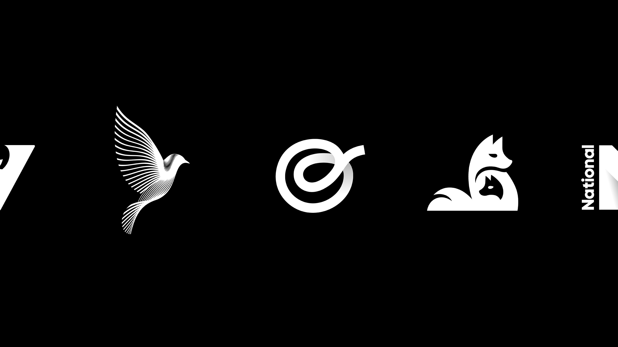
Our brand marks
A logo is often the first impression of a brand – a mark that needs to be simple, distinctive, memorable and enduring. At Tried&True, we believe a logo is more than a symbol; it’s the visual essence of a business, the anchor point for every story a brand tells. The selection here represents some of the identities we’ve crafted across diverse industries. Each one is built from strategy, distilled into design, and created to carry meaning while standing out in a crowded world. This collection reflects our belief that the strongest brands are those that connect clarity with creativity – marks that are confident, memorable and built to last.