Pask Winery

CHALLENGE

Pask Winery sought an identity that more honestly reflected who they were, the wines they crafted and the philosophy behind them. Their existing expression lacked the restraint, elegance and quiet confidence that define Kate Radburnd’s winemaking style. The task was to articulate the depth of their story without embellishment, and to establish a visual language that felt grounded in place and true to their character.

APPROACH

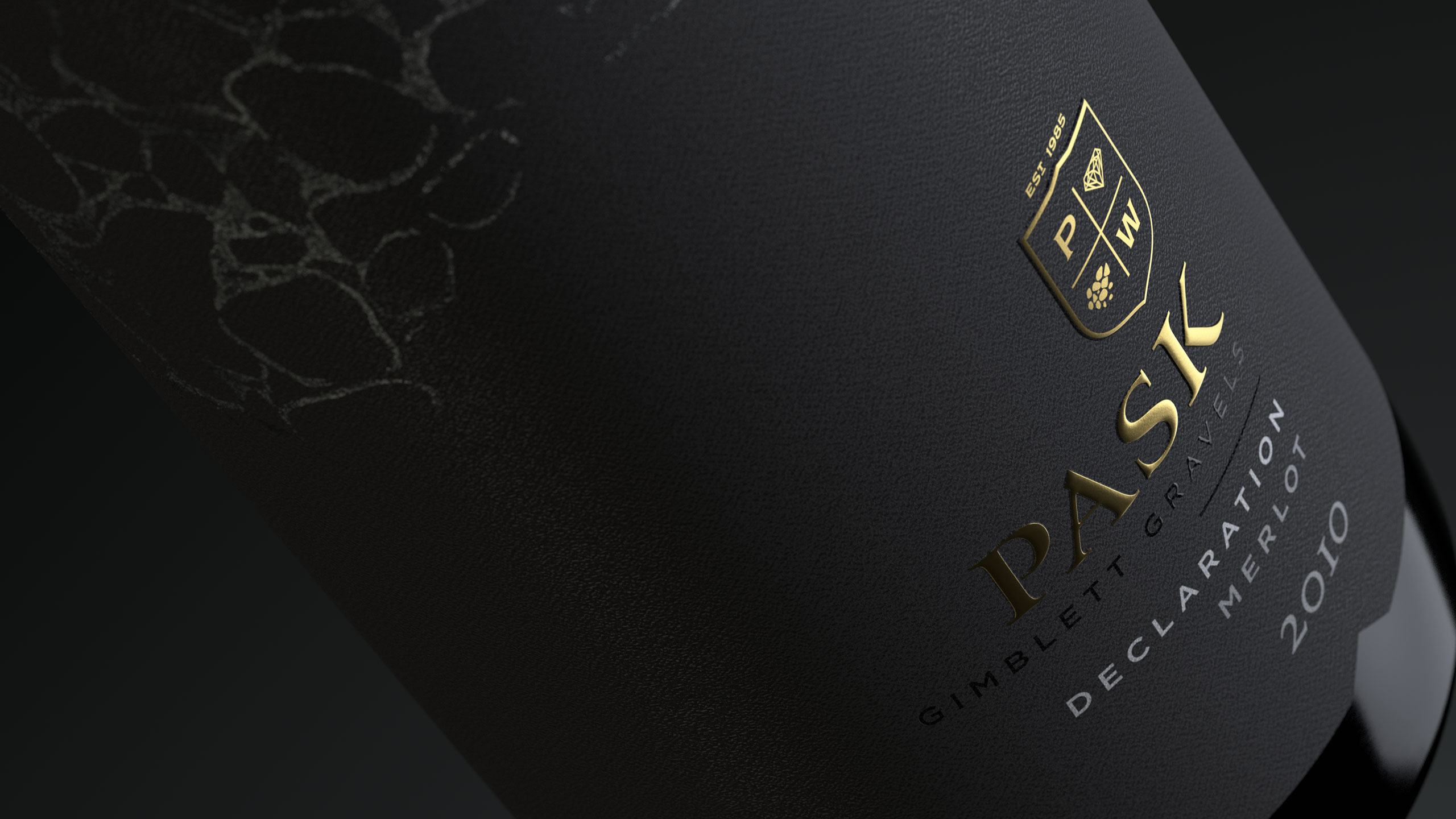
The Pask crest became the foundation of the identity. Divided into four considered segments, it holds the initials that honour the winery’s heritage while drawing focus to the stones of the Gimblett Gravels. This terrain is central to everything Pask represents. As the only winery producing its entire portfolio exclusively from grapes grown in this renowned region, provenance is not merely part of their story — it is the story. The crest therefore operates as both emblem and anchor, a distilled symbol of origin, legacy and craft.

While the overarching design philosophy remains intentionally understated, refinement was introduced through subtle textural details, considered line work and quiet moments of embellishment. These nuances bring depth, tactility and a sense of craftsmanship to an expression that otherwise remains minimal and composed. The result mirrors the wines themselves: elegant on the surface, detailed in their structure, expressive without ever overstating.

RESULT

The refreshed identity now presents Pask Winery with greater clarity and self-assurance. The crest offers an immediate and unmistakable link to the Gimblett Gravels, while the restrained visual language communicates sophistication, authenticity and integrity. Together, these elements create a brand world that aligns seamlessly with the character of the wines and the ethos of the people behind them.

KEY TAKEAWAY

Simplicity becomes powerful when it is grounded in truth. Pask Winery demonstrates how a pared-back identity, built on meaningful symbolism and refined detail, can project confidence, provenance and craft without needing to raise its voice.


Before

Zeelandt Brewery

CHALLENGE

Zeelandt is a respected Hawke’s Bay craft brewery known for brewing beer with skill and integrity. The issue was that the packaging didn’t live up to the quality of the beer. The clothes didn’t match the man beneath. Chris at Zeelandt wanted a look that reflected the true to style ethos of each brew and encouraged people to pick it up with confidence.

APPROACH

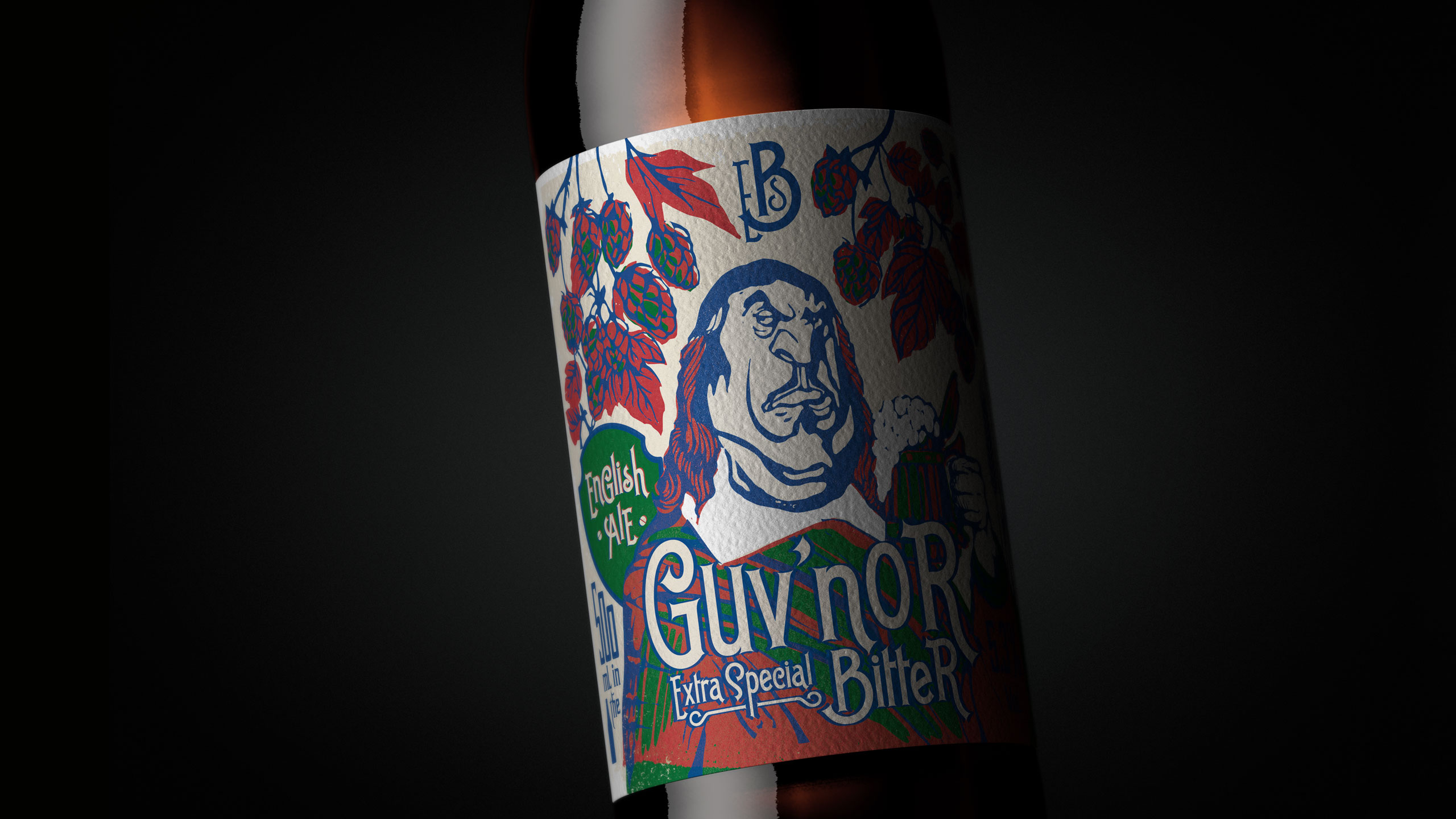
We created a story for every beer, using these narratives to guide the imagery and personality of the range. A consistent woodcut illustration style gave the beers a unified visual language, allowing a diverse set of images to feel connected as part of one family. The approach had both craft and memorability, helping each brew stand out while reinforcing the overall Zeelandt world. Because independent breweries often work with tight budgets, we built a system that allowed assets to be extended and reused across multiple touchpoints without losing impact. This ensured consistency, efficiency and a strong return on design investment.

RESULT

A cohesive and characterful brand system that reflects the depth and craft of Zeelandt’s brewing. The new identity and packaging increased shelf appeal, strengthened storytelling and created a sense of pride across all consumer and trade touchpoints.

KEY TAKEAWAY

When every brew has a story and the visual language amplifies that truth, the packaging becomes a powerful extension of the craft. Zeelandt’s refreshed identity proves that thoughtful design can elevate perception, create cohesion and work hard even within modest budgets.


Before

Service Foods

CHALLENGE

Service Foods are New Zealand’s largest privately owned and operated food service distribution business. Despite their scale and vertical integration, including their own growers, butchery, fishery and bakery, many in the market did not fully understand the breadth or quality of what they offered. The existing identity, anchored by a chef icon, unintentionally positioned them closer to a catering company than a national supplier of premium produce. The challenge was to create an identity that reflected the true depth of their operation, the quality of their sourcing and the scale of their national presence.

APPROACH

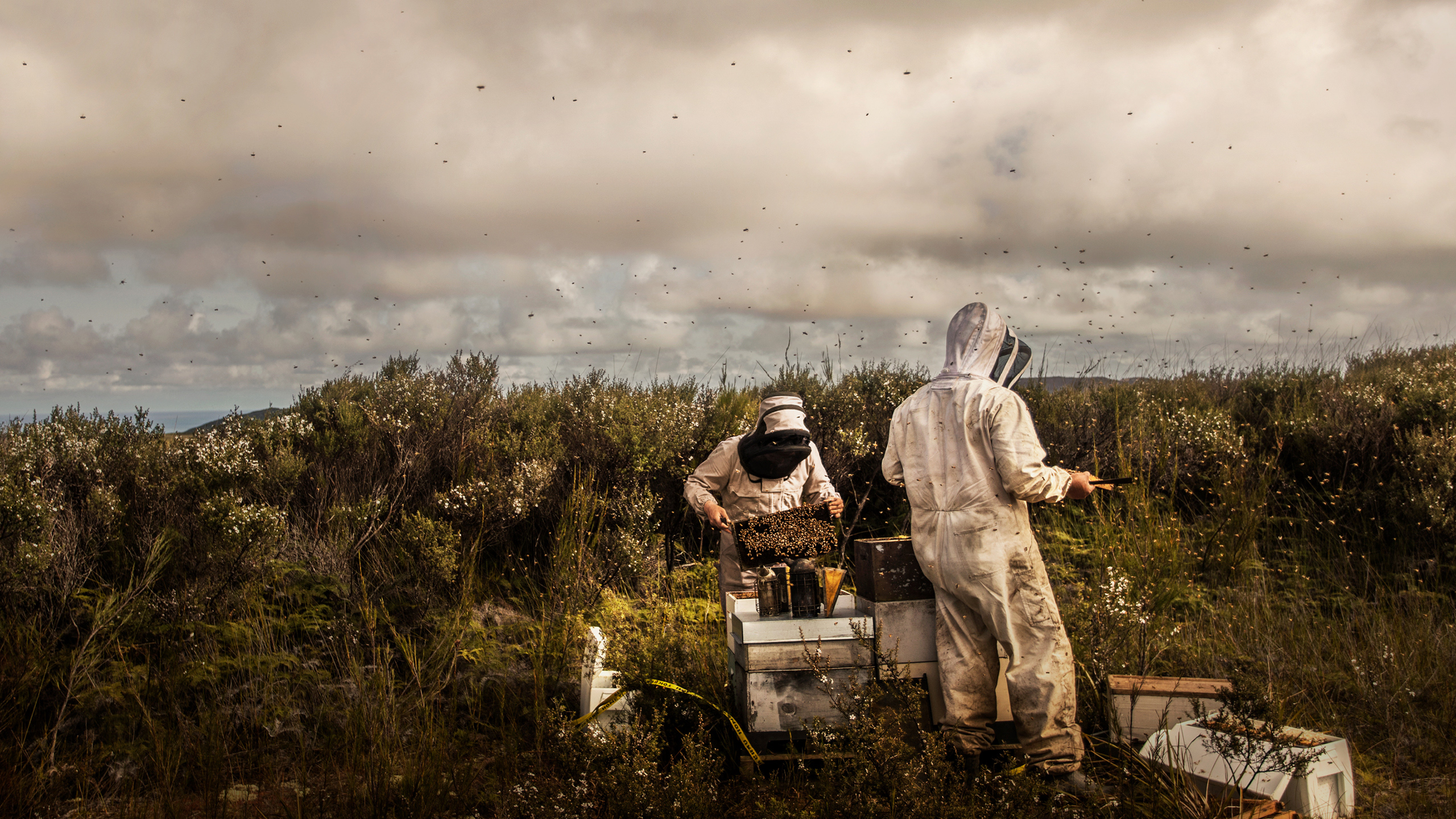
We reframed the brand around its real strength : the direct connection between source, quality and delivery. The new identity was built to tell this story with clarity and impact. Dramatic photography became central to the system, capturing ingredients at their origin and showing the raw, honest beauty of the food itself. These images highlighted the calibre of their growers, fishermen, butchers and bakers, and reinforced the idea that Service Foods begins at the source, not at the warehouse.

This bold visual language carried through every touchpoint. Video content showed ingredients being selected, prepared and transported, giving motion and narrative to the supply story. Digital channels used these same dramatic visuals to create standout and immediacy. Fleet livery turned their trucks into moving billboards showing New Zealand’s best produce at scale. Trade shows and customer presentations adopted the same style, immersing viewers in the world of quality sourcing and elevated service. Across all media, the design removed the outdated chef symbolism and replaced it with a confident, service led identity that champions provenance, care and expertise.

RESULT

The rebrand transformed how Service Foods was perceived in the market. What was once seen as a logistics business became recognised as a trusted partner committed to quality and provenance. The dramatic imagery and consistent design language unified the brand across every environment, from trucks and warehouses to digital platforms and promotional spaces. The new identity presented Service Foods as a national leader with a clear and distinctive point of view on sourcing and service.

KEY TAKEAWAY

When a brand shows the truth behind its operation with clarity and conviction, perception shifts. For Service Foods, spotlighting the journey from farm to plate turned a functional supplier into a trusted food partner, proving that a strong story, told consistently and dramatically, can elevate a business without altering its fundamentals.


Before

Anchor Export Nutritional

Challenge

Anchor needed a messaging platform for its Pacific markets that would guide all communication for the next three years. The platform had to cover the full spectrum of Anchor’s offer : from the everyday goodness of milk through to more complex nutritional benefits across a portfolio of dairy products. The challenge lay in creating a unified campaign that would resonate across vastly different markets. These ranged from sophisticated, French-influenced food environments in New Caledonia to rural communities in Papua New Guinea, where dairy familiarity and nutritional knowledge varied significantly. Anchor required a story that could cut through these cultural and educational differences. It needed to be simple enough to grasp instantly, strong enough to travel across countries and categories, and flexible enough to anchor a long-term communications strategy.

Approach

We conducted in-depth research across the Pacific to uncover the single most compelling message that could be understood and valued everywhere. The insight was clear and universal : dairy products help kids grow strong. This truth transcended cultural nuance and created a powerful foundation for the platform. Alongside this, we discovered that aspirational nutrition – stronger, fitter, healthier – held deep emotional currency for parents and caregivers. These findings formed the creative springboard for the campaign. While milk remained the heart of Anchor’s offer, we needed to express that Anchor is more than milk. Everything originates from the simple goodness of pure dairy, and this became the backbone of our messaging: Anchor is made from the goodness of milk.

To communicate this visually, we combined great lifestyle imagery with simple, expressive illustrations that highlighted the benefits of dairy. This dual-system approach meant that even without reading a headline, viewers could instantly understand the nutritional value of the products. The blend of photography and illustration created warmth, accessibility and emotional resonance, while giving the campaign a flexible visual language that could stretch across packaging, in-store, digital, outdoor and educational materials.

Result

The messaging platform provided Anchor with a clear, unified story that could operate confidently across diverse Pacific markets. The core message ‘dairy products help kids grow strong‘, anchored every communication layer, ensuring consistency while allowing each market to express relevance in its own context. The combination of imagery and illustration proved especially effective, enabling quick comprehension and emotional connection regardless of literacy levels or familiarity with dairy nutrition. The campaign elevated understanding of Anchor’s full nutritional offer and strengthened the brand’s role as a trusted partner in family wellbeing. It created a platform with enough longevity to guide multiple years of communication, product launches and market activations across the Pacific.

Key takeaway

When markets vary widely in knowledge and culture, the most powerful story is often the simplest one. By grounding the platform in a universal truth and expressing it through imagery and illustration that communicated benefits at a glance, Anchor gained a compelling, flexible and long-lasting foundation for growth across the Pacific.

Church Road Single Vineyard

CHALLENGE

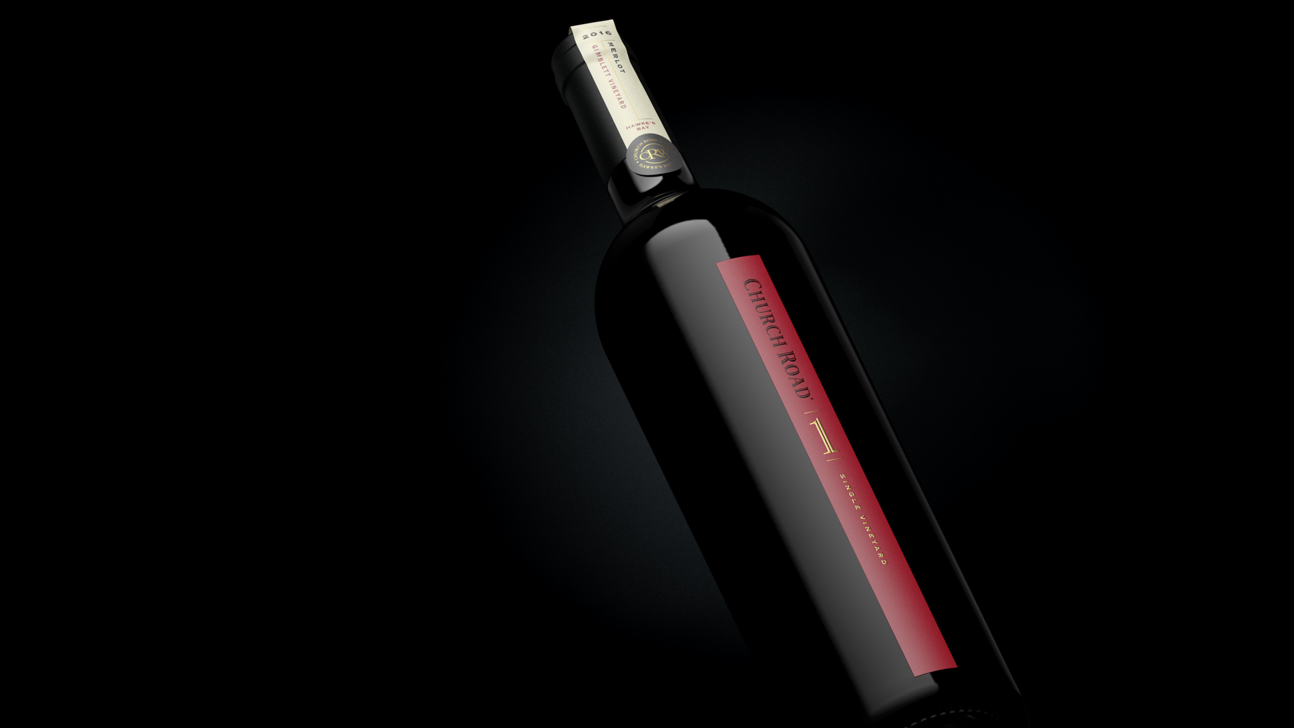
Church Road sought to introduce a new tier to its portfolio that would celebrate the winemaking excellence of Hawke’s Bay and the craft of the Church Road team, led by winemaker Chris Scott. Positioned between the Grand Reserve range and Tom, this Single Vineyard release needed to communicate premium quality, provenance and craftsmanship, while maintaining coherence within the broader Church Road family. The challenge was to create a visual identity that felt both elevated and unmistakably Church Road.

APPROACH

We centred the design on the idea that simplicity is the ultimate sophistication. Drawing from Church Road’s heritage and contemporary confidence, we created a label that reflected purity of place and the singular focus of a vineyard wine. The distinct label shape provided instant shelf and portfolio distinction, while refined detailing, texture and composition conveyed understated luxury. Every design choice was made to evoke credibility, confidence and restraint – qualities that define both Church Road and the wines themselves.

RESULT

The Single Vineyard range introduced a refined new expression of the Church Road brand. Recognisable at a glance, yet distinct within the portfolio. Its simplicity and craftsmanship gave it authority on shelf and in cellar, reflecting the care and precision behind each bottle. The design has strengthened Church Road’s presence in the premium wine segment and cemented its reputation for world-class winemaking.

KEY TAKEAWAY

True sophistication lies in restraint. The Single Vineyard design demonstrates how simplicity, clarity and craftsmanship can communicate authenticity and elevate brand perception without excess.


Featured on DesignRush
https://www.designrush.com/best-designs/awards/packaging

Church Road 120 Years

CHALLENGE

The year 2018 marked the one hundred and twentieth anniversary of Church Road Winery, a significant milestone for a brand with deep heritage and enduring influence. The challenge was to celebrate this history in a way that felt authentic, meaningful and visually compelling, without leaning into nostalgia. The brief called for a limited edition bottle wrap that would bridge past and present, honour the individuals who shaped the winery and invite consumers into the story in a contemporary, crafted way.

APPROACH

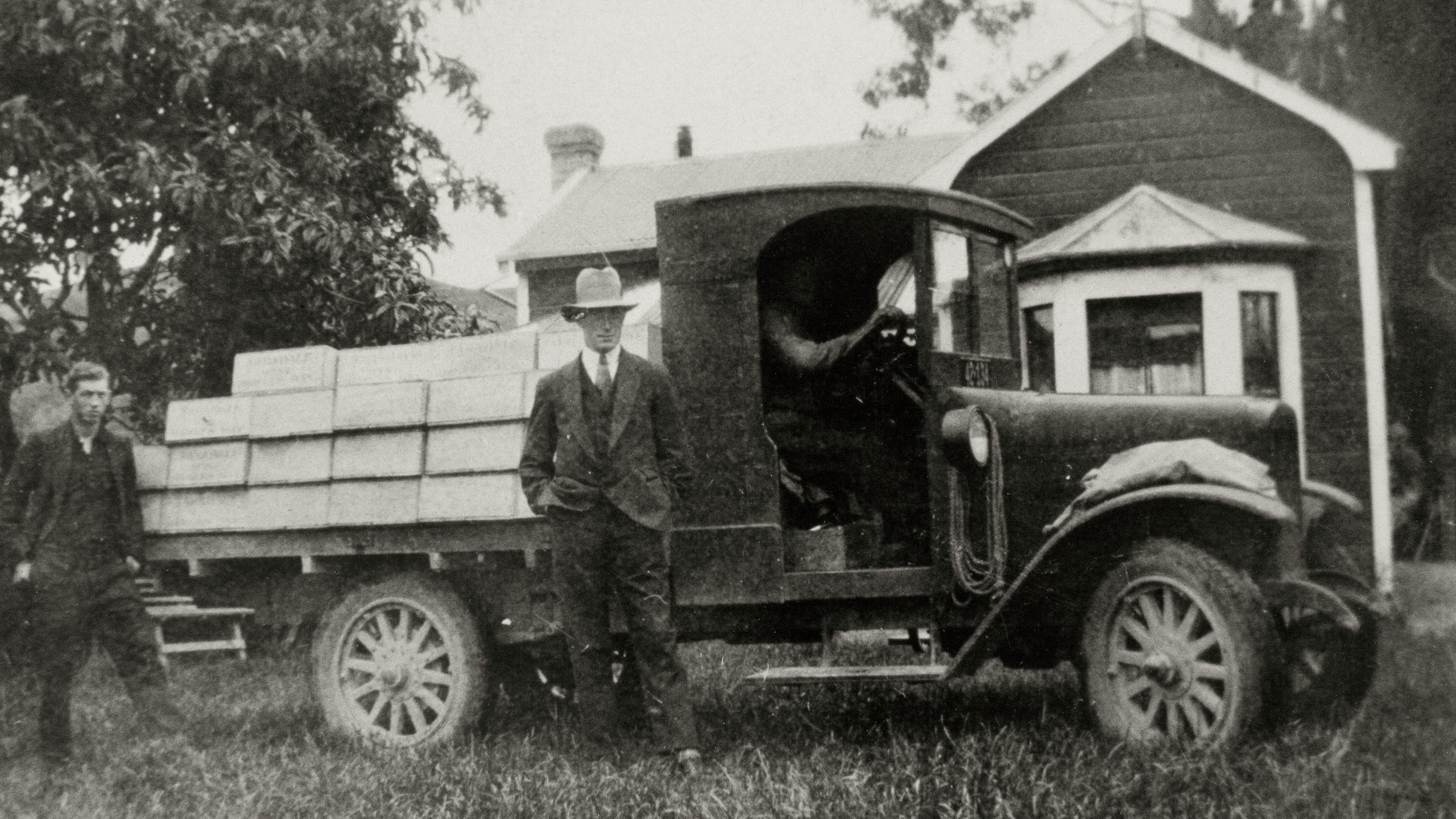
We centred the storytelling on Tom McDonald, widely regarded as the father of French winemaking in New Zealand. His ambition and pioneering drive shaped the early decades of the winery and paved the way for the modern Church Road. The bottle wrap became a narrative surface where these stories could unfold honestly and with impact.

Five archival images were selected, each capturing a moment from Tom McDonald’s life and his time at the winery. These were paired with the varietals in the McDonald Series, allowing the story to evolve across the range rather than sit as a single commemorative gesture. To elevate the craft and create a keepsake-quality experience, we engaged Signet in the UK to develop a bespoke wax seal. This seal was applied to the string that wrapped around the paper, adding a tactile, ceremonial detail that reinforced authenticity and marked the anniversary as something genuinely special.

RESULT

The limited edition bottle wrap offered consumers a deeper connection to the brand, presenting Church Road’s heritage through real imagery, thoughtful storytelling and crafted detail. The addition of the custom wax seal created a distinct sense of occasion, strengthening provenance and elevating the McDonald Series with a meaningful anniversary expression.

KEY TAKEAWAY

Milestones offer powerful storytelling opportunities. Church Road 120 Years shows how authentic archives, combined with crafted elements such as a bespoke wax seal, can honour a legacy, enrich a premium wine range and create lasting value for both brand and consumer.

Munch’n

CHALLENGE

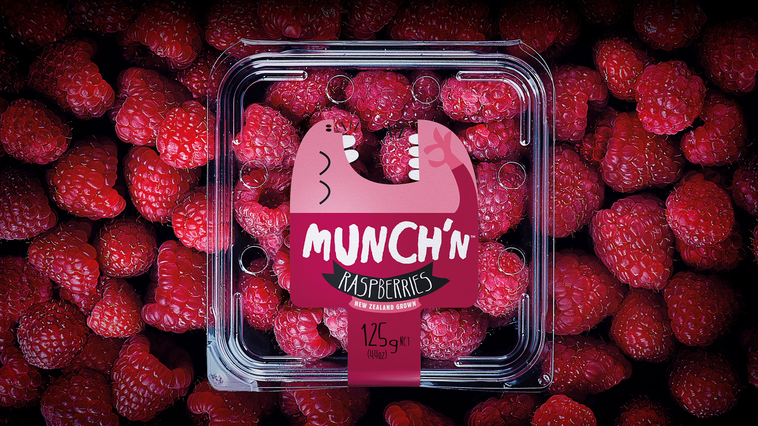
Freshmax, one of the largest fresh produce companies in the Pan-Pacific region, wanted to create a brand that could unify its premium berry portfolio – from kiwiberries and blueberries to cherries and strawberries. The challenge was to build a distinctive fresh-produce brand that could live confidently across multiple fruit types while balancing strong brand presence with essential product visibility. In a tactile category where consumers inspect freshness before purchase, simplicity, trust and instant appeal were key.

APPROACH

The idea for Munch’n was inspired by the irresistible, bite-sized nature of the fruit – perfect mouthfuls you can’t stop popping. The identity was designed to be bold, playful and immediately recognisable, using clean shapes and vibrant colours to ensure standout on small punnet labels. The design struck a careful balance between branding and transparency, letting the fruit remain the hero. Beyond packaging, the brand was brought to life through a digital-first campaign – building excitement before the season launched, engaging consumers across social media, and running a countdown as the harvest came to an end.

RESULT

Munch’n quickly established itself as a standout produce brand, recognised for its freshness, simplicity and personality. The identity’s flexibility allowed it to extend seamlessly across the wider berry range, creating a consistent family look at retail while supporting strong engagement online. The campaign helped drive anticipation and brand awareness in a category not typically associated with brand loyalty.

KEY TAKEAWAY

Even in categories where product drives purchase, a strong brand creates emotional connection. Munch’n proves that fresh produce can be both natural and branded – simple, joyful and full of flavour, just like the fruit itself.

Woodstock

Challenge

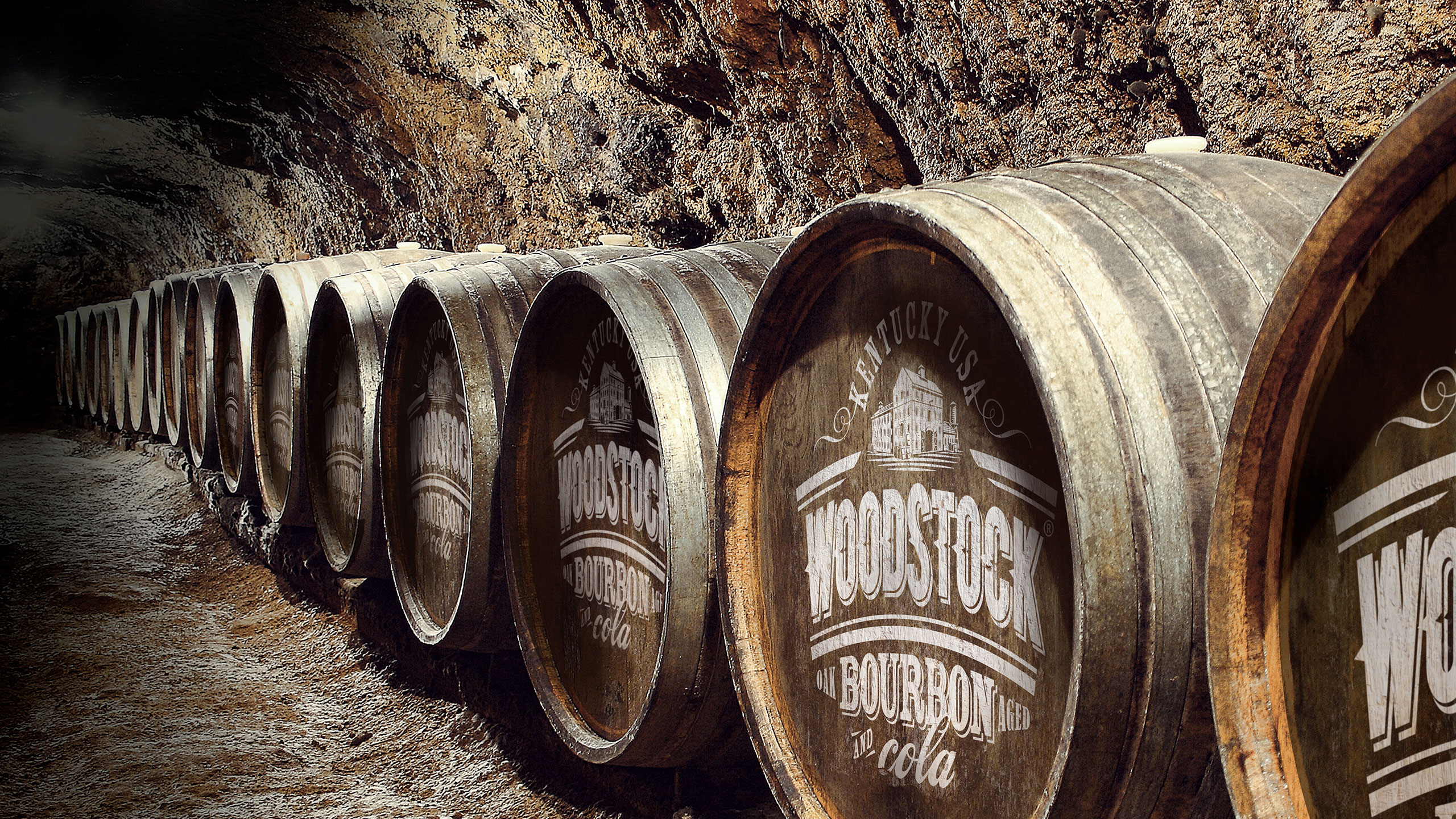
Woodstock Bourbon was facing a clear identity crisis. Although the product was made with true Kentucky Bourbon, its packaging failed to convey authenticity or credibility. The old design attempted to reinforce provenance by repeating the word “Kentucky” seven times on the front of the can, yet consumers still did not realise it was genuine Kentucky Bourbon. Instead of strengthening the message, the repetition diluted it. The brand needed a way to integrate this important truth into the hierarchy in a way that felt credible, ownable and unmistakably part of Woodstock’s story. Without a compelling identity to carry its heritage, Woodstock struggled to assert itself in a competitive bourbon RTD category. The opportunity was to bring its origins to life through a more confident, crafted and coherent expression.

Approach

We began by elevating the brand’s core truth : that Woodstock is made with authentic Kentucky Bourbon. We developed a stronger, more iconic brand mark that locked up with key heritage cues, giving the pack an immediate sense of authority. Rather than repeating “Kentucky” excessively, we integrated provenance into the visual hierarchy so it became a meaningful, ownable part of the brand world. Layering and detail became central to the new system. Handcrafted aged typography, illustrative elements and textured messaging were introduced to tell Woodstock’s story with depth and craft. These cues evoked the world of real bourbon – barrels, age, timber, heritage – allowing authenticity to be felt rather than shouted. This approach replaced overstatement with genuine narrative power. The resulting identity was bold, grounded and flexible enough to strengthen the brand across all formats and flavours.

Result

The redesign transformed how consumers perceived Woodstock. What had previously felt confused and overstated became confident, credible and clearly rooted in Kentucky Bourbon heritage. By integrating provenance into the hierarchy and expressing it through crafted design rather than repetition, Woodstock reclaimed an authenticity that had been lost. The new identity restored pride and recognisability, giving Woodstock a distinctive presence that better reflects the character of the product itself.

Key takeaway

Authenticity resonates when it is woven into the brand, not forced upon the consumer. By integrating Kentucky provenance into a crafted hierarchy, Woodstock gained the credibility and distinctiveness needed to stand tall in the bourbon RTD category.


Before

Mosin Fresh

Challenge

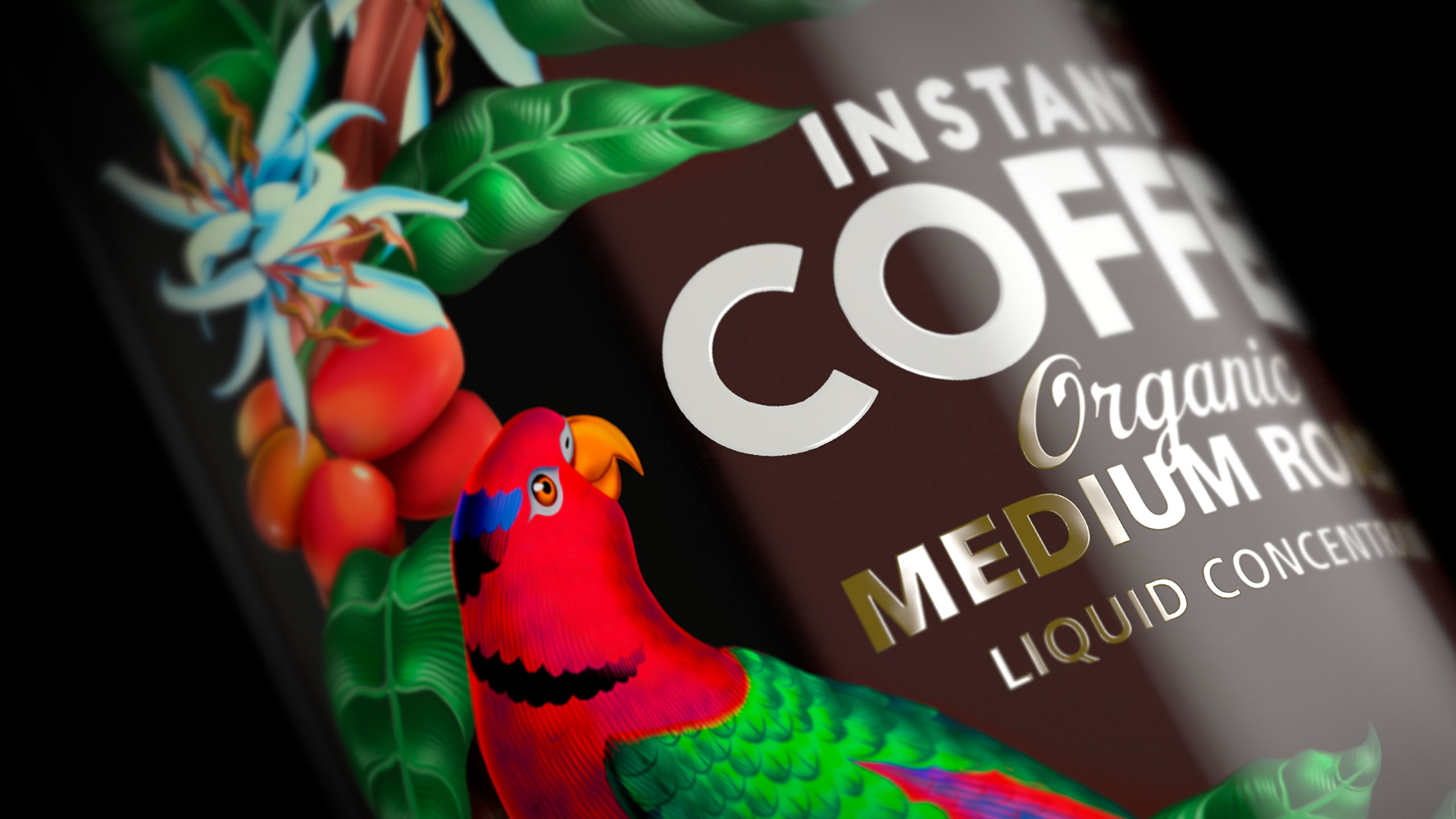
Moisin Fresh is a liquid coffee concentrate sourced from Papua New Guinea, a country recognised as one of the world’s leading producers of high-quality, organically grown coffee. Despite its exceptional provenance, the existing brand lacked the presence, character and storytelling needed to express the richness of its origins. Our task was to create a new identity and packaging system that would showcase the beauty, depth and authenticity of this uniquely Papua New Guinean product. The challenge lay in capturing not only the product’s coffee credentials, but also the broader sense of place – the exotic landscapes, extraordinary wildlife and vibrant culture that define PNG. The brand needed to feel premium, artistic and true, capable of standing proudly in local and international markets.

Approach

We immersed ourselves in the environment that shapes PNG coffee. The country’s mountainous terrain, rich volcanic soil and pristine ecosystems create some of the most sought-after coffee in the world. This geography, along with the biodiversity surrounding the farms, became central to the creative direction. The identity celebrates this abundance through highly detailed illustration, expressive typography and a layered visual language that feels both crafted and alive. Birds of paradise, lush foliage and natural textures were illustrated with great care, reflecting the precision and pride that go into growing and harvesting coffee in Papua New Guinea. The packaging was treated as a piece of art, allowing every panel to reveal another moment of discovery. Type, colour and print techniques were considered thoughtfully to ensure the product felt premium while honouring the culture and environment that produced it. The aim was to make Moisin Fresh instantly recognisable as a coffee with genuine origin – not generic, not manufactured, but deeply rooted in one of the world’s most important coffee-growing regions.

Result

The new identity and packaging transformed Moisin Fresh into a brand with real presence and cultural resonance. Consumers could immediately see and feel the story of its origin, while the artistic execution elevated the product into something giftable, collectable and proudly representative of PNG’s world-class coffee heritage. The brand now communicates authenticity and quality at a glance, allowing Moisin Fresh to stand confidently in markets where provenance and storytelling shape purchasing decisions. The combination of rich illustration and clear coffee credentials created a distinctive brand that captures both the beauty of Papua New Guinea and the excellence of its coffee.

Key takeaway

When a product is rooted in a place as extraordinary as Papua New Guinea, the brand must honour that story. By elevating its coffee credentials and expressing the vibrancy of its origin through crafted illustration and detail, Moisin Fresh gained an identity as remarkable as the coffee itself.