MOSIN FRESH
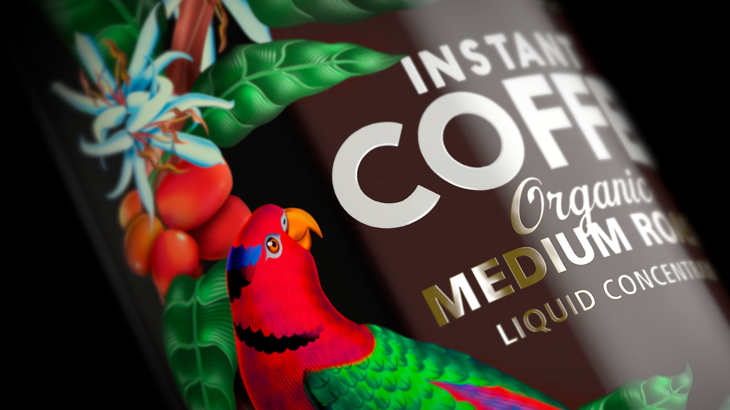
Moisin Fresh is a liquid coffee concentrate from Papua New Guinea. Our task was to develop a new brand identity and packaging that showed off this exotic paradise. There was no shortage of rich inspiration from the local environment, the amazing wild life, stunning fauna and some of the best organic coffee in the world. Every care was taken with the illustrations, type & printing to create a piece of art that captured the beauty of this product and place.
PROJECT OUTPUT
Brand identity, packaging, illustrations.

NUMBERWORX
Creating a new start-up is a big move and it was no different for Numberworx who offer businesses financial acumen & guidance to all sort of businesses. Launching themselves into the market for the first time, they needed a brand identity that gave them and potential new clients confidence. Our inspiration for the naming, logo design and collateral for Numberworx was piecing together the financial puzzle of business, delivered with simplicity and framed it up in a way that made it easy for people to understand and relate to.
PROJECT OUTPUT
Naming, logo design, stationery, collateral.

ANCHOR FLAVOURED MILK
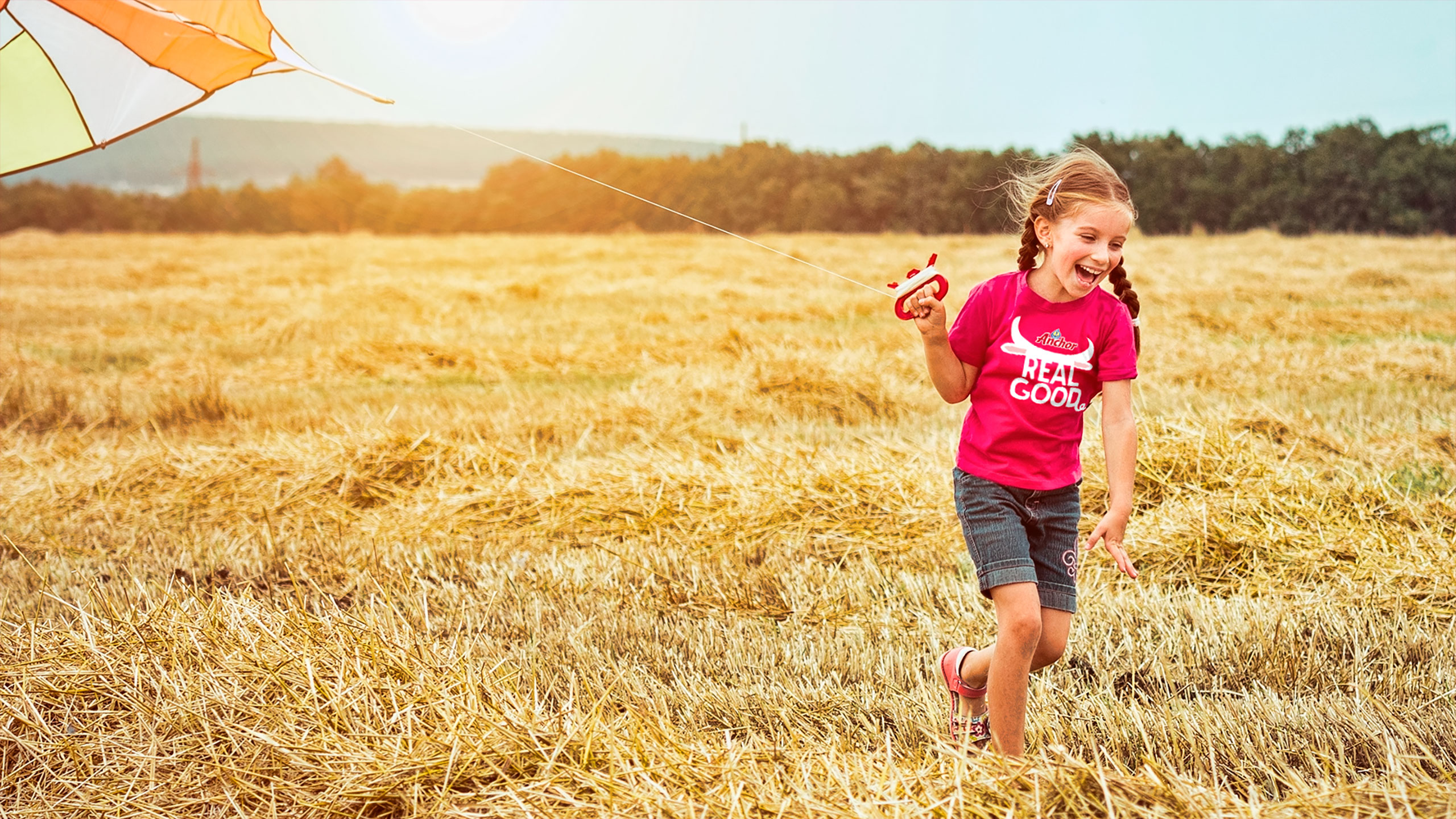
The biggest challenge for this brief from Fonterra was the packaging update for Anchor Flavoured Milk had to work in up to 14 very diverse countries, across multiple languages. Based on research insights we moved away from the previously sports focused packaging, to a simpler, bolder design that heros flavour and has the personality and stand-out to connect with younger consumers and transcend language barriers.
Strong, visual point-of-sale was a must to help communicate the packaging change and grow the brands share across these markets. We brought the packs to life on the comms. touch-points so if you couldn’t read you would still understand the message.
PROJECT OUTPUT
Packaging, point of sale, vehicle livery, trade presenters, promo give-aways, outdoor advertising.

Before

CHURCH ROAD GWEN
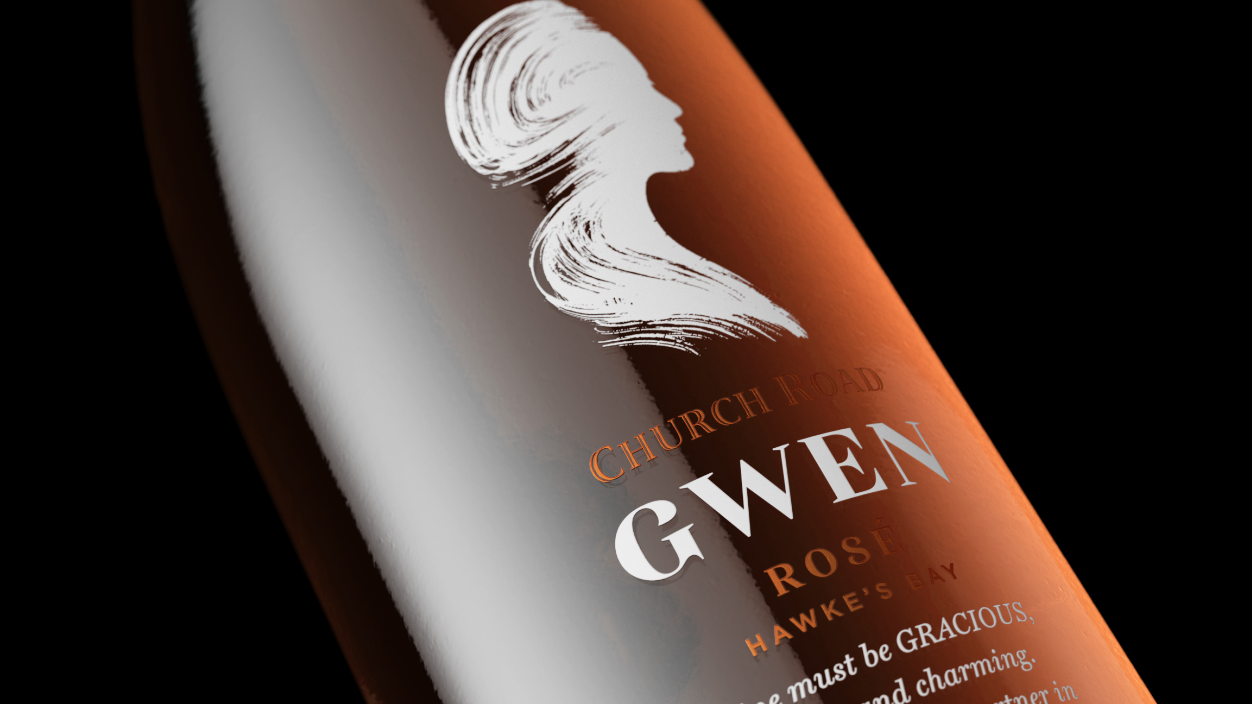
Church Road Winery were introducing a fine wine Provence style Rosé to their portfolio, a wine that was different to anything they had ever launched, so was deserving in its own range and pack style.
The wine style was aligning with Church Road’s expertise and heritage, and would be more feminine and delicate than any other product in their portfolio. This provided an opportunity to resonate with a female audience and recruit new consumers to the brand via a beautiful, sophisticated and distinctive proposition.
Our design inspiration came from a poem written by Tom McDonald to his wife, Gwen: ‘Wine must be gracious, loving and charming. Wine is like a partner in life…’ We created a striking illustrated silhouette of Gwen, and kept the rest of the bottle design simple with elegant typography.
PROJECT OUTPUT
Wine branding, naming, packaging.

DEUTZ
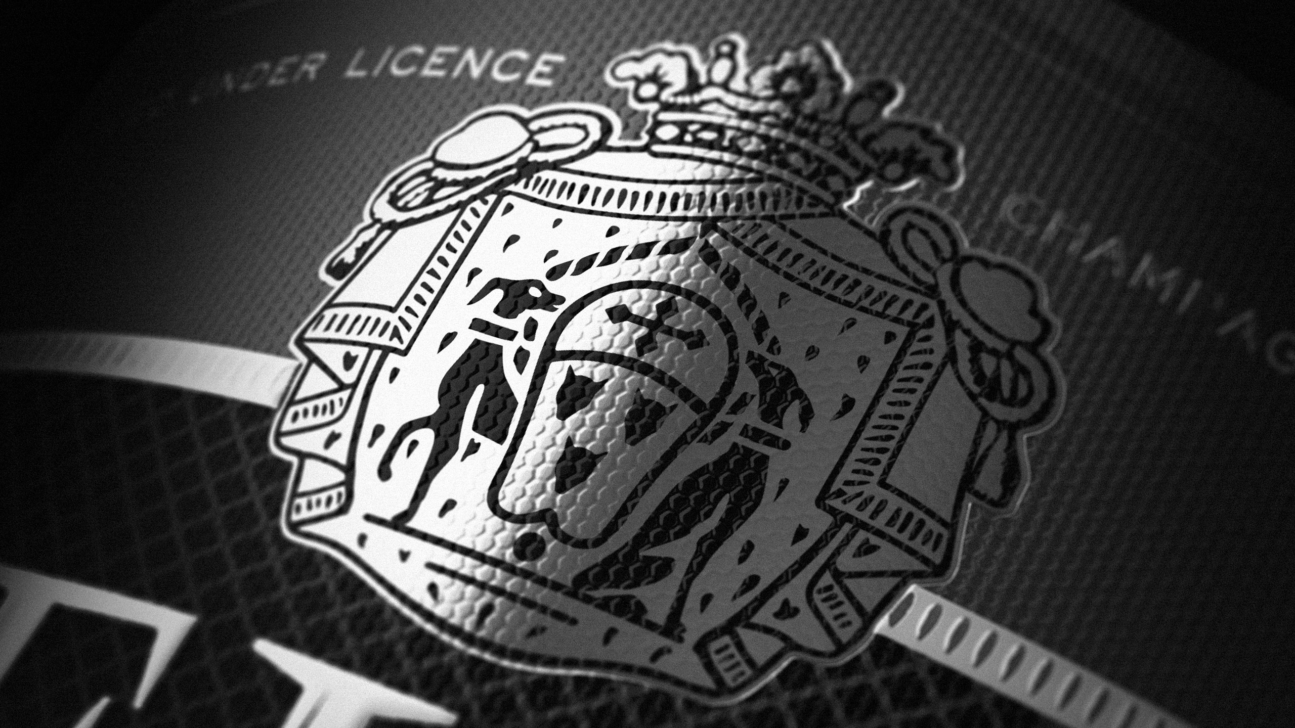
The brief from Pernod Ricard for Deutz was to evolve their existing range of packaging, modernising it to retain relevance and enhance shelf stand-out, whilst still retaining brand recognition. It was really important the changes made were subtle enough that there was no confusion for shoppers during the change. The brand mark was strengthened for greater standout and label details refined and embellished to give it a fresher more premium look. We updated the stocks, textures and print finishes to elevate its appearance and give it a truly premium look and feel.
PROJECT OUTPUT
Brand mark, packaging.

Before

BLUEPRINT GLOBAL
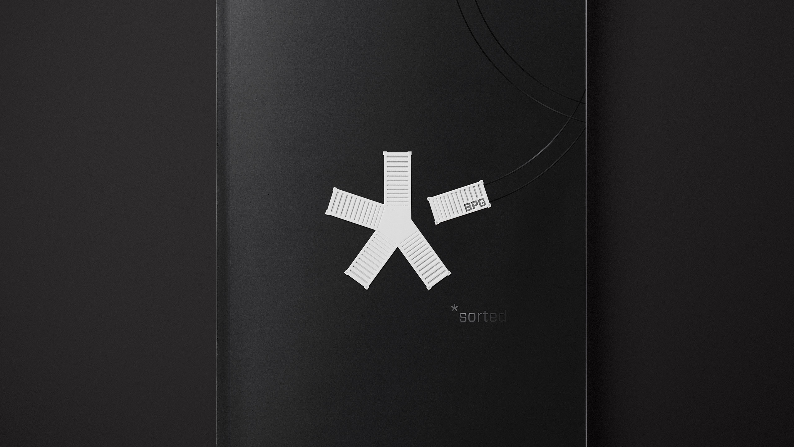
Blueprint Global is a logistics company that specialises in making the complex simple, yet all of their communications did the exact opposite. We developed a brand and visual identity to communicate their offer – the logo created from five shipping containers that come together to form a ‘chilled’ symbol. The five containers represented the five core segments of the business (air, sea, land, cross-trade & rail).
To create a more memorable and distinctive brand we added a layer of emotive imagery. Globally diverse locations showing transportation from the source to its final destination – capturing the careful, personal approach of a company who goes beyond the usual port-to-port service.
PROJECT OUTPUT
Brand identity, livery, collateral, presentations, digital, stationery.

Before

KIRK GROUP
We partnered with Kirk Group to help launch them as one group, with one vision globally. As the industry leaders of image carriers in Australasia, they needed a corporate profile and marketing collateral that showcased the group’s value in delivering integrated solutions from design through to print.
Strong imagery with incredible colour played a pivotal role in the brands new identity – it creates stand-out & cut-through, allowing them to show case their best in class pre-press & print capabilities.
PROJECT OUTPUT
Corporate profile, plate and tube shippers, stationery, environmental design.

UNITED FISHERIES
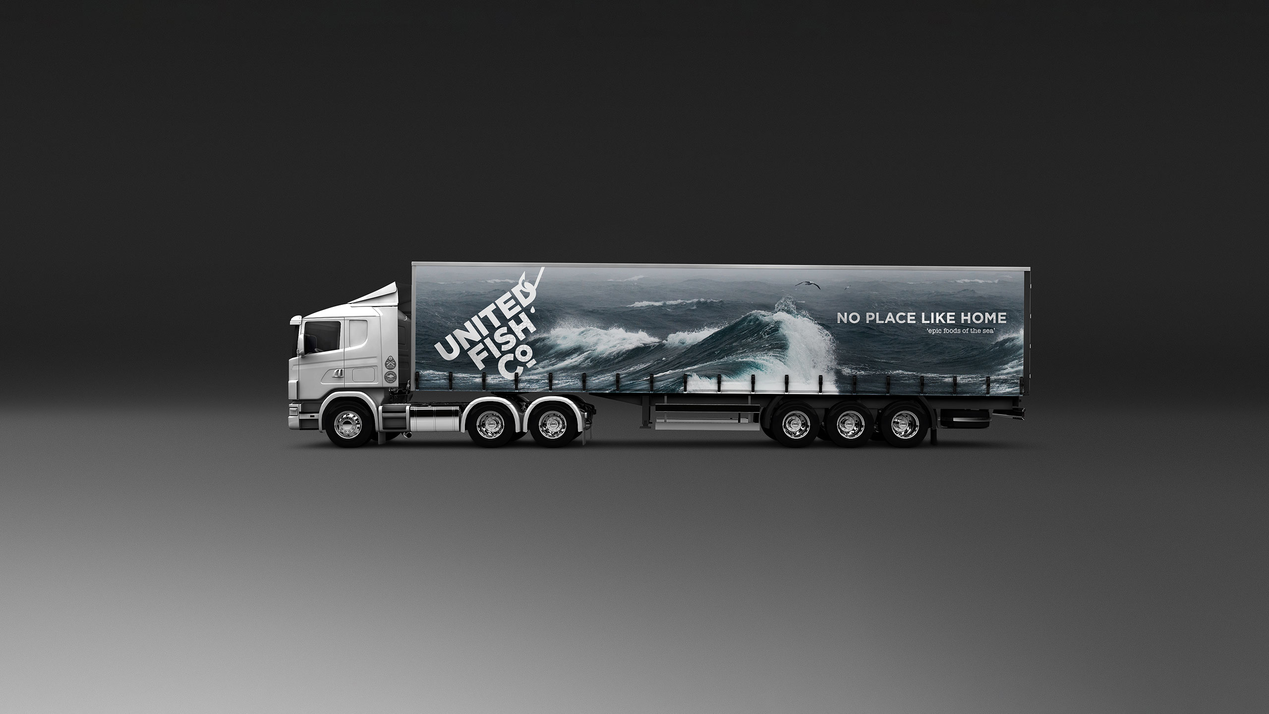
United Fisheries came to us wanting a brand that captured a ’salt of earth’ personality for fresh, NZ caught seafood. It needed to reflect the authenticity of the fisherman they worked with every day.
The word-mark caught on the fishing hook and pulled up through the water, tells the story of freshly caught fish. The packaging is built off the brand’s ’sea believers’ positioning – respect for the ocean & everything in it, with a visual style that is an extension of the rugged and isolated environments of coastal New Zealand.
PROJECT OUTPUT
Brand strategy, brand identity, brand mark, packaging, vehicle livery, brochures, advertising, stationery, event stands.

Before

