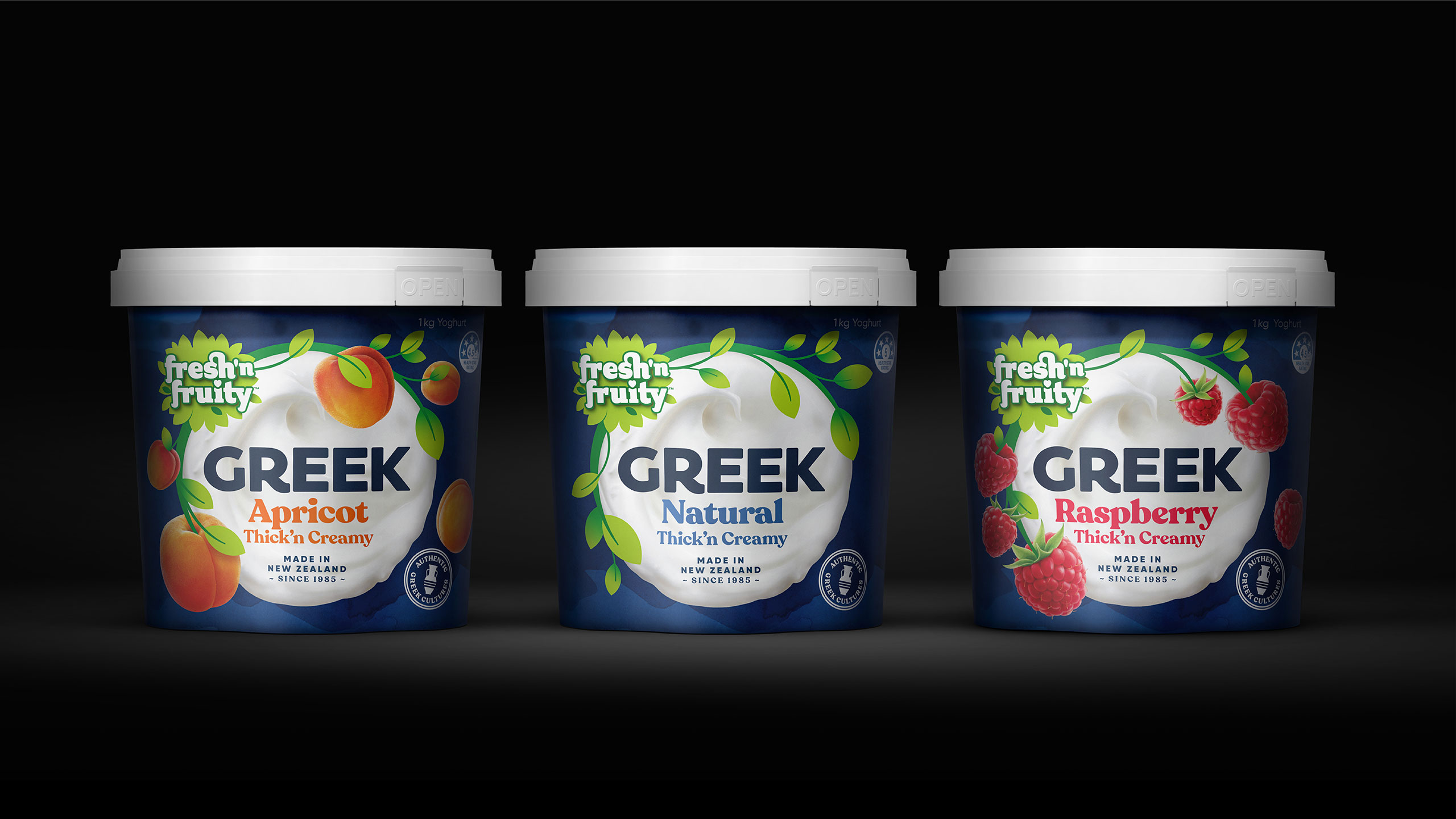
Fresh’n Fruity Greek and Indulge Yoghurts
Fresh’n Fruity is a brand Kiwis know and love, it’s a staple in most fridges and kid’s lunch boxes. However, the mainstream yoghurt category is in decline as more enticing offerings are being launched. Fonterra identified an opportunity to develop two new ranges. The Greek range targeted at consumers that wanted a more creamy Greek style yoghurt.
We developed the packaging, taking the iconic Fresh’n Fruity logo and placing it on a vibrant blue background that has outstanding shelf presence and most importantly, looks delicious!
Fresh’n Fruity Indulge was another opportunity for Fonterra to tap into the growing premium/indulgent segment, with mainstream yoghurt being in decline.
The key objective here was to communicate on pack a delicious, thick and creamy premium yoghurt that still looks part of the Fresh’n Fruity family. A big part of this range was to show off the layer of fruit within the yoghurt while still maintaining great stand-out.
Project Output
Brand identity, packaging, advertising.
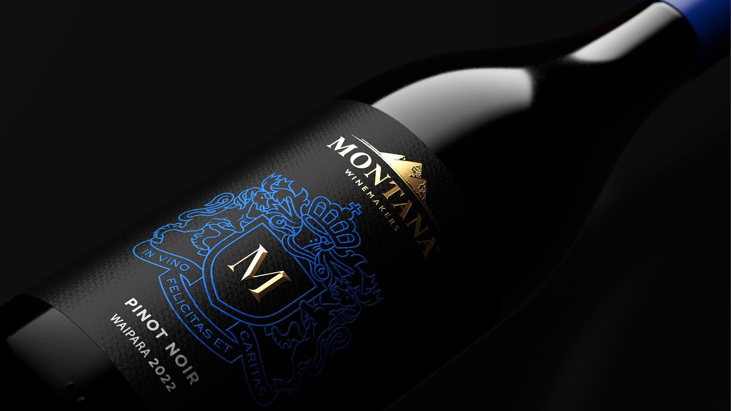
M by Montana
Introducing a new, premium range to the iconic Montana family of wines, M by Montana. This is their pinnacle wine range, steeped in heritage yet crafted for the modern palate, these confident wines bring to life a bolder, more premium expression of New Zealand terroir. Montana is a brand known and loved by Kiwis for over 40 years, so building on that heritage we started with the original Montana crest ‘In vino felicitas et caritas’ (in happiness and love of wine), and gave it a twist, by designing a label with a strong, modern yet regal blue set against a classic premium black background.
Project Output
Brand identity, packaging.
ANCHOR BRANDING
ANCHOR is a Kiwi Classic. It’s been a welcome part of our country’s homes, fridges, pantries and tables since it was first produced in the Waikato with a little good old dairy know-how and ingenuity back in 1886. However over the past few years, the brand has lost clarity due to disparate communication and most recently a focus on nutrition and performance that lacked warmth, humanity and accessibility. Consumers associate Anchor with trust, familiarity, but the brand wasn’t standing for anything exceptional and was losing power in the mind.
Our brief was to develop a Masterbrand design system to help re-connect with New Zealanders on a deeper emotional with a clear, ownable and emotional story to tell that has a cohesive way of connecting all the Anchor supporting stories together. Based on the brand platform ‘the natural home of dairy, we developed an instantly recognisable ‘milkflow’ device to house the logo and tagline, to be used across all communications. No matter what the imagery or messaging was, there would be no doubt in the consumers mind we are telling the Anchor story and how important it is in the home life of Kiwis, and feel natural, kind, vital and inclusive.
We have now implemented the system across the full vehicle fleet, outdoor and press advertising and social media, nationwide and through the Pacific markets.
PROJECT OUTPUT
Master brand system, brand guidelines.
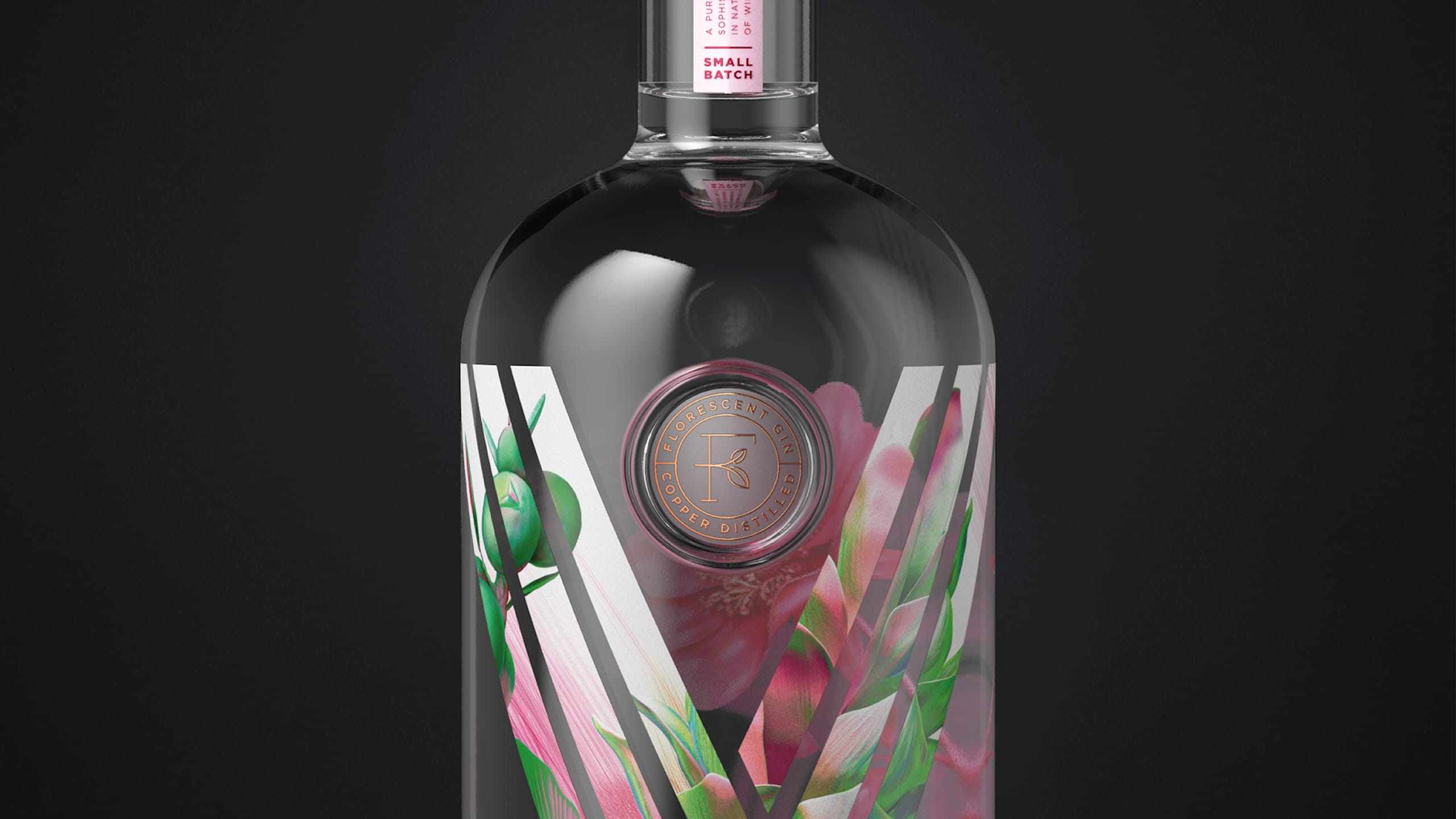
FLORESCENT GIN
A gin that would change from clear to pink when tonic was added. We developed the name ‘ Florescent’ to reflect the colourful nature of the gin, but also ‘flora’ to allude to the floral botanicals represented on the bottle. Peering through the screen printed front of bottle, you see a stunning pink hibiscus flower, the catalyst to change the colour of the gin.
PROJECT OUTPUT
Brandmark, naming, packaging.
UNITED FISHERIES
United Fisheries initially approached us with a desire to refresh their brand, aiming to tell their deep connection to the sea and the authenticity of their operations. Through a collaborative process, we developed the “Sea Believers” positioning—a concept that embodies their respect for the ocean and the dedication of the fishermen who work tirelessly to bring fresh, New Zealand-caught seafood to market. This positioning became the foundation of the refreshed brand, where the wordmark, caught on a fishing hook and pulled up through the water, visually tells the story of freshly caught fish, grounding the brand in the rugged and remote coastal environments of New Zealand.
Building on this strategic foundation, we expanded our partnership with United Fisheries to create a portfolio of brands that address various market segments. From United Fish Co. and United Food Co. to Sea Cuisine, Loco Loco, 8th Street, Lucky Boy, Ya Tai, and West Street, each brand was thoughtfully developed with its own unique offering. Whether delivering premium seafood or celebrating vibrant, culturally inspired flavours. Each brand resonates with consumers while staying true to United Fisheries’ core values of quality, authenticity, and sustainability.
www.unitedfisheries.co.nz
PROJECT OUTPUT
Brand strategy, brand identity, brand mark, packaging, vehicle livery, brochures, website, advertising, stationery, event stands.

Before
GOOD FEEDING
Good Feeding believe establishing healthy preferences at the very beginning develops positive lifelong eating practices and fights the good fight against childhood obesity. From healthy beginnings comes healthier lives, it’s the start we all deserve.
Their feeding programme, Go Well, helps take baby from first flavours through to adventurous eating in six simple steps. Designed to expose infants to different tastes and textures, Go Well helps deliver what’s best for baby and provides peace of mind for parents – all delivered to your door.
After developing the strategic brand platform and naming, we designed a flexible system, one that was friendly, approachable and simple, not cutesy, cheesy or naïve, as is often seen across the baby food category. Our logo represents fresh new starts through a sprout shape, a spoon that feeds and nurtures and a continuum of care and regeneration. Our photography captures the goodness of the programme, from farm to plate, without the fuss.
Good Feeding has now launched a pilot scheme in the USA, with plans to expand around the globe.
PROJECT OUTPUT
Brand strategy, naming, visual identity, packaging, communications.

2022 Transform Awards
Best Visual Identity from the Food & Beverage Sector
Gold Winner
“Very solid project all round. The strategy, execution and results are very strong overall. It’s hitting all the right marks while achieving great results in a short time span.”
— 2022 Transform Awards judging comments
KĀPITI YOGHURT
Kāpiti has been making incredible dairy products here in Aotearoa since 1984. Unmistakably New Zealand, the names, stories and creativity behind the products all reflect their unique providence. Up until now, Kāpiti has been known for their premium range of cheese and ice cream. Our client saw an opportunity to launch in a new category – yoghurt, offering a delicious, luxury treat for those indulgent moments.
Building on the Kāpiti brand promise of ‘Mouthwatering taste discoveries’, we wanted to capture the essence of Kāpiti – captivating and exciting tastes, textures and flavour adventures.
Using black for the pack was a no-brainer, it’s the Kāpiti brand colour and speaks to the premium nature of the brand and product. However black can be recessive on shelf, particularly in the chiller space of the supermarket. We need our packs to ‘pop’, to clearly distinguish between flavour variants and bring that flavour to life – eat with your eyes!
We photographed the towers of flavour, making them the hero of the pack. They’re juicy, gooey, leaving you wanting more. They’re not picture perfect, they’re real, messy and show the passion for the flavour adventure.
Project Output
Visual identity, packaging, communications.
VIETROSE
Since 2008, Vietrose has been bringing something new to the table for food buyers all over the world. Young, innovative and curious, their strength comes from their passion to develop and produce interesting and innovative products, in spec and on time for food buyers around the world.
We tell the company’s story and vision through an arresting corporate profile that is brought to life through compelling imagery and words that capture their passion, precision and food innovation.
PROJECT OUTPUT
Brand identity, profile, website, collateral, uniforms, office interior, livery.
Before

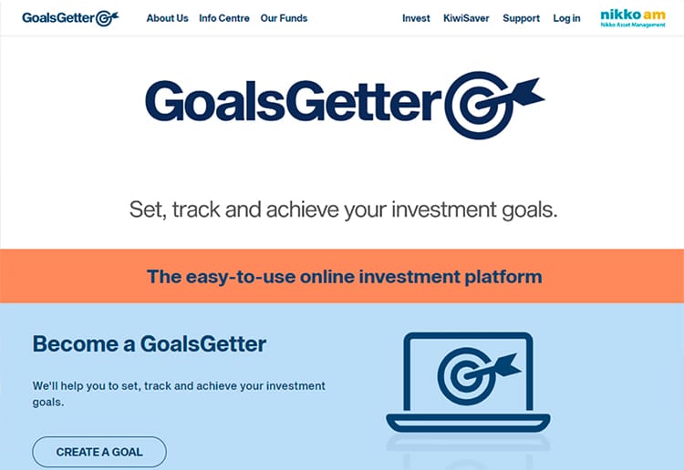
GOALSGETTER
Nikko Asset Management is a Japanese multinational investment company. It is one of the largest asset managers globally. GoalsGetter is their smart online investment platform that gives everyday investors the ability to invest in Nikko AM managed and Kiwisaver funds. The platform makes it easy for anyone to set up – you can start with as little as $250 – and track your investments online. Set your goal – whether it be that dream holiday, a house, or retirement – you can personalise your goals and the smart fund managers behind GoalsGetter manage your money.
We developed the strategic brand platform and visual identity for GoalsGetter, to bring it to life in the digital world.
A suite of illustrations was created to tell the story in a dynamic and engaging way, with our action based ‘GO’ logo all about doing, positivity and empowering our investors, helping them reach those goals.
PROJECT OUTPUT
Brand strategy, visual identity, illustration.
Before
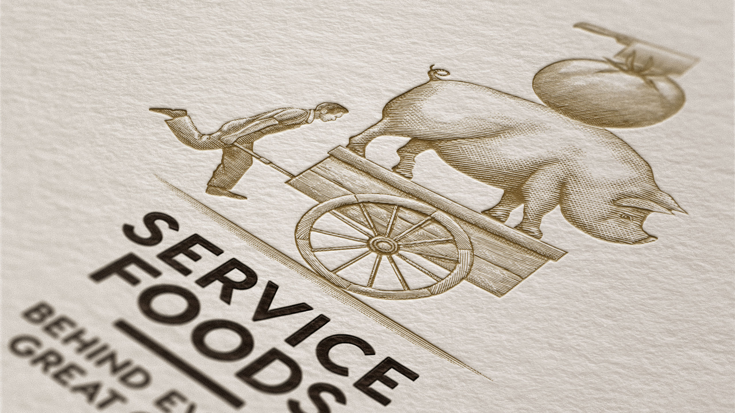
SERVICE FOODS BRAND IDENTITY
Service Foods are New Zealand’s largest privately owned and operated food service distribution business. They directly import over 4000 products from over 20 countries and supplement this with 8000 locally produced products.
They have their own growers, butchery, fishery and bakery, however much of their market were unaware of their full offer. We wanted to tell their story through an identity that visually showed and described their hand-picked sourcing carefully delivered to their clients.
Through the design process we identified that their brand image of the chef was communicating the wrong thing to their customers, rather than being a supplier of quality produce they looked like a catering company. This insight was the foundation of the creative direction.
PROJECT OUTPUT
Brand identity, vehicle livery, advertising, stationery, events, trade marketing, printed communications.

Before